Screens in the Windows user interface
In accordance with our Lifecycle policy, the Windows GUI is no longer supported from Thinkwise Platform version 2026.1 and higher. See Transition to the Universal UI for more information.
Main screen
When the application starts a screen similar to the one in the following example is displayed.
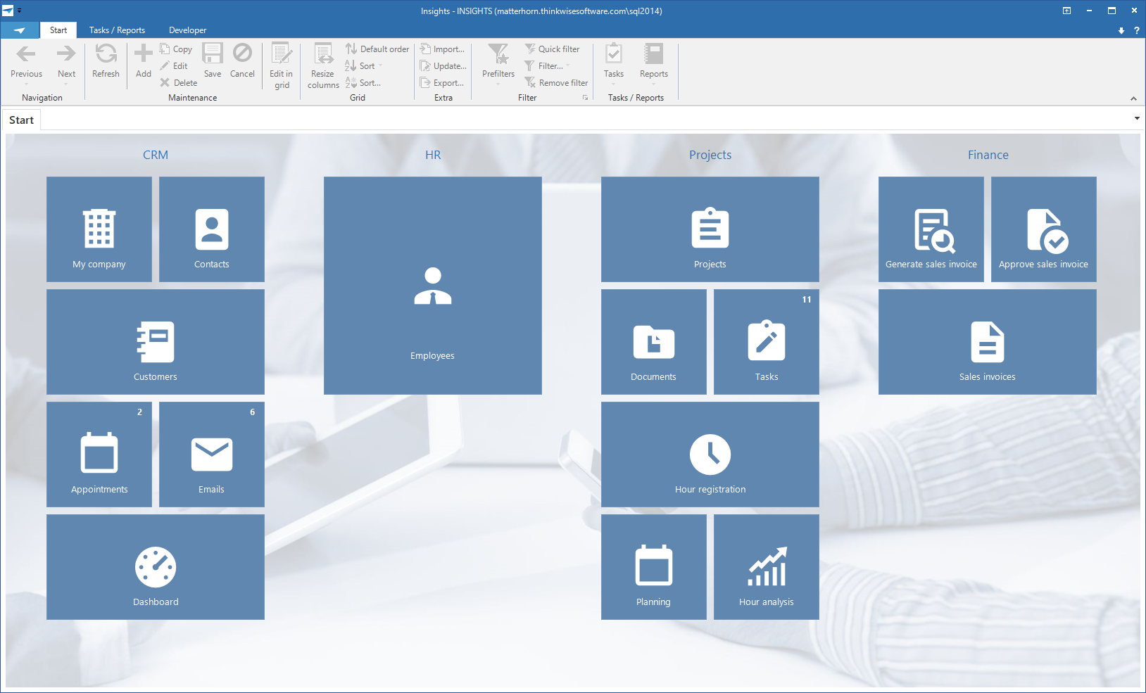 The main screen
This screen consists of three parts:
Ribbon
The ribbon contains a number of toolbars with their functions. Certain toolbars are only visible if they are applicable to the active screen. For example, the Business Intelligence toolbar is only shown if a cube or graph is active.
The various functions in a toolbar are also enabled and disabled depending on the context in which you are working. If, for example, a form is active, then the buttons in the grid are partially switched off and vice versa.
The various toolbars in the ribbon are briefly explained in the following paragraphs.
About
The About toolbar offers the possibility to close the application and to change your password. Change password is only visible if you are allowed to do this. When you click on this a screen appears in which you can enter your old and 2x your new password.
 About screen
Start
The Start toolbar contains the standard functions for working with the Thinkwise user interfaces, such as navigating through and editing data, sorting and filtering, importing and exporting and an indication of active process flows.
 Start toolbar
Tasks and Reports
This toolbar is able to call up tasks that are available on the work screen.
User preferences
This toolbar contains the functionality to modify your user interface, such as the language, and the sequence and visibility of columns and tabs.
See: User preferences
 User preferences
Active Process Flow
This toolbar is displayed when a process flow is active and shows the steps of the process flow.
Cube
This toolbar consists of functions that affect the cube view.
Graph
This toolbar provides the possibility to modify the colors, legend and form of the graph and display stored graphs.
Developer
This toolbar is only visible for developers. It contains options for refreshing the model, debugging facilities, automatic testing and the Application Logic monitor.
Navigation bar
After the program is started the navigation bar is displayed on the left side of the screen. It is possible to navigate to different parts of the program using the navigation bar. This is presented as a quick launch toolbar or a tree structure menu. In addition, the various applications can be navigated to using the application menu, this is always situated under the navigation bar.
Quick launch toolbar
The quick launch toolbar can be used to start the various parts of the program such as a work screen, a task and a report. These components are grouped logically.
Quick launch toolbar with collapsed quick launch toolbar groups
By clicking open a quick launch toolbar group, the components of that group that can be started will be displayed.
Quick launch toolbar with expanded quick access toolbar group 'Sales'
It is also possible to hide the quick launch bar, thereby creating more space on the work screen. Click on the pinned push-pin symbol at the top of the quick launch toolbar.
The quick launch toolbar then slides away to the left. To display the quick launch toolbar again the mouse must be held above the 'Quick launch toolbar' label. Click on the unpinned push-pin at the top of the quick launch toolbar to again fix the quick launch toolbar.
Tree structure menu
Apart from using the quick launch toolbar you can also navigate through the program with the help of a tree structure menu. This works almost the same as the quick launch toolbar, but it can contain several layers.
Tree structure menu
Application menu
The application menu may be visible at the bottom of the navigation bar. This is only visible if several programs are being used.
Application menu
A program can be started by clicking on the associated button. The quick launch toolbar or the tree structure menu adjust themselves accordingly and work can start with this program. A distinction is made between programs that are already loaded and programs that still need to be loaded. Programs that are not yet loaded are shown with a red 'not-loaded' symbol.
You can also make the application menu smaller by clicking on the separator bar and dragging it downwards. When this is done only the symbols that are associated with these programs are displayed. By clicking on it the program opens in the same manner as with the expanded menu.
Small Application Menu
Work screen
A work screen is opened by clicking on a quick launch bar or tree structure menu component. Data can be referenced and updated in a work screen. Among other things, tasks can be carried out and reports can be printed.
Tabs
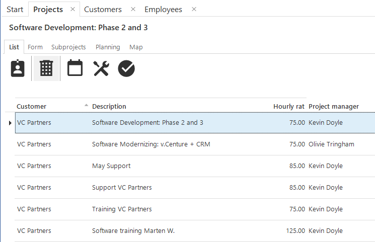 Tabs
Tabs
If several work screens are opened simultaneously (for instance via the quick launch toolbar) then it is possible to navigate between these screens with the help of the main tabs. To switch between work screens click on the tab of the required screen. It may be that work screens from different programs are open. If you click on the tab of another program then the quick launch bar or the tree structure menu will also change.
When an item on a quick launch toolbar, for which the associated work screen is already open, is clicked on the screen springs directly to it. It can however happen that you want to open a specific screen twice. To do this the user can click on the quick launch toolbar component, that needs to be opened again, by holding down the Ctrl key.
Screen components
The Thinkwise application screens are built up from various screen components, which can be combined on one type of screen according to the wishes of the developer. The standard types of screens that are available are discussed in the following chapter. This chapter presents a summarized overview of the available components.
Grid
The grid contains a summary of the data displayed in a table. These are shown in rows. You can navigate through the data and adjust the sort sequence by clicking on a headling.
 Grid view
Form
The form contains the data of the currently selected row. Using the form it is possible to update and delete this row or to add a new row.
One form can include several tabs. This depends on the available amount of space.
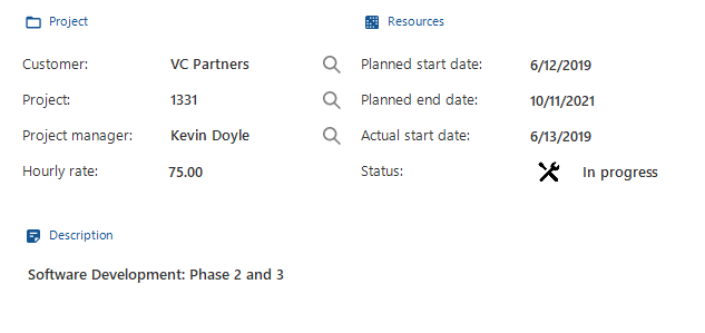 Form View
Cube and graph
Business Intelligence information is made visible in the form of cubes (pivot tables) and graphs, which are mutually linked. Pre-defined overviews can be opened or overviews can be created by dragging fields.
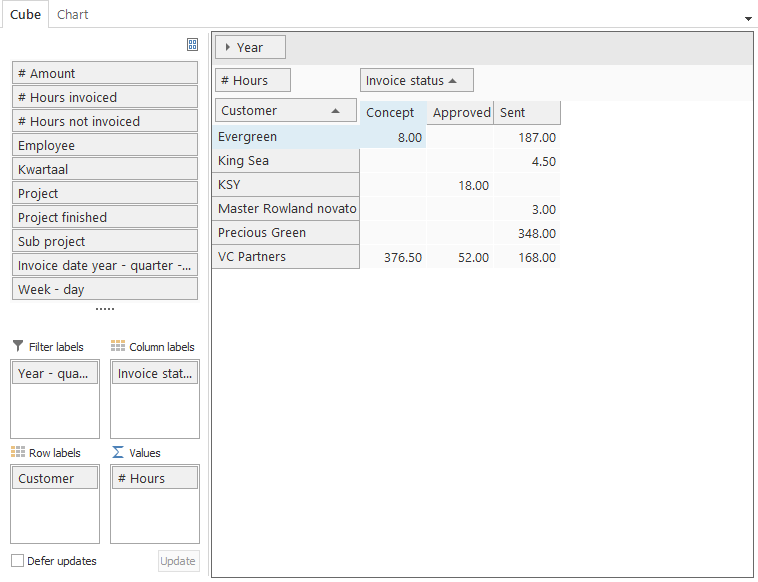 Cube view
Graph view
Tasks and report bar
A tasks or report bar displays all available tasks or reports as buttons on the screen. These can be displayed both horizontally as well as vertically.
Types of screens
If the user opens a screen the information is displayed in the window on the right of the quick launch bar. As a default there are five types of screens available; a master-detail screen, a vertical master-detail screen, a hierarchically screen, a popup screen and the Business Intelligence screen. In addition, there may be customized screen types available. The default screen types will be discussed in the following paragraphs.
Master-detail screen (horizontal)
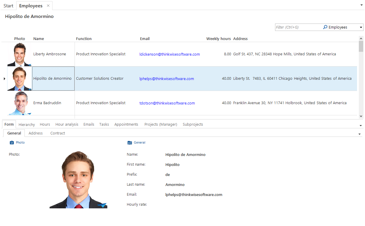 Master-detail screen
The master-detail screen is divided into two parts, the main category (master) and the associated sub-categories (details). In this example the main category is 'Emails' and the associated sub-categories are 'Content' and 'Details'. The sub-categories are classified in detail tabs. When different emails in the list of emails are clicked on, the content and the details will also change.
Master-detail screen (vertical)
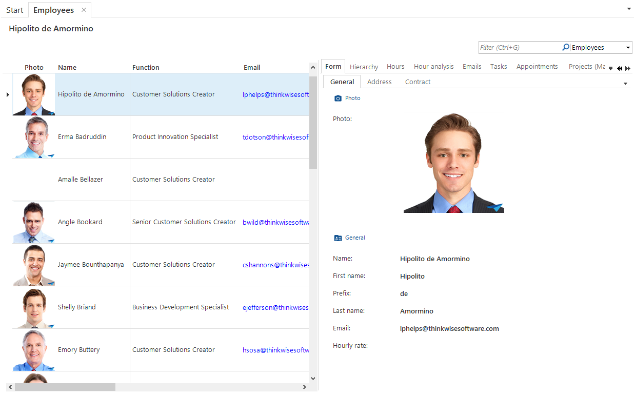 Master-detail screen (vertical)
Along with the horizontal master-detail screen there is also a vertical master-detail screen available. This works the same as the horizontal version except that the grid is positioned on the left of the form instead of under it.
Hierarchy screen
The hierarchy screen consists, just as the master-detail screen, of a main category with associated sub-categories, only these are displayed differently. In this screen the first tab is the grid of the main category and the second tab the form. These are followed by the detail tabs with the sub-categories.
This screen is particularly suitable for a main category with many fields or data. Indeed on the second tab almost the entire screen is available to display the fields. The advantage of the master-detail screen is that the grid and the form are displayed simultaneously.
When the user opens the detail screen in a grid the name of the data being displayed is shown in the top left of the work screen. This example concerns the customer 'Antea Group'. The user can select the data in the grid that he wishes to be displayed or that needs to be updated. The details of the data that is selected is then displayed in the form.
If several items of data are selected, then only the last one selected is displayed.
Popup screen
The popup appears 'from the screen'. The screen always appears in the middle. The layout of the popup screen can differ for each action that is executed.
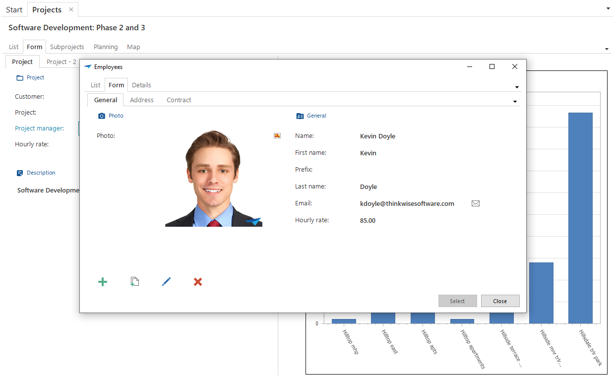 Popup screen