Functions in the Windows form
In accordance with our Lifecycle policy, the Windows GUI is no longer supported from Thinkwise Platform version 2026.1 and higher. See Transition to the Universal UI for more information.
Introduction
The form contains the data that is selected from the grid view. A field can
consist of data that comes from another table, such as with Country. By
clicking on the magnifying glass next to this
field the underlying data is displayed in a popup. It is also possible to
execute a number of things directly, including sending an e-mail directly from
the data
, opening a web page
or opening Google maps with an address
. Also, a form can contain several tabs.
The form is provided with a form bar, that makes it possible to add or edit data or to navigate through it.
Form bar
The form contains analogous functions as with the ribbon and context menu. It is therefore possible to use the same functions from the start toolbar or from the context menu.
Add data
Adding data can also be done from the form through use of the form bar, if this
has been made available by the developer. Press on* * to add data. Then press on
to save the data; or on
to cancel the data input.
Edit data
Editing data via the form bar. Can be done by clicking on .
Delete data
Deleting data via the form bar takes place with the key. It may be that data cannot be deleted, if
for example other data is dependent on it.
Navigate through the data
From the form bar it is possible to navigate through the data with the arrow
keys
. To
go to the first or last record can be done using the arrow keys with a stripe
.
Copy the data
Copying the data that is displayed from the form can be done with the button.
Refresh the data
Refreshing the current data that is displayed takes place with the button.
Input types
Input fields
Various input fields are used within the application, each of which have their own function. The input fields can also include various ´states´, which consist of:
Optional input field
Required input field
Read-only input field
Default input
Default input
The default input field can be provided with textual input. The textual input consists of alphabetical characters, special characters and numbers. The input field is different depending on the type of data that must be entered. A number input applies for numbers and a date input applies for dates. These are explained in more detail in the following paragraphs.
Entering numbers
Number input
Only numeric numbers between 0 and 9, comma, full-stop or hyphen can be entered into a number input field.
Combination input
Combination input
The combination input is set up such that it can contain various functions, depending on which field is active. It is possible from the combination input, to make a selection on several fields or open a calculator.
Select data
Data grid
If the magnifying glass is clicked on when in the combined input field, the grid is opened with data. By clicking on one of the data elements this is linked to the above data.
Calculator
Calculator
If the magnifying glass is clicked on when in the combined input field, the window with the calculator is opened. The required calculations can be made within the calculator. The final result of the calculator can be confirmed with Ok_ or cancelled with _Cancel;
Color selector
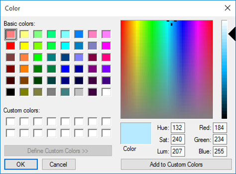
 Color selector
If the magnifying glass is clicked on when in
the combined input field, the window for the color selector is opened. One color
can be selected within the color selector. The color can be confirmed with Ok
or cancelled with Cancel;
Date input
Date picker
If the date is clicked on in the date input field, the date picker will open. The date picker provides the possibility to select a date. The date picker can be emptied in one go by pressing Empty.
Time input
Time input
Indicating the time can be done by using the up and down button, in addition the time can be entered via the keyboard.
Check mark
It may be necessary to confirm or deny something with the help of a check mark. A check mark is often filled in as default either with or without a check mark, but it is possible in some cases that neither of them is entered. The area in which the tick belongs then appears in color.
Check mark not filled in, no confirmation, no denial
Empty check mark, denial
Check mark filled in, confirmation
File input
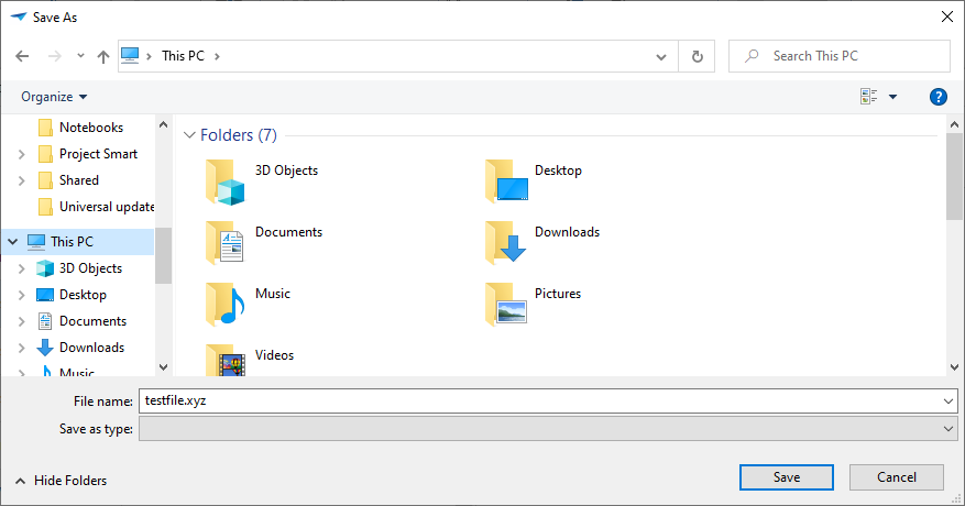
Upload file
If the arrow is clicked on, then a window opens to store the file.
 Select file
Press on Save with the left-hand mouse button. Press on Cancel with the left-hand mouse button to stop the export.