Business intelligence in the Windows user interface
In accordance with our Lifecycle policy, the Windows GUI is no longer supported from Thinkwise Platform version 2026.1 and higher. This means some features on this page are no longer supported. See Transition to the Universal UI for more information.
Business Intelligence
Apart from updating data, the program also includes possibilities to carry out analyses and present data graphically.
The Business Intelligence screen is divided into two sections, the cube and the graph sections. The data in the cube section can be clearly presented in the form of a table and the data from the cube can be presented graphically in the graph section.
Cube
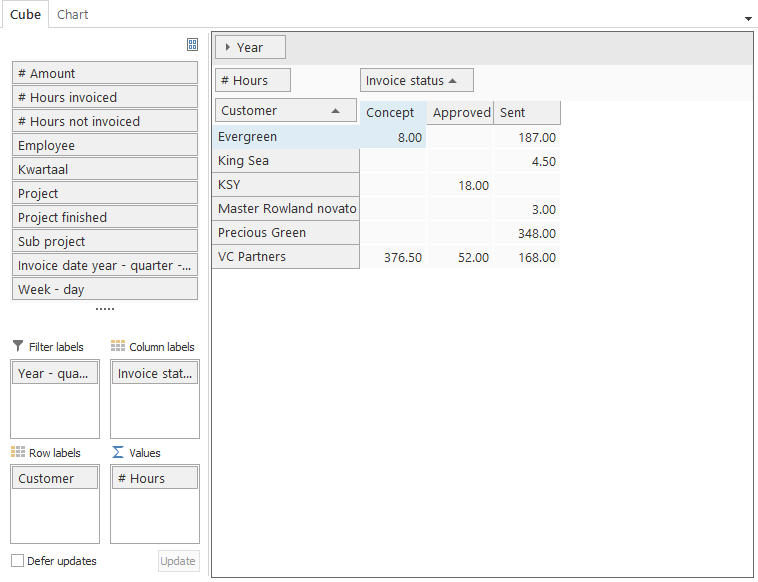
The cube is divided into two sections, the dimension and value bar (1) and the presentation screen (2).
 Cubes
Cubes
Dimension and value bar
The dimension and value bar contains the fields that can be used in the cube.
 Dimension and value bar in cubes
A distinction is made between the dimension and the value fields. The dimension fields are used to place a value in the cube or graph. The value fields give the result of that which needs to be measured. These fields always start with a # symbol.
To make use of the dimension and value fields, these must be dragged to the value bar. The value bar ensures that these are grouped in the presentation screen.
 Value bar in cubes
The value bar is sub-divided into four sections, each of which has its own role for producing the cube.
Filter label The type on which is filtered
Column labels Axis against which values are plotted (X-axis)
Row labels Axis against which values are plotted (Y-axis)
Values The type of value that is presented
If the dimensions are placed under the required row or column label and the value is under values, then the presentation screen will also be filled.
Presentation screen
The data is shown graphically in the presentation screen. The data that is presented is derived from the designated row and column label, which combine to present the value.
 Presentation screen in cubes
Expand and collapse with several rows or columns
With a large number of rows or columns it is useful to expand and collapse them, depending on what is important at any given time. This can be done by clicking on the arrows next to the field that must be expanded or collapsed. Or by clicking twice on a column.
Sort on row or column labels
Sorting on a row or column label is useful to create an overview of a minimum or maximum result. Click on a row or column to apply the sort in descending or ascending sequence;
Display information behind the field in the cube
If a cube is calculated only the information that is relevant for the user is displayed on the screen. To retrieve the details of the underlying fields the field in question in the cube must be clicked on twice. The detail window is then opened.
 Detail screen in cubes
ℹ This option is not available in the Web version of the application.
Context menu
The use of the cube is extended with functions from the context menu.
 Context menu in cubes
Refresh the cube
To retrieve the latest data for the cube it is useful to refresh it, so that the latest data is worked with.
Open cube views
This allows predefined cube views to be requested. These are made available by the developer.
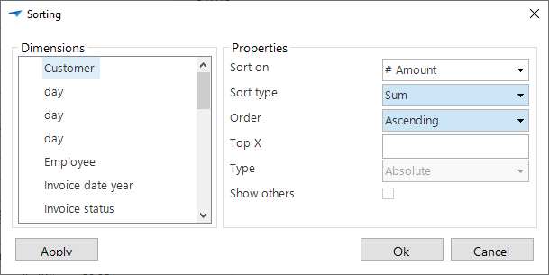
Advanced sorting with the cube
It is possible to apply an advanced sort for the cube, so that it can be indicated exactly how the sort must take place. An example of an advanced sort is given below.
 Advanced sorting in cubes
The options to display a top X provide the user with the possibility to not only present data in the cube but a top number of records or percentages. The function 'Display others' is then advised, so that the total value remains intact.
Set cube totals
It is possible to calculate the totals for each row. For this it must be indicated with 'dimensions' which dimensions must be used for determining the total. Subsequently, with 'totals', it is indicated which calculation must take place for the total.
 Totals in cubes
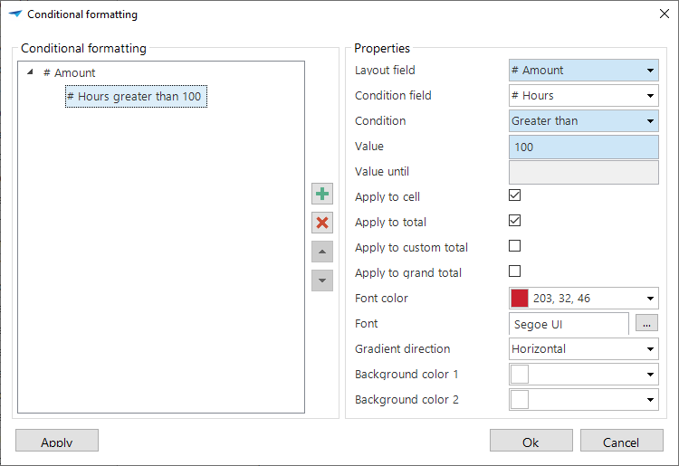
Set conditional layout
It is possible to set up a conditional layout for cubes via the context menu. To do this, specify which field you want the layout to apply to and under what conditions.
Display all totals
As default all totals are presented that have been given for the cube. Under Totals can be indicated which totals must be displayed.
 Display totals in cubes
Display the totals on left
Display the grand totals for the totals.
Display the totals on right
The totals are presented for the grand totals.
Apply a prefilter
There may be prefilters present in the cube. These are filters defined by the designer, so that these do not have to be created every time. It can also be that when a work screen is opened the prefilter is enabled by default. The content of the prefilters is always business specific and therefore we will not discuss them further in this document.
Export the cube
It may be useful to export the data that is composed with the cube to a file, so that this can be used for other purposes.
The possible file formats are displayed by clicking on Export from the context menu.
 File format for export within cubes
Print preview of the cube
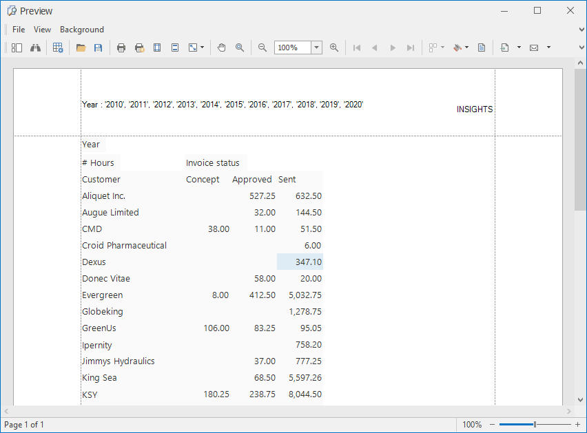 Print preview in cubes
The menu within the print preview window consists of several options;
| Option | Description |
|---|---|
| Search within the view | |
| Modify formatting | |
| Open file | |
| Save | |
| Quick print, without selecting a printer | |
| Select printer and then print | |
| Modify page layout | |
| Modify header and footer text | |
| Modify the format of the document | |
| Drag through the document | |
| Zooming in and out within the document | |
| Navigating within the document | |
| Create an overview of several pages | |
| Modify the background color | |
| Add a watermark | |
| Export the document | |
| Send document via e-mail | |
| Close the print preview |
Print the cube
Printing a cube is also possible from the context menu.
Graph
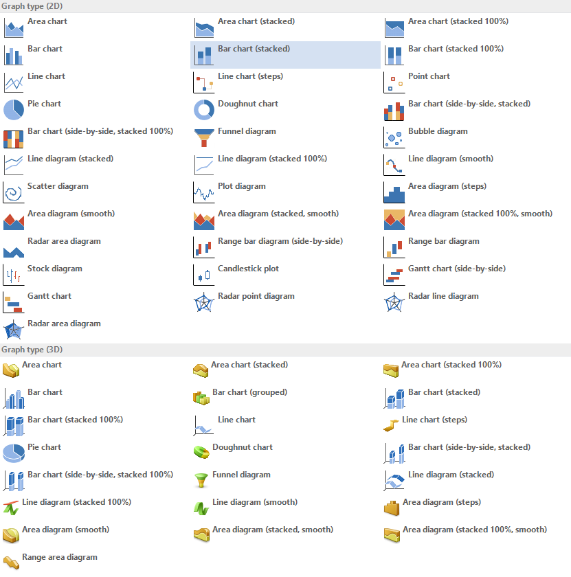
The data from the cube can be presented graphically, both two dimensionally as well as three dimensionally. Several kinds of diagrams are used for this, such as:
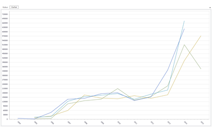
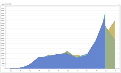 Area chart Area chart | 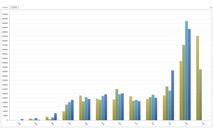 Histogram Histogram |
 Line graph Line graph | 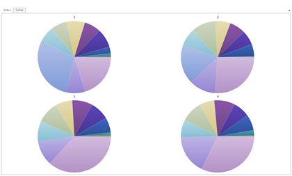 Pie chart Pie chart |
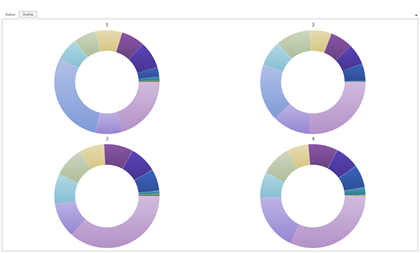 Doughnut chart Doughnut chart | 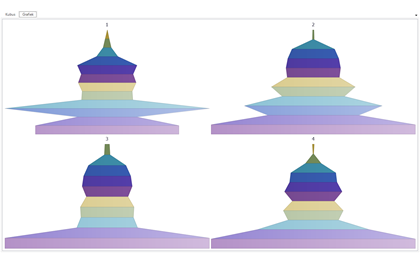 Funnel chart Funnel chart |
The actions that can be executed within the work screen in relationship with the graph are described in the following paragraph.
Selective graph
If a cube is used which contains a large amount of data, it is advisable to select one-or-more rows, so that the presentation of the graph becomes easier. Open the cube view for this. Select the required rows by clicking on the first one and keeping Shift pressed, click on the last row that needs to be selected. To specifically select a number of rows hold down the Ctrl button instead of the Shift button.
Open the graph context menu
The graph view is provided with several functions that are available in the context menu.
 Context menu in graph
Set up two or three dimensional graph presentation
There are a number of different forms of presentation available to display the graph. These can be in a 2D or 3D format.
Display labels
The labels are displayed as default and show the value of a component in the graph or diagram. It is possible to indicate with the right mouse button whether the labels need to be displayed and where these should be positioned.
Display legend
Defining a legend with a graph is useful to indicate exactly what information is being presented. This can be called up via the context menu with Display Legend.
Set up Legend options
These options can be adjusted to more specifically indicate what is displayed in the legend. In the figure below it can be seen that the position of the legend and the format that this takes on the page can all be defined.
 Legend with graphs
Set up lines with a title
It is possible to define lines on the graph with a certain value. Along with the value the color, thickness and style of the line can all be adjusted. Furthermore, a title can also be assigned to a line.
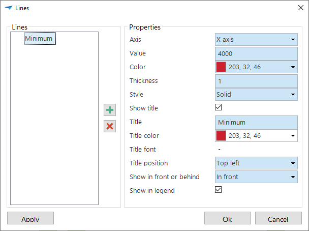 Setting up lines in graphs
Rotate graph (2D)
To view the graph from a different angle, this can be displayed in a horizontal and vertical view. By clicking on 'Rotate' graph the x-axis and y-axis are switched.
Rotate graph (3D)
It is possible to view a 3D graph from various angles. By rotating the graph using the 'Rotate' option the graph can be freely rotated on its axis. The 'Restore' option resets the graph to its original setting.
Zoom in on the graph
To bring the graph closer, it is possible to zoom in on it via the 'Zoom in' function. This enlarges the graph. You can zoom in and out on the graph by scrolling on the mouse.
Along with zooming with the scroll wheel it is also possible by holding down Shift and clicking on the graph. To zoom out hold down Alt and click on the graph.
Set up transparency in the graph
It is possible to define a specific transparency for the graph so that certain results are more visible. This can be set from 0 to 100%.
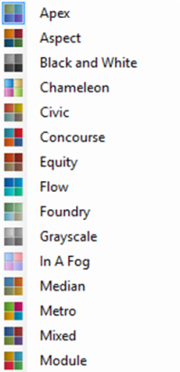
Set up the graph color palette
Presenting the graph in a different color scheme is possible by adjusting the color palette via the toolbar or the context menu.
 Color palette in graphs