Sort, search, and filter
Introduction
This guide explains which features and components you can use for adding sort, search and filter functionality to your end application that uses the Universal GUI.
- Community post - Smarter Filtering in the Universal UI
Sort
Sort order in column header
In a grid, users can change the sort order by using the arrow icons next to the column headers. The sorting is saved and restored when the component loads again.
For its configuration, see:
Advanced sort order options
Users can also change the sort order in a grid with the option Sort... in the overflow menu. The Sort pop-up offers the following options:
- To sort data, users can select columns from the list of available columns on the left and use the
>>button to add them for sorting in ascending order. They can also double-click columns in the list or drag and drop columns to add them. - To exclude columns from sorting, users can select them on the right and use the
<<button to move them back to the available list. They can also double-click columns in the list or drag and drop columns to remove them from the sorting. - Users can group columns by selecting them on the right and clicking the Group button. This requires the Group permission to be enabled, see Allow grouping in a grid. Clicking again on a grouped column will ungroup it.
- To remove all sorting and grouping, users can click the Clear button.
- To return to the default sorting and grouping settings defined in the Software Factory, users can click the Default button.
- To change the order of columns on the right (sorted/grouped columns), users can drag and drop columns in the list or select a column and then click Up or Down. Clicking Up on a non-grouped column above a grouped column will also group the selected column.
- To toggle between ascending and descending order for a column on the right, users can select the column and click the Direction button.
When a column that is not visible in the grid is added to the sorting, it will become temporarily visible. However, refreshing the Universal GUI, going into edit mode, closing and reopening the document, or switching pages in pagination will hide the column again. Then, it will no longer be visible.
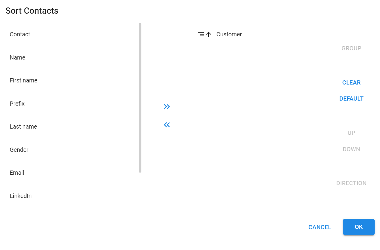 Sort pop-up
Search in a grid
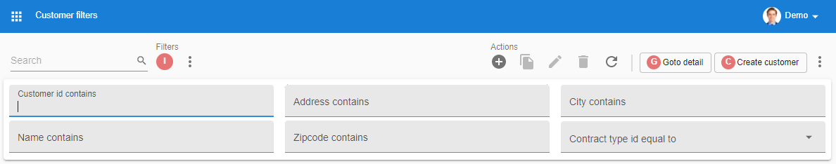
Search field
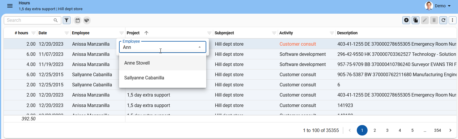
To find a specific word in a grid, users can enter the item they are looking for in the Search field. The Search field is permanently visible on a screen. It filters several columns at the same time. Hovering over the field shows the columns that are filtered. Only the rows that contain the search term are shown.
- To remove the search term and its results, users can select Clear
 .
. - If not enough space is available to display the Search field, users can select Search
 .
.
To configure the Search configuration for your end application, see Search.
 The Search field and some prefilters
Search in columns with multiline values
Users can filter columns that contain multiline values.
- To search in columns with multiline values, users must select the three vertical dots in the column header. This opens a pop-up with a search field and the values of the selected column.
- To start searching, users must enter a search term in the pop-up.
- To view the filtered results, users must close the pop-up.
 Search in a column with multiline values
Search in the menu
To find specific menu items, users can use the Menu search field. When a Menu group matches the search, the expanded group is displayed. When a Menu item matches the search, only that item is shown within its group. Menu groups cannot be collapsed while searching.
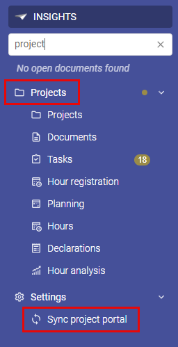 Search for 'project' in the Menu search field, with two results
Filter (pop-up)
In the Filter pop-up, users can set the operators and values for filtering the available fields. This filter has a default mode for straightforward filtering, and an advanced mode for more complex filtering.
Which mode is shown when the Filter pop-up is reopened depends on the active filters: if no filters or only basic filters are active, the default mode is shown; otherwise, the advanced mode is opened.
You can save your custom filters as prefilters.
Default filter pop-up
To set up a default filter, users select Filter  in the toolbar.
In the default filter pop-up, users can:
- Set the operators and values for the available fields.
- Filter multiple levels deep on data in related subjects. See also Example: filter on data in related subjects.
- Select Reset to return the pop-up to its initial settings.
- Select Filter to close the pop-up and filter the subject.
- Save a filter as a prefilter, see Prefilter.
The option Clear all filters from the overflow menu automatically clears these filters, as they may be applied to hidden columns.
Advanced filter pop-up
To set up a default filter, users:
- Select Filter in the toolbar.
- Switch to the advanced filter
 in the Filter pop-up.
The conditions already selected in the default filter are carried over when switching to the advanced filter.
in the Filter pop-up.
The conditions already selected in the default filter are carried over when switching to the advanced filter.
The advanced filter pop-up can do everything the default filter pop-up can, and offers more advanced options to create complex filter queries. Users can:
- Add multiple rules and organize them with
AND,OR, orNORlogic. - Combine rules in groups and connect each group using
AND,OR, orNORoperators. - Mix and match operators in nested groups.
- Add multiple filters to the same column.
This flexibility enables users to address complex scenarios,
such as a situation in which one field must meet one condition but another field must meet one of several alternatives.
In that case, multiple conditions must be true at the same time (AND), while for alternative conditions, any one condition being true is sufficient (OR).
See also Example: Filter pop-up on data in related subjects.
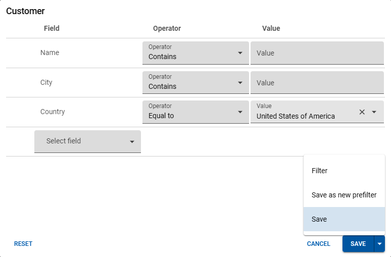
Save a filter as a prefilter
Users can save a default or advanced filter as a prefilter using the following steps:
- Select Filter in the toolbar.
- Set up a default or advanced filter.
- Open the dropdown list of the Filter button and select Save.
- Enter a Prefilter name.
The filter is automatically applied and added to the user's action bar as a prefilter. Users can also edit or remove custom prefilters, see Custom prefilters.
 .
Saving an advanced filter as a prefilter
.
Saving an advanced filter as a prefilter
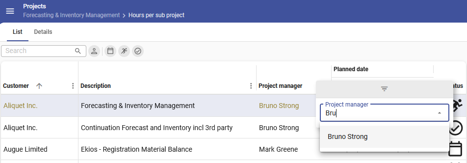
Example: filter on data in related subjects
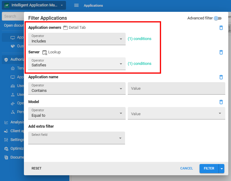
This example shows a filter on applications in IAM. The goal is to filter on expired application ownerships for applications that have a server of type 'DB2'.
If a user selects a reference to filter on it will look like this:
 A filter pop-up with related subject filtering
When clicking the link Conditions, the filter pop-up of the related subject opens. Here, the detail or lookup references of the related subject are available.
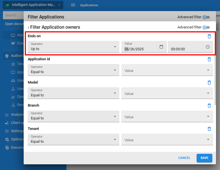 Example of filtering at a deeper level on related subjects
In advanced mode, the online/offline Status is also considered:
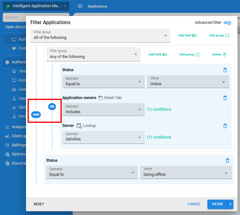 Example of the advanced filter pop-up with multiple conditions
Configuration of the filter pop-up
To configure the Filter pop-up for your application, see:
- Data permissions - Allow users to filter data in a grid.
- Add columns to a filter pop-up - Add or remove columns from the filter pop-up to optimize the user experience.
- Add lookup and detail references to a Filter pop-up - Add or remove lookup and detail references from the filter pop-up to allow filtering on data in related subjects.
Filter form
A Filter form is a screen component that you can add to a screen in your end application. For its configuration, see Screen types.
To users, a filter form is always visible in their screen, they can use it to filter data in the grid. The data is filtered immediately when they select Enter and the in-line filter form dropdown shows all relevant options. When data in a column is filtered, the column header displays the icon filter. The option Clear all filters from the overflow menu automatically clears these filters, as they may be applied to hidden columns.
- Users cannot change conditions (e.g., "larger than" or "not equal to").
- The following data is not yet suitable for filtering: columns with a date, time, label, group header label, group header icon, HTML, RTF, SQL editor, image link, image upload, image BLOB (binary large object), file, file upload, signature, video link.
To configure the Filter pop-up for your application, see:
 A filter form in the Universal GUI
Prefilter
To find a data set that meets specific criteria, users can toggle between predefined filters, called prefilters. Prefilters are similar to regular Filters, but do not allow user input. They only show rows that meet the criteria.
For example, for a screen with project details, you can define prefilters for the project status. You have defined prefilter In progress as active by default. If a user opens the screen, only the projects with status In progress are shown. They can disable this prefilter and select the prefilter Planned to see all the planned projects. Disabling all prefilters would show all the projects.
- To activate prefilters, users can select a prefilter button in the prefilter bar. The lines underneath the buttons indicate which prefilter are active.
- To deactivate a prefilter, users can deselect the prefilter button.
- If not enough space is available to display the prefilters, users can select
 to see all (additional) filters.
To configure prefilters for your end application, see Prefilters.
The Search field and some prefilters. The underlined prefilter is active
User preferences for prefilters
The Universal GUI can remember and apply a user's default prefilter state preference. For example, if a user deactivates a prefilter that was initially activated, and returns to the same screen, the prefilter will remain deactivated by default.
To configure the prefilter status, see User preferences availability.
Custom prefilters
Users can manage their custom filters from the overflow menu with the option Own prefilters. In this menu, users can:
- Select Create new prefilters to add a new prefilter.
- Select Edit
 to change the selected prefilter.
 - Select Delete
 to remove selected prefilter.
 - Save edited prefilters as new prefilters with a different name: The Save button contains the option "Save as new prefilter". After saving, the prefilter is automatically updated and becomes available in the toolbar for the specific subject.
Users can select their own Custom prefilters from the action bar. For Thinkwise platform version 2026.1 and higher, users can select their Custom prefilters from the Own prefilters group button in the action bar.
Users can also save a filter as a prefilter.
 Save as prefilter
Quick filter
To filter for a specific value, users can select a cell in a grid and select Quick filter  from the action bar,
or use the keyboard shortcut
from the action bar,
or use the keyboard shortcut CTRL + ALT + R.
The column of the selected cell is filtered against the value of the selected cell with the condition is equal to.
Quick filters filter by value instead of by their key.
- Due to some technical limitations, the quick filter is not available for all data types.
- If the overflow menu or the Quick filter option is not visible, filtering is not allowed.
- When the quick filter is applied to a column for which a filter has been defined already, the first filter is cleared from the column.
- To disable a quick filter, the user selects the same cell and selects Quick filter a second time.
No further configuration is required to use the quick filtering.
 The overflow menu with Quick filter and Clear all filters
Filter in a column header
If a column contains a lookup column or domain with elements, users can filter the values from the grid header and select multiple values in the dropdown filter. For example, for column 'Invoices' with a COMBO control, users can filter in the header on Paid, Unpaid, and Overdue.
See:
The column header filter in a grid includes the following features:
- When opening the filter in the header of a column, a dropdown shows a list of filtering options. It takes into account all relevant subject filters except the one on the column the user is currently filtering. This means they have access to all relevant options within the current context.
- Each option in the list is preceded by a checkbox. Users can select the checkboxes for the items they wish to include in the filter.
- By default, the list of items in a lookup dropdown is limited to 25 to optimize performance and usability. If the list exceeds this limit, a search/suggestion field replaces the list of checked items with a dropdown list with search functionality. To change the maximum number of items for the filter, set a value for the extended property LookupGridHeaderFilterOptionsLimit.
- When a user re-opens the filter dropdown, any active filters are automatically checked, making it easy to see the current filter settings.
- The selected options are added to the
INfilter. This gives users more control over their data and makes it easier to customize the view. Dropdowns in the filter pop-up from the toolbar allow multi-item selection and theINoperator to present the filter at both ends.
::: tip Use Keyboard shortcuts to filter columns more easily. :::
 Search for specific records using the column header filter
Clear all filters
To clear all filters, users can open the overflow menu and select Clear all filters.
If this option is disabled (greyed out), no filter is active.