Universal controls
Introduction to controls
In the Universal user interface, different controls are used to display and edit different types of data.
The Universal user interface currently only supports editing data through the Form component, but in the future it will be possible to edit data using the grid and other components too.
When editing a row, mandatory fields are marked with an asterisk after the title and require a value before the row can be saved. Fields without an asterisk are optional and can be left blank.
 Mandatory Name field
 Optional Website field
Generic controls
Text
Text fields are used to input free text, and can allow single or multiple lines of text.
For longer texts, users can also use the Multiline domain control.
Single line text field
 Multiline text field
Multiline
The Multiline control is intended for texts that exceed one line. Use Text controls instead for single-line texts.
Users can edit Multiline controls in grid edit mode. They can edit these controls directly within the grid or open them in a pop-up for editing. The pop-up button is also available for a Multiline control in the form.
During grid editing, this button also appears on the active record in the grid. It respects the setting Show action button found in the Software Factory menu: Data > Domains > tab Form > tab Domain.
Users can also adjust the row height in a grid by selecting Auto row height or Default row height from the overflow menu. By default, these options are available from the overflow menu, but their order, position and display type can be changed using a custom action bar. See also, Rows in a grid.
Code editor
The domain control Code editor is used for editing JSON and XML data. It highlights the syntax for keys, values, strings, and more. Users can click the pencil icon next to the editor to open the JSON or XML code in an external editor.
Users can edit code locally in their preferred IDE by using the Thinkwise Workspace Listener. For more information, see Edit code locally.
 Code editor control
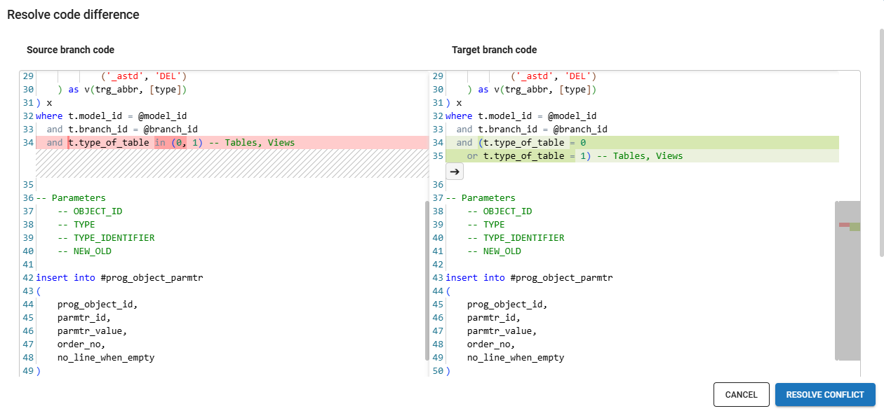
Code diff editor
The Code diff editor control can be used to compare code, for example, JSON or XML data. It is also possible to resolve code differences if the related columns or parameters are editable.
 Code diff editor control
Text in HTML format
In an HTML control:
- Users can enter formatted text. Colors can be applied to text and the background using the color picker.
- In the form editor, users can edit the text in the currently applied format.
- In an editable grid, users can only edit the contents of an HTML control via the pop-up.
- Users can use the browser's built-in spellchecker. The behavior of the spellchecker is dependent on the browser.
- Users can select Auto row height or Default row height from the overflow menu to adjust the row height in a grid. By default, these options are available from the overflow menu, but their order, position and display type can be changed using a custom action bar. See also, Rows in a grid.
If the pop-up  icon is present, users can select it to open a larger display.
In edit mode, this display contains a formatting toolbar, with common text formatting options, such as font selection.
In addition, users can add tables or links by using the buttons in the toolbar.
Images can be pasted directly into the editor.
icon is present, users can select it to open a larger display.
In edit mode, this display contains a formatting toolbar, with common text formatting options, such as font selection.
In addition, users can add tables or links by using the buttons in the toolbar.
Images can be pasted directly into the editor.
In both the pop-up and form editor, users can use regular keyboard shortcuts, such as:
- ctrl + B for bold text
- ctrl + I for italic text
- ctrl + U for underlined text
- ctrl + C to copy
- ctrl + V to paste
 HTML format example
SQL editor
The domain control SQL editor highlights the syntax for SQL statements, keywords, comments, and strings. Users can click the pencil icon next to the editor to open the SQL code in an external editor.
 SQL editor control
Number
Number fields only allow the input of numeric values and will automatically apply the correct number of decimals. Use the minus key to toggle between positive and negative numbers.
 Number control
Progress bar
The progress control shows the percentage progress of, for example, a task.
 Progress control
Color picker
The Color control is available in the grid, form, and card list. When the user is in non-edit mode or in the card list, the user sees the color that was selected and its HEX code.
When in edit mode in a grid or form, the user can:
- Select a Color using the Color picker
 .
. - Clear a Color using Clear color
 .
.
 Color control in edit mode
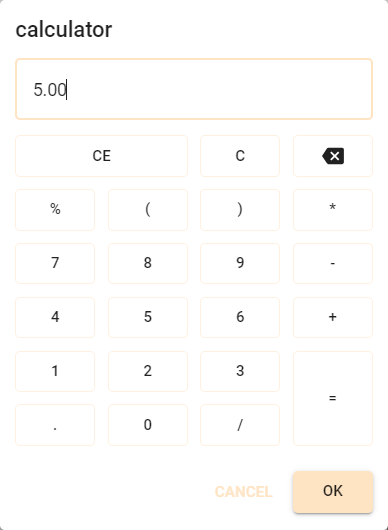
Calculator
The Calculator domain control enables users to carry out calculations using on-screen buttons or their keyboard. The decimal separator, either a comma or a period, is automatically determined according to the user's regional setting.
 Calculator control
Personal information controls
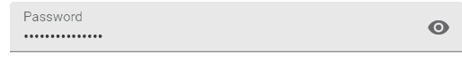
Password
In a password control field, the password is by default hidden from view.
Password controls are available in grid, form, and card list components.
Users can use the Visibility  icon to display the password in plain text or to hide the password from view.
The Visibility icon is shown by default, also when the field is non-editable or read-only.
icon to display the password in plain text or to hide the password from view.
The Visibility icon is shown by default, also when the field is non-editable or read-only.
 Password control field with visibility icon
The passwords are not sent or stored encrypted, so this only protects against being displayed in plain text.
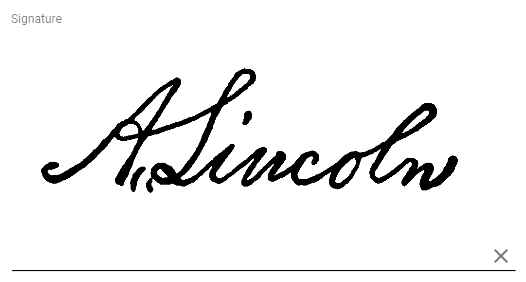
Signature
The signature control provides the possibility to enter a signature using a mouse, stylus or finger.
 Signature control
Selection controls
Checkbox
In a checkbox control, users can toggle between two values in field, such as Yes or No, Enabled or Disabled. This is called a Boolean data type.
 Example of a checkbox control
When a user hovers in a grid over a column containing Boolean values, three dots (...) appear, indicating that it can be filtered.
When selected, a pop-up opens that allows them to select which information they would like to see in the grid, for example, all records with an empty checkbox.
Undetermined (or null) means that the value is not set or is unknown.
For more information about the checkbox control, see available domain controls.
 A grid with a checkbox control (values: selected, cleared, undetermined), and a filter for these values
Radio button
A radio button control is used to select from two or more options. If the field is not mandatory, a choice can be undone by clicking on it again.
 Radio button control
You can configure a radio button icon instead of radio button text. See domain elements for combo and radio button. The number of rows and the way the options are displayed can be customized as well. See field height in positions.
Combobox (dropdown list)
A combobox is used to select an option from a predefined set.
 Combobox control with images
 Combobox control with lookup button
If a lookup button  is displayed in the combobox, it is possible to open a pop-up window for more information about
the options or, if allowed, to add or edit the available options.
is displayed in the combobox, it is possible to open a pop-up window for more information about
the options or, if allowed, to add or edit the available options.
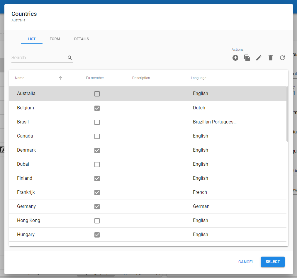 Lookup pop-up to select or modify the available Countries
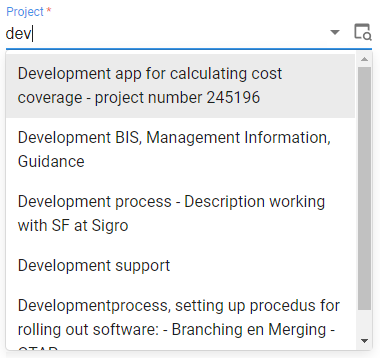
Combobox with a suggestion
The suggestion control is similar to a combobox, but provides the ability to filter the available options. It only shows the first couple of options that match the input filter. The suggestion control is often used when there are a large number of options to choose from. On mobile, a keyboard will open automatically when the lookup is accessed.
 Suggestion control
Time-related controls
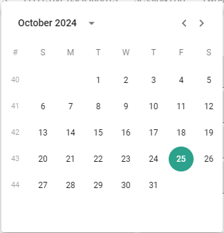
Date
The date control provides a drop-down calendar to easily select a date:
 Date control
Time
A Time field provides a drop down menu to easily select a time value.
 Time control
Visual information controls
Image
Image controls are used to display images. To upload an image from the local file system, select the image icon or drag the image onto the field.
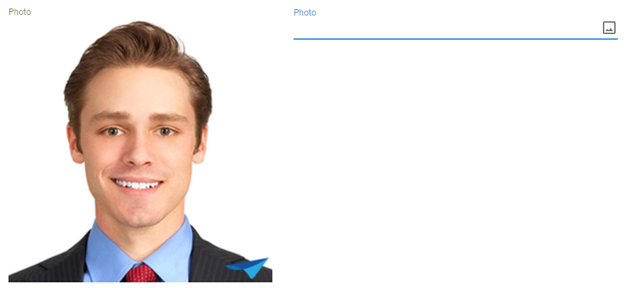 Image control
Video
The video control is used to upload and display videos and can also play uploaded videos.
 Video control
Communication and information controls
Make a phone call
Clicking on the phone icon in a phone number control opens the default telephony application, like Skype on Windows or the integrated iOS and Android app.
 Phone number control
Send an email
Clicking the email address in read-only mode or the email icon while editing mode creates a new email to the provided email address, using the default Email client.
 Email control
Navigate to a website
Two controls are available to allow users to navigate to a website:
- URL control - A user can click a URL in read-only mode or the open icon in edit mode to open the URL in a new browser window or tab.
- or add a URL in the text in an HTML control - A user can open this link in two ways:
- Right-click on the link and select their browser's option to open the link in a new tab.
- Press CRTL while clicking on the link.
A URL control
Upload a file
The file control is used to upload a file, like an Office or PDF document, from the local file system to the server. To upload a file, select the upload icon or drag the file onto the field.
 File control
Location controls
Show an address in Google Maps
The maps icon in the Address control opens Google Maps in a new browser window or tab, showing the provided address.
 Address control
Add a location pin
Location controls add a location pin to the input field. For more information, see LOCATION control.
 In an empty mandatory field, the location is filled automatically
Bar code scanner
For more information, see Barcode scanner control.
If users have a hand-held scanner and scanning is the last step in a task, the task is submitted directly, if:
- The scanner is configured to send Tab after the barcode.
- The scanner is connected to, e.g., a cell phone or a desktop.
- The focus is on the barcode input field in a task.
- The barcode field is the last visible field in a task.