Universal screen components
Introduction to screen components
General information about the screens in the Universal user interface is described in the Basics. Components that you can use to build screens for the Universal UI are described here.
You can use keyboard shortcuts in the Universal UI to navigate the screen more quickly. See Keyboard shortcuts for screen component navigation for more information.
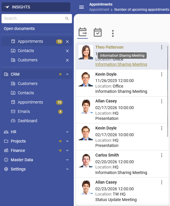
Card list (Universal UI)
The Card list is a screen component that can be used to display a limited set of columns for multiple rows of the current subject. We recommend limiting the number of columns in a card list to ensure optimal readability and usability. The rows shown are limited by any search conditions or active prefilters. If the card list is placed in a detail tab, only the rows that belong to the selected parent row are shown.
Users can:
- Select a card to see more details in the Form component, such as email address, phone number, or photo.
- Scroll vertically to see more cards if there are more cards than can fit in the available space.
- Click on a lookup hyperlink in an active card, for example to open details about a client.
- When a row is selected, the hyperlink text is styled with the Accent color.
 Cardlist with an opened overflow menu to download the employee's photo
Bar components
The following bar components are available for your application:
Action bar
The Action bar can be found at any location in the screen: top, bottom, left, or right. It gives users quick access to the most important actions for the current subject, such as Add, Copy, and Edit. An action bar may contain tasks, reports, cubes, search, or prefilters, but these may also be shown in separate, dedicated bars.
 Action bar with CRUD buttons, task and report buttons and a grouped button
Users can:
- Select the Add, Copy or Edit buttons. The user interface automatically navigates to a component that is capable of editing data, such as the Form, even if it is located on another tab.
- Hover over an icon in the action bar to see the name of the action and the shortcut key, if any, in a tooltip.
- Open the overflow menu to see all available actions, tasks, reports, and prefilters. The overflow menu is available when there are too many items to fit in the available space.
- Select their own Custom prefilters from the action bar. For Thinkwise platform version 2026.1 and higher, users can select their Custom prefilters from the Own prefilters group button in the action bar. See Custom prefilters for more information.
 Action bar tooltip
To set up the action bar and for more information:
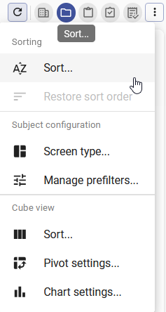 Overflow menu in the action bar
Prefilter bar
The prefilter bar shows a button for each prefilter and enables users to filter the subject's dataset. The user interface will remove this component if no prefilters are present.
For more information about setting up a prefilter bar:
- More information about Prefilters.
- More information about setting up prefilters.
- To add a Prefilter bar component to a screen type, see Add screen components.
- Instead of a dedicated Prefilter bar, you can also add a prefilter bar to the action bar, see Action bars.
Cube view bar
The cube view bar shows the available cube views as buttons. The user interface will remove this component if no cube views are present.
For more information about setting up a cube view bar:
- Create a cube view.
- Instead of a dedicated Cube view bar, you can also add a cube view bar to the action bar, see Action bars.
Report bar
The report bar shows the available reports as buttons on the screen. The user interface will remove this component if no reports are present.
For more information about setting up a report bar:
- To add a Report bar component to a screen type, see Add screen components.
- Create a table report.
- Use a tile instead of a button to open a report.
- Instead of a dedicated Report bar you can also add a report bar to the action bar, see Action bars.
Task bar
The task bar shows the available tasks as buttons on the screen. The user interface will remove this component if no tasks are present.
For more information about setting up a task bar:
- To add a Task bar component to a screen type, see Add screen components.
- Create a table task.
- Use a tile instead of a button to open a task.
- Instead of a dedicated Task bar you can also add a task bar to the action bar, see Action bars.
Search bar
Users can enter a search string in the Search bar to find specific information in the current subject.
For more information about the configuration of a Search bar:
- To add a Search bar component to a screen type, see Add screen components.
- Include columns in search.
- Column order in the search tooltip.
- Instead of a dedicated Search bar you can also add a search bar to the action bar, see Action bars.
Tiles instead of buttons
Tasks and reports can be displayed as tiles instead of small buttons. Users can select one to execute the task or report.
See:
- To open tasks from a tile, add them to a tile menu. See Add a task to a menu.
- To open reports from a tile, add them to tile menu. See Add a report to a menu.
- Reorder or hide details.
 Example: report tile
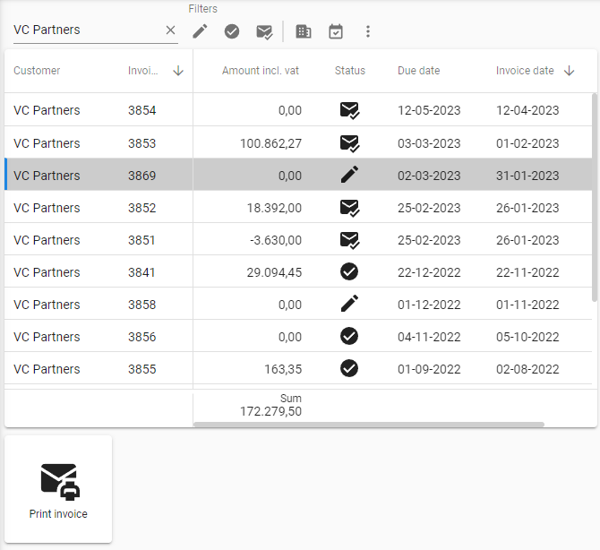
Grid
The Grid component shows multiple columns for the current subject's rows, possibly limited by a search condition or prefilter. See also Search, Filter in a column header, and Filter form.
If the grid is in a detail tab, only the rows that belong to the selected parent row are shown.
Open a lookup pop-up
There are several ways to open a lookup pop-up from a grid:
- In editable grids and forms, users can open the lookup with a magnifying glass
 next to a field.
 Example: a form field with a lookup pop-up
- In read-only grids, users can open the lookup in an active row via a lookup hyperlink.
- When a row is selected, the hyperlink text is styled with the Accent color.
 Opening a lookup pop-up using a lookup hyperlink
- Users can also use the
Ctrl + Alt + Pshortcut to open the lookup for the field that is currently selected. The shortcut only works when the grid component has focus.
If a user enters a search string in the field before opening the lookup pop-up, only the matching data will be loaded in the lookup pop-up.
Manage columns
- If not all columns fit within the available space, users can scroll to the other columns with a horizontal scrollbar.
- Users can show or hide read-only columns in grids with the option Grid in the overflow menu.
- Users can change the current sort order by using the arrow icons next to the column names.
- Users can change the order of columns in a grid by dragging them.
- Users can lock columns to keep them always visible as long as there's enough space. These locked columns are separated from the others by a vertical line. This option is available in the overflow menu > Grid > Lock columns until. For more information on the configuration of locked columns in your application, see Number of columns locked in a grid.
- Users can also lock columns by dragging them into the already locked column area on the left of the grid. Similarly, users can unlock columns by dragging them to the unlocked column area.
- Users can change the column width manually by dragging a border. See Enlarge or reduce components.
- If a column contains a domain with elements, users can filter the values from the column header. See Filter in a column header.
- If a column contains a lookup column with elements, users edit a value from a control in the cell. See Select a value in a column.
- Users can change the grouping of a grid by dragging a column header to a group box. To enable this feature, see Allow grouping in a grid.
For more information about the configuration of default grid settings in the Software Factory see Grid settings for subjects.
Manage rows
-
Grids can contain a pinned top row. If adding records is allowed, users can add or copy a row here. See Allow adding new records to the grid.
-
Users can navigate through records using the arrow keys. When a drop-down control is reached in a default editable grid, the arrow up and down keys will open the control instead of navigating to the next record.
-
Users can drag and drop rows in a grid. See Drag and drop.
-
Users can change multiple records in a table at once using the Update option from the overflow menu. The Update option is unavailable while the subject is in edit mode.
-
Users can delete multiple records at once in a grid. See Add, Copy, Update, or Delete permissions and Confirm update and delete.
noteCurrently, it is not possible to delete records across multiple pages when paging is enabled.
-
Users can select Auto row height or Default row height from the overflow menu for Multiline and HTML controls to adjust the row height. By default, these options are available from the overflow menu, but their order, position and display type can be changed using a custom action bar.
noteWhen users enable Auto row height in a grid with many rows, lazy height calculation is applied to optimize performance. This ensures only relevant row heights are calculated. This has several consequences, further described in Lazy height calculation.
For more information about the configuration of default grid settings in the Software Factory see Grid settings for subjects.
 Grid with one fixed column, sorted by Customer name. At the top, you can add a new row, or copy a row.
Delete rows
Users can delete one or multiple rows at once in a grid. To do this, select one or more rows using Keyboard shortcuts, followed by selecting Delete from the action bar or pressing DELETE.
When selecting 'Delete', a pop-up appears:
-
If all rows on the current page are selected, users can select whether to delete Selected rows or All rows that match the current filter.
note- If users execute a task on All rows, the active search, filters, and prefilters are applied to the rows. This means that the task will be executed for all rows that match the current settings, not all rows available in the grid.
- By default, All rows can be executed on a maximum of 5000 rows. This can be changed using the extended property MaxStageRowLimit. Note that increasing or removing this limit may cause long processing times or crashes.
-
If one or more rows are selected, users can choose whether to delete the selected record(s) or not.
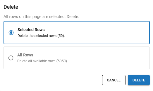 Pop-up to delete all rows in a grid
Execute a task on multiple rows
Users can execute a task or report for specific or all rows in a grid, if multiple row selection is enabled. This is useful in cases where paging is set up or when the number of records exceeds the display limit, and not all rows are visible in the user interface. If the subjects settings for max. no. of records is set to 1 and the page size to 0, this action is not possible.
To do this, users can:
-
Select records using available keyboard shortcuts.
-
Execute the task or report for those records.
-
In the pop-up, either select:
- Selected Rows - Execute the action for selected rows.
- All Rows - Execute the action for all available rows in the grid.
note- If users execute a task on All rows, the active search, filters, and prefilters are applied to the rows. This means that the task will be executed for all rows that match the current settings, not all rows available in the grid.
- By default, All rows can be executed on a maximum of 5000 rows. This can be changed using the extended property MaxStageRowLimit. Note that increasing or removing this limit may cause long processing times or crashes.
 Users can choose to execute a task or report for selected rows or all rows
Execute a task on multiple rows (mobile device)
In a grid, it can be convenient to execute a task on multiple rows.
To select multiple rows on mobile and tablet devices, users can:
- Long-press on a single row. Checkboxes will appear for each row.
- Use the checkboxes to select more rows. The number of selected rows is displayed in the top bar.
- Execute the task. If parameters apply, a single dialog is displayed for all of the rows.
To select all rows, users can:
- Check the Select all -/Deselect all v box in the grid header.
To turn off the multi-selection, users can:
- Select the Cancel X icon in the top bar.
The following restrictions apply:
- Since the top bar displays the selection, a user can select multiple rows in only one grid at a time.
- Multi-select is only possible in Edit mode when auto-save is enabled.
- If a task has a Popup for each row setting, this popup will be displayed for all selected rows. It is not possible to abort this flow. See Create a task.
Preview
The Preview screen component shows a detailed view of the selected item.
A wide range of file types can be previewed, such as images, text files, and PDFs.
In some cases, a Preview  button is available to open the preview in a new tab.
For more information about the configuration of the Preview screen component, see Preview component.
Pivot table
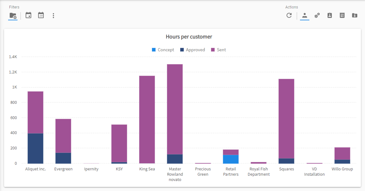
In business intelligence, datasets ('data cubes') are visualized in a pivot table or a chart, or both. It is possible to create predefined views (cube views) of the data.
Various screen components are available for pivot tables:
- Pivot table - displays data in a table format, with aggregated information such as sums, totals, or averages. Dimensions and numeric information are displayed as categories (rows) and series (columns).
- Cube panel - allows users to modify a series and categories and create a customized overview of the pivoted data.
- Chart - See Chart.
Pivot tables allow users to make online analyses and to present the underlying data aggregated and sorted. Subtotals and grand totals are shown to the right of summed values. Users can select Expand all or Collapse all from the overflow menu to expand or collapse all the items in the pivot table. When users double-click a pivot table cell, a pop-up table opens showing the underlying data for that specific cell. This new table is read-only and adheres to any filters set on the pivot table.
For more information about the configuration of pivot tables, see Cubes.
- Community post - Edit Matrix Data Faster Using the Editable Pivot Grid
Example of a pivot table
As an example, the screenshot below visualizes four dimensions:
- At category level, data is grouped by three dimensions, primarily by Mechanic, then Year fixed, and then Contract type.
To view each individual Contract type with its Hours estimate and Hours worked numeric information, users can click the arrow icon. This expands or collapses the Mechanic dimension, and then Year fixed. - The fourth dimension is the location where mechanics work. In the example, this can be Apeldoorn, Hardenberg, and Harderwijk, respectively. On the right are the three associated series.
If a category-level dimension contains a numeric value, these values are automatically aggregated (by using a sum, average, or count). For example, in the screenshot below, the total number of Hours worked for Bakker, Gerrit in 2017 is 108.
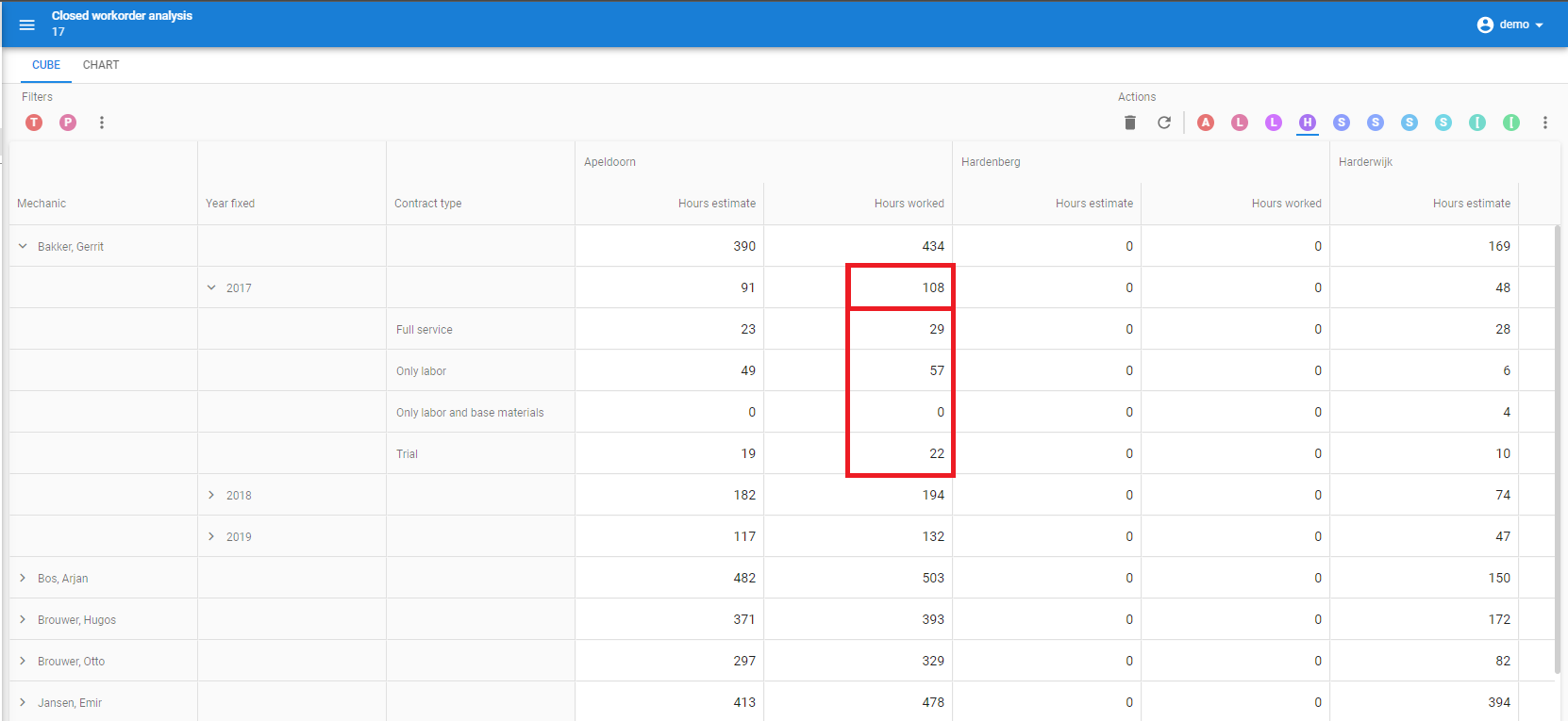 Pivot table
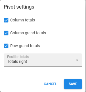
Totals in a pivot table
To add or remove totals in a pivot table, users can select the option Pivot settings from the overflow menu. Here, they can enable and disable totals for rows and columns and choose where to show the grand totals.
For more information about the configuration of grand totals in a pivot table, see Pivot field totals.
 Pivot table settings
Exporting a pivot table
Users can export the data from a pivot table to an Excel or CSV file by selecting the Export pivot action from the overflow menu in the action bar, or from the cube view bar.
When a user exports a pivot table:
- Domain element fields are exported as displayed in the pivot table, including their translations.
- Numeric fields are exported as raw numbers without their regional formatting.
- Date fields are exported as raw values without their regional formatting.
- Only visible data is exported, underlying values in collapsed groups will not be included in the export.
For more information on configuring export settings, see Make a pivot table exportable.
Chart
The Chart screen component shows a visual representation of information. If a chart is displayed in a detail tab, and if the detail tab is related, it will only show the data for the selected parent row. It can be used independently but also in combination with a pivot table.
 Chart
Chart
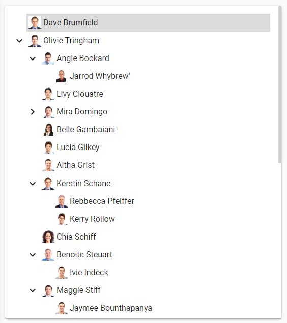
Tree (hierarchical or grouped data)
The Treeview screen component displays hierarchical or grouped data. In a tree view, users can:
- Click on the arrows in front of a row or use the
RIGHTandLEFTarrow keys to open or close a group. - Select Collapse all
 and Expand all
  from the overflow menu to expand or collapse all the items in the tree view.
An active row is always expanded.
from the overflow menu to expand or collapse all the items in the tree view.
An active row is always expanded.
For more information about the configuration of tree views, see Tree settings.
 Treeview
Edit
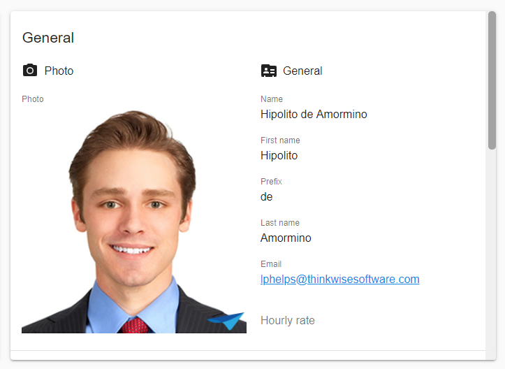
Form
The Form screen component shows the content of a single row, currently selected in a card list or grid component.
In a form, users can:
-
Create a new row on the current subject by selecting the Add or Copy buttons in the Action bar.
-
Modify an existing row by selecting the Edit button. The user interface will automatically navigate to the Form of the current subject, even if it is located on another tab.
-
Scroll vertically to access more fields if there are more fields than can fit in the available space.
-
In read-only forms, open the lookup via a lookup hyperlink:
- The hyperlink text is styled with the Accent color.
- Empty lookups show a placeholder: 'Nothing selected', which is also clickable.
For more information about the configuration of forms, see:
- Form settings.
- In a form, controls are used to display and edit different types of data. See Controls.
 Editing a row in a form
Formlist
In a Formlist screen component, users can start editing right away. A formlist does not contain action buttons: every change is automatically saved. For more information about the configuration of a formlist, see Formlist component.
Example
Suppose a survey contains multiple questions with different types of answers. For example, a full name, a birth date, and a Yes/No checkbox that shows whether the user wants to receive commercial emails or not. When using a formlist, this survey would look like this:
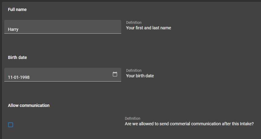 Example of a formlist
Scheduler
In a Scheduler screen component, appointments or tasks are visible in a timeline.
In a scheduler, users can:
-
Drag and drop items horizontally to change the start and end date. These dates can also be changed manually. Dragging and dropping items vertically can be used to reassign the ownership of the item to a different resource. To allow dragging and dropping, see Set up a scheduler.
-
Execute tasks by clicking or touching a time cell in the Scheduler. This is useful to create new items, such as a new appointment. The start time of the clicked time cell is passed as a parameter to the task. To allow tasks to be executed from the Scheduler, see Set up task execution on a time cell.
-
Double-click items to execute a task in the Scheduler. This is useful to, for example, open a form to edit an existing item. To set up double-clicking items to execute a task, see Set up a double-click task.
-
Drag and drop an external row, such as from a grid, directly onto a time cell in the Scheduler to create a new activity. To allow external drag and drop on a time cell, see Set up external drag and drop to create a new activity.
-
Zoom in or out to another timescale for a better overview. The Scheduler component remembers the timescale the user selected: When reopening the Scheduler window, the last timescale chosen is displayed. This preference is saved in the browser (for example, Google Chrome on your device) but is not persisted across browsers or devices.
-
Jump to Today by selecting the Today button to set the date range to the current date.
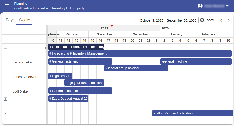 Example of a resource scheduler in Universal UI
Maps
With the Map screen component, users can view locations on a map. You can use it to show routes or locations of, for example, customers, production sites, vehicles, or areas of special interest. Other uses include weather or traffic information.
Example maps
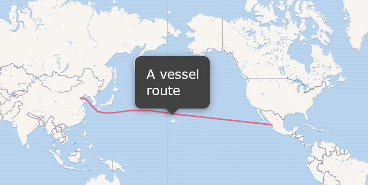 Example of a map showing a cargo vessel route
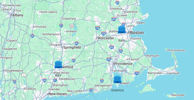 Example of a map showing office locations, clicking a location shows the address
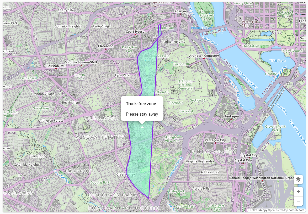 Example of a map with an overlay showing a truck-free zone
On a screen with a Map component, and if configured, users can:
- Add a geometric type to a map, such as a location marker, line, polygon, rectangle, or circle. If configured, they can also add a label or other information to the geometric type.
- Move an existing location marker on a map by dragging it to a new location.
For more information about the configuration of maps, see:
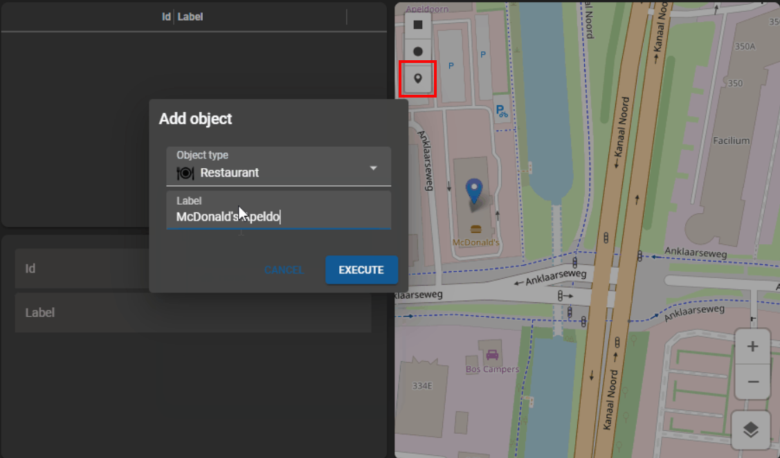 Task for adding a marker to a map, with a pop-up for an object type and a label
Custom component
With the Custom component screen component, you can expand the functionality of Thinkwise applications. You can use it, for example, to add advanced graphic applications to your application.
For more information about the configuration of custom components, see Custom component.
The following example shows an integrated CAD viewer in a Thinkwise application:
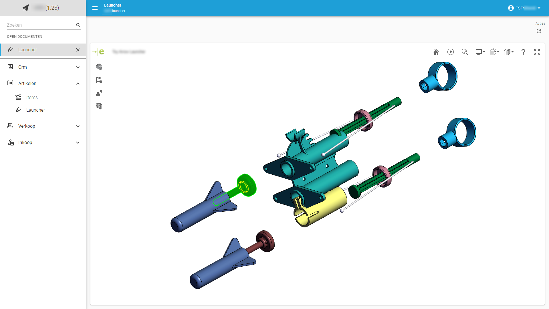 Custom component with a CAD viewer