Basics
Introduction to the Universal UI
The Universal UI provides a modern user experience on mobile devices, desktop and web. It is a fully responsive application that runs on any device and automatically adapts to the device's characteristics, such as the screen size and input method.
The Universal UI is responsive, meaning that it automatically adapts to the display size of the device used. As a result, screens at a smaller resolution can be completely different from a higher resolution. However, the functionality of the application remains the same.
Being a Progressive Web App (PWA), it can be easily installed to the user's device, just like a native desktop or mobile app. It can leverage native device features, such as the camera and location services.
This page covers the basic functionality for users of the Universal UI. For more detailed information on specific features, see the following pages:
- Sort, search, and filter for information on the available sort, search, and filter functionality in the Universal UI.
- User preferences for more information on how users can set their preferences in the Universal UI.
- Universal screen components for more information about the available screen components and what users can do with them.
- Universal controls for more information about the available controls in the Universal UI, such as buttons and input fields.
- Keyboard shortcuts for an overview of the available keyboard shortcuts in the Universal UI.
Release cycle and versioning
A new version of the Universal UI with additional features is released every four weeks. We recommend using the same version for Indicium and the Universal UI, as some features require fixes in both runtime components. Note that, in line with the Lifecycle Policy, the latest version of the Universal UI is backward compatible with older, supported versions of the Thinkwise Platform.
This guide describes the general features and operation of the Universal UI. The examples and images in this manual are based on the 'Thinkwise Insights' demo application.
See also:
You can find more information about the supported features in the Universal blog posts in the Thinkwise Community and in the feature matrix in the Thinkwise Community Portal (menu item Software > Feature Matrix).
Log in and out
After opening the Thinkwise web application in a browser, the login screen is shown. Here, users can:
- Enter their username and password
- If necessary, check the Stay signed in box to stay logged in for two weeks after the user's last activity.
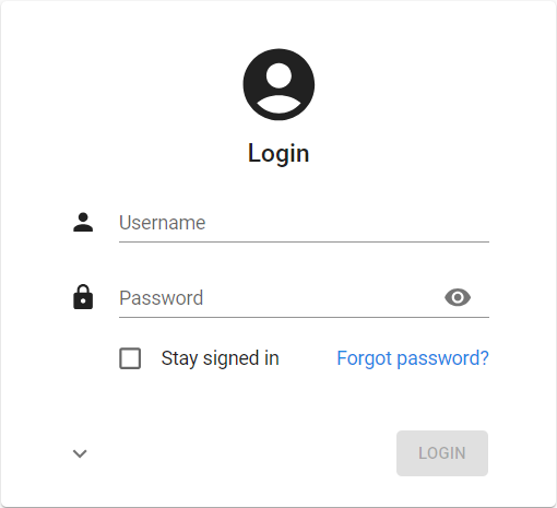 The login screen
Users can log out of the application by selecting the option Logout option in the profile menu. The application will return to the login screen.
 Logout of the application
Change password
If allowed, a user can change their password in the profile menu > Change password. A new screen is opened where they can change their password. After a change, it is required to log in again.
A password can only be changed if all changes have been saved or canceled.
See also Allow change password.
Switch to another application
On the top left of the menu, the logo and name of the currently selected application are displayed.
- If a user has access to more than one application, they can switch to another application by selecting the application name. This is called the Application switcher.
- If more menus are available, a user can expand
 the application.
All the menu types can be opened in this way (Listbar, Tree, or Tiles).
the application.
All the menu types can be opened in this way (Listbar, Tree, or Tiles). - If configured, the Application switcher contains a search bar to search for applications.
See the setting
enableApplicationSearchin the Universal UI setup guide.
 Switching to another application
Main screen
When a user starts an application, a screen similar to the one below is shown. This screen consists of three parts:
- The header
- The menu
- The work screen
 Example of a main screen
Header
The header contains:
- the menu button
 on the left, to show or hide the menu
 - Next to the menu button: the title of the currently active document, and underneath it information about the selected record, if any
- The profile menu
 The header with the profile menu
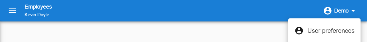
Profile menu
By selecting their name in the header, users open the profile menu. The following options are available:
- User preferences for theme, density, and language
- Open model insight (Developer mode)
- Debug center (Developer mode)
- Switch to IAM metasource (Developer mode)
- Subscribe or unsubscribe to push notifications
- Refresh model (Developer mode)
- Create Personal Access Token
- About
- Log out of the application.
For more information on Developer mode options, see Developer mode (Universal UI).
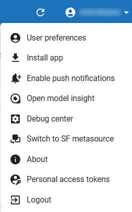 The profile menu
About
To view the version information and release date of the application, users can select the profile menu > User preferences > About.
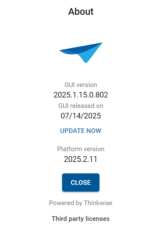 About screen
Work screen
If a user selects a menu item, a work screen is opens, showing the relevant information for that subject. A work screen can have many different layouts and can contain different components.
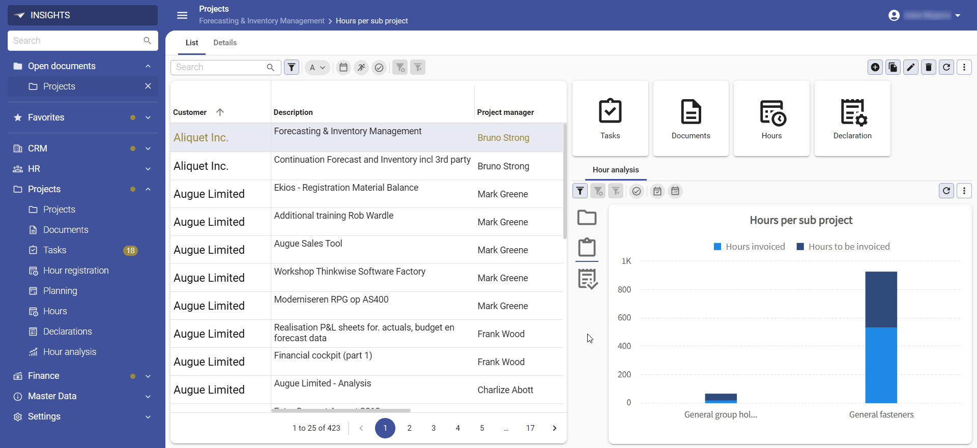 Example of a work screen
Classic menu
To expand or collapse the classic menu, users can select the menu icon in the header.
This increases the available space for any open documents.
They can hover over the menu to temporarily expand the menu.
On smaller devices, like smartphones, the menu is hidden by default and only opens after a user selects a menu icon.
The classic menu shows menu groups and items. Users can:
- Select a menu item to open the corresponding screen.
- Press Ctrl + click on a menu item to open another instance of the corresponding screen.
- Press Alt + click in the menu or on detail tiles to open the (detail) document in a new floating browser window.
Numbers displayed next to a menu item are called badges. When one or more items within a menu group have a badge, a dot badge is displayed in the menu group. A dot badge signals that something in the menu group requires attention, such as incomplete tasks or unread messages.
All open screens are shown in the open documents section on top of the menu. Here, users can switch back and forth between screens.
- A
>means it is a zoomed detail screen. - To close an open screen, users select the
xnext to the name. A dot*instead of anxmeans the screen contains unsaved changes and cannot be closed.
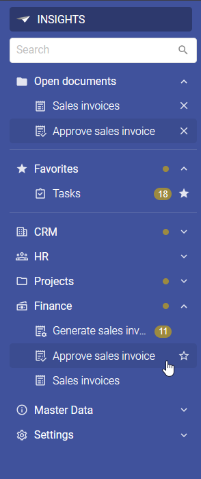 A classic menu with open documents, favorites, a badge and dot badges
Tiles menu
A tiles menu displays all menu items using tiles, divided into one or more groups.
The tiles menu always covers the entire screen and automatically hides after a user selects a menu item. To return to the tiles menu, they can select the tiles menu button in the header.
 Tiles menu button
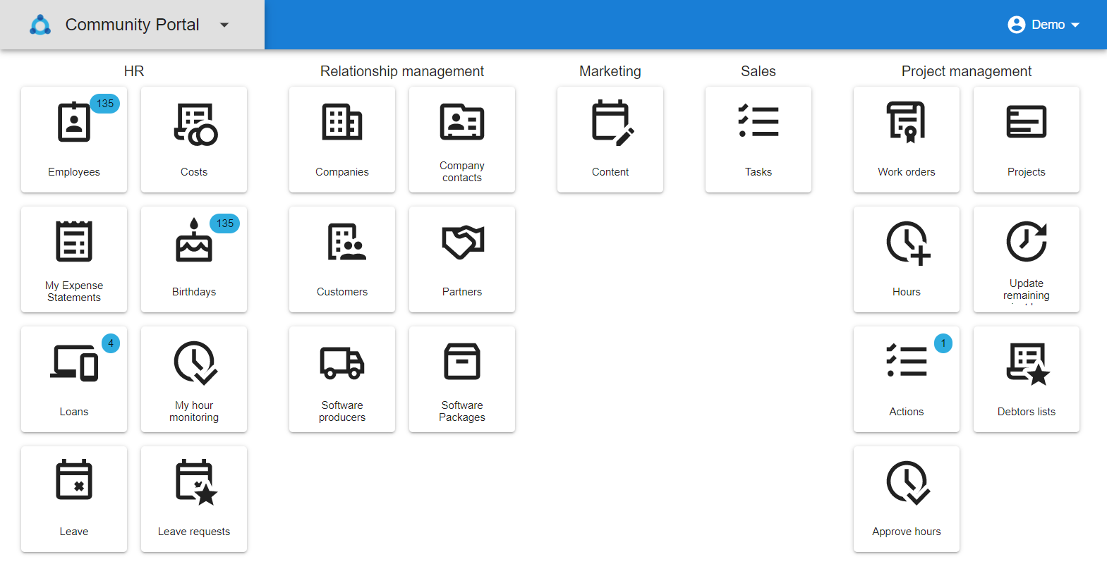 Example of a tiles menu
Navigation
Navigate within a screen (tabs)
Users can select tabs to navigate between different sections within a screen. Tabs can contain one or more components displaying information of the screen's main subject (like a List of projects or a Form showing the selected project), and components for related information, like the Subprojects or Planning for the selected project. These tabs are called detail tabs.
 Component and detail tabs
Users can:
- Double-click a detail tab to open a new document and display the detail information for the selected parent. This does not apply to mobile devices as there is no double-click functionality.
-
Press Alt and double-click on a detail tab to open it in a new floating browser window, with the subject in focus.
- Scroll the tab bar to the left or right using touch or the scroll
<>icons if there are too many tabs for the available space.
 Scrollable tabs
For more information about the configuration of tabs, see Tab container component. You can place tabs and detail tabs horizontally (next to each other) or vertically (on top of each other, to make it look like a menu). See Horizontal or vertical tabs.
Navigate to detail information (detail tiles)
Detail tiles can be used to navigate to detail information of the selected parent row, like the emails or projects of the selected customer.
Users can:
- Click a detail tile to open a new document that displays the detail information, filtered on the selected parent. The current parent is displayed in the title of the new document.
-
Press Alt and double-click on a detail tab to open it in a new floating browser window, with the subject in focus.
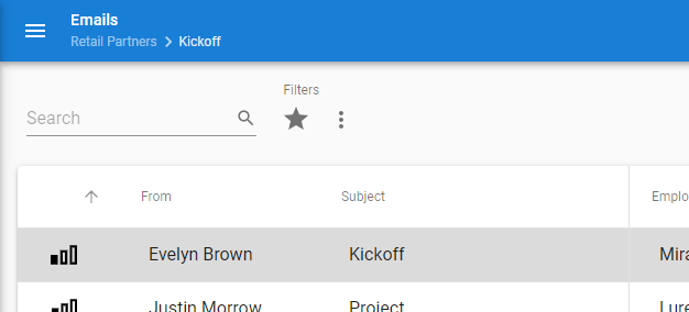 After opening a detail tile: Emails of customer Retail Partners
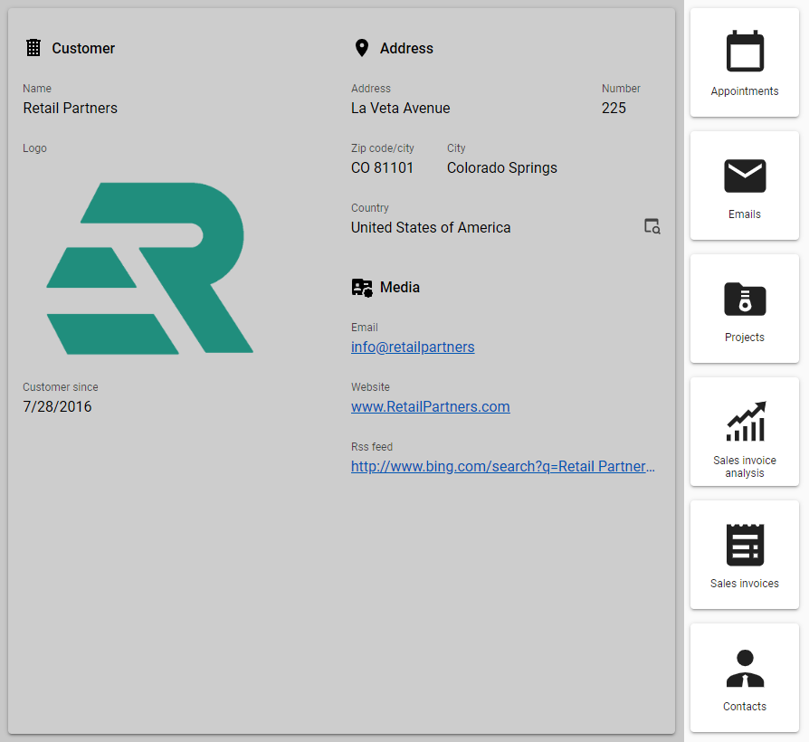 Detail tiles available for customer Retail Partners
Navigate to a row (grid, tree, card list)
Users can quickly navigate to a specific row in a Grid, Tree or Card list screen component. Users can open the Go to pop-up by using the keyboard shortcut CTRL+G.
In the Go to pop-up, users can:
- View the currently active row number as well as the total number of rows.
- Enter a Row number to and select OK to go to that row.
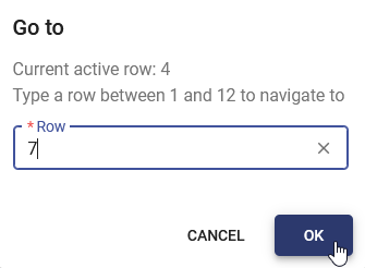 Enter a number to navigate to a specific row
Drag-and-drop items
If a row supports drag-and-drop, a drag handle  is displayed next to it.
A user can select the handle to pick up the row and hold their mouse button down while moving to drag it to its new position.
is displayed next to it.
A user can select the handle to pick up the row and hold their mouse button down while moving to drag it to its new position.
 The mouse cursor changes to a hand when you hover over a drag handle
While dragging a row, blue dotted lines show where the user can drop the item.
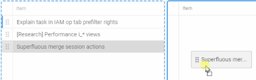 Drag row to a target table
Drag-and-drop is available for grid and tree components. The following functions are available:
- Drag from one table to another.
- Drag between browser tabs. Cross-browser is supported. The task will be executed based on the user who is logged into the target browser.
- Select, drag, and drop multiple rows.
- Drag over tabs. The tab will be activated automatically.
- Drop items on a specific row.
You can set up a task which is used for drag-and-drop, and create a drag-and-drop link. When the user drops an item on that table or row, the drag-and-drop task is started. You can use this to create functionality for re-ordering, adding in a specific position, or dropping children on a parent.
Furthermore, you can use this drag-and-drop link to set up external drag-and-drop on a time cell in the Scheduler. This allows users to drag and drop rows, such as from a grid, directly onto a time cell in the Scheduler. This is useful for creating activities for a resource at a specific time.
If a user drops an item on a row that does not support it, it will be dropped on the table instead.
Select a value in a column in a grid
If a column contains a domain or lookup column with elements, users can select the values from a control in the column.
For further information to set this up, see:
Import and export
Import
Users can import data from a file or the clipboard by selecting Import from the overflow menu of a subject or (Ctrl + Shift + I). Selecting this option starts the Import wizard.
In this wizard, users can configure the following:
- How to upload the data:
- Upload file - users can select and upload a file (
.xls,.xslx, and.csvextensions are allowed). - Use clipboard as data source - users can paste CSV data from their clipboard into the Clipboard field. The Date format and Number format need to be configured to match the data format.
- Upload file - users can select and upload a file (
- How to import the data:
- Insert all data
- Add new records, update existing records
- Only update existing records
- How to prepare the data:
- For an Excel file, users can configure the worksheet and where the data starts.
- For a CSV file, users can select the first row that contains columns headers. The delimiter that separates the column values is detected automatically.
- Indicate if the imported Excel or CSV file contains the raw data (Database values) or the human-readable values (Converted data).
- How to map the data. Users can:
- Select the checkbox of each column that should be imported.
- Map each column to a column in their database: for each selected column, a database column can be selected.
- Set a constant value for columns that are not available in Excel but do require a value.
- Set a column's values to empty (NULL) so that the column is imported but its values are not.
A preview is shown of which data will be imported. Selecting Import starts the import process. After the import has been completed, an overview will be shown of how many records have been imported, updated, or failed. Users can download an Excel file with the rows that failed to import and the reason why.
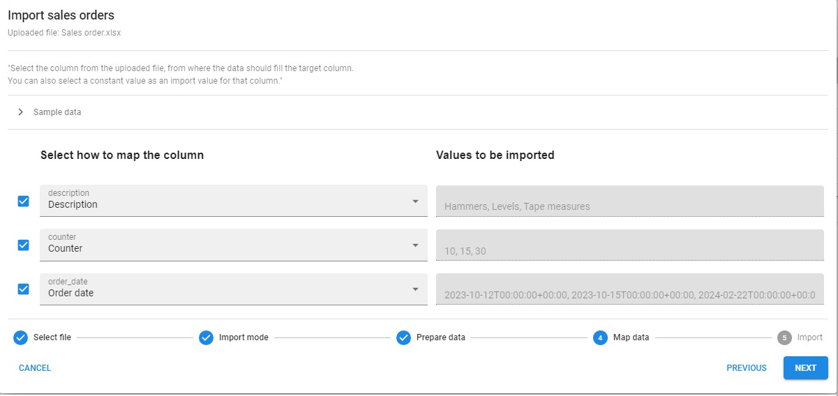 Mapping the source columns to the target columns
Export to Excel
Users can export data in a grid to an Excel (.xslx) file by executing the task Export immediately from the overflow menu of a subject.
Prefilters and user settings are taken into account when the data is exported.
The following applies when a user exports data:
- If paging is enabled, data from all pages is exported.
- Primary key columns are only exported when they are set to Visible in grid. If they are not exported, importing and updating data in Excel may not work as expected since the entire primary key is required to accurately identify records.
- Password-type columns are always excluded from the export.
- If Copy to clipboard is disabled for a column in the Software Factory it will be excluded from the export.
- The order of the columns in the exported file will match the order of the columns as they are displayed in the grid, including any user-defined column ordering. This applies to all columns, including primary key columns.
Users can create a Custom export for more precise control over export settings.
Custom export
Users can configure how to export data in a grid by selecting Export from the overflow menu of a subject or (Ctrl + Shift + E). Selecting this option starts the Export wizard.
In this wizard, users can configure the following:
- Which rows to export:
- Export selected row(s)
- Export all rows
- How to export each column:
- Select columns
- Drag columns up or down the list to rearrange the order.
- Enable Export headers and data translated and localized to export the translated values. Disable this option to export database values instead. Using translated data is beneficial when the exported data needs to be used directly, but it can be unreliable when multiple values share the same name.
- The export file format (
.xls,.xslx, or.csv).
Selecting Export starts the export process. The generated file will be downloaded to the user's computer.
Update rows
Users can update one or multiple rows in a grid, form, or cube by selecting Update from the overflow menu. This is useful to change a value for multiple records, for example, to update the status of multiple orders to 'Shipped'.
Selecting Update from the overflow menu starts the Update wizard. In this wizard, users can configure the following:
- Whether to update Selected rows or All rows that match the current filter.
- Select the fields to update and enter the new values for these fields.
- Review the changes and confirm the update.
To allow users to update multiple rows at once, the appropriate permissions must be granted. See Add, Copy, Update, or Delete permissions.
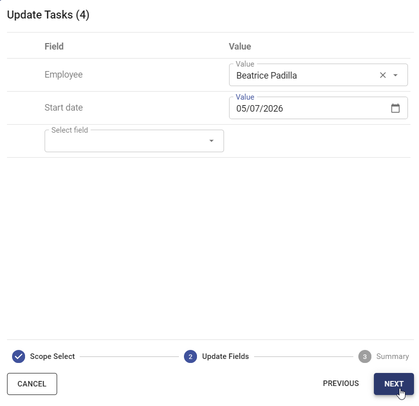 Use the 'Update' wizard to update multiple rows
Use an application offline
When an internet connection is lost or unavailable, users can still use the application in offline mode. Using offline mode is useful in environments with unreliable internet access, such as basements where maintenance often takes place or ships at sea.
Offline mode is automatically enabled when the application detects no internet connection. When the application switches to offline mode, an icon is shown in the header to indicate that the application is offline. When the icon is hovered, the tooltip says 'You are in offline mode. No connection available.'
An indicator next to the menu shows the state of the connection:
 offline.
 online without changes.
 online with pending changes.
 Tooltip indicating a lost connection
Users can use the following functionalities in offline mode:
- Execute menu and table tasks set up for offline execution. Other menu items are greyed out and cannot be used. See Offline-available task for more information.
- View tables and table variants set up for offline availability. See Offline-available table for more information.
When the connection is restored, the application automatically switches back to online mode. All the offline executed tasks and their input will be synchronized, including canceled task actions.
While synchronizing, a progress page is shown with the status of the synchronization. Lastly, the user interface is reloaded.