Universal theme
Introduction to Universal theme​
You can use themes in the Universal GUI to define the overall look and feel of the interface. You can set up a font type, color palette, and other style properties. For each theme, you can configure a Light and a Dark mode. You can apply a different theme to each of your applications.
If you use the Windows GUI for your application, see Classic theme (Windows GUI).
Create a theme​
To create a theme for the Universal GUI:
menu User Interface > Themes
-
Select Add
and enter a theme name.
-
Select Universal as Theme type. Windows GUI To set up a classic theme, see Classic theme (Windows GUI).
-
Enter a Description.
-
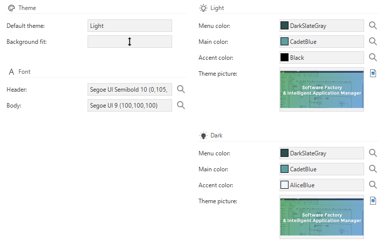
Set the Default theme to Dark or Light. A user can switch between the dark and light mode in the application, so settings are available for both modes. Users can change their preferences in the profile menu. For more information, see Theme and localization.
-
Upload a Theme picture for both the Light and Dark mode. This image is used as a background image in the application.
-
Select the Fit for the background:
- Tiled - The image is repeated horizontally and vertically across the entire screen, like a pattern, without scaling or distortion. Empty spaces are filled with the background color.
- Center - The image is centered. Empty spaces are filled with the main color.
- Fit - The image is resized so it fits within the screen, without being cropped or distorted. Empty spaces are filled with the main color.
- Stretch - The image is resized to fill the entire screen in width and height. The image may be distorted (stretched wider or taller).
- Fill - The image is resized to cover the screen completely. Parts of the image may be cropped.
Universal theme settings
Set up a font​
You can select an existing font or add a new one. The selected font face and size are used for the headers and body of the interface; the font color and style are ignored.
To add a new font:
menu User Interface > Themes > group Font
- Select the lookup control
.
- In the lookup pop-up, go to the tab Form.
- Select the Add
button.
- Select a Font face, Font size, and Color.
- Optional. The font name is automatically generated and available in the field Font. You can change this if desired.
Set up colors​
The following colors are available to style an application, for both Dark and Light mode:
- Menu color - The color of the menu and top bar. If the menu color is not set, the main color is used. You can use menu colors to differentiate between applications or to match the color of your company logo. Check if the main and accent colors have sufficient contrast with the menu color and backgrounds used in both light and dark modes to ensure optimal readability.
- Main color - The primary color refers to the color that appears most frequently in the application.
- Accent color - The accent color refers to the color used to accent key parts of the user interface. For example, the background color of badges.
You can select an existing color or add a new one.
To add a new color:
menu User Interface > Themes > group Light/Dark
- Select the lookup control
.
- In the lookup pop-up, select one of the following:
- Basic color
- Custom color - select the color in the color picker and select Add to Custom Colors.
Change the application icon and title​
By default, an application is provided with a Thinkwise icon and title. You can change this to customize your application.
The Universal folder contains three icons:
favicon.ico- The browser tab icon.logo.png- The shortcut icon on your screen (resolution 192x192)logo-512.png- The shortcut icon on your screen (resolution 512x512)
Your browser decides whether to use logo.png or logo-512.png, based on the resolution.
To change the logo and title:
When you replace the Universal GUI with a newer build, exclude the manifest.json file and your icons, or they will be overwritten.
- Open the
Universalfolder. - Change the icons.
- If you added icons with another name, point to the new icons in the
manifest.json. - Here, you can also change the application title.
See also:
Comfortable and compact mode in the Universal GUI​
It is important to find the right balance between content and whitespace in your application. Proper use of whitespace improves comprehension, legibility, and focus and can help guide the user through the interface.
By default, the Universal GUI uses comfortable mode. This mode offers more spacing between elements, creating a clear and legible interface. Some applications or use cases are less suited for this mode. For example, when an application displays large amounts of data that users need to scan, view, and compare. You can use compact mode in the Universal GUI to display more data on the screen.
See the table below for the differences between these two modes.
| Setting | Compact | Comfortable |
|---|---|---|
| Font size | 14px | 14px |
| Grid row height | 36px | 44px |
| Pivot grid row height | 36px | 36px |
| Spacing | 4px | 8px |
Users can switch between comfortable and compact mode in their profile settings. For more information, see Theme and localization.
You can set the default mode for your users in the config.json file.
Use the following code:
"spacingMode": "compact"
If you do not define spacingMode:
compactis used for desktop.comfortableis used for touch devices.
You can customize the appearance of screen components in the Universal GUI, for example by adjusting grid and form settings. For more information, see Settings for subjects.
Custom CSS in the Universal GUI​
-
The custom CSS file in IAM replaces the
custom.cssfile used by the Universal GUI. If nocustom.cssfile is uploaded in IAM, the Universal GUI uses its originalcustom.cssfile. Support for thecustom.cssfile in the Universal GUI is deprecated and will be removed in a future release. For more information, see Add styling to a login page for a domain. -
To clearly separate styling between Indicium and the Universal GUI, login pages use distinct CSS classes:
- All Indicium login pages use the class
indicium. - All Universal login pages use the class
universal.
We strongly recommend including these identifiers into your code to ensure consistent behavior across platforms.
- All Indicium login pages use the class
Every Universal GUI download contains a custom.sample.css file in the public folder.
Rename this file once to 'custom.css' for each Universal GUI installation, even if you do not use the custom styles.
Renaming ensures custom styles will not be overwritten when updating the Universal GUI.
If you do not rename this file, a 404 error is displayed in your Developer tools.
Considerations for using Custom CSS​
- Because there is no support for custom CSS, we recommend you use the community for questions about custom CSS.
- Before creating a ticket, ensure no custom CSS is active.
- If you are missing
classesor, more likely,data-testids, let us know via the community. - Check your custom CSS after any update (for example, an update of Universal, the Software Factory / Intelligent Application Manager, or your model)
Do's​
- Use the
data-testids provided by the Universal GUI.- They are used for automated testing and thus unlikely to change.
- They are further along than BEM-classes.
- Rename
custom.sample.csstocustom.css, even if you will not be using custom CSS.
Don'ts​
- Avoid using generated CSS classes (e.g.
.css-1ksyjmz). - Refrain from modifying layout.
- Do not use custom CSS for things that can be changed using the Software Factory.
Resources​
- Mozilla Developer Network: Documentation about CSS
- Learn CSS: A course by Google on CSS
- The CSS specification: How CSS actually works under the hood
CSS classes in the Universal GUI​
The Universal GUI provides static CSS classes for a selection of elements, mainly on the login page. The BEM — Block Element Modifier naming convention is used to structure classes. Not all components have fixed classes yet.
We do not recommend using the generated CSS classes (like css-dz6rn8) for components that do not use BEM yet, as they will change over GUI versions.
In some cases, you can use pseudo-classes, like :after or :nth-of-type(x) instead, which are less likely to change.
Use platform-specific CSS​
You can prefix your CSS with the platform for which you have started the Universal GUI. This means that you can support different CSS styles for your menu: Windows, Web, and Universal. See also Platforms.
The class that specifies the platform is part of the html tag.
The platform option names are:
windowswebuniversal
In the following example, the text color of the header becomes red, but only for the Windows platform.
.windows main > header.MuiAppBar-root .title {
color: #f44336;
}
Theme colors and picture​
You can use the following custom properties to set the colors and picture of your theme in your custom CSS:
- Main color:
--primary-color - Accent color:
--secondary-color - Theme picture:
--background-picture
/* Give labels the primary color with a background image, with a backup for light mode */
.light label {
color: var(--primary-color, #323232) !important;
background-image: var(--background-picture) !important;
}
/* Make all SVG's the secondary color, with a backup for light mode */
.light svg {
fill: var(--secondary-color, #323232) !important;
}
/* Give labels the primary color with a background image, with a backup for dark mode */
.dark label {
color: var(--primary-color, #fafafa) !important;
background-image: var(--background-picture) !important;
}
/* Make all SVG's the secondary color, with a backup for dark mode */
.dark svg {
fill: var(--secondary-color, #fafafa) !important;
}
Background color for a subject or variant​
Each screen in the Software Factory has data properties that allow you to access the current subject and variant.
- {tab}:
data-tab-id - {tab variant}:
data-tab-variant-id - {reference id}:
data-tab-ref-id
You can use these properties in your CSS to set a background color for a subject or variant:
/* Change the background for the grid on the subject `project` with the variant `windows`.*/
[data-tab-id="project"][data-tab-variant-id="windows"] .grid {
background: #fafafa !important;
}
Logo​
/* Hide the original logo */
.login__group--icon {
display: none;
}
/* Display an alternative logo */
.login__group--icon-container {
background: url('https://office.thinkwisesoftware.com/thinkwise2.png');
background-position: center;
background-size: contain;
background-repeat: no-repeat;
height: 4em;
width: 4em;
margin-bottom: 8px;
}
Company logo in scrollbar​
.scrollbar-container
{
background: url(company logo url);
background-position: center bottom;
background-repeat: no-repeat;
background-size: 200px;
}
Title​
/* Hide the original title */
.login__group--title {
display: none;
}
/* Display an alternative title */
.login__group--header::after {
content: 'Alternative title';
font-weight: 500;
font-size: 1.3125rem;
font-family: Roboto, Helvetica, Arial, sans-serif;
padding-bottom: 9px;
}
Message​
/* Display a message */
.card-content__login::after {
content: 'Maintenance is scheduled for Sunday between 8AM and 12AM. The application will not be available then.';
font-weight: 300;
font-size: 0.9rem;
font-family: Roboto, Helvetica, Arial, sans-serif;
color: #ba000d;
display: inline-block;
text-align: center;
}
Example: login page with a custom background image, logo and title, and a maintenance message
Hide menu and header​
This example hides the menu and header, and only shows a dashboard or other start objects.
/* Hide the sidebar menu */
#__next > .sidebar {
display: none;
}
/* Hide the header */
#__next > main > header {
display: none;
}
/* Resize and reposition the main screen*/
#__next > main > div {
height: calc(100% - 16px);
width: calc(100% - 16px);
left: 0px;
}
Example: hidden menu and header
Set tab labels to uppercase​
By default component and detail tab labels follow the casing that is specified in the translation.
To set tab labels to uppercase, add the following CSS to the custom.css file:
.tabstrip__button__title {
text-transform: uppercase !important;
}
Transparent login form​
.card__login
{
background-color: rgba(255, 255, 255, 0.9) !important;
}
Hide 'Forgot password?' link​
#resetPassword {
display: none;
}
Form section titles and group titles​
/* Section title */
.section-title .text {
font-size: 2rem !important;
color: red;
}
/* Group icon */
.group-title svg {
width: 28px !important;
height: 28px !important;
fill: blue !important;
}
/* Group title */
.group-title .text {
font-size: 1.5rem !important;
margin-top: -2px; // Align text with icon
}
.group-title {
color: green !important;
}
Example: custom form section titles and group titles
Form field outlines and background colors​
All form fields get a border automatically, and you can specify which color it should have. You can also set a background color for non-editable fields.
Outlined fields, the non-editable field has a different background color
/* Background color for non edit mode inputs */
.tsf-control.disabled {
background-color: pink;
}
/* Background color for Read Only inputs */
.tsf-control.read-only {
background-color: purple;
}
/* Outline color for mandatory fields */
.tsf-control.mandatory .tsf-control-outline {
border-color: fuchsia;
}
To set no color, use:
.tsf-control.tsf-control {
background: transparent;
}
Settings for specific modes​
To specify style sheet rules that are specific for light or dark mode, or for comfortable or compact mode, use the following classes:
/* light mode */
.light {
/* settings that are specific for light mode */
}
/* dark mode */
.dark {
}
/* comfortable mode */
.comfortable {
}
/* compact mode */
.compact {
}
Bind custom CSS to a specific application​
The root element of the web page contains a hook that you can use to bind custom CSS to a specific application.
This hook is called data-active-application, and its value defines the active application.
Example HTML:
<!DOCTYPE html>
<html lang="en" translate="no" class="dark compact" data-active-application="insights" style>
<head>
</head>
<body>
</body>
</html>
In the example above, the active application is called "insights".
In your CSS file, prefix any CSS selector with html[data-active-application="insights"] to use that style only for that active application.
Replace the value "insights" with the name of the application that you want to use the custom style for.
Example CSS:
html[data-active-application="insights"] body {
background-color: red;
}
Different styling for combobox controls​
To visually differentiate between the Combobox (dropdown list) and the Combobox with a suggestion, you can apply different CSS styling for each combobox type:
- The class
combo-selectapplies to the Combobox (dropdown list) control - The class
autocomplete-selectapplies to the Combobox with a suggestion control
Identify field state in a grid​
The grid assigns specific classes to cells to indicate the column's state.
The classes are found on the target element .conditional-layout-container within each cell.
You can use custom CSS to emphasize cells with the .has-error class, for example, by using a red border or background color.
The available classes are:
.mandatoryfor cells with a mandatory field.readonlyfor cells with a disabled field.has-errorfor cells with a field that has an error