Classic theme (Windows GUI)
Introduction to the Classic theme
The classic theme contains a wide range of settings for the Windows and Web user interfaces.
Setting up a suitable theme for your application can benefit productivity. We recommend keeping the theme simple and aligning it with the house style of your company. A theme that is too bold can distract the users and lead to confusion when navigating the application. When the colors of a theme are underexposed, this can be confusing because it is not clear where one tab ends and the other begins.
Colors and fonts used
We recommend that you use a limited set of colors and fonts when creating a theme. Two tabs are available to see which colors and fonts are used in the theme:
menu User interface > Themes > tab Themes > tab Colors used
menu User interface > Themes > tab Themes > tab Fonts used
 Fonts used in a theme
Change a color or font in a theme
To change a color or font in a theme:
menu User interface > Themes > tab Themes > tab Colors used
menu User interface > Themes > tab Themes > tab Fonts used
- Select the color you want to change.
- Select the task Update color or Update font.
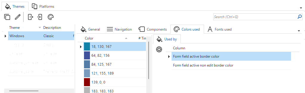 Colors used in a theme
Document tab settings
Active and inactive tab colors
When tabs are opened from the menu, they can be active (selected) or inactive (not selected). To set the tab colors in this instance and the colors when you move over the tab:
menu User interface > Themes > tab Themes > tab General > tab Tabs > tab Document tab
The following settings are available:
-
In area Active, select a Color and a Font for an active tab.
 Example: an active tab with text in bold
 -
In area Inactive, select a Color and a Font for an inactive tab.
 Example: the inactive tab Code changelog is grey
 -
In area Mouse over, select a Color and a Font for a tab when the user moves the mouse over it.
Tab header height
The tab header height is a relative value. To set the height of the tab header:
menu User interface > Themes > tab Themes > tab General > tab Tabs > tab Document tab > area Tab
-
In field Height method, select one of the following options:
- Default
- Spacious - Extra padding based on font size.
- Manual - Manual padding in pixels around the header text. Enter a value in field Height.
 Tab with manually added extra height
Tab border colors
To set the color of the tab header border and content border:
menu User interface > Themes > tab Themes > tab General > tab Tabs > tab Document tab > area Tab
The following settings are available:
- Header border color.
- Content border color.
Example: transparent tab header borders
 Tab header with transparent borders
Example: borders the same color as the background
Here, the borders are the same color as the background. This reduces the amount of lines on the screen in nested tabs.
 Tab color settings theme
Show icons in the tab headers
For each subject, you can specify an icon in the menu Subjects > Settings > General > field Icon.
To display the icons in the tab headers:
menu User interface > Themes > tab Themes > tab General > tab Tabs > tab Document tab > area Icons
- Select the checkbox Show.
 Show icons checkbox
Background colors and settings
Application
The background of your application is visible when no tabs are open. You can configure a color and an image.
To configure a background for your application.
menu User interface > Themes > tab Themes > tab General > tab Background > Background
-
Select a Color.
-
Select a Background picture.
noteAn image in landscape format usually gives the best results. If your application scales from landscape to portrait, the sides are cropped to fit the screen.
-
Select the Fit for the background picture:
- Tiled - The image is repeated horizontally and vertically across the entire screen, like a pattern, without scaling or distortion. Empty spaces are filled with the background color.
- Center - The image is centered. Empty spaces are filled with the background color.
- Fit - The image is resized so that it fits within the screen, without being cropped or distorted. Empty spaces are filled with the background color.
- Stretch - The image is resized to fill the entire screen in width and height. The image may be distorted (stretched wider or taller).
- Fill - The image is resized to completely cover the screen. Parts of the image may be cropped.
-
Select a splitter Color.
-
Select a Splitter line color.
 Add an image in the theme
Document
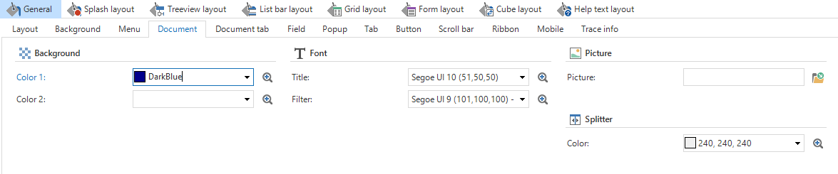
The document background color or image is visible when a tab is opened. To configure a background color or image for your document:
menu User interface > Themes > tab Themes > tab General > tab Background > tab Document
The following settings are available:
- Color.
- A font for the Breadcrumbs.
- Picture.
- A Color for the splitter. The splitter is the line between, for example, the grid, form, and image.
- A border for the Search.
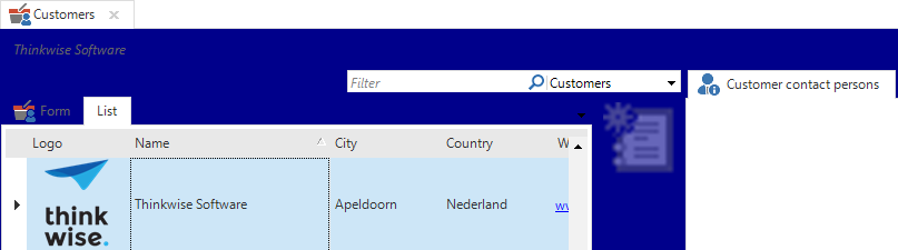 Document theme settings and the result
Pop-up
To select the background color of a pop-up lookup:
menu User interface > Themes > tab Themes > tab General > tab Background > tab Popup
The following setting is available:
- Color.
Scrollbar
To select the background color and mouseover color of the scrollbar:
menu User interface > Themes > tab Themes > tab General > tab Background > tab Scrollbar
The following settings are available:
- A Color for the scrollbar.
- A Color for the scrollbar when the user moves the mouse over it.
Header and footer
To select the colors for the top and bottom of the application:
menu User interface > Themes > tab Themes > tab General > tab Background > tab Header and footer
The following settings are available:
- Color and Font for the header.
- Color and Font for the footer.
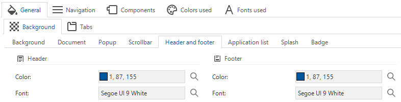 Header and footer theme settings
Application list
To select the colors for the application list at the bottom of the menu:
menu User interface > Themes > tab Themes > tab General > tab Background > tab Application list
The following settings are available:
- Color and Font for the application list.
- Color and Font for the active application.
- Color and Font for when the user moves the mouse over an application name.
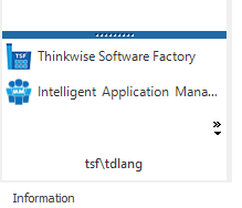 Application list style
Splash screen
The colors and logo for the splash screen can be configured in IAM in the menu Global settings. The splash screen is configured in IAM because it can be applied in more than one application. For more information, see Application and splash screen title.
In the Software Factory, you can specify which components should and should not be displayed on the splash screen:
menu User interface > Themes > tab Themes > tab General > tab Background > tab Splash
The following settings are available:
- Visibility checkboxes:
- Address
- Title
- Lines
- Font
- Font for the Label
- Font for the Field
- Button - not available
 Setting splash theme
Badge
To select the background color and font color of badges:
menu User interface > Themes > tab Themes > tab General > tab Background > tab Badge
The following settings are available:
- Color
- Font
Navigation settings
Ribbon
To configure the ribbon in your application:
menu User interface > Themes > tab Themes > tab Navigation > tab Ribbon
The following settings are available:
- Background Color.
- Font
- Mouseover Color.
- Item mouseover Color.
- Tab background:
- Regular.
- Mouseover.
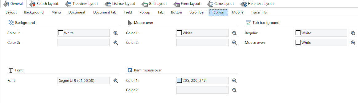 Theme settings for the ribbon
The color you selected for the ribbon will appear behind an icon of a task, pre-filter, etc. in the ribbon in the work area.
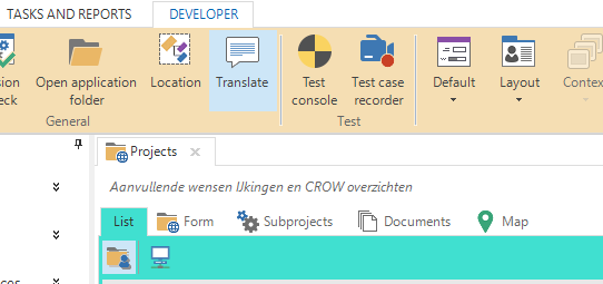 Example of a ribbon with a background color
Listbar
If the menu is displayed as a list bar you can, for example, set a background, give the groups and items a color, and display an image at the bottom of the menu.
To configure the list bar in your application:
menu User interface > Themes > tab Themes > tab Navigation > tab List bar
The following settings are available:
- List bar
- Header
- Item
- Picture
Tree
If the menu is displayed as a tree view you can, for example, set a background, give the groups and items a color, and display an image at the bottom of the menu. If users can switch between different types of menus, then both menus have to be set up.
To configure the tree view in your application:
menu User interface > Themes > tab Themes > tab Navigation > tab Tree
The following settings are available:
- Tree - Background color, mouseover color, and line color.
- Item - Font, mouseover border color, and show icons or not.
Tiles
If the menu is displayed as tiles you can specify tile groups and individual tiles. It is possible to, for example, set a background color or image.
menu User interface > Themes > tab Themes > tab Navigation > tab Tiles
The following settings are available:
- Tile menu - Background color and picture.
- Tile group - Font, background color, mouseover color, and border color.
- Tile - Background color and font, border color, color and font for the selected tile, and border color.
Title bar
The title bar is the bar above the ribbon of the application. It holds the name of the application.
To configure the title bar in your application:
menu User interface > Themes > tab Themes > tab Navigation > tab Title bar
The following settings are available:
- Background Color.
- Font.
 Bar above the ribbon of the application
Component settings
Grid
For a grid, you can set the background color, border color, and font color. In addition, settings are available for Group, Header, Row, Aggregate, and Focus cell.
To configure the grid theme in your application:
menu User interface > Themes > tab Themes > tab Components > tab Grid
The following settings are available:
- Background color
- Border color for Border, Header border, Aggregation border, and Fixed column border.
- Fonts for the Grid, Look-up, and Look-up (mouseover).
- Show vertical grid lines.
Tabs are available for the configuration of a theme for:
- Group - Show Border, Color, Text alignment.
- Header - Background Color, header Font, mouseover Color, Font, and borders.
- Row - Color and Font for the active row, active row border, selected row, selected row border, mouseover, mouseover border, and alternating background.
- Aggregate - Color and Font. See Grid aggregation style.
- Focus cell - Background Color and Font, and border Color and Type.
When you select Transparent for a border, the rows in the grid will be colored alternately in the color of the background and in a shade darker.
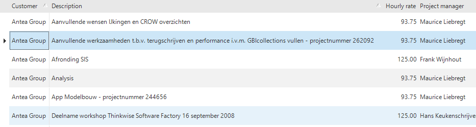 Grid view with alternating colors
Grid aggregation style
If your grid contains an aggregation, such as a sum or average, you can style it in a different way than the rest of the grid.
To configure the grid aggregation style:
menu User interface > Themes > tab Themes > tab Components > tab Grid > tab Aggregate
The following settings are available:
- Color.
- Font.
 A grid with a different style for the aggregation
Form
For a form, you can set the background color, border colors, and the group label font and color. In addition, settings are available for Table, Button, and Field.
To configure the form theme in your application:
menu User interface > Themes > tab Themes > tab Components > tab Form
The following settings are available:
- Background color.
- Header border color.
- Content border color.
- Group label - Font and Color.
Tabs are available for the configuration of a theme for:
- Table - Color for active and non-active mode, mouseover Color, and tab Height method.
- Button - Color for active and non-active mode, mouseover Color, Font, Border type, and Form controls. Select the option Show on mouse-over to only show the buttons when the user moves the mouse over the form.
- Field - Color and Font for non-editable, editable, mandatory, and read-only fields, border colors for editable and non-editable fields, and label font. If the application is not in a modify or add mode, all fields will adopt the color of the read-only fields.
 Form view with active fields
 Form with inactive fields
Cube settings
For a cube, you can set the background color and border color. In addition, settings are available for Chart, Field, and Area.
To configure the cube theme in your application:
menu User interface > Themes > tab Themes > tab Components > tab Cube
The following settings are available:
- Background color.
- Border color.
Tabs are available for the configuration of a theme for:
- Chart - Background color, Border color ,and Palette.
- Field - Color, Border, and Font for fields, selected fields, and mouseover fields. Color and Font for data, totals, and grand totals.
- Area - Color and Font for filters, data, rows, columns, selected cells, active cells, and fields.