Introduction to themes
Introduction to themes
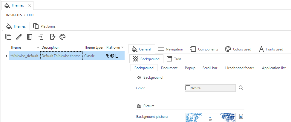
menu User interface > Themes > tab Themes
The theme (style) of the user interface is defined in the model. A theme determines the colors, fonts, and images that are used and is defined for all components of the user interface.
Different theme types are available for the Windows and Web and the Universal user interfaces.
 Themes
Set up a default theme
The default theme is the theme that is applied to all applications in a model that do not have a specific theme defined. Leaving the default theme empty could lead to applications being shown with the wrong theme. For more information on how to configure themes for the different GUIs, see Universal theme and Classic theme (Windows GUI).
To configure a default theme for a model:
menu Models > Model overview > tab Branches > tab Model settings > group Theme
- Select a Default theme.
Export or import a theme
To apply themes that transcend a model, you can Import  and Export
  themes.
Export a theme
menu User interface > Themes > tab Themes
- Select the task Export theme .
- Select a Theme and enter a File name.
- Click Execute.
- Select a folder and if necessary, you can still change the name.
The default file name contains the model, branch, and date.
The default extension is
.json. - Click Save.
Import a theme
menu User interface > Themes > tab Themes
You can import a theme from exported JSON or from a source model and branch in the same Software Factory.
To import a theme from exported JSON:
- Select the task Import theme .
- Select the checkbox From exported JSON.
- Select the file path of the
*.jsonfile you wish to import. - Add a Theme name.
- Click Execute.
To import a theme from a source model and branch:
- Execute the task Import theme .
- Clear the checkbox From exported JSON.
- Select a Source model, Source branch, and Source theme.
- Add a Theme name.
- Click Execute.
In both cases, the model will be decompressed and imported. Trace columns will be filled with the user name 'Imported' and the current system date and time.