Settings for Subjects
Introduction to Settings for Subjects
menu User interface > Subjects
Default settings are available for each branch. After this, you can apply specific settings to each table or view.
Default settings for tables in a branch
menu User interface > Subjects > tab Default settings
In this tab, you can add and change the default settings for all tables in a branch.
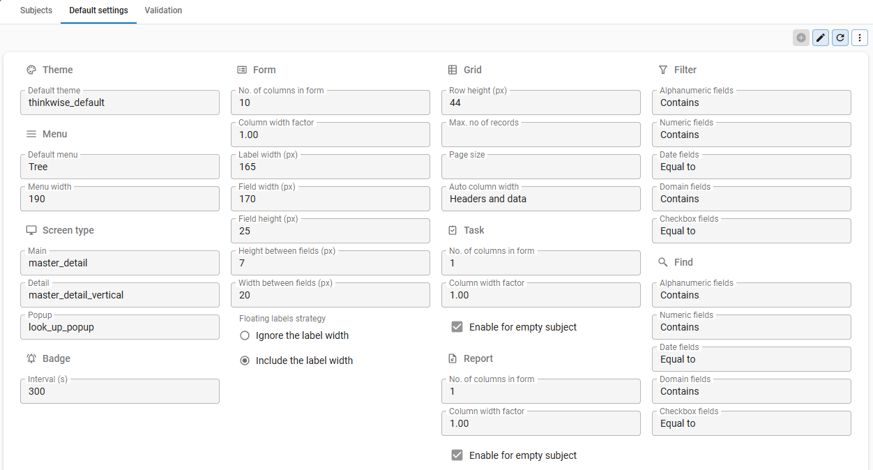 Default settings for the tables
Table settings overview
You can configure settings for a table where the default settings do not apply.
menu User interface > Subjects > tab Default/Variants > tab Settings > tab General
The following settings are available:
| Group | Settings |
|---|---|
| General | Table icon. |
| Settings | Badge, auto refresh, auto-save, open without data, maximum number of records, page size |
| Screen type settings | Screen type selection, default subject height. |
| Lookup settings | Display column, presentation, refresh data on opening combo box. |
| Grid settings | Row height, auto column width, grouping in a grid, number of columns fixed in a grid, allow adding new records to a grid. |
| Tree settings | Textual and visual presentation, tree type, expand the tree automatically. |
| Form settings | Number of columns, horizontal space, vertical space, hide navigation and update buttons. |
| Card list settings | Title and image. |
| Custom component settings | Custom component location. |
| Offline settings | Offline availability, refresh groups. |
| Permissions | Permissions for data manipulation, data, import, export, mass update, copy to clipboard. |
| Performance settings | Unused logic concepts, handlers, refresh behavior. |
| Badges | Visual indicator, refresh interval, control procedure, badge value logic. |
 General settings on the Subjects screen
General (subjects)
Table icon
If you add an icon to a table, it will be displayed with the screen title in the menu and on (detail) tabs.
Since icons are used at different locations in the user interface and with different sizes, we advise you to use scalable SVG icons.
menu User interface > Subjects > tab Default/Variants > tab Settings > tab General > group General
- Select an Icon.
Settings (subjects)
Show badge
menu User interface > Subjects > tab Default/Variants > tab Settings > tab General > group Settings
See Badges.
Auto refresh
It is possible to refresh the subjects and variants automatically every x seconds.
Performance can deteriorate if the screen is refreshed too often. Also, sessions remain open if screens are refreshed constantly, which can pose security risks.
If a validation message about the auto refresh interval appears, consult your Security Officer on how to proceed. If you opt to keep the settings, the validation message may be approved.
To refresh the data automatically:
menu User interface > Subjects > tab Default/Variants > tab Settings > tab General > group Settings
- Select the Auto refresh checkbox.
- Enter an Interval (seconds).
- To prevent unnecessary auto-refresh actions, select the Change detection checkbox on tab Performance.
- To set the refresh behavior after specific actions, see Refresh behavior.
Auto-save
The option Auto-save saves your data automatically when you move to a different row, tab, etc. It also saves changes in the parent subject if the child is refreshed manually.
menu User interface > Subjects > tab Default/Variants > tab Settings > tab General > group Settings
- Select the Auto-save checkbox.
Open without data
It is possible to open a screen without retrieving the data. Instead, if available, the focus will be on the Search field, or the filter pop-up is displayed. Without retrieving all the data first, the screen will start faster.
Use this option for large data sets in which it is common to start by filtering data, for example, for products or relations in an ERP system.
The Open without data option is only applied to the main subject, not to detail subjects.
menu User interface > Subjects > tab Default/Variants > tab Settings > tab General > group Settings
- Select the checkbox Open without data.
Confirm update and delete
Universal UI You can specify if the user should confirm after updating or deleting the selected row.
menu User interface > Subjects > tab Default/Variants > tab Settings > tab General > group Settings
For mandatory confirmation when updating a row:
- Select the checkbox Confirm update.
For mandatory confirmation when deleting a row:
- Select the checkbox Confirm delete.
Maximum number of records
It is possible to set the maximum number of records that the UI should retrieve from the database for the selected subject. An icon in the grid will indicate whether it contains more records than the set limit.
You can set the maximum number of records for one subject or a default for all subjects.
To set a maximum number of records for one subject:
menu User interface > Subjects > tab Default/Variants > tab Settings > tab General > group Settings
-
In the field Max. no of records, set the maximum number of rows that the UI has to retrieve from the database for the selected subject.
- Universal UI If you do not set the maximum number of records, it will apply a default of 100, unless the page size is already defined with a specific value. You cannot change this default value.
- Windows GUI If you enter 0 as the maximum number of records, the value from the extended property (explained below) will be used. If you did not set a value in the extended property, there is no limit to the maximum number of records.
To set a default maximum number of records for all subjects:
- Windows GUI To set a maximum number of records for all subjects, use the extended property MaxNoOfRecords in the configuration file or the Intelligent Application Manager.
Page size
The default settings for retrieving subject data and the use of paging are different for all UIs. Paging means that the data is spread over several pages rather than displayed on one long page.
menu User interface > Subjects > tab Default/Variants > tab Settings > tab General
- Universal UI To relieve memory usage, the UIs use paging by default when retrieving data from the database. By retrieving only a limited number of records per page, the UIs can access all records in a large set. You can change the number of rows per page in the Page size field.
- Windows GUI The Windows GUI is only limited by the Maximum number of records.
- Universal UI In the Universal UI, you can activate paging by entering the number of rows in the field Page size. The values 0 and lower
(-1, -2, etc.) disable paging for this subject, and the value of Max no. of records is applied if set. Paging is also disabled while editing the subject or document.
- The active record always remains on the active page. In this way, it stays on your screen when you switch between pages.
- You can set the default page size in the menu Models > Model overview > tab Branches > tab Model Settings > group Grid. This default is overruled by the page size in the subject.
- The advantage of paging is that it prevents developers from using a top-statement on a subject. If a top-statement is used, for example, a top 100, this could suggest there are only 100 records in the table, while there actually are more.
When paging is used, the Go to row process flow actions can only navigate to a row within the current page.
Paging at the bottom of a multi-record component, e.g., a grid or card list
Screen type settings
For more information about screen types, see Screen types.
menu User interface > Subjects > tab Default/Variants > tab Settings > tab General > group Screen type
- Select a screen type for the main, detail, zoom, and popup screens.
- Enter a Def. subject height (in Pixels or as a Percentage)
Lookup settings (subjects)
Lookup display settings
A lookup allows users to select or view a value from a field in an associated table. For each table, you can configure which data should be displayed and how the data should be displayed in the lookup. You can set up the default settings for a table here.
To configure the default display settings of a lookup:
menu User interface > Subjects > tab Default > tab Settings > tab General > group Look-up
-
Select a Display column to determine what field is shown to the user when they use the lookup.
-
In the field Def. control, select the lookup control:
- Auto complete - when typing, the first record that matches the input of the user is displayed automatically.
- Combo (alphabetical) - a value from a combo box can be selected. The list is sorted alphabetically.
- Combo (sorted) - a value from a combo box can be selected. The list is sorted according to the default sorting of the lookup subject.
- Suggestions (contains) - When typing, values containing the input are presented. On a mobile device, a keyboard is opened.
- Suggestions (starts with) - When typing, values starting with the input are presented. On a mobile device, a keyboard is opened.
When a new table is created, the default lookup control is set to Suggestions (starts with), since this setting offers better performance when returning a large number of rows from a lookup table.
If the lookup table is displayed with a pop-up window, this can be the standard, but a it is also possible to display a variant.
tipFor tables with a small dataset, a Combo lookup control may be suitable, since it displays all available values from a lookup table in a drop-down list. For tables with larger datasets, other options like Suggestions (contains) may be more suitable, since this lookup control allows users to search for a value.
-
Optional. Select the checkbox Def. refresh on dropdown to refresh the lookup data before the combo box expands.
-
Optional. Select the checkbox Def. has popup to display the look-up table in a pop-up window.
It is possible to override the default lookup settings for columns, task parameters and report parameters.
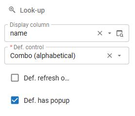 Lookup settings
Lookup display column
You can select a Display column to determine what field is shown to the user when they use the lookup. This setting applies to all target tables that refer to this source table.
For example, a table employee has name as its lookup presentation field, while the primary key is a number.
The lookup presentation field is determined by applying the following rules:
- If no presentation field is entered, the last reference column is displayed.
- If no presentation field is entered and the source column is also a lookup, the presentation field of this lookup is displayed.
In both cases, if the lookup display column is based on a domain element, the translation of the matching domain element is displayed if it exists.
These rules are applied recursively until an explicitly set up presentation field or modified presentation field is reached. In this way, a link table is automatically correctly translated.
If, for example, the field employee_id in sub_project has a lookup to sub_project_employee and the associated presentation field is empty, the translation of employee_id with sub_project_employee is applied. This draws from the employee table, from which the name is chosen.
This system is known within Thinkwise as deep joining.
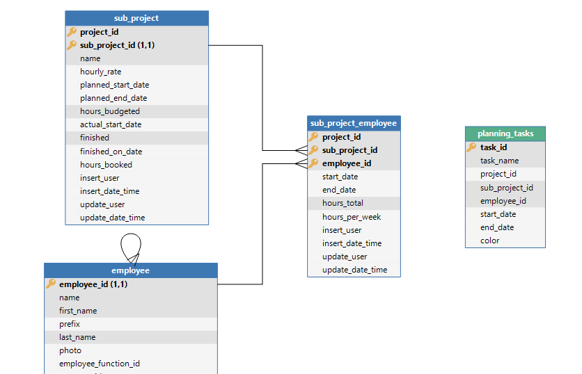 Example of deep joining
Grid settings (subjects)
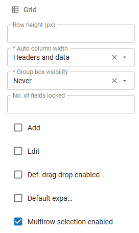
Row height
If, for example, images must be displayed in the grid, it can be necessary to increase the row height.
menu User interface > Subjects > tab Default/Variants > tab Settings > tab Components > group Grid
- Enter the Row height in pixels.
Universal UI The minimum row height is 20 pixels for compact mode. Padding is added for comfortable mode, which results in a row height of 28 pixels. The summary row has a height of 20 pixels for compact mode and 28 pixels for comfortable mode.
Header height and width
The grid header height is determined independently of the row height.
The grid header width is determined as follows:
- Universal UI If the header text is too long, it will wrap over multiple lines.
- Windows GUI If the header text is too long, it will split following the newlines in the translation.
The grid header height is independent of the row height.
- Universal UI The grid header height is 34 pixels for compact mode and 40 pixels for comfortable mode. If the header text wraps onto multiple lines, the height will increase to fit the text.
- Windows GUI The grid header height is dependent on the font size. If the font size is increased, the header height will also increase.
To optimize the header display:
- Use a grouped column header as an alternative to long names.
- Set the Auto column width to Headers and data so the headers are taken into account when calculating the column width. Windows GUI The grid header height is dependent on the font size. If the font size is increased, the header height will also increase.
Auto column width
The user interface can automatically set the column width in a grid based on the content of the cells in the grid. Note that this setting does not apply to fixed-size columns.
To set the auto column width:
menu User interface > Subjects > tab Default/Variants > tab Settings > tab Components > group Grid
-
In the field Auto column width, select the setting you want to use:
- No - No auto column width is applied.
- Headers and data - The column width is based on the header and the data in the cells.
- Data only - The column width is based on the data in the cells only.
To optimize performance, we recommend setting Auto column width to No if you have 20 or more visible columns in a table or a table variant.
You can use the enrichment Set auto column width to 'Headers and data' for every table to configure this option for all the tables in your application. For more information, see Model enrichments for the User interface.
Allow grouping in a grid
If enabled, users can group columns using the grid column menu, the sort dialog or by dragging columns to the group box.
menu User interface > Subjects > tab Default/Variants > tab Settings > group Permissions > group Data
- To enable grouping, select the Group checkbox.
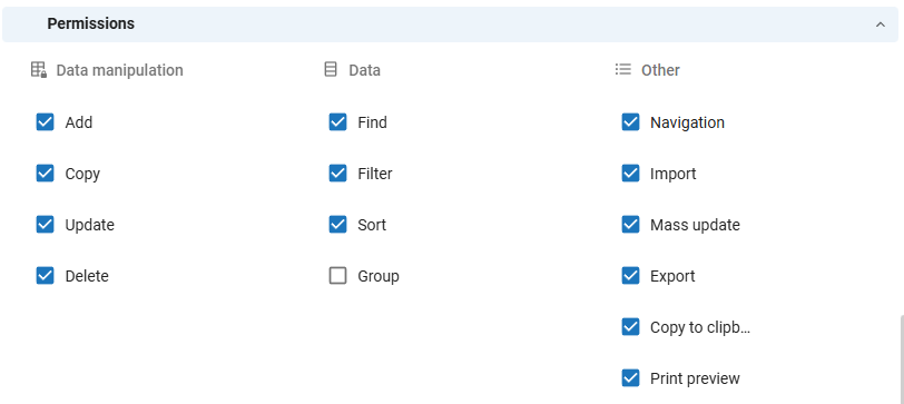 Enable grouping
menu User interface > Subjects > tab Default/Variants > tab Settings > tab Components > group Grid
-
Modify the visibility of the group box in field Group box visibility:
- Never - The group box is never shown, and it is not possible to change the grouping of the grid.
- When grouped - The group box is shown only when a group exists in the model.
- Always - The group box is always visible, and it is possible to drag grid columns into it.
 Group settings
The figure below shows an example of grouped columns in a grid.
 Grouping in grid
Number of columns locked in a grid
If a grid contains too many columns to be displayed on the screen, a horizontal scrollbar is added automatically. However, sometimes you wish to keep a number of columns visible, for example, a definition or a name. This is possible by locking columns. These columns are separated from regular columns by a vertical line.
To lock columns in a grid:
menu User interface > Subjects > tab Default/Variants > tab Settings > tab Components > group Grid
- In the field No. of fields locked, enter the number of columns you wish to lock.
The following rules apply:
- The hidden columns in the grid also count when determining the No. of fields locked.
- Windows GUI It is not possible to combine this setting with the setting Next group, which is used to group fields logically together.
- Universal UI If there is not enough space, the UI will unlock the locked columns one by one, starting with the rightmost column. If the screen layout or size is changed to provide more space, the UI will automatically lock the these columns again.
Allow adding new records to the grid
menu User interface > Subjects > tab Default/Variants > tab Settings > tab Components > group Grid
-
Select the Add checkbox to allow adding new records to the grid.
-
Universal UI
The 'Add in grid row' is only visible when it is allowed to add records, and the user clicks Add. The record is added to a pinned top row because it's primary key is not yet known.
Make a grid editable
It is possible to make records in a grid editable by default.
menu User interface > Subjects > tab Default/Variants > tab Settings > tab Components > group Grid
- Select the checkbox Edit to allow editing of records directly within the grid.
Enable drag-drop in a grid by default
You can enable drag-drop functionality in a grid by default.
To enable drag-drop in a grid:
menu User interface > Subjects > tab Default/Variants > tab Settings > tab Components > group Grid
- Select the checkbox Def. drag-drop enabled.
Expand a grouped grid by default
Windows GUIYou can set grouped columns in a grid to automatically expand when a table is opened. For more information on how to group columns, see: Group columns
To automatically expand a grouped grid:
User interface > Subjects > tab Default/Variants > tab Settings > tab Components > group Grid
-
Select the checkbox Default expanded.
The field Level becomes available.
-
In the field Level, enter the number of levels that should expand automatically.
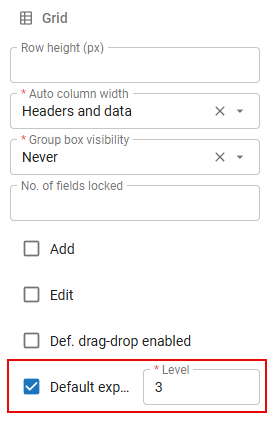 Expand a grouped grid by default.
Multiple row selection
Universal UI Windows 3-tierBy default, users can select multiple rows in a grid, which is useful for bulk editing, deleting, or copying rows. It might be useful to disable this setting when your users to have small devices, such as smartphones or tablets.
To disable multiple row selection:
menu User interface > Subjects > tab Default/Variants > tab Settings > tab General > group Grid
- Clear the checkbox Multirow selection enabled.
Tree settings (subjects)
Textual and visual presentation of the tree
menu User interface > Subjects > tab Default/Variants > tab Settings > tab Components > group Tree
- Select the Display column. This is the textual presentation for the tree. When left blank, the lookup display column will be shown.
- The icon selected in the Image column will be presented in front of the display column.
Tree type
menu User interface > Subjects > tab Default/Variants > tab Settings > tab Components > group Tree
- Select a tree Type: 'Hierarchical' or 'Column'.
Expand a tree by default
You can set a tree to expand automatically when a table is opened.
To automatically expand a tree:
User interface > Subjects > tab Default/Variants > tab Settings > tab Components > group Tree
-
Select the checkbox Default expanded.
Field Level becomes available.
-
In the field Level, enter the number of nodes that should expand automatically.
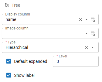 Tree properties
Show labels in a tree
You can show labels in a tree to display the textual presentation of the tree nodes.
To show labels in a tree:
menu User interface > Subjects > tab Default/Variants > tab Settings > tab Components > group Tree
- Select the checkbox Show label.
Form settings (subjects)
Number of columns in the form / Form column width factor
Universal UImenu User interface > Subjects > tab Default/Variants > tab Settings > tab Components > group Form
- In the field No. of columns in form, enter the maximum number of columns to be displayed in a form. If you enter '0', the UI will display as many columns as possible.
- Enter a Form column width factor. This factor determines the relative width of the columns in a form. For more information, see Form column width factor.
Label width / Field width / Horizontal space
The combined widths determine the horizontal space that is reserved for form columns.
If no value is entered, the default value for the branch is used.
menu User interface > Subjects > tab Default/Variants > tab Settings > tab Components > group Form
- Enter the Label width (px).
- Enter the Field width (px).
- Enter the Width between fields.
Field height / Vertical space / Horizontal space
To set the height of fields, the vertical and horizontal space between fields:
menu User interface > Subjects > tab Default/Variants > tab Settings > tab Components > group Form
- Enter the Field height (px).
- Enter the Heights between fields (px).
- Enter the Width between fields (px).
Hide navigation and update buttons
It is possible to hide the navigation and update buttons in the form. These actions are then only accessible in the ribbon and via shortcuts.
menu User interface > Subjects > tab Default/Variants > tab Settings > tab Components > group Form
- Select the Hide buttons checkbox.
Auto-edit
To enable auto-editing in a form:
menu User interface > Subjects > tab Default/Variants > tab Settings > tab Components > group Form
- Select the Auto-edit checkbox.
Card list settings (subjects)
See also Card list and Card list (Universal UI).
Title and image for a card list
menu User interface > Subjects > tab Default/Variants > tab Settings > tab Components > group Card list
-
Select the source for the card list Title:
- None.
- First visible field.
- Lookup display column.
-
Select the source for the card list Image:
- None.
- First visible image field.
Lookup settings (subjects)
Introduction to lookups
A lookup is a user interface component that displays values from an associated table, allowing users to select or view these values. A lookup is not the same as a control type, such as a Combo, since a control type displays a fixed list of domain elements while a lookup displays referenced values from a table.
In the data model of your application, you create domains to set up tables. These tables consist of columns, which can be used as a reference for a lookup. A lookup can also be set up for task parameters and report parameters.
When you create a lookup, you must always select a Reference column. This is the column from the referenced table whose values are retrieved and displayed in the lookup. You can set up what is displayed in a lookup in the following ways:
- You can set up a Display column
to display values from a different column of the referenced table in the user interface.
For example, for a domain with the data type NVARCHAR, you can select
user_idas a reference column and selectuser_nameas the display column. As a result, the user name is displayed in the user interface instead of the user ID. In addition, you can set up a control for the lookup, which determines whether the lookup is displayed as a combo box, suggestions, or auto-complete. See Default lookup display settings for more information. - You can create a prefilter to filter specific records in the lookup. To do this, you must set the Look-up state of your prefilter to On, On hidden or On locked. Here, you can also use the calculated field to further control which records are displayed in the lookup.
- You can make a domain element unavailable in the data model and thus unavailable in the lookup. Note that this does not delete the domain element and that it will be unavailable throughout the application.
Default lookup display settings
For each table, you can set up which data appears in the lookup and how it is displayed. You can set up the default settings for a table here.
To configure the default display settings of a lookup:
menu User interface > Subjects > tab Default > tab Settings > tab General > group Look-up
-
Select a Display column to determine what field is shown to the user when they use the lookup.
-
Optional. To configure the settings for the Display column, open its lookup popup
and go to tab Form. The following settings are available:
-
In the field Def. control, select the default lookup control:
- Auto complete - when typing, the first record that matches the input of the user is displayed automatically.
- Combo (alphabetical) - a value from a combo box can be selected. The list is sorted alphabetically.
- Combo (sorted) - a value from a combo box can be selected. The list is sorted according to the default sorting of the lookup subject.
- Suggestions (contains) - When typing, values containing the input are presented. On a mobile device, a keyboard is opened.
- Suggestions (starts with) - When typing, values starting with the input are presented. On a mobile device, a keyboard is opened.
When a new table is created, the default lookup control is set to Suggestions (starts with), since this setting offers better performance when returning a large number of rows from a lookup table.
If the lookup table is displayed with a pop-up window, this can be the standard, but a it is also possible to display a variant.
tipFor tables with a small dataset, a Combo lookup control may be suitable, since it displays all available values from a lookup table in a drop-down list. For tables with larger datasets, other options like Suggestions (contains) may be more suitable, since this lookup control allows users to search for a value.
-
Optional. Select the checkbox Def. refresh on dropdown to refresh the lookup data by default before the combo box expands.
-
Optional. Select the checkbox Def. has popup to display the lookup table by default in a pop-up window.
You can override the default lookup settings for columns, task parameters and report parameters.
 Lookup settings
Lookup display column
You can select a Display column to determine what field is shown to the user when they use the lookup. This setting applies to all target tables that refer to this source table.
For example, a table employee has name as its lookup presentation field, while the primary key is a number.
The lookup presentation field is determined by applying the following rules:
- If no presentation field is entered, the last reference column is displayed.
- If no presentation field is entered and the source column is also a lookup, the presentation field of this lookup is displayed.
In both cases, if the lookup display column is based on a domain element, the translation of the matching domain element is displayed if it exists.
These rules are applied recursively until an explicitly set up presentation field or modified presentation field is reached. In this way, a link table is automatically correctly translated.
If, for example, the field employee_id in sub_project has a lookup to sub_project_employee and the associated presentation field is empty, the translation of employee_id with sub_project_employee is applied. This draws from the employee table, from which the name is chosen.
This system is known within Thinkwise as deep joining.
 Example of deep joining
Offline settings (subjects)
Offline availability
To make a table or variant offline available:
menu User interface > Subjects > tab Default/Variants > tab Settings > tab Components > group Offline
Checkbox Offline enabled indicates whether the table or one of the variants can be available offline (can only be set up at table level).
- Select checkbox Offline available.
Refresh groups for working offline
Refresh groups are used to ensure data are refreshed correctly. For each group you can indicate at which interval it has to be refreshed and whether it is atomic.
- For atomic groups, changes in the offline details are only carried out if the synchronization of all tables in the group is successful. If, for instance, a (connection) fault occurs during the synchronization of an order, it makes no sense to synchronize the order lines.
- For non-atomic groups, all tables are synchronized, irrespective of whether a (connection) fault has occurred.
The refresh group can also be filled for tables that are only available online. After updating an online table, all offline tables from the same refresh group are refreshed.
menu User interface > Subjects > tab Default/Variants > tab Settings > tab Components > group Offline
- Select a Refresh group or open the pop-up to create one.
To create a refresh group in the pop-up:
- Select a Model and Branch.
- Add a Refresh group name and description.
- If it has to be an atomic group: select the Atomic checkbox.
- Enter an interval in field Refresh after minutes.
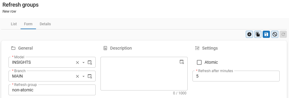 Create a refresh group in the pop-up
Offline refreshing after an update
This indicates whether an offline updatable table following an update has to be immediately refreshed (including all other tables from the same refresh group)
When creating prefilters, it can be indicated with the Filter for the offline data option whether a prefilter has to be applied when retrieving the offline data. In this way, a smaller set of data can be worked with offline than online. Due to performance considerations, it is recommended to keep the amount of offline data as small as possible.
Permissions
menu User interface > Subjects > tab Settings > tab Permissions
 Overview of the Permissions tab with subject settings
Add, Copy, Update, or Delete permissions
You can allow users to add, copy, update, or delete data in a table using the CRUD buttons in the action bar.
menu User interface > Subjects > tab Settings > tab Permissions > group Data manipulation
- Select which actions are allowed: Add, Copy, Update, or Delete.
- When clearing the Add and Update checkboxes, users can no longer import data.
- When clearing the Update checkbox, users can no longer perform a mass update See also, Import/export/mass update permissions.
Import/export/mass update permissions
Users can import, export and update data in bulk with a fixed value or based on an imported file. For more information, see:
- Windows GUI - Export, import and update
- Universal UI - Import and export and Update.
To allow users to import, export, or mass update data:
menu User interface > Subjects > tab Settings > tab Permissions > group Other
- Select which import and export actions are allowed: Import, Mass update , or Export.
Ensure you have set up the correct Add, Copy, Update, or Delete permissions. If these permissions are not set up correctly, users may not be able to import, export, or mass update data. For example, if a user has no Update permission, they cannot perform a Mass update.
Data permissions
You can allow users to search, filter, sort, or group data in a table.
menu User interface > Subjects > tab Settings > tab Permissions > group Data
- Select which actions the user may carry out in the table: Find, Filter, Allow sort, or Group.
For more settings, see:
Universal UI If the checkbox Filter is cleared, the Filter pop-up is not shown for that subject. For more information, see Filter (pop-up).
For more information for users, see:
- Universal UI Sort, search, and filter
- Windows GUI Sort, search, and filter
Copy to clipboard
To allow users to copy data from a table to the clipboard:
menu User interface > Subjects > tab Settings > tab Permissions > group Other
- Select the checkbox Copy to clipboard.
Print preview permission
To allow users to print a table:
menu User interface > Subjects > tab Settings > tab Permissions > group Other
- Select the checkbox Print preview.
Performance settings
Unused logic concepts
It is possible to deselect unused logic concepts to prevent unnecessary calls to the logic layer.
menu User interface > Subjects > tab Default > tab Settings > tab Performance > group Use concept
- Deselect unused logic concepts. For more information, see Logic concepts.
- To prevent unnecessary auto-refresh actions, select the Change detection checkbox. This logic concept checks whether or not a subject has been changed and needs to be refreshed. See also Auto refresh.
Handlers
Handler procedures allow you to override the default insert, update, and delete SQL commands initiated by the user interface and Indicium with your own business logic.
menu User interface > Subjects > tab Default > tab Settings > tab Performance > group Use concept
For more information, see chapter Handlers in the Logic concepts manual.
Refresh behavior
By default, while a user is editing data, grid values are updated based on the data in the active row. It is also possible to refresh the subjects and variants automatically every x seconds. See Auto refresh.
This topic explains how to set the refresh behavior after specific actions.
Before you can do this, you must enable the extended property GridEditUpdateUsingRefreshOption (see Extended properties).
To set the refresh behavior after specific actions:
menu User interface > Subjects > tab Default > tab Settings > tab Performance > group Refresh
-
Select the refresh behavior for the actions After insert, After copy, After update, and After delete:
- None - the user interface will not refresh any data.
- Row - the user interface will only refresh the current row after updating.
- Universal UI The parent row will be refreshed one level up.
- Subject - the user interface will refresh the current subject including lookups and details.
- Universal UI The parent row will be refreshed one level up.
- For a Formlist component to maintain performance, use this option only when necessary. The Formlist displays editors for each record and updates the layout for each row, so frequent refreshes can slow down performance.
- Document - the user interface will refresh the main subject including all lookups and details.
- Universal UI For After insert, After copy, and After delete, this option refreshes the entire subject.
Refreshing slows down performance. Select None if refreshing is not strictly necessary.
 Overview of the Performance options
Badges
A badge is a small visual indicator that can be used to show information to the user, for example the number of unread messages or notifications. In the Thinkwise platform, badges can be displayed in the menu, on detail tiles, and on detail tabs.
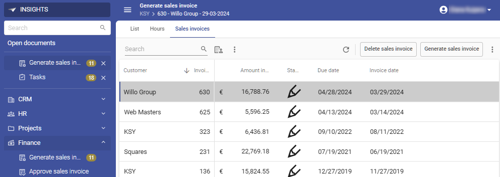 Example of badges displayed in the menu
Set up a badge
If a validation message about the auto refresh interval appears, consult your Security Officer on how to proceed. If you opt to keep the settings, the validation message may be approved.
To set up a badge:
menu User Interface > Subjects > tab Default/Variants > tab Settings > tab General > group Settings
-
Select the checkbox Show badge.
-
Enter an Interval (s) in seconds at which the badge should be refreshed. If you do not enter a value, the default badge interval of your model is used. You can configure the default Interval (s) value for your model in menu Subjects > tab Default settings > group Badge.
noteUsing a high number of badges in your application or frequent badge refreshes can negatively impact performance. Frequent refreshes are not recommended, as they keep sessions active longer than necessary, which can pose security risks.
-
Go to menu Business logic > Functionality > tab Control procedure to create a control procedure for your badge. Here, you can add logic to calculate the badge value. Your template should at least assign a value to
@badge_value. For more information, see Adding functionality for the complete procedure and Business logic in badges for the parameters that you can use in your badge logic. -
Synchronize your model to IAM to ensure your latest configurations are available for your application. For more information, see Synchronization to IAM.
Business logic in badges
You can use the following parameters in your badge logic:
| Parameter | Description |
|---|---|
variant_id | The variant the badge is executed for. The badge concept is the only variant specific concept. The reason for this is that the badge value is often dependent of the default prefilters, which can deviate per variant. |
badge_value | The value that is displayed by the badge in the UI. Only an integer can be used. If you set the @badge_value to null, the badge will not be displayed. |
col_id | All column values, linked task parameter values, or linked report parameter values that are part of a detail foreign key. |
The template below sets the badge value to the number of validation messages or to empty when it is set to 0.
select @badge_value = nullif(count(1), 0)
from validation
where model_id = @model_id
  and branch_id = @branch_id
- Community post - Right channel, right moment: choosing the best notification