Links
Details
If you create a variant, settings will change along with changes made in the default, provided this variant has not been modified manually. Some settings can only be configured in the default and can not be changed in the variant. Tabs in the variant are only visible if they defer from the default. See Variants for more information.
Show a detail tab or tile for a table
menu User interface > Subjects > tab Default > tab Links > tab Details
Detail tabs and detail tiles for references can be turned on and off:
- Select the Show detail checkbox to specify whether a subject should be included as a detail tab or detail tile.
- Optionally, use the up-arrow and down-arrow tasks on the left-hand side to put the detail tabs in sequence.
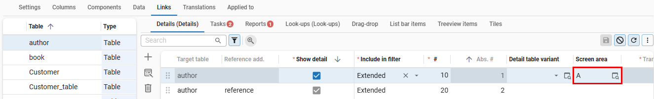
Link a detail to a screen area
You can link detail tabs and tiles to a Screen area. For more information, see Screen areas. If a screen area is not available in the assigned screen type, the fallback area will be used.
To link a detail to a screen area:
menu User interface > Subjects > tab Default > tab Links > tab Details
-
Select a Table or Table variant.
-
Select a Screen area to link a detail to a screen type with the same screen area:
- For detail tabs, see tab container with subject details.
- For detail tiles, see detail tiles component.
 Overview of Details in a table
Add a detail reference to a Filter pop-up
Universal UImenu User interface > Subjects > tab Default > tab Links > tab Details
In a Filter pop-up, users can filter multiple levels deep on data in related detail references for a subject. You can configure which detail references are available. For more information, see:
- Add lookup and detail references to a Filter pop-up.
- Filter pop-up in the Universal user interface guide.
Link a task to a table
To link an existing task to a table:
menu User interface > Subjects > tab Default > tab Links > tab Tasks > tab Task > tab Form
For more information about the settings, see Create a table task.
Link a report to a table
A table report is a report that is linked to one or more tables. To link an existing report to a table:
menu User interface > Subjects > tab Default > tab Links > tab Reports > tab Report > tab Form
For more information about the settings, see Create a table report.
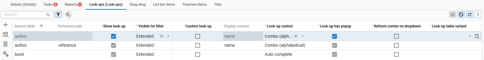
Lookups
Use a column as a lookup
menu User interface > Subjects > tab Default > tab Links > tab Look-ups
For each reference, you can indicate whether it should be used as a look-up. This can be different for each column. In the case of a specific look-up, table settings such as the look-up type, the column view, etc., can be overwritten.
The UI will resolve recursive look-up presentation. If the last reference field in the look-up table has a look-up and the previous reference field is left blank, the presentation field of this field is used (recursive).
Settings:
- Look-up control - Select the type of control to influence the behavior of the editor. This is applied to the grid, form (edit), and task/report parameters. See also Keyboard on a mobile device for a column with a look-up control.
- Look-up has popup - Allows the user to open look-up popups from the grid menu
 . See the Universal UI's user manual.
 Overview of Look-ups in Links
Add a lookup reference to a Filter pop-up
Universal UImenu User interface > Subjects > tab Default > tab Links > tab Look-ups
In a Filter pop-up, users can filter multiple levels deep on related lookup references for a subject. You can configure which lookup references are available. For more information, see:
- Add lookup and detail references to a Filter pop-up.
- Filter pop-up in the Universal user interface guide.
Keyboard on a mobile device for a column with a look-up control
When opening a look-up control in a column, a keyboard will only appear
if you set the Extended property DisableKeyboardForAutoCompleteCombo to false.
Note that if a lookup has a Default control with a suggestion (as configured in the menu User interface > Subjects > Settings), a keyboard will always open when accessing the lookup. A suggestion type control will display a maximum of 8 results based on the typed search criteria.
You can base the choice between these options on user preference and the number of items expected in the (unfiltered) dropdown.
Display lookup hyperlinks for read-only fields
Universal UIUsers can open lookup pop-ups by clicking on hyperlinks in the grid, form or card list. Lookup hyperlinks are only available for read-only fields. For more information see Open a lookup pop-up from the grid and Card list (Universal UI).
To display lookup hyperlinks for read-only fields, configure the following settings:
- Show action button is set Always. For more information, see Show or hide the action button for read-only fields. Set this to Never to hide lookup hyperlinks.
- Select the Look-up has popup, to indicate that the field has a look-up pop-up. For more information, see Lookup display settings.
When Show action button is set to Never and Look-up has popup is not selected, no lookup hyperlink is displayed and the user cannot open the lookup pop-up in any other way.
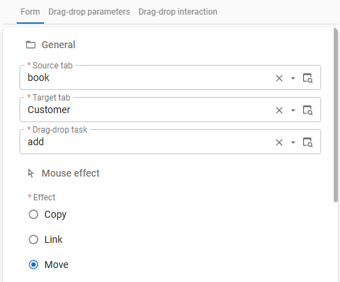
Drag-and-drop links
A drag-and-drop link is part of a drag-drop task. A drag-drop task is a regular task with a drag-drop link. The drag-drop link defines the source and target of the drag-and-drop action.
To create a drag-and-drop link:
menu User interface > Subjects tab Default/Variants > tab Links > tab Drag-drop > tab Form
-
Select a Source tab.
-
Select a Target tab.
noteIf you select a Scheduler as a Target tab, the field Drop date time parameter becomes available. Selecting a Drop date time parameter automatically populates the Start date time parameter field in the Add activity task field of the Scheduler. For more information, see Set up external drag-and-drop on a time cell.
-
Select a task in the field Drag-drop task.
 Select a source, target, and task
 -
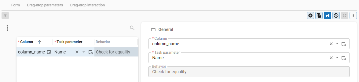
Go to the tab Drag-drop parameters.
-
Select a Column from the source table to map to a Task parameter.
If multiple rows are dragged, the task will be executed multiple times. Task settings for pop-up per row will be applied.
Task parameters that are mapped by both the target and source table will be checked for equality. If the values are not equal, drag-and-drop will be prevented by the UI.
 Parameters for the drag-and-drop task
 -
Go to the tab Drag-drop interaction and execute the task Enable drag-drop
 to enable the drag-and-drop link.
By default the drag-and-drop link is disabled.
to enable the drag-and-drop link.
By default the drag-and-drop link is disabled.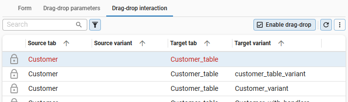 Enable the drag-and-drop combination
 -
When dragging over a component in a grid (Windows GUI or tree), the user interface by default selects multiple rows. To change this behavior, you can enable drag-and-drop in the context menu (right-click > Tasks > Enable drag-drop).
You can enable drag-and-drop by default for the source table or variant in the model (menu Models > Model content > tab Tables > tab Form > tab General > checkbox Def. drag-drop enabled).
The UI allows rows to be dropped on any component of the target table. However, when a user hovers over a multirow-component of the target during drag-and-drop, the UI will apply one of the following behaviors:
-
If the drag-and-drop task has variable input, depending on the selected row of the target, the UI will navigate to the hovered row.
-
If the drag-and-drop task only has one unique set of input, and the selected row will not change the input of the drag-and-drop task, the UI will treat the grid or tree like any other component and not navigate to the hovered row.
Context procedures are executed during the hovered navigation, after a short delay. During this time, the cursor might display a question mark.
Link tables to menu items
menu User interface > Subjects > tab Default/Variants > tab Links > tab List bar items/Treeview items/Tiles
These tabs show the links between tables and menu items. It is possible to modify this.