Data
In the data component, you can configure search, filter, find, sort, prefilters, and conditional layouts for your application.
If you create a variant, settings will change along with changes made in the default, provided this variant has not been modified manually. Some settings can only be configured in the default and can not be changed in the variant. See Variants for more information.
Search
A search field is permanently visible on a screen. It can be used to search on several columns at once. In the results, only the rows with at least one field containing the entered search value are displayed. All other rows are removed.
Include columns in Search
To include columns in the Search field:
menu User interface > Subjects > tab Default > tab Data > tab Search
- Select the checkbox Incl. in search to include a column in the Search field.
The Search field is independent of whether the filter is enabled or not in menu User interface > Subjects > tab Settings > tab Permissions > checkbox Filter. If this checkbox is cleared, any column allowed in Search will still show in the Search field in the UI.
 Add columns to a Search field
Column order in the Search tooltip
Universal UImenu User interface > Subjects > tab Default/Variant > tab Data > tab Filter
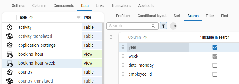
In your application, the tooltip for the Search field displays the columns used for searching. You can determine the column order in the Filter tab. In the example below, the subject column is placed in front of the employee_id primary key column, which you would expect to be the first in the original list of columns in the data model (menu User interface > Subjects > Columns).
 The order of columns in the Search tooltip
Filter and Find
Availability of Filter and Find tabs in the Software Factory
menu User interface > Subjects > tab Default/Variant > tab Data > tab Filter/Find
In the Software Factory, the tabs for Filter and Find are only available if users are allowed to use these features according to the settings in the tab Permissions. The same applies to tasks for setting up Filter or Find in variants.
See Data permissions.
Add columns to Filter and Find
Find is only available in the Windows GUI.
You can optimize the usability of Filter (form and pop-up) and Find in your applications by adding a relevant set of columns.
To add columns to Filter and Find:
menu User interface > Subjects > tab Default/Variant > tab Data > tab Filter/Find
-
Select the column visibility (Visible for filter/Visible in Find):
- Always - for frequently used filter/find terms. They are always displayed, regardless of whether the Filter/Find dialog is expanded.
- Never - for fields that should not be filtered or found. Use this, for example, for columns containing binary data.
- Extended - for the remaining fields. These are only shown when a user expands the Filter/Find
 dialog.
-
Optional. In the field Filter condition, select the default way of filtering or finding for a specific column in a subject.
Universal UI For the following control types, filter conditions are not supported:
- File/image
- HTML/multiline
- Label
-
If necessary, drag and drop the columns to change their order.
It is possible to copy filter/find order and visibility settings. See Copy settings to filter and Copy settings to find.
Prefilters in these tabs:
 Possibly visible - hides all the columns that will be hidden in the application (type: Hidden).
Hidden fields are usually not used for searching or filtering.
Possibly visible - hides all the columns that will be hidden in the application (type: Hidden).
Hidden fields are usually not used for searching or filtering. Possibly editable - only shows the columns that can be edited in the application (type: Editable).
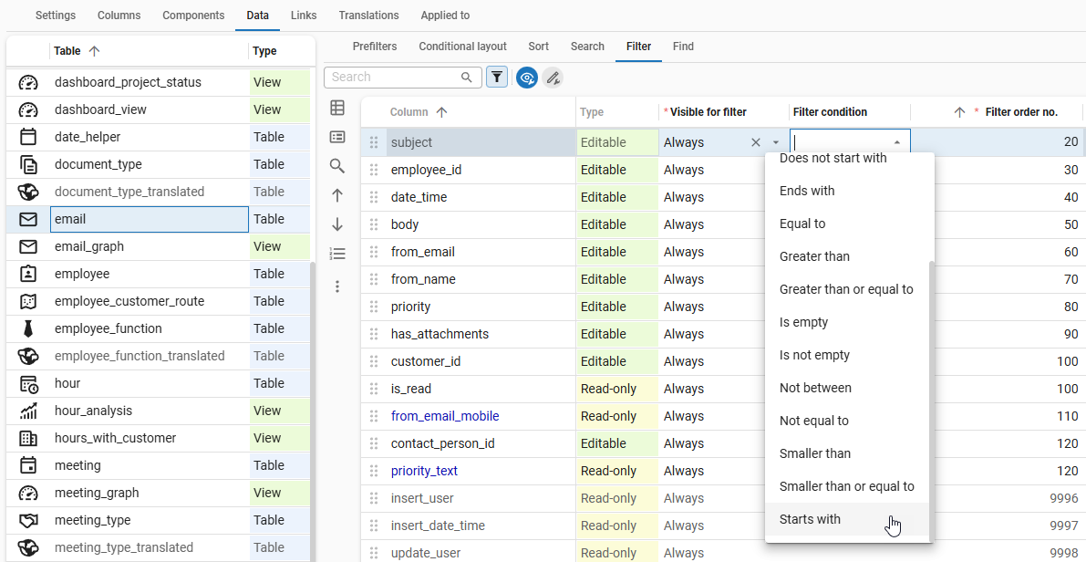 A column with a condition that is visible for a filter
Add lookup and detail references to a Filter pop-up
Universal UIBy default, the Filter pop-up in an application lists all available lookup and detail references of the subject. With these references, users can filter multiple levels deep on data in related subjects. For more information, see Filter (pop-up).
To change the availability of a reference in the filter pop-up:
Always analyze referenced subjects on their performance before joining them. Exclude heavy views or tables with a lot of data from reference filtering to avoid performance degradation at runtime after filtering.
menu User interface > Subjects > tab Default > tab Links > tab Details/Lookups
-
For each detail or lookup, select an option in the column Visible for filter:
- Always - The detail or lookup is always visible in the filter pop-up.
- Extended - The detail or lookup becomes available in the filter pop-up when the user manually adds it to the filter.
- Never - The detail or lookup is not visible in the filter pop-up. Use this option when joining the reference data degrades the performance of the main subject.
Copy settings to filter
To copy order and visibility settings to the filter:
menu User interface > Subjects > tab Default/Variant > tab Data > tab Filter
- Execute the task Copy from find
 to copy search settings to the filter.
 - Execute the task Copy from grid
 to copy grid settings to the filter.
 - Execute the task Copy from form
 to copy form settings to the filter.
The order will be copied by default, one-to-one. To also include the visiblity, select Visibility in the pop-up.
If necessary, the visibility will be transformed based on the Type of the source:
- If it is editable or read-only, the visibility will be transformed to always.
- If it is hidden, the visibility will be transformed to never.
Copy settings to find
To copy order and visibility settings to Find:
menu User interface > Subjects > tab Default/Variant > tab Data > tab Find
- Execute the task Copy from filter
 to copy filter settings to the Find.
 - Execute the task Copy from grid to copy grid settings to the Find.
- Execute the task Copy from form to copy form settings to the Find.
The order will be copied by default, one-to-one. To also include the visiblity, select Visibility in the pop-up.
If necessary, the visibility will be transformed based on the Type of the source:
- If it is editable or read-only, the visibility will be transformed to always.
- If it is hidden, the visibility will be transformed to never.
Sort columns
A default sort can be specified for each table. You can sort on one or more columns.
menu User interface > Subjects > tab Default > tab Data > tab Sort
- Select on which columns sorting is allowed with the checkbox Allow sort. For example, because it concerns a large text column for which no index is defined.
- In the column Sort order, select for each column if it should be sorted in ascending or descending order.
- Select the checkbox Default sort if you want to group one or more columns in a grid. See Group columns.
To quickly set the sort order for a selected subject based on its primary key and the table's look-up display column,
execute the task Set up initial sort order  .
This is especially useful when you need to set up the sort order for multiple tables.
The sort order is based on all primary key columns or, if a look-up display column is defined, on all but the last primary key column and the look-up display column.
.
This is especially useful when you need to set up the sort order for multiple tables.
The sort order is based on all primary key columns or, if a look-up display column is defined, on all but the last primary key column and the look-up display column.
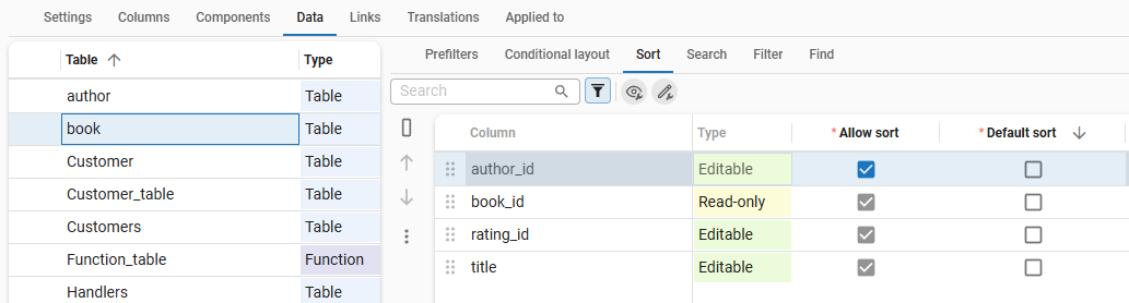 Sort order configuration for table columns in the Data tab
Group columns
If the checkbox Default sort is selected, you can group one or more columns in a grid.
menu User interface > Subjects > tab Default > tab Data > tab Sort
- Select the checkbox Group until to mark the last column by which to group. All columns up to and including the column with Group until selected become part of the group. In the example below, books are grouped by author_id and then by book_id.
Windows GUI You can set grouped columns in a grid to automatically expand when a table is opened, see Expand a grouped grid by default. You can also let users dynamically group columns, see Allow grouping in a grid.
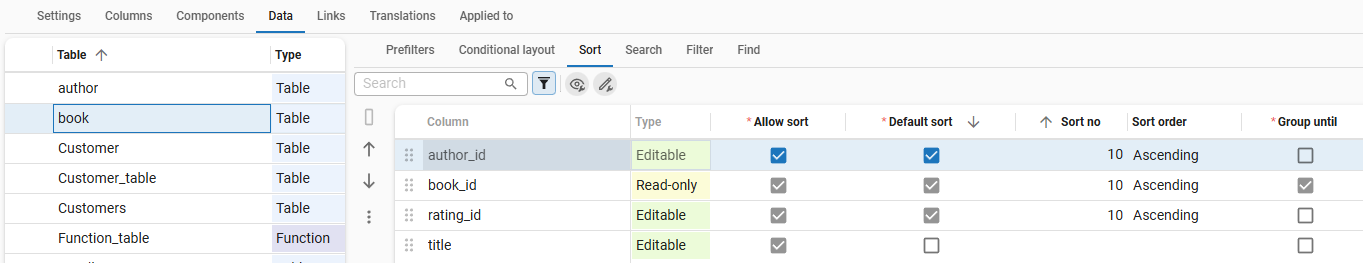 Group books by author_id and book_id
Prefilters
Introduction to prefilters
Prefilters are predefined filters that a user can select in your application.
- Windows GUI Prefilters are displayed in the ribbon or the context menu.
- Universal UI Prefilters are displayed in the prefilter bar, possibly in the overflow menu. For more information, see also Prefilter in the Universal user interface documentation.
 The Search field with prefilters, where the underlined prefilter is active
You can create prefilters for your application, and also allow users to create their own prefilters in your application, see:
- User-defined prefilters in the Universal UI
- Save a filter as a prefilter
- User-defined prefilters in the Windows UI
Create a prefilter
If you want to add your prefilter to a prefilter group, we recommend to create the prefilter group first. See Create a prefilter group.
To create a prefilter:
menu User interface > Subjects > tab Default > tab Data > tab Prefilters > tab Prefilter > tab Form
- Enter a name for the Prefilter that you want to add to the selected table.
- Select the Prefilter group from the drop-down list. See Create a prefilter group. As soon as a prefilter is assigned to a group, the group appears in the grid so you can drag/drop other prefilters into it.
- Select the Prefilter type. See Prefilter type.
- Select the Prefilter state - this defines the visibility, status, and accessibility of the prefilter in different contexts. See Default prefilter state.
- Select an Icon for the prefilter.
- Select the Sequence no. With this setting you can influence the order in which the prefilter appears.
- Optional: select a keyboard shortcut that can be used to enable or disable the prefilter. Make sure that the screen does not contain multiple prefilters using the same shortcut. Also, avoid using a shortcut that is already used by the GUI, such as Ctrl + R. For more information, see Shortcuts (used by GUI's). Validations are in place to prevent you from selecting such shortcuts.
- Optional. To show a prefilter in a Prefilter bar or a (Custom) action bar, select the same Screen area as the bar. For more information, see Screen areas.
- Optional. Select a Custom display type.
For example, Icon + text (> text > icon) means that the report is displayed as an icon with text. On a smaller screen with less space, it is displayed as text (the first fallback: > text). With even less space, it is displayed only as an icon (the second fallback: > icon). The overflow menu is always the last fallback type, except for the display type Hidden.
You can create prefilters based on the elements of a domain.
Start the task Generate prefilters based on domain elements  and select the column with the domain containing the desired elements for your prefilters.
Optionally, you can create a new prefilter group or choose an existing one to add the prefilters to.
See also the enrichment Create prefilters based on domain elements.
and select the column with the domain containing the desired elements for your prefilters.
Optionally, you can create a new prefilter group or choose an existing one to add the prefilters to.
See also the enrichment Create prefilters based on domain elements.
Prefilter type
A prefilter can be based on a query or you can specify conditions based on columns.
menu User interface > Subjects > tab Data > tab Prefilters > tab Form
-
Prefilter columns - Add the conditions in the Prefilter columns tab. Select a Column, Filter condition, and Filter value (the database value, not the translation). You can specify multiple columns for each prefilter.
-
Query - Enter the query into the corresponding field. It is placed in the
whereclause by the GUI. Always use the aliast1to access the current table. Smoke tests contain a validation to check the use of the aliast1.t1.order_date < getdate()
If the application is started in developer mode, you can view the resulting query in the debug screen.
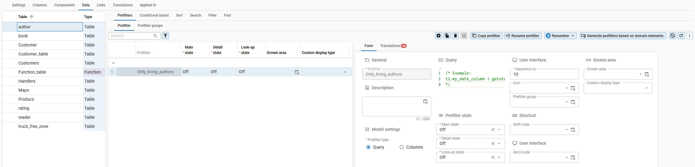 A prefilter configured with a SQL query condition
Default prefilter state
A prefilter can have a different status in different contexts. The context can be the main screen, a detail screen, or a lookup screen.
To set the default prefilter state in a context:
menu User interface > Subjects > tab Default > tab Data > tab Prefilters > tab Form
- The following fields are available for each context:
- Main state
- Detail state
- Look-up state
- The following states are available for each context:
- On - the prefilter is visible and active, and can be deactivated by a user.
- On hidden - the prefilter is not visible to the user but is active.
- On locked - the prefilter is visible and active but cannot be deactivated by a user.
- Off - the prefilter is visible and deactivated, but can be activated by a user.
- Off hidden - the prefilter is not visible to the user and deactivated.
You can use the following states for data authorization:
- On hidden
- On locked
- Off hidden - in combination with prefilter groups that are:
-
Mandatory - See Mandatory prefilter groups.
-
Match any (OR) - See Multiple active prefilters.
Example
Prefilter group
coloris Mandatory and multiple prefilters are allowed to be active (Match any (OR)).
Available prefilters:- Red
- Green
- Blue (state: Off hidden)
Result: users can see records that comply with prefilters Red, Green, or both. They cannot see or use prefilter Blue or records that comply with it.
-
Prefilter access control
The Main state, Detail state, and Look-up state can be set for each prefilter. See Default prefilter state.
To configure the user access to a prefilter in a specific table for a specific role:
menu Access control > Model rights > tab Tables > tab Prefilters > tab Roles
-
Select a table.
-
Select a prefilter.
-
Select a role and start the task Assign rights
 .
.To assign rights to prefilters for the Current object:
-
To make the prefilter visible to users assigned to this role, select the checkbox Visible.
-
If users in a user group assigned to the role are not allowed to disable the prefilter, select the checkbox Always on.
To change the Parent rights:
-
To make the prefilter available in the parent objects, select the checkbox Make available. The affected parent objects are displayed in the field Affected objects.
To inspect the filter modes of your prefilters when setting up the access control for prefilters:
- In relation to the model rights of your users: menu Access Control > Model Rights > tab Tables > tab Prefilters.
- In relation to your user roles: menu Access Control > Roles > tab Tables > tab Prefilters.
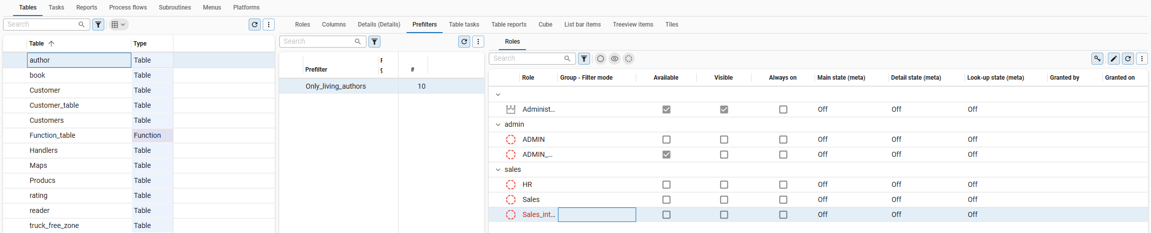 The role rights for prefilters
Examples of prefilter combinations
In the following examples, the data set that is filtered is a set of memberships that can have a certain status but also contain some additional characteristics. A record cannot have two statuses from the same membership simultaneously. For example, a record cannot be a Draft and Active, or Paid and Payment rejected, but it can be Active and Paid, because those values belong to different memberships.
The following combinations are now possible:
| Multiple active prefilters allowed | Filter mode | Mandatory | Description |
|---|---|---|---|
| Yes | Match all (AND) | No |
|
| Yes | Match all (AND) | Yes |
|
| Yes | Match any (OR) | No |
|
| Yes | Match any (OR) | Yes |
|
| No | N/A | No |
|
| No | N/A | Yes |
|
Prefilter groups
Create a prefilter group
Prefilters can be grouped together in a prefilter group. This allows you to organize related prefilters under a common button, making it easier for users to find and use them.
To create a prefilter group:
menu User interface > Subjects > tab Default > tab Data > tab Prefilters > tab Prefilter groups > tab Form
-
Create a new Prefilter group and add a Description. The Sequence no. is automatically assigned, but you can change it to determine the order in which the prefilter group appears.
-
Optional. Add an Icon to represent the task group.
-
Optional. Select the checkbox Submenu to display the tasks in a task group as a submenu. If this option is not selected, the tasks are grouped visually with separators.
-
Optional. Select a Custom display type. This allows you to display grouped tasks differently for each screen. This option becomes available when you select Submenu.
-
In the group Prefilter behavior, select whether you want to allow Multiple active prefilters.
- If you clear this checkbox, only one of the prefilters in the group can be active at any time. They are mutually exclusive. You do not have to select a Filter mode. See Exclusive prefilter groups.
- If you select this checkbox, multiple prefilters can be active simultaneously. Specify the desired behavior by selecting the Filter mode. See Multiple active prefilters.
-
In the group Prefilter behavior, select whether the prefilter group is Mandatory. See Mandatory prefilter groups.
When you create or edit a prefilter, you can now add it to the Prefilter group you created.
Universal UI For more information on grouped actions and their behavior in the Universal UI, see Group actions in the action bar.
Exclusive prefilter groups
You can set the prefilters in your prefilter group to be mutually exclusive.
menu User interface > Subjects > tab Data > tab Prefilters > tab Prefilter groups > tab Form
For example, if your prefilter group contains the prefilters Available and Not available, enabling them simultaneously makes no sense. An item cannot be available and not available simultaneously.
In that case, make sure that Multiple active prefilters is cleared in your prefilter group.
An enabled prefilter in an exclusive group can be locked or hidden, via settings in the model or rights. When this is the case, all other prefilters in this group will also be locked or hidden, as they cannot be activated.
When multiple prefilters are enabled due to settings in the model or user preferences, the GUI will only enable the prefilter with the highest order number. When multiple enabled prefilters are locked or hidden, no data will be shown.
Exclusive prefilter groups can be configured to be mandatory. The user will not be able to disable the active prefilter. If no prefilter is enabled because of model settings, no data will be shown until a prefilter in the mandatory exclusive prefilter group is activated.
See Examples of prefilter combinations.
Multiple active prefilters
menu User interface > Subjects > tab Default > tab Data > tab Prefilters > tab Prefilter groups > tab Form
If you want to allow multiple prefilters in your prefilter group to be active simultaneously, select Multiple active prefilters in the prefilter group. When Multiple active prefilters is selected, you also need to specify the Filter mode.
The Filter mode defines whether the combination of prefilters is evaluated as a logical AND or as a logical OR:
- Match all (AND) means that if multiple prefilters are activated, the resulting data set will have to comply with all the selected prefilters' conditions. For example, if there are two status prefilters for new and active, all records that have both the status new and the status active will be included in the result.
- Match any (OR) means that if multiple prefilters are activated, the resulting data set will have to comply with at least one of the selected prefilters' conditions.
For example, if there are two status prefilters for new and active, all the records that either have the status new or the status active will be included in the result.
Windows GUI The Windows GUI does not support Match any (OR). If you select this option, only one prefilter can be active at any moment.
See also Examples of prefilter combinations.
Mandatory prefilter groups
When a prefilter group is mandatory, users are not allowed to deselect all the prefilters in that group. All data remains hidden if:
- The prefilter group is marked as Mandatory
- All prefilters in this group are Off. See Prefilter state.
This includes the situation where all prefilters in the group are Off by default and Hidden from the user through role permissions (see Prefilter access control). If you want users to see data, they need to be able to see and activate the prefilters or the prefilter group should not be mandatory.
To make a prefilter group mandatory:
menu User interface > Subjects > tab Default > tab Data > tab Prefilters > tab Prefilter groups > tab Form
- Select the checkbox Mandatory.
Conditional layout for grids and forms
You can use conditional layouts in grids and forms to format the font and background color of a field based on specific conditions. Universal UI If you are using variants, you can only determine if a conditional layout is applied and where.
You can configure conditional layouts separately for tasks, reports, and cubes:
- For tasks, see Add conditional layout for a task.
- For reports, see Add conditional layout for a report.
- For cubes, see Add conditional layout for a cube view.
Universal UI The following controls are not supported by the conditional layout:
- Radio button
- Signature
- Checkbox
- HTML
Set up a conditional layout
To set up a conditional layout:
menu User interface > Subjects > tab Default/Variants > tab Data > tab Conditional layout > tab Form
-
Select a table.
-
Enter a name for the Conditional layout.
-
To apply the layout, select the checkbox Show conditional layout.
-
Select the Column where the layout must be applied. If no column is selected, the layout is applied to the entire row.
-
Select at least one component where the layout must be applied:
- Apply to Grid
- Apply to Form
- Apply to Edit
- Apply to Scheduler Resource - See also Add conditional layout to a Scheduler resource.
note
Not all checkbox combinations are allowed. For example, Apply to Edit always has to be accompanied by Apply to Grid and Apply to Form.
-
Set up the formatting of the conditional layout:
- Universal UI In the group Universal:
- Select a Background color and Font color for the Light and Dark themes.
- Select additional settings for Font: Bold, Italic, Underline, or Strikethrough.
- Select a Font size for the font. The size L is 1.25 times the size of the default font, and XL is 1.5 times the size of the default font.
- Windows GUI In the group Windows:
- Select a Font and a Background color.
- Universal UI In the group Universal:
-
Specify the conditions under which the conditional layout must be applied. See Set up conditional layout conditions.
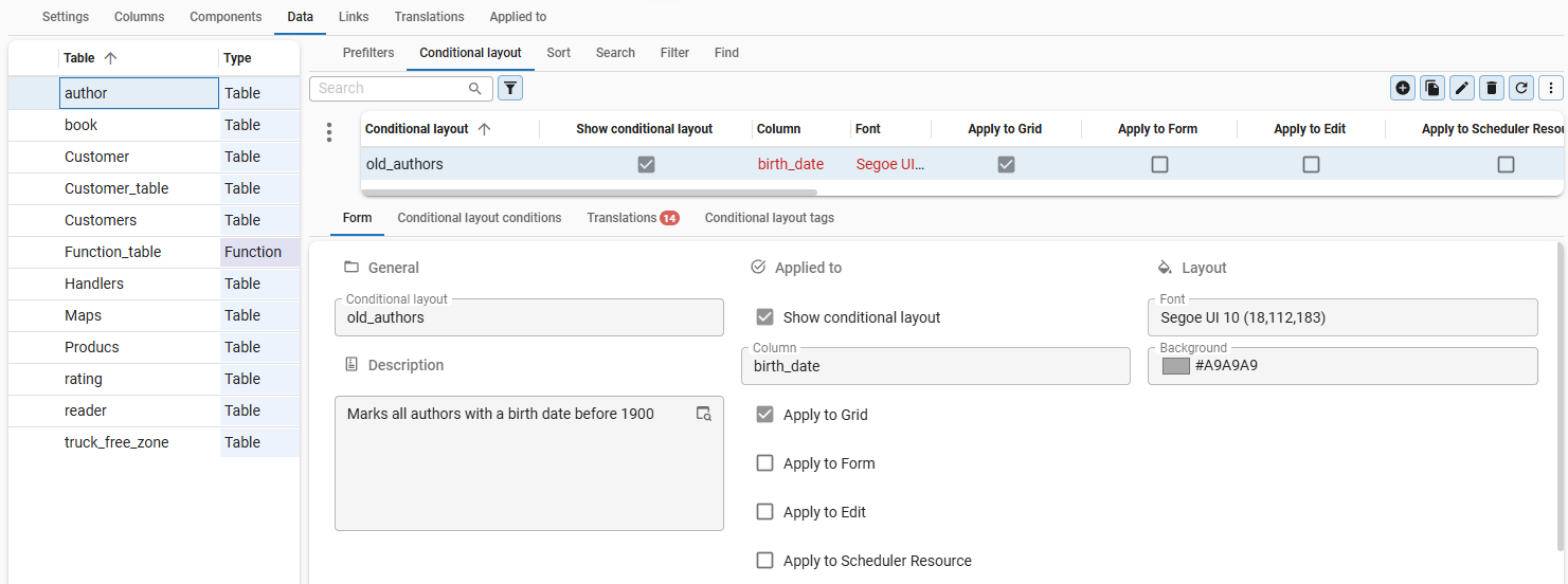 Conditional layout settings for a table in the Universal UI
For conditional layouts with help text entered, the Thinkwise platform automatically generates an overview of the conditional layouts of a subject in the help text.
 Conditional layouts in the help text of the Software Factory
Set up conditional layout conditions
For each conditional layout, you can specify one or more conditions that determine when the conditional layout is applied. Expression fields are allowed to model conditional layouts based on queries, for example, by checking whether a date has expired.
To apply conditional layouts to progress bars, the extended property FormProgressBar must be present and set to 'True'.
To set up conditional layout conditions:
menu User interface > Subjects > tab Default > tab Data > tab Conditional layout > tab Conditional layout condition
-
Select the Table for which you want to set the conditional layout.
-
Select the Conditional layout for which you want to set the condition.
-
Select the Column where the layout should be applied.
-
Select zero, one, or more Conditions from the drop-down list:
-
If you set no conditions, the conditional layout is always applied.
-
If you set multiple conditions, all must be met to apply the conditional layout.
Available conditions
- Equal to / Not equal to
- Contains / Does not contain
- Starts with / Does not start with
- Ends with / Does not end with
- Greater than / Greater than or equal to
- Smaller than / Smaller than or equal to
- Between / Not between
- Is empty / Is not empty
-
-
Select the Type of value for the condition, Constant or Column.
-
Select the required values or columns for the condition.
When conditions are evaluated, only the first matching record per resource is considered to determine which layout is applied. Additional matching records are ignored.
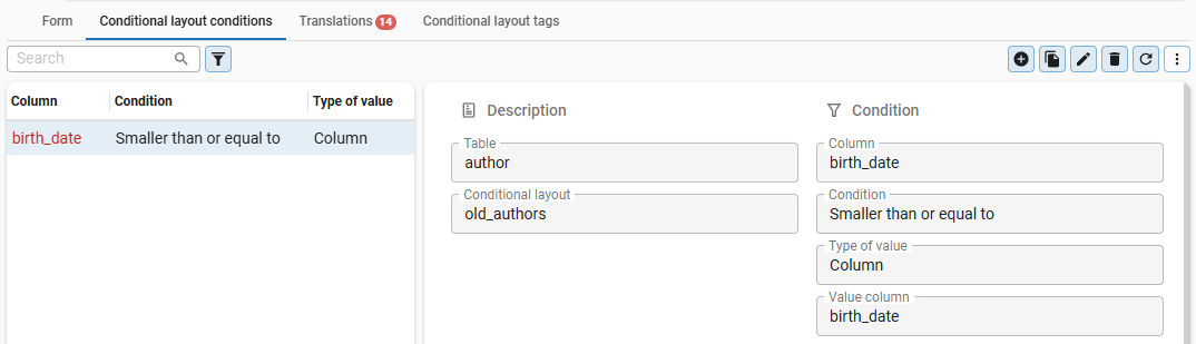 Condition setting for a specific conditional layout