Components
Components
The settings for the grid, form and card list can be changed in the Components tab.
Grid
menu User interface > Subjects > tab Default/Variants > tab Components > tab Grid
Below, you will find the options to configure a table grid.
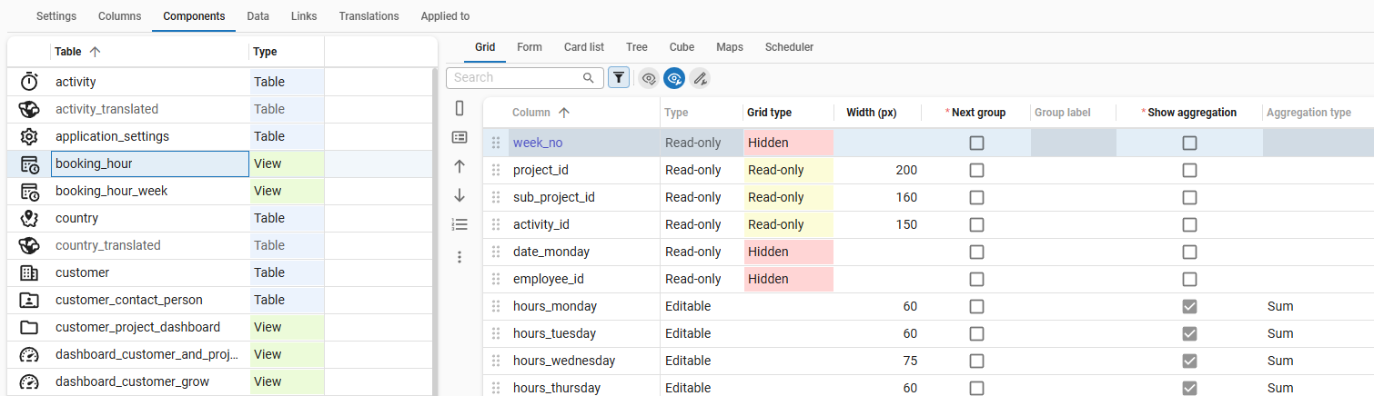 Grid configuration
Field order in a grid
menu User interface > Subjects > tab Default/Variants > tab Components > tab Grid
The field order in a grid may differ from the table definition. For each grid, you can define a different order by dragging the columns in a different order or using the tasks available on the left side of the screen:
- Copy order from column - Copy the column order as defined in the tab Columns.
- Copy from form - Copy the column order as defined in the tab Form, for more information see Copy from form.
- Move grid column up - Move the selected column one position up.
- Move grid column down - Move the selected column one position down.
- Renumber the grid - Renumber the columns in the grid based on their current order.
 Tasks to manage the field order in a grid
Grid column type
menu User interface > Subjects > tab Default/Variants > tab Components > tab Grid
In the column Grid type you can set whether a column in the grid should be editable, read-only or hidden. This is relevant if a user switches the grid to edit mode (so, if they select the option Edit in grid).
This option can never be set more freely than the definition in the column. See Type of column.
Grid column width
menu User interface > Subjects > tab Default/Variants > tab Components > tab Grid
The column width is determined by the Thinkwise list component. You can adjust it by specifying the width in pixels.
Columns in next group (grid)
Grouping columns in a grid is useful when columns logically belong together. You can use it, for example, to shorten column names because the group gets its own label.
Example of grouped columns in a grid
The example below shows a grid with grouped columns: the planned start and end dates are grouped under the label Planned date, and the actual start and end dates are grouped under the label Actual date. Without grouping, the column names would be too long to fit in the grid, for example Planned start date and Planned end date.
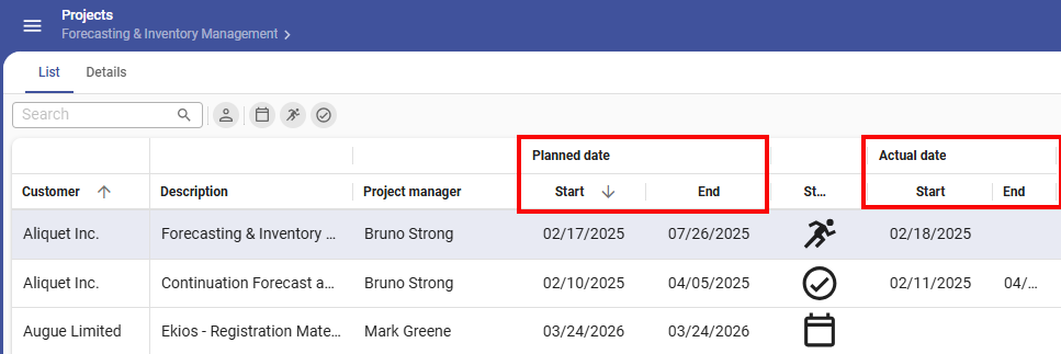 Example of grouped columns in a grid
To group columns in a grid:
menu User interface > Subjects > tab Default/Variants > tab Components > tab Grid
- Select the checkbox Next group for the first column of the new group.
- Enter a label for the group in the column Group label.
The following rule applies:
- Windows GUI It is not possible to combine this setting with the setting Number of columns locked, which is used for locking columns in a grid.
- Universal UI Grouping is disabled if:
- A default non-editable grid is in edit mode, and auto-save is disabled.
- A record has been changed in a default editable grid without auto-save.
Settings for groups and tabs can also affect hidden columns.
If you are getting unexpected results, such as fields or columns in an unexpected group or tab,
clear the prefilter Possibly visible  to see the hidden columns.
This prefilter is active by default.
to see the hidden columns.
This prefilter is active by default.
Aggregations in a grid
Aggregations are used to calculate totals for a column in a grid, such as the number of rows, minimum and maximum values, and the sum or average of a column.
The following rules apply:
- When an unsupported aggregation type is selected, no aggregation is made.
- When multiple records are selected, the aggregation is calculated for the selected records.
- When a single record is selected, the aggregation is calculated for the entire dataset.
Example of aggregations in a grid
In this example, the aggregation type Sum is used to display totals for the column Hourly rate.
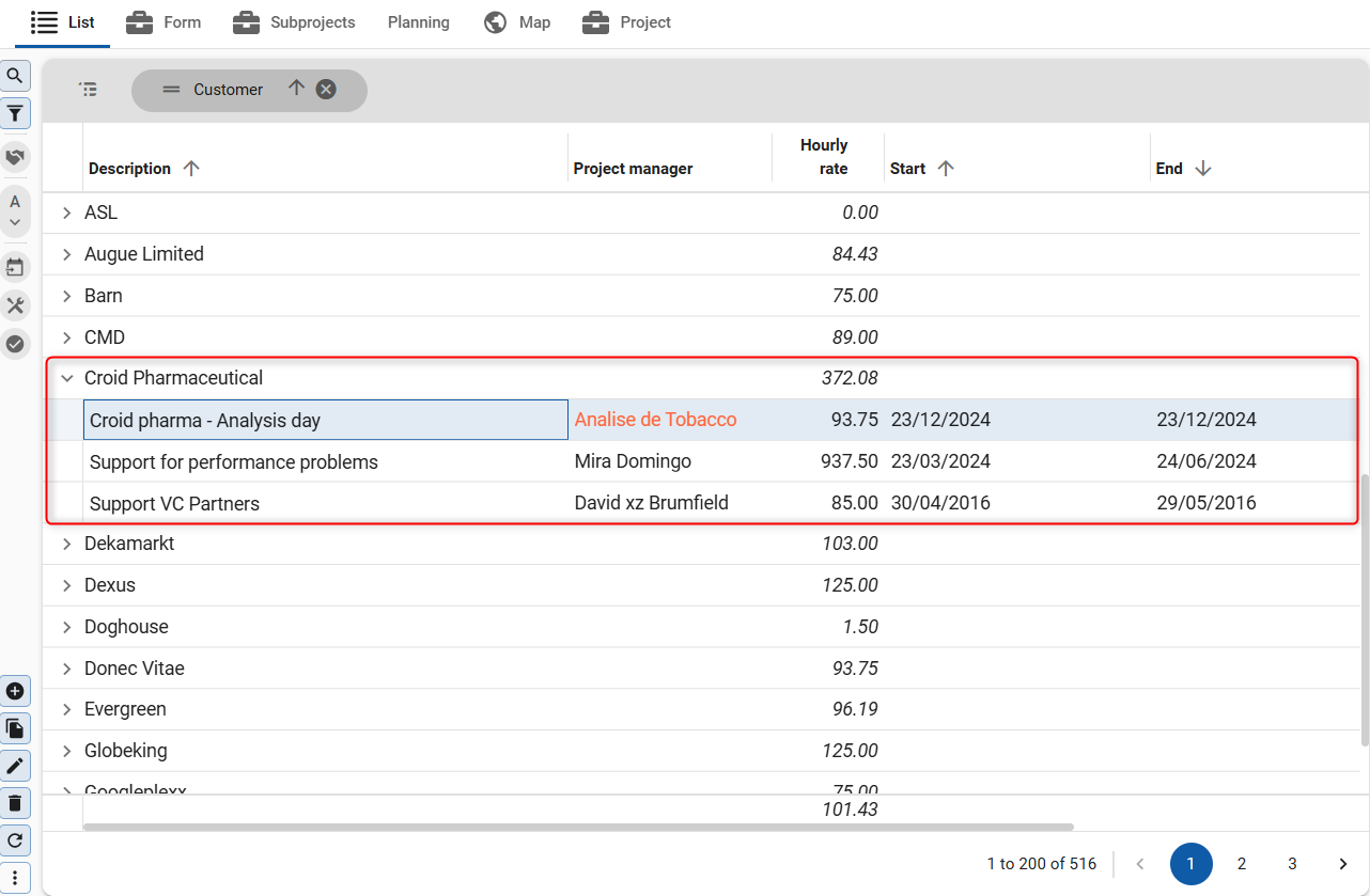 Example of a grid with aggregations
To display totals in a grid:
menu User interface > Subjects > tab Default/Variants > tab Components > tab Grid
- Select the checkbox Show aggregation for the column you want to aggregate.
- Select the Aggregation type from the drop-down list.
Available aggregation types
The following aggregation types are available:
Universal UI- Average - The average of the values in the column.
- Sum - The sum of the values in the column.
- Count - The number of records in the column.
- Maximum - The highest value in the column.
- Minimum - The lowest value in the column.
- Average - The average of the values in the column.
- Count - The number of records in the column.
- Maximum - The highest value in the column.
- Minimum - The lowest value in the column.
- StdDev - The standard deviation of the values in the column. Used for sample data.
- StdDevp - The standard deviation of the population of the values in the column. Used when your data represents the entire population.
- Sum - The sum of the values in the column.
- Var - The variance of the values in the column. Used for sample data.
- Varp - The variance of the population of the values in the column. Used when your data represents the entire population.
In the screenshot below, the aggregation type Sum is selected for the columns year and week to display the totals for these columns:
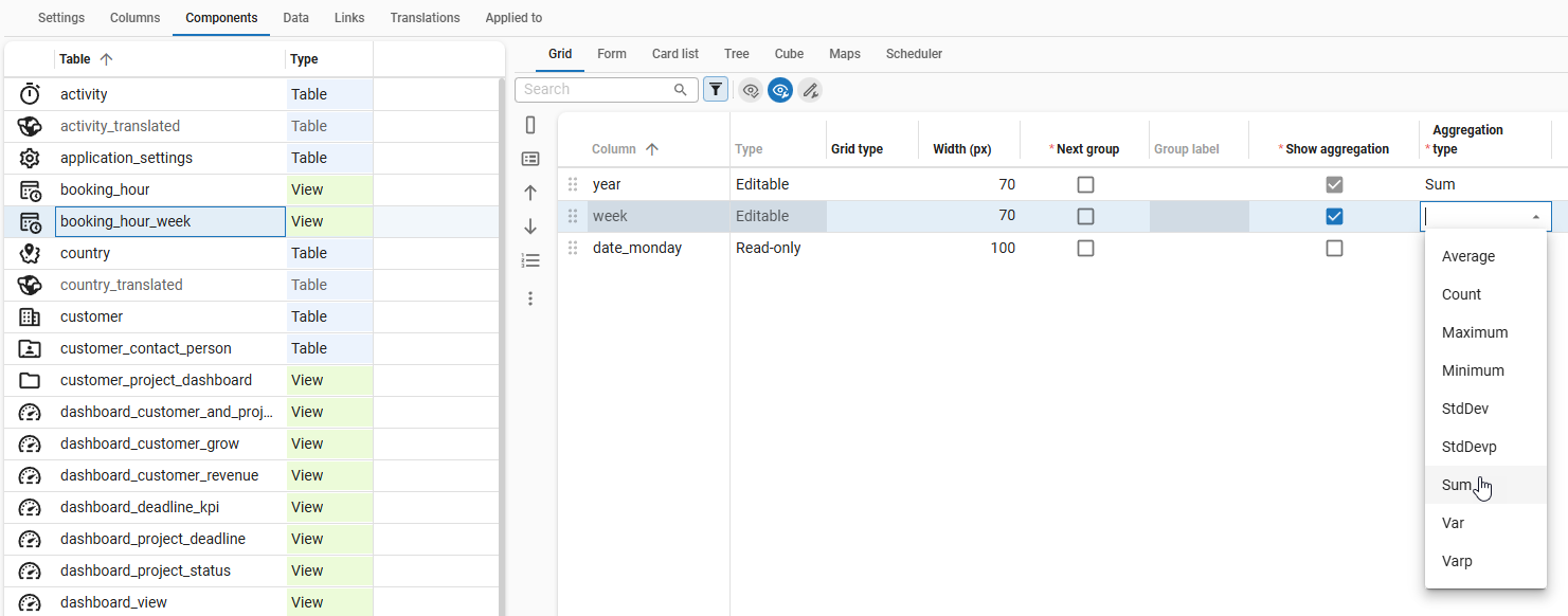 Drop down list with the aggregation options
Copy from form
To copy the order and visibility settings of a form to the grid:
menu User interface > Subjects > tab Default/Variants > tab Components > tab Grid
- Execute the task
 .
.
The order will be copied by default, one-to-one. To also include the visiblity, select Visibility in the pop-up.
If necessary, the visibility will be transformed based on the Type of the source:
- If it is editable or read-only, the visibility will be transformed to always.
- If it is hidden, the visibility will be transformed to never.
Form
The following options are available for configuring a table's form. They also apply to a formlist, except for the options about the tab pages.
For guidelines on how to design a form, see Form.
menu User interface > Subjects > tab Default/Variants > tab Components > tab Form
- Community post - Influence Form behavior in the Universal UI
 Form configuration
Field order in a form
menu User interface > Subjects > tab Default/Variants > tab Components > tab Form
For each form, you can define a different field order using the tasks on the left side of the screen.
Field form type
menu User interface > Subjects > tab Default/Variants > tab Components > tab Form
The field Form type determines whether a field in the form is editable, read-only, or hidden. This option can never be set more freely than the definition in the column. See Type of column.
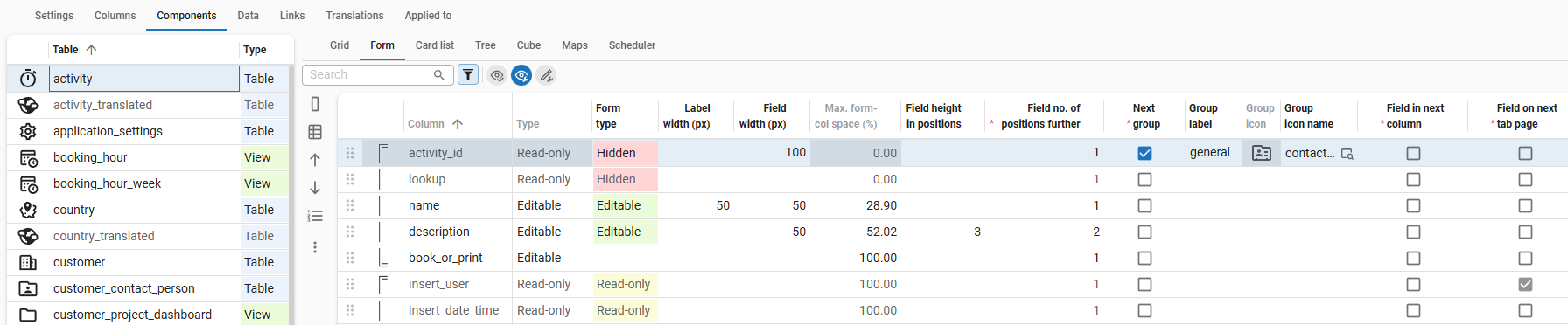
Field height in positions
You can set the height in rows for each form field. This is particularly useful when dealing with large amounts of text that span multiple lines. Be aware that the outcome may differ between the Windows GUI and the Universal UI, as Windows screens are oriented horizontally while Universal UI screens are vertical.
menu User Interface > Subjects > tab Default/Variants > tab Components > tab Form
- Specify the height in the field Field height in positions.
Label width
A label is the text that is displayed to describe a form field. It usually provides a description or name for the field. You can set the width in pixels for each label in pixels.
To set the width of a label:
menu User Interface > Subjects > tab Default/Variants > tab Components > tab Form
- Specify the width in pixels in the field Label width (px).
Field width
You can set the width in pixels for each form field in pixels. It is recommended to make the label widths as narrow as possible, while the field widths should be as wide as possible.
To set the width of a form field:
menu User Interface > Subjects > tab Default/Variants > tab Components > tab Form
- Specify the width in pixels in the field Field width (px).
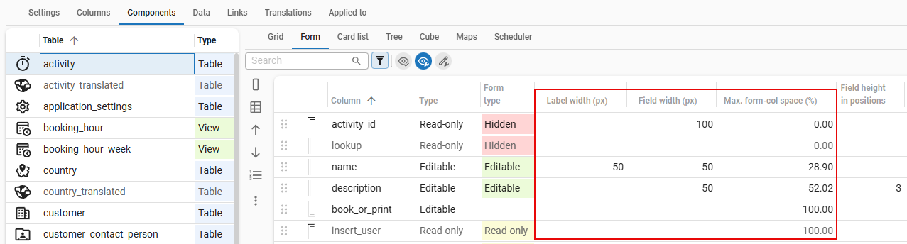
Maximum form column space
Universal UIThe Universal UI is a responsive user interface that automatically adjusts to a user's screen size. Because of this, the form layout may change depending on the available space. You can set the maximum space a field in a form column occupies on the screen to ensure that the form layout remains consistent across different screen sizes.
If you place more than one field on a single line, the maximum form column space determines how the available space is divided between the fields.
The maximum form column space is calculated with the Label width (px) and Field width (px) settings. If neither of these settings are specified, the maximum form column space is set to 100% by default.
To set the maximum form column space:
menu User Interface > Subjects > tab Default/Variants > tab Components > tab Form
- Enter the width in pixels for the label in the column Label width (px).
- Enter the width in pixels for the field in the column Field width (px).
In the field Max. form-col space you will now see the calculated maximum form column space in percentage.
Example
In this example the date and time fields are displayed in one form column. The maximum form column space has been set to 50% for both fields. If the screen size changes, the field widths will adjust accordingly but they will remain side by side in the same column, evenly distributed.
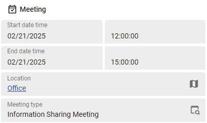 One column in a form with two fields placed side by side
 The maximum form column space is based on label and field width
Field number of positions further
menu User interface > Subjects > tab Default/Variants > tab Components > tab Form
- To place more than one field on a single line or to create blank spaces, enter the value 0 in the column Field no. of positions further. Then, this field and its label will be displayed on the same line as the previous field. To remove its corresponding label, you also need to enter the value 0 in the column Label width.
- To add a field in a lower position: enter, for example, the value 3 to add the field two places lower.
Field in next group (form)
To group fields that belong together in a form:
menu User interface > Subjects > tab Default/Variants > tab Components > tab Form
- Select the checkbox Next group for the first field of the new group.
- Enter a label for the group in the field Group label.
- Select an icon for the group in the field Group icon.
Settings for groups and tabs can also affect hidden columns.
If you are getting unexpected results, such as fields or columns in an unexpected group or tab,
clear the prefilter Possibly visible to see the hidden columns.
This prefilter is active by default.
Universal UI The setting Next group adds an empty position to the form if no label or icon is specified for the group. This space separates the new group from the previous one, even if they are vertically aligned within the same form column. If this is not intended, use Field in next column instead to create a new group without the empty position acting as a separator.
Field in next column
It is possible to force fields into the next column. All the following fields, including groups, will also be displayed in the next column.
menu User interface > Subjects > tab Default/Variants > tab Components > tab Form
- Select the checkbox Field in next column for the first field that should be displayed in the next column.
- Optional. Combined with the setting Field no. of positions further = 0, the field will get a new position on the form instead of next to its predecessor (see also Field number of positions further).
The following rules apply:
- In forms or form sections without groups, fields remain together vertically instead of spreading horizontally within the form or form section.
- Universal UI To place fields in two columns, if space permits, combine the setting Field in next column (halfway the fields) with the setting Fields on next tab page.
- Universal UI In forms or form sections with groups, fields move to a new column if space permits. However, a field will only move to a new column if available form columns exist. Availability depends on the horizontal width and other settings, such as the maximum number of form columns. If the field cannot move to a new column, there will be no visual indication that the group is separated.
When Field in next column is set, but the entire preceding group is hidden, the Universal UI removes the label and icon of the preceding group. In previous generation GUIs, the group 'inherited' the label and icon from the field marked with Field in the next column. To ensure a smooth transition from previous generation GUIs, you can execute the enrichment Retain group label and icon for fully hidden form groups. This enrichment transfers the Field in next column setting to the hidden form field that introduces the group.
Fields in next tab or section
-
Universal UI - The Universal UI is oriented vertically, which means that a form can be vertically divided into sections.
- To place fields over the full width of a form, combine the setting Fields on next tab page with the setting Next group.
- To place fields in two columns (if space permits), combine the setting Fields on next tab page with the setting (halfway the fields) Field in next column.
-
Windows GUI - The Windows GUI is oriented horizontally, which means that a form can be horizontally divided into tabs. If the data does not fit on the next tab, it will be renumbered.
 Example of multiple numbered tabs in the Windows GUI
To move fields to the next tab or section with their own label and icon:
menu User interface > Subjects > tab Default/Variants > tab Components > tab Form
- Select the column that should be shown on the next tab or section.
- Select the checkbox Field in next section.
- Enter a name for the next tab or section in the field Tab page label.
- Select an icon for the next tab or section from the drowpdown or lookup in the field Tab icon name. The Tab icon is automatically shown.
If a tab container has a vertical orientation and at least one of its detail tabs has an icon, icon space is reserved for every detail tab in that container, even if they have no icon. See also Vertical tabs.
Settings for groups and tabs can also affect hidden columns.
If you are getting unexpected results, such as fields or columns in an unexpected group or tab,
clear the prefilter Possibly visible to see the hidden columns.
This prefilter is active by default.
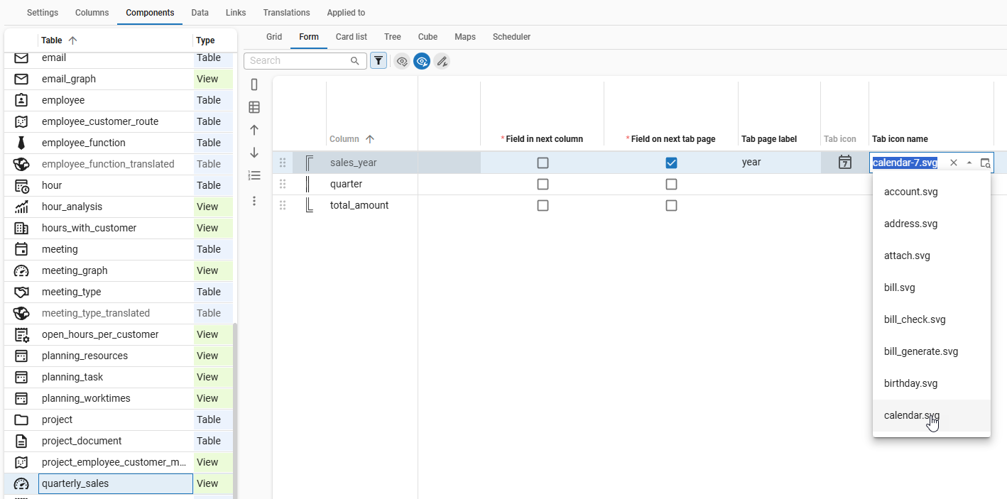 Move sales_year field to the next tab
Collapse a section by default
Universal UIBy default, all sections in a vertical form are expanded to show all columns inside. For larger forms, this can be undesirable since it may impact performance and overwhelm the user. Keeping sections collapsed by default can improve usability and efficiency.
In IAM, a main administrator is allowed to grant users permission to collapse and expand sections in a form, see Create or edit a user preference configuration.
To prevent a collapsible section from being expanded by default:
menu User Interface > Subjects > tab Default/Variants > tab Components > tab Form
-
For the first column in a section, select the checkbox Field in next section.
-
Enter a Tab page label or Tab icon name. Without one, the section cannot be collapsed or expanded. Either:
-
Enter a label that clearly explains to the user which fields are present in the collapsed section.
-
And/or select an icon that clearly indicates the content of the collapsed section.
-
Or enter a white space in the Tab page label to create a bar without a label. This still allows users to expand or collapse the section.
Examples of bars for collapsible sections
The example below shows a form with three sections with different bars:
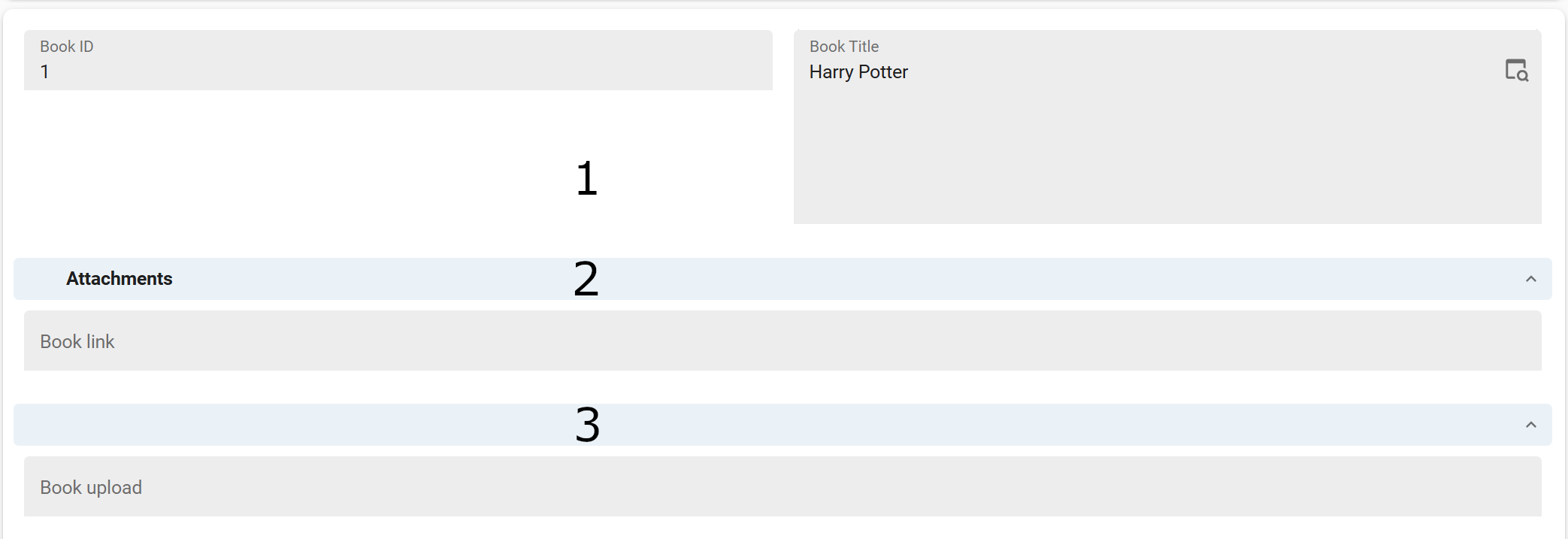
- The first section has no Tab page label or Tab icon name, so it cannot be collapsed or expanded.
- The second section has a Tab page label explaining the content of the section. The section can be collapsed or expanded.
- The third section has a white space in the Tab page label. The section can be collapsed or expanded but does not have a label to explain the content.
 Example of different bars for collapsible sections in a form
-
-
Clear the checkbox Default expanded.
Copy from grid
To copy the order and visibility settings of a grid to the form:
menu User interface > Subjects > tab Default/Variants > tab Components > tab Form
- Execute the task
 .
.
The order will be copied by default, one-to-one. To also include the visiblity, select Visibility in the pop-up.
If necessary, the visibility will be transformed based on the Type of the source:
- If it is editable or read-only, the visibility will be transformed to always.
- If it is hidden, the visibility will be transformed to never.
Card list
A card list displays columns vertically, which is more suitable for smaller screens such as mobile devices. We recommend limiting the number of columns in a card list to ensure optimal readability and usability.
menu User interface > Subjects > tab Default/Variants > tab Components > tab Card list
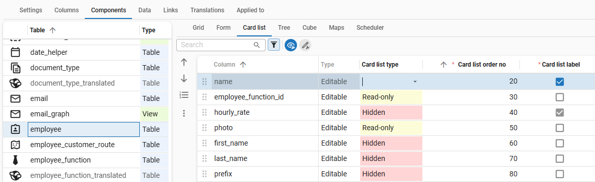 Card list configuration
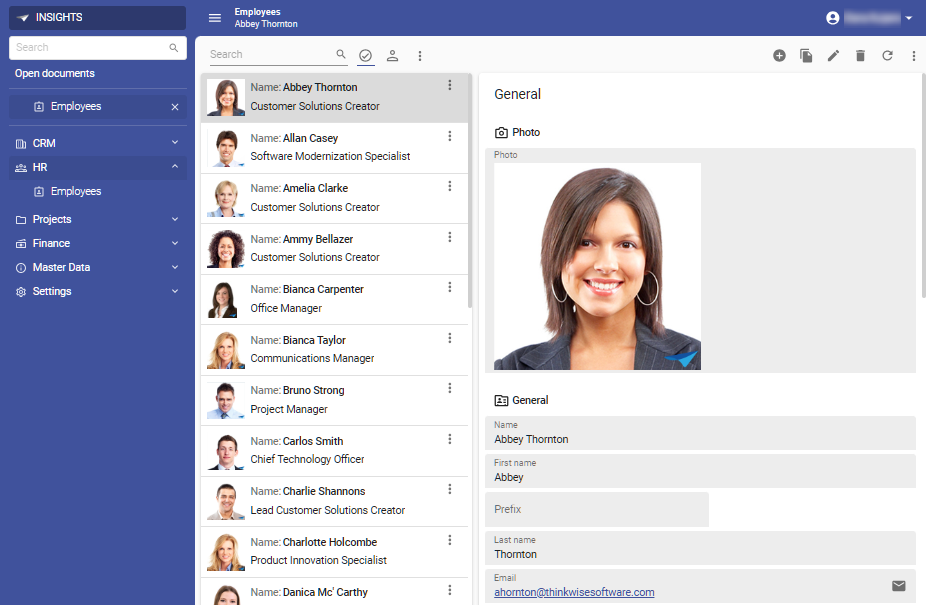 Example of a card list in the Universal UI
Tree
menu User interface > Subjects > tab Default/Variants > tab Components > tab Tree
A tree view can be created by using a screen type that contains a Treeview component.
- For more information on settings, see Tree settings.
- It is possible to model on which sorted columns the tree has to group. See Group columns.
Cubes
menu User interface > Subjects > tab Default/Variants > tab Components > tab Cube
This indicates whether a table or view is a cube and which options this offers. See cubes.