Screen types
Introduction to screen types
The screen type of a subject (table or variant) determines the screen structure used to visualize the subject. There are four different levels for which a screen type can be specified:
- Main screen: when the table is opened from the menu.
- Detail screen: when a table is a detail of another table.
- Pop-up screen: when a table opens as a pop-up.
- Zoom screen: when a detail of another table is double clicked so it opens as a main size screen.
If the screen type is left empty, then the standard screen type as indicated at the branch, is used.
Design a screen type
Create a screen type
Before designing a custom screen type, you first have to create one:
menu User interface > Screen types > tab Screen types > tab Form
- Enter a name in the field Screen type.
Keep the name of the screen type abstract, so you can use it in more places. For example, not customer but parallel_detail.
-
The following settings are available:
Add screen components
For an overview of all the components, see Available screen components.
To add and arrange the screen type components:
menu User interface > Screen types > tab Design
For more information about the Design tab, see Overview of the Design tab.
- Drag components into the design area. See also Available screen component.
The Tab container is an important screen component. For more information on how to use it, see Add a tab container with components and Add a detail tab.
- If necessary, configure the components. See Settings and properties for screen components
The following rules apply:
- The first component will fill the entire page.
- If you drag another component into the design area, both components will get a frame at the position where it is dragged.
- You can reposition the components freely using drag-drop.
- You can place a number of button bars and a filter next to each other instead of on top of each other. This allows for a more efficient use of the available space.
- White space between the various components is added automatically.
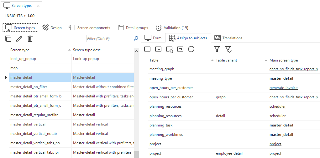
Assign the screen type to a subject
To assign a screen type to a subject:
menu User interface > Screen types > tab Screen types
- Select the screen type that you want to assign to a specific table.
- Go to the tab Assign to subjects.
- Select the table(s) and variant(s) to which you want to assign the selected screen type.
- Execute one of the Assign screen type [...] tasks (main, detail, zoom, or popup).
The name of the screen type is highlighted in bold. Underlined screen types are explicitly set up to deviate from the standard screen types defined at the branch.
It is also possible to assign a screen type to a subject in the Subjects screen: menu User interface > Subjects > tab Default/Variants > tab Settings > tab General > group Screen type. See Screen type settings.
 Assigning screen types
Screen preview
Best practice is to open your end application and to refresh the model after you have made some changes.
- Windows GUI Refresh model is available in the Developer ribbon.
- Universal GUI Refresh model is available in the Profile menu.
For both, Developer mode is required. See Developer mode.
When the screen is developed according to your wishes, it is possible to display a preview of the screen in the Software Factory.
menu User interface > Screen types > tab Design
-
Connect to an end product by selecting Connect
 .
Use the Thinkwise Mock Database provider to display a preview without the end application. The preview is then displayed with dummy data.
.
Use the Thinkwise Mock Database provider to display a preview without the end application. The preview is then displayed with dummy data. -
Select the table to which it needs to be connected and select Preview
 .
.
A new document opens inside the Software Factory development environment, showing the screen type applied to the selected subject.
You can reload the model with Refresh  .
.

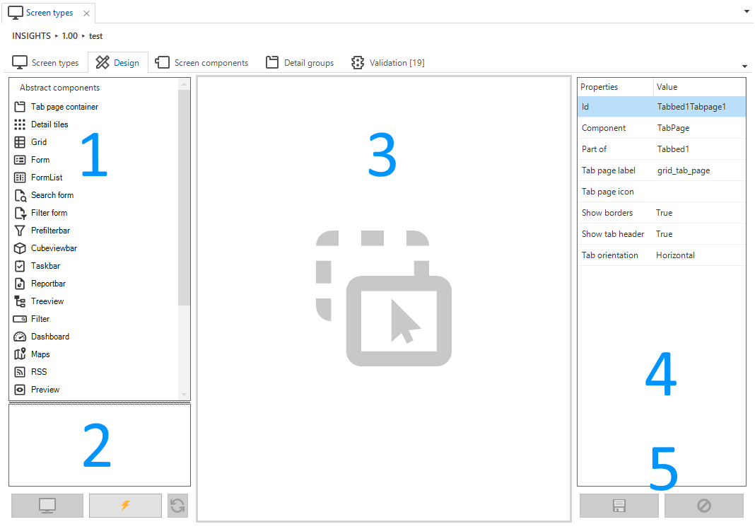
Overview of the Design tab
When a new screen type is created, it can be designed on the tab Design. This tab consists of:
 Designing a screen type
- Abstract components - An overview of the available abstract screen components that can be dragged into the design area.
- Preview - Test your screen type on an existing end product.
- Design area - Drag the screen components here to create your own screen type, .
- Properties - The properties of the selected component. These can be manually adjusted.
- Save and reset - Save or reset your modifications.
Available screen components
The following components are available that can be dragged into the design area:
| Icon | Component | Explanation | Properties |
|---|---|---|---|
 | Tab container | The tab container ensures that several tabs can be used under which the details or other components can be classified. Empty tabs are removed by the user interface. | Show borders (True/False) Show tab headers (True/False) Tab orientation (Horizontal/Vertical) |
 | Detail tiles | This component shows the subject details in tiles. Clicking on a tile will open a new document. | |
 | Grid | Shows multiple records in a grid. The user interface will remove the grid if there can only be at most one line. | Show grid header (True/False) |
 | Form | Data from one row can be presented and modified in the form. | |
 | Formlist | This component displays a form without tab pages for every row in the grid. All the forms will be stacked and a scrollbar will be created when it exceeds the screen. | |
 | Search form | The search form provides an overview of the (limited) search set on the screen. The search result is marked, and all other rows remain visible. | |
 | Filter form | The filter form provides an overview of the (limited) filter set on the screen. The result is filtered, and all other rows are removed as long as the filter is active. Universal GUI Columns with the following domain Control types (as set in the menu Data > Domains > tab Form > field Control) are not supported: Date, DateTime, Time, Label, Group header label, Group header icon,, RTF, SQLeditor, Multiline, Image link, Image upload, Image BLOB, File, File upload, Signature, Video link. | |
 | Prefilter bar | A button for all prefilters is displayed in this bar. The user interface will remove this component if there are no (visible) prefilters. | Alignment (Left/Right or Top/Bottom) |
 | Cube view bar | To display the available cube views in a bar on the screen, in the same way as prefilters, tasks, and reports. Use it, for example, to develop screens with only charts and the toolbar to select the view. The user interface will remove this component if there are no cube views. See also Business intelligence. | Alignment (Left/Right or Top/Bottom) |
 | Task bar | In this bar, a button is displayed for each available task. The task buttons then disappear from the standard action bar at the top. The user interface will remove this component if there are no tasks. See also Task bar. | Alignment (Left/Right or Top/Bottom) |
 | Task tiles | Universal GUI All tasks assigned to the subject will be displayed as tiles. | Alignment (Left/Right or Top/Bottom) |
 | Report bar | A button for all reports is displayed in this bar. The user interface will remove this component if there are no reports. | Alignment (Left/Right or Top/Bottom) |
| Report tiles | Universal GUI All reports assigned to the subject will be displayed as tiles. | Alignment (Left/Right or Top/Bottom) |
 | Treeview | Displays a tree structure. The user interface will remove the structure if there can only be at most one row. See also Tree view properties | |
 | Filter | The filter can be used for quick filtering on several columns. In the Universal GUI, columns with the following domain Control types (as set in the menu Data > Domains > tab Form > field Control) are not supported: Date, DateTime, Time, Label, Group header label, Group header icon,, RTF, SQLeditor, Multiline, Image link, Image upload, Image BLOB, File, File upload, Signature, Video link. | Dock (Left/Fill/Right) |
 | Dashboard | Displays the data in a Dashboard form. The user interface will remove the component if there is no maps definition for the table. At the time of writing, this can only be created with an object model extender. | |
 | Map | The Maps component displays a folder in which data can be viewed. The user interface will remove the component if there is no maps definition for the table. At the time of writing, this can only be created with an object model extender. | |
 | Preview | Displays the first column of a table that contains a file link or path (for instance a URL or a file upload column). | |
 | Pivot table | Provides the possibility to display a pivot table. The user interface will remove the pivot table if there is no cube definition for the table. See also Business intelligence. | |
 | Pivot table fields | Provides the possibility to display fields that can be dragged and dropped in a pivot table. The user interface will remove the pivot table fields if there is no cube definition for the table. See also Business intelligence. | |
 | Graph | Displays a graph on the screen. The user interface will remove the graph if there is no cube definition with a graph for the table. See also Business intelligence. | |
 | Scheduler | The scheduler displays a graphical planning. The user interface will remove the component if there is no scheduler definition for the table. Windows GUIWeb GUI - A scheduler can only be created with an object model extender. Universal GUI - Available as a component with limited functionality, but no object model extender is needed. | |
 | Card list | Universal GUI This component shows records as cards, with an image and title, in a scrollable list. | |
 | Action bar | Universal GUI This component replaces the default action bar, and can be placed anywhere on a screen in a horizontal position. See also Change the order in the action bar. | |
 | RSS | Displays an overview in which RSS feeds can be presented. The user interface will remove the component if there is no RSS definition for the table. At the time of writing, this can only be created with an object model extender. |
Settings and properties for screen components
Component settings within a screen type
Each screen type is a collection of several components. Each screen component within a screen type has its own settings:
menu User interface > Screen types > tab Screen components
The tab Screen components displays an overview of the selected screen type's components in a tree structure. Depending on the horizontal or vertical orientation of the component you can adjust the following settings:
- Height, Height unit, Width, and Width unit - the height and width in pixels or a percentage
- Fix on resize - Select if the size should remain the same when the screen is resized.
Component properties within the Design tab
In the tab Design, properties are available that you can adjust while designing the screen type:
menu User interface > Screen types > tab Design
Click on a component to change its configuration in the panel on the right-hand side of the screen. Each component has its own settings, like:
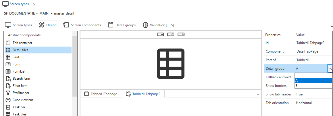
- Detail group. By default, you can select one of the options A, B and C. You can add new detail controls on the tab Detail groups
- Fallback group. See Fallback groups
- Tab page label
- Tab page icon.
Universal GUI Icons are hidden by default. To show them, add the extended propertyShowTabIcons. See Extended properties - Show or hide borders or tab headers. See Hide tab headers and borders
- Show tab headers
- Tab orientation. See Horizontal or vertical tabs
Available for user preferences
For each screen type, you have the option to make it available for user preferences. If enabled, users can choose a different screen type in their preferences.
menu User Interface > Screen types > tab Form > tab Screen types
- Select the checkbox Available for user preferences.
If you developed a screen type specifically for one particular process, it may not be suitable for other subjects. In such cases, clear the checkbox Available for user preferences.
Hide the breadcrumbs
Universal GUISometimes, showing the breadcrumbs is not useful for a screen type.
To hide the breadcrumbs by screen type:
menu User Interface > Screen types > tab Form > tab Screen types
- Select the checkbox Hide breadcrumb.
Hide the main action bar
Sometimes the action bar that is shown by default does not make sense for a screen type.
To hide the toolbar by screen type:
menu User interface > Screen types > tab Form > tab Screen types
- Select the checkbox Hide main action bar.
Change the order in the action bar
You can reposition the items in the action bar. You could, for example, place the tasks on the left and the search field on the right.
menu User interface > Screen types > tab Screen components > tab Form > tab Screen component properties
To change te order of items in the action bar:
- Add the Screen component prop
toolbar_orderto the top screen component in the screen tree. - Enter the Value in JSON format.
{
  "start": [
    "Extra",
    "Crud"
  ],
  "end": [
    "Reports",
    "Prefilters",
    "Tasks",
    "CubeViews",
    "Search"
  ]
}
This JSON object has two properties, "start" (the items on the left) and "end" (the items on the right).
Both properties are arrays that can hold the following values:
- "Search"
- "Prefilters"
- "Crud"
- "Tasks"
- "Reports"
- "CubeViews"
- "Extra"
Most of these are self-explanatory. "Extra" holds the items in the overflow menu like Import, Export, Filter, Restore sort order, etc.
Hide tab headers and borders
menu User interface > Screen types > tab Design
You can hide the tab header completely or only hide its border. Select a tab container, and use the following tab properties to achieve this:
- Show tab header
- Show borders
These fields can both be set to false to hide their respective properties.
Horizontal or vertical tabs
Universal GUIBy default, tabs in a Tab container component are displayed horizontally, next to each other. It is possible, however, to display them vertically, to make the tabs look like a menu.
For more information about the use of icons in vertical tab headers, see Fields on next tab.
 Vertical tabs example
To convert a (horizontal) tab panel in the Tab container component of a screen into a vertical tab panel:
menu User interface > Screen types > tab Design
-
Select the Tab container component.
-
In the screen type modeler on the right-hand side, change the property Tab orientation to Vertical.
 Tab orientation property in the screen type modeler
Breakpoints
Some definitions
Universal GUIResponsive screens are designed to work well on mobile, tablet, and desktop devices, by adapting the layout to the device and screen size. A responsive screen is created by using breakpoints in combination with screen types.
Breakpoints are the points at which your GUI changes to a screen type that presents the data with the best possible layout, depending on the screen size.
A breakpoint screentype is a horizontal screentype without splitters that is suitable for small devices. It is used after reaching the breakpoint for its connected or original screentype.
Add your own breakpoint screentype
For every screen type in the Software Factory, you can define one or more breakpoints. When this breakpoint has been reached, the GUI will switch to the screentype you selected.
menu User interface > Screen types > tab Form > tab Screen types
- Enter a Breakpoint in pixels.
- Select the Breakpoint screen type that should be used as of this breakpoint.
Add a task-created breakpoint screentype
For an existing screentype, you can use a task to create a breakpoint screentype. This screentype is based on its original screentype and automatically connected to it.
menu User interface > Screen types
- Select the screentype for which you want to create a breakpoint screentype.
- Select the task Create horizontal screentype as breakpoint
 .
. - Enter the Breakpoint.
Breakpoints debug mode
Universal GUIIn the Universal GUI, a debug mode is available to help add breakpoints.
It is enabled by setting debugMode: true in the config.json.
Now, the current width and active screen type for each screen are shown in the GUI.
If a screen type is a breakpoint, you will also see the screen type that it is a breakpoint of.
Breakpoints example
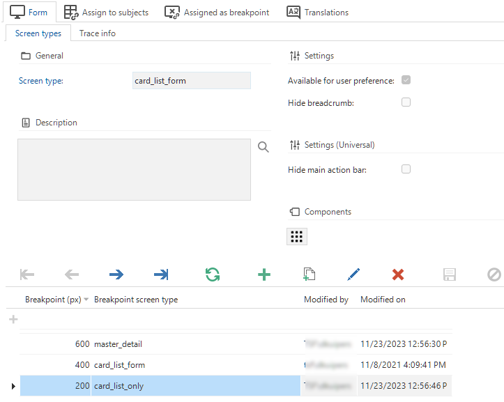
menu User interface > Screen types > tab Form > tab Screen types
It is possible to define more breakpoints:
| Breakpoint (px) | Breakpoint screen type |
|---|---|
| 600 | master_detail |
| 400 | card_list_form |
| 200 | card_list_only |
- In this situation, the used screen type is master_detail as long as the number of pixels is between 400 and 600.
- When the screen is made smaller, between 200 and 400 pixels, the GUI switches the screen type to card_list_form.
- And when the screen is smaller than 200 pixels, the GUI will show screen type card_list_only.
 Example of a breakpoint set-up
Fallback groups
Introduction to fallback groups
menu User interface > Screen types > tab Design
You can assign detail references to a specific Detail group in the model. If this detail group is not available in the assigned screen type, the detail references will be shown in the Fallback group. If no fallback group is present in the screen type, the detail references will not be shown. If multiple fallback groups are provided, the GUI will decide where to show the details.
You can use fallback groups to, for example:
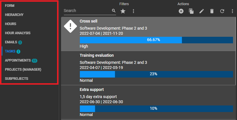
- Manage where details that do not belong to any detail group in the screen type are shown if there are multiple detail tabs or detail tiles on the screen.
- Only show a very specific set of details if they are shown in a detail group, but show more details if you zoom in on them.
- Leave the choice to the user (using user preferences) to display a screen type with a restricted set of details or a screen type with an extensive set of details.
- Show a more restricted set of details on specific break points.
For example, you have set up the standard screen type master_detail.
This screen type uses detail group 'A' for its detail tabs.
Fallback allowed is on for the details.
If you apply this screen type, the details of group 'A' will be visible. Additionally, items assigned to other detail groups and items without a group will be visible as well (if they exist).
If you want to restrict the visible details to only group 'A', clone master_detail.
Give the new screen type a name, for example, master_details_essentials.
Make sure that Fallback allowed is off for this screen type.
Only details that are explicitly part of group 'A' will be displayed on master_details_essentials.
Set up fallback groups
You can set up fallback groups in menu User interface > Screen types, either on tab Design or tab Screen components:
- On tab Design, set the field Fallback allowed to True to indicate that the currently selected tab page can be used as a fallback group.
- On tab Screen components, select the checkbox Use as fallback group for the screen component(s) that will be the fallback group.
Fallback group scenarios
Five distinct fallback group scenarios are possible. They are based on the combination of fallback settings in a screen type and which tab pages are available.
In the following examples, imagine that there are three detail groups specified in subjects: A, B, and undetermined. There are two detail containers: A and B. In some scenarios, only container A is present.
The table below shows in which detail container(s) the detail groups are displayed in each scenario.
| Detail container A present | Detail container B present | Fallback detail container | Result |
|---|---|---|---|
| Yes | No | None | Only detail tab pages assigned to detail group A are visible (in container A). |
| Yes | No | A | All detail tab pages are visible in container A. |
| Yes | Yes | None |
|
| Yes | Yes | A |
|
| Yes | Yes | A & B |
|
Detailed example
Situation
- The 'ARTICLE' screen has two screen types: 'MAIN' and 'ZOOM'. It also has two detail tabs: 'PRICES' and 'LOCATION'.
- In the 'MAIN' screen type, two detail groups are available: 'A' and 'B'. The 'ZOOM' screen type, however, only contains detail group 'A'.
Using the fallback option, you can either group all details ('PRICES' and 'LOCATION') into the fallback group or hide all detail groups not present in the screen type.
Goals
- Show both detail tabs if you open the 'ARTICLE' screen via the menu ('MAIN').
- Hide the 'LOCATION' detail tab if you access it via a lookup ('ZOOM').
Implementation
- Assign detail group 'A' to 'PRICES' and detail group 'B' to 'LOCATION'.
- In the 'ZOOM' screen type, set Fallback allowed to False.
This will ensure that all details assigned to detail group 'B' are hidden if you access the 'ARTICLE' screen via a lookup.
Tab container component
The component Tab container has two functions:
- Add tab pages that contain other components
- Add tab pages for details
If you add a Tab container to your screen type, it shows one tab by default. You can add other components to this tab. Use the context menu to add extra tabs, and to change a component tab to a detail tab and vice versa.
Add a tab container with components
A Tab container can contain other components, for example, a Grid, a Form, and a Task bar.
To insert a tab with other components:
menu User interface > Screen types > tab Design
- Drag the component Tab container into the design area.
- Right-click on the tab container and select Edit tab pages from the context menu (right mouse button).
- Drag other components to this tab.
- If necessary, configure the components. See Screen component properties.
- To add another tab at the same level as the first, select Add component tab page from the context menu.
This example shows a Tab container with a Grid, a Form, two Task bars, and a second tab.
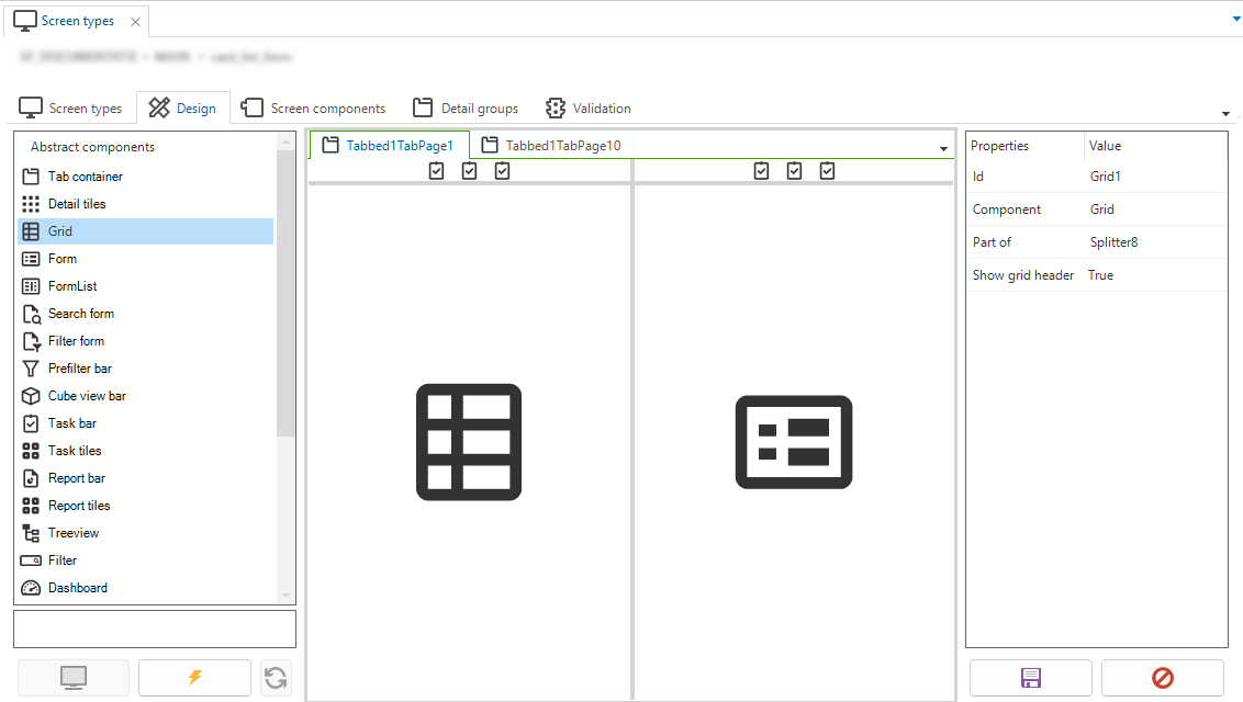 A tab container with components
Add a detail tab
To insert a tab with subject details:
menu User interface > Screen types > tab Design
- Drag a Tab container component into the design area.
- From the Tab container, open the context menu (right mouse button).
- Select Change component tab page to detail. The tab will become gray and the details will be initialized based on the definitions of the subject.
- If necessary, configure this components. See Screen component properties.
 Detail tab page groups
Detail tiles component
To insert a Detail tiles component with subject details:
menu User interface > Screen types > tab Design
-
Drag a Detail tiles component into the design area.
-
Select a Detail group setting on the right-hand side of the screen.
By default, options A and B are available, but you can add new options in the tab Detail groups.
In the Subjects details screen, you can distribute the subject details among the detail groups.
If a detail group is not available in the assigned screen type, the detail references are shown in a fallback group.
Task bar component
A task bar component displays a button for each task. The user interface will remove this component if there are no tasks present.
If no task bar is present, tasks are displayed in the action bar. If you add a task bar, it will display a button for each task, and these tasks are not shown on the action bar anymore.
Universal GUI- The taskbar automatically resizes to fit the icons.
- You can place both a task bar and a task tiles component on a screen. Multiple task bars on one screen are also possible.
- If you place the task bar at the top of the screen, it will become part of the main action bar. In that case, it will never be removed from the main action bar, even if the screen contains another taskbar or task tiles component.
Task bar component icon sizes
For the icons in a task bar, you can choose from 7 sizes (in pixels).
 Screen type with task bar and Icon size property
In the Universal GUI, these sizes are translated into 3 possible values, according to the following table. The icon size is also affected by the Compact or Comfortable mode setting. In compact mode, less padding is applied. More padding is applied in the comfortable mode.
| Icon size in Software Factory | Icon size in Universal GUI | Button size Compact mode | Button size Comfortable mode |
|---|---|---|---|
| 16*16, 20*20 | 20*20 | 32*32 | 40*40 |
| 24*24 | 28*28 | 40*40 | 48*48 |
| 32*32, 40*40, 48*48, 64*64 | 36*36 | 44*44 | 56*56 |
The icon size set for task bar icons also applies to icons in the action bar at the top.
Preview component
The preview component supports a wide range of file formats, including but not limited to:
-
Images (.jiff, .jpg, .jpeg, .bmp, .png, .ico, .svg, .gif)
-
Text files (.txt, .cs, .java, .ini, .log, .bat and .sql)
-
Web pages (.html, .htm, .xml, .gif, .msg and .svg)
-
XML files (.xml)
-
Universal GUI Outlook emails (.msg, .eml)
noteYou can download attachments in emails directly from the preview.
-
PDF and PostScript files (.pdf and .ps)
-
URLs
If a preview cannot be generated for a file, the preview component will state 'No preview is available'.
Enable Cross-Origin Resource Sharing (CORS)
By default, a website only allows requests that come from the same origin (domain). If you host a website yourself and you want to allow requests from another origin, you can use Cross-Origin Resource Sharing.
This concept also applies to previewing websites for another domain in the Universal or Web GUI. This is only possible if the request is allowed in the configuration of the website you want to preview.
Scheduler component
For Windows GUI and Web GUI, a scheduler can only be created with an object model extender.
- Place the Scheduler screen component in the screen type.
- For more information about setting up the Scheduler, adding views with a different time scale, and an overview of its available features, see the Scheduler manual.
Formlist component
Windows GUI Universal GUIA formlist can be created by using a screen type that contains a FormList component. A formlist uses the subjects and columns Form settings for visualization and positioning.
The FormList component shows the content of multiple rows within a single form. A formlist is always in edit mode. There are no action buttons, every change is automatically saved. Formlists are used to display dynamic forms that can have different control types.
Suppose a survey contains multiple questions with different types of answers. For example, a full name (string), a birth date (DateTime), and a Yes/No checkbox that indicates whether the user wants to receive commercial emails or not. Using a formlist, this survey would look like this:
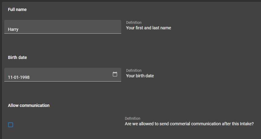 Example of a formlist
In this example, a Layout control procedure in combination with an answer type field can be used to show the correct answer field for the related question. The corresponding stored procedure is then executed to determine the visibility of each control.
Using a Group label control type in a Form or FormList component results by default in a bold (group) label. See the labels Full name, Birthdate and Allow communication in the image above.
Formlist details and restrictions
Universal GUIIn a formlist, the Universal GUI supports the following control types: String, Number, Decimal, DataTime/Date/Time, Checkbox, and Radiobutton.
- HTML, file, lookup, and combo box controls are not supported.
- There can only be one form column. Multiple form columns are not supported.
- For adjacent fields, the width is evenly distributed over the available width, regardless of the settings in menu User Interface > Subjects > tab Components > tab Form.
- When grouping controls for a single record, the
field in next groupandfield in next taboptions are not supported. - A formlist is default editable and works around the subject editing mechanism. Without any other editable components, like form or grid, CRUD buttons are hidden on the action bar.
- A formlist patches directly to the table just after changing a value. To keep the editing experience fast and smooth, no data is refreshed and field visibility is not updated.
- After changing a field value, layout changes (whether fields are visible or not) are not performed.
- After changing a field value, other dataset changes are not visible instantly.
- As layout mode, only the navigation layout mode can be used.