Screen type design
Introduction to screen types
The screen type of a subject (table or variant) determines the screen structure used to visualize the subject. There are four different levels for which a screen type can be specified:
- Main screen: when the table is opened from the menu.
- Detail screen: when a table is a detail of another table.
- Pop-up screen: when a table opens as a pop-up.
- Zoom screen: when a detail of another table is double clicked so it opens as a main size screen.
If the screen type is left empty, then the standard screen type as indicated at the branch is used.
 Screen type overview
Design a screen type
Create a screen type
Before designing a custom screen type, you first have to create one:
menu User interface > Screen types > tab Screen types > tab Form
-
Enter a name in the field Screen type.
noteKeep the name of the screen type abstract, so you can use it in more places. For example, not customer but parallel_detail.
-
Optional. Select a Screen type group. For more information, see Group a screen type.
-
The following settings are available:
Add screen components
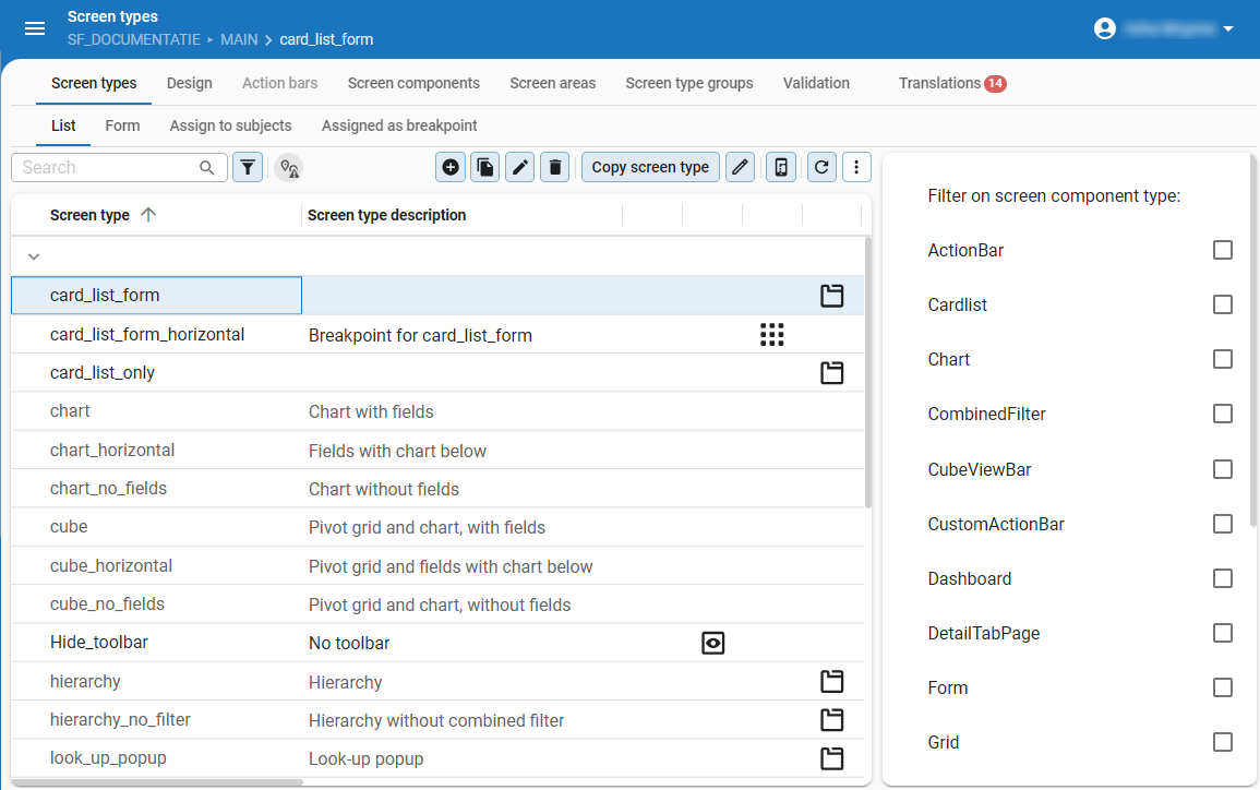
- For an overview of all the screen components, see Available screen components.
- The Tab container is an important screen component. For more information on how to use it, see Tab container component.
- To quickly find screen types with specific components, use the filter in the FormList in the tab Screen types.
- For more information about the Design tab, see Overview of the Design tab.
To add screen components to the screen type:
menu User interface > Screen types > tab Design
- Drag screen components into the design area.
- If necessary, configure the components. See General screen component settings.
The following rules apply:
- The first component will fill the entire page.
- If you drag another component into the design area, both components will get a frame at the position where it is dragged.
- You can reposition the components freely using drag-drop.
- You can place bars and filters both horizontally and vertically in a screen. In both cases, you can place them next to each other instead of on top of each other. This allows for a more efficient use of the available space.
- White space between the components is added automatically.
Assign the screen type to a subject
To assign a screen type to a subject:
menu User interface > Screen types > tab Screen types
- Select the screen type that you want to assign to a specific table.
- Go to the tab Assign to subjects.
- Select the table(s) and variant(s) to which you want to assign the selected screen type.
- Execute one of the tasks: Assign screen type [...] (main, detail, zoom, or popup).
The name of the screen type is highlighted in bold. Underlined screen types are explicitly set up to deviate from the standard screen types defined at the branch.
It is also possible to assign a screen type to a subject in the Subjects screen: menu User interface > Subjects > tab Default/Variants > tab Settings > tab General > group Screen type. See Screen type settings.
Screen preview
Best practice is to open your application and to refresh the model after you have made some changes.
- Windows GUI Refresh model is available in the Developer tab of the ribbon.
- Universal UI Refresh model is available in the Profile menu.
For both user interfaces, Developer mode is required. See Developer mode.
When the screen is developed according to your wishes, it is possible to display a preview of the screen in the Software Factory.
menu User interface > Screen types > tab Design
-
Connect to your application by selecting Connect
 .
Use the Thinkwise Mock Database provider to display a preview without the application. The preview is then displayed with dummy data.
.
Use the Thinkwise Mock Database provider to display a preview without the application. The preview is then displayed with dummy data. -
Select the table to which it needs to be connected and select Preview
 .
.
A new document opens inside the Software Factory development environment, showing the screen type applied to the selected subject.
You can reload the model with Refresh  .
.
 A screen type preview open in the Software Factory
Overview of the Design tab
When a new screen type is created, it can be designed on the tab Design. This tab consists of:
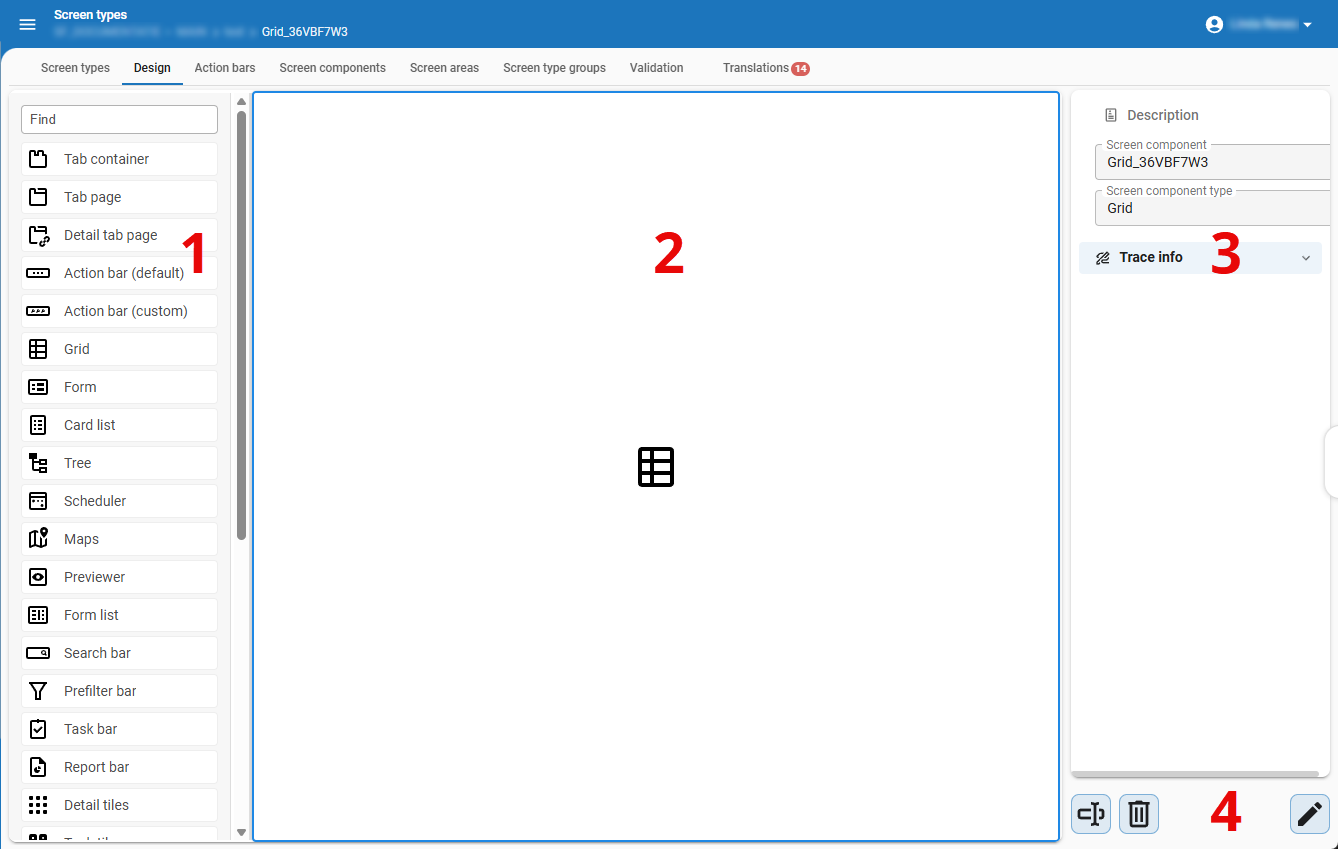 The Design tab with the component panel, design area, and properties panel
- Abstract components - An overview of the available abstract screen components that can be dragged into the design area.
- Design area - Drag the screen components here to create your own screen type.
- Properties - The properties of the selected component. These can be manually adjusted.
- Rename, delete, or edit - Rename, delete, or edit the selected component. When in edit mode, you can save or cancel your changes.
Component properties within the Design tab
In the tab Design, properties are available that you can adjust while designing the screen type:
menu User interface > Screen types > tab Design
Click on a component to change its configuration in the Properties panel on the right-hand side of the screen. Each component has its own settings, such as:
- Screen area. See Screen areas
- Fallback area. See Fallback areas
- Tab page label
- Tab page icon. Icons are hidden by default. To show them, enable the setting Show tab icons in the tab Model settings. See Default model settings for a branch.
- Show or hide borders or tab headers. See Hide tab headers and borders
- Tab orientation. See Horizontal or vertical tabs
You can change the tab page label and icon for a tab container. See Label and icon of a tab container.
Screen type settings
Group a screen type
You can organize your screen types by grouping them, which is useful if you have many screen types. Each screen type can belong to only one group. Grouping screen types does not affect anything in the application, it is purely for organizational purposes.
To create a screen type group:
menu User interface > Screen types > tab Screen type groups
- Add a Screen type group and enter a name.
- Optional. Enter a Description.
- Go to the tab Screen types and select a Screen type group to assign the screen type to a group.
Allow users to select a different screen type
For each screen type, you have the option to make it available for user preferences. If enabled, users can choose a different screen type in their preferences.
menu User Interface > Screen types > tab Form > group Settings
- Select the checkbox Available for user preferences.
If you developed a screen type specifically for one particular process, it may not be suitable for other subjects. In such cases, clear the checkbox Available for user preferences.
Hide the breadcrumbs
Universal UISometimes, showing the breadcrumbs is not useful for a screen type. To hide the breadcrumbs by screen type:
menu User Interface > Screen types > tab Form > group Settings
- Select the checkbox Hide breadcrumb.
Configure a maximum screen size for modal screens
Universal UIA modal screen is a screen that overlays the main application. When a modal screen is active, the user cannot interact with the main application. A modal screen is often used to display additional information such as an alert, a confirmation, or a form.
You can configure a maximum height and width for a modal screen. This is useful when a document is opened in one of the following ways:
- as a lookup pop-up.
- as a Floating window or as a Modal document when using the Open document process flow action.
- as a Floating window or as a Modal document when using the Zoom detail process flow action.
To configure a maximum screen size:
menu User Interface > Screen types > tab Screen types > tab Form
- In the group Modal size (Universal UI only), select one of the following options in the fields Max. height and Max. width:
- Automatic - The GUI determines the width and height of the screen type.
- Maximum - The GUI uses as much width and height as possible within the screen or browser limits.
- Custom - A number of pixels, for example 850, which will not be exceeded.
The modal settings from the initial screen type will be used for lookup pop-ups, floating windows, and modal documents. Settings from subsequent breakpoint screen types will not be applied when the breakpoint is activated.
 Maximum size settings for a modal screen type
Breakpoints
Some definitions
Universal UIResponsive screens are designed to work well on mobile, tablet, and desktop devices, by adapting the layout to the device and screen size. A responsive screen is created by using breakpoints in combination with screen types.
Breakpoints are the points at which your GUI changes to a screen type that presents the data with the best possible layout, depending on the screen size.
A breakpoint screen type is a horizontal screen type without splitters that is suitable for small devices. It is used after reaching the breakpoint for its connected or original screen type.
Add your own breakpoint screen type
Universal UIFor every screen type in the Software Factory, you can define one or more breakpoints. When this breakpoint has been reached, the GUI will switch to the screen type you selected.
menu User interface > Screen types > tab Form > tab Breakpoints
- Enter a Breakpoint in pixels.
- Select the Breakpoint screen type that should be used as of this breakpoint.
Add a task-created breakpoint screen type
Universal UIFor an existing screen type, you can use a task to create a breakpoint screen type. This screen type is based on its original screen type and automatically connected to it.
menu User interface > Screen types > tab List
- Select the screen type for which you want to create a breakpoint screen type.
- Select the task Create horizontal screen type as breakpoint
 .
. - Enter the Breakpoint.
Breakpoints debug mode
Universal UIIn the Universal UI, a debug mode is available to help add breakpoints.
It is enabled by setting debugMode: true in the config.json.
Now, the current width and active screen type for each screen are shown in the GUI.
If a screen type is a breakpoint, you will also see the screen type that it is a breakpoint of.
Breakpoints example
Universal UImenu User interface > Screen types > tab Form > tab Breakpoints
It is possible to define more breakpoints:
| Breakpoint (px) | Breakpoint screen type |
|---|---|
| 600 | master_detail |
| 400 | card_list_form |
| 200 | card_list_only |
- In this situation, the used screen type is master_detail as long as the number of pixels is between 400 and 600.
- When the screen is made smaller, between 200 and 400 pixels, the GUI switches the screen type to card_list_form.
- And when the screen is smaller than 200 pixels, the GUI will show screen type card_list_only.
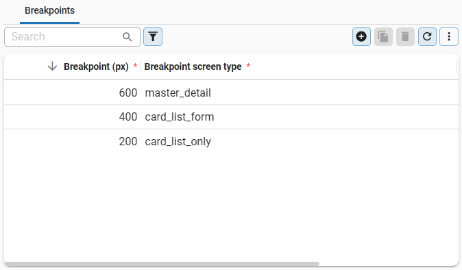 Breakpoints configured for three different screen widths
Screen areas
Introduction to screen areas
A screen area can be seen as a group of similar information in a screen type. You can use screen areas to organize information, for example:
- Configure details hierarchically or in a related way.
- Place buttons at different locations on a screen.
If a screen area is not available in the assigned screen type, the detail, bars, or tiles will be shown in the Fallback area.
Create a screen area
You can create your own screen areas and name them as suits your needs, for example:
- A, B, C, etc.
- General, Specific, Related, etc.
- Human resources, Financial, Logistics, etc.
To create a screen area:
menu User interface > Screen types > tab Screen areas
- Add a new screen area and enter a name.
The tab Usage shows where the screen area is being used. This can be helpful when, for example, you want to make a change to the screen area and see what impact this might have. For more information on this generic feature, see Usage.
Assign a screen area to a screen component
In a screen type, you can assign a screen area to the following components:
- Tab containers with subject details - see Add a tab container with subject details
- Detail tiles
- Prefilter bar
- Cube view bar
- Task bar and Task tiles
- Report bar and Report tiles
- Universal UI Actions in the Action bar or Custom action bar related to tasks, reports, prefilters, and cube views. See Action bars.
To assign a screen area to a screen component:
menu User interface > Screen types > tab Design
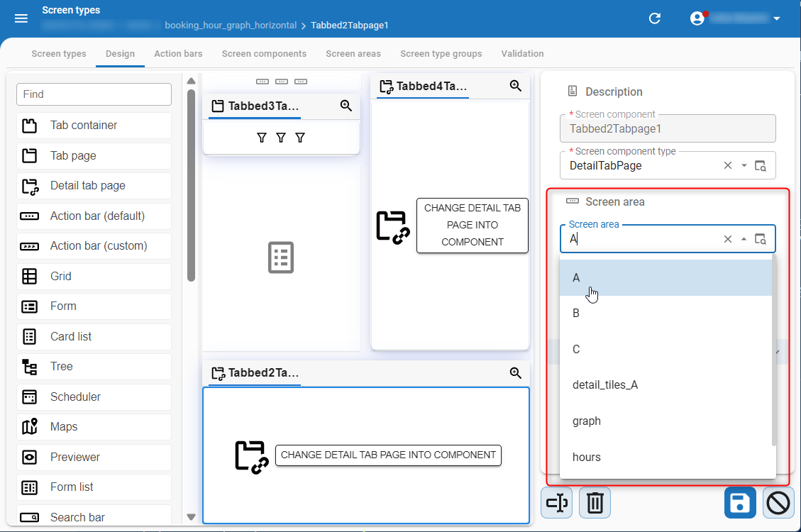
- Add a screen component to your screen type.
- In the Properties panel on the right-hand side of the screen, select the Screen area.
 Screen area assigned to a screen component in the Properties panel
Link a screen area to an object
If you have assigned a screen area to a screen component, you can link an object to the same screen area. That object will then be shown in that screen component. This is possible for:
- Details - Link a detail to a detail tab page. See Link a detail to a screen area
- Table tasks - To show a task in a Task bar or a (Custom) action bar, see Create a table task
- Table reports - To show a report in a Report bar or a (Custom) action bar, see Create a table report
- Prefilters - To show a prefilter in a Prefilter bar or a (Custom) action bar, see Create a prefilter
- Cube views - To show a cube view in a Cube view bar or a (Custom) action bar, see Create a cube view
Screen area example
Example: How we configured the tab General settings for branches in the Software Factory
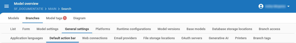
menu Models > Model overview > tab Branches > tab General settings
This example explains how the tab General settings and all its detail tabs are configured in the Model overview.
 All General settings for a branch
The screen type and screen area configuration for this screen
menu User interface > Screen types > tab Design
The screen type for this tab is called branch_maintenance, as shown in the image below.
- The tab container for General settings is
Tabbed1TabPage 18 - It contains one detail tab page
Tabbed8DetailTabPage5. - To this detail tab page, we assigned the Screen area = general_settings.
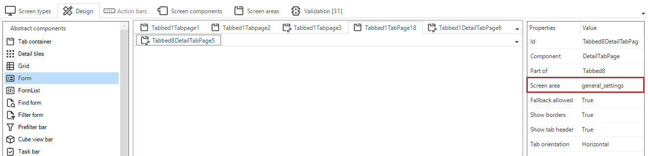 Screen type design for branch_maintenance with the general_settings screen area assigned
The tables that have been linked to the same screen area
All tables that must be available as a detail tab to the tab General settings have been linked to the same screen area as the detail tab page:
menu User interface > Subjects > tab Default/Variants > tab Links > tab Details
For each detail, the Screen area has been set to general_settings. As a result, all details are shown in their own tab page underneath the tab General settings.
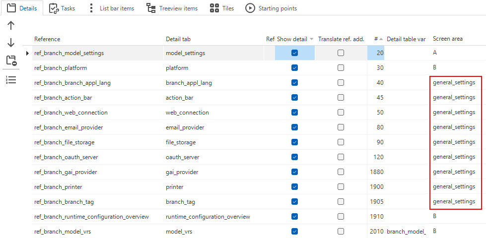 Details and their screen areas
Fallback areas
Introduction to fallback areas
menu User interface > Screen types > tab Design
It is possible to assign detail references, task and report tiles, and task, report, prefilter, and cube view bars to a specific Screen area in the model. If this screen area is not available in the assigned screen type, the details, tiles, and bars, will be shown in the Fallback area. If no fallback area is present in the screen type, the detail references will not be shown. If multiple fallback areas are provided, the GUI will decide where to show the details.
You can use fallback areas to, for example:
- Manage where details that do not belong to any screen area in the screen type are shown if there are multiple detail tabs or detail tiles on the screen.
- Only show a very specific set of details if they are shown in a screen area, but show more details if you zoom in on them.
- Leave the choice to the user (using user preferences) to display a screen type with a restricted set of details or a screen type with an extensive set of details.
- Show a more restricted set of details on specific break points.
For example, you have set up the screen type master_detail.
This screen type uses screen area 'A' for its detail tabs.
Fallback allowed is on for the details.
If you apply this screen type, the details of group 'A' will be visible. Additionally, items assigned to other screen areas and items without a group will be visible as well (if they exist).
If you want to restrict the visible details to only group 'A', clone master_detail.
Give the new screen type a name, for example, master_details_essentials.
Make sure that Fallback allowed is off for this screen type.
Only details that are explicitly part of group 'A' will be displayed on master_details_essentials.
Set up a fallback area
To set up a fallback area:
menu User interface > Screen types > tab Design / tab Screen components
- On tab Design, set the field Fallback allowed to True to indicate that the currently selected tab page can be used as a fallback area.
- On tab Screen components, select the checkbox Use as fallback area for the screen component(s) that will be the fallback area.
Fallback area scenarios
Five distinct fallback area scenarios are possible. They are based on the combination of fallback settings in a screen type and which tab pages are available.
In the following examples, imagine that there are three screen areas specified in subjects: A, B, and undetermined. There are two detail tab pages: A and B. In some scenarios, only page A is present.
The table below shows in which detail tab page(s) the screen areas are displayed in each scenario.
| Detail tab page A present | Detail tab page B present | Fallback detail tab page | Result |
|---|---|---|---|
| Yes | No | None | Only detail tab pages assigned to screen area A are visible (in detail tab page A). |
| Yes | No | A | All detail tab pages are visible in detail tab page A. |
| Yes | Yes | None |
|
| Yes | Yes | A |
|
| Yes | Yes | A & B |
|
Fallback area example
Situation
- The 'ARTICLE' screen has two screen types: 'MAIN' and 'ZOOM'. It also has two detail tabs: 'PRICES' and 'LOCATION'.
- In the 'MAIN' screen type, two screen areas are available: 'A' and 'B'. The 'ZOOM' screen type, however, only contains screen area 'A'.
Using the fallback option, you can either group all details ('PRICES' and 'LOCATION') into the fallback area or hide all screen areas not present in the screen type.
Goals
- Show both detail tabs if you open the 'ARTICLE' screen via the menu ('MAIN').
- Hide the 'LOCATION' detail tab if you access it via a lookup ('ZOOM').
Implementation
- Assign screen area 'A' to 'PRICES' and screen area 'B' to 'LOCATION'.
- In the 'ZOOM' screen type, set Fallback allowed to False.
This will ensure that all details assigned to screen area 'B' are hidden if you access the 'ARTICLE' screen via a lookup.