Schedulers
Introduction to Schedulers
Universal UIA Scheduler can be used to visualize appointments or tasks on a timeline. A Scheduler is built around time cells, which represent a time period, such as a day, week, or month. Within these time cells, activities can be displayed, such as appointments or tasks. Each activity can be linked to a resource, for example, an employee or machine.
For more information about the available features for the Scheduler component in the Universal UI, see Scheduler.
For the Windows GUI, a Scheduler can only be created with an object model extender.
- Community post - Discover the Enhanced Scheduler (Part 1)
- Community post - Interact with the Enhanced Scheduler (Part 2)
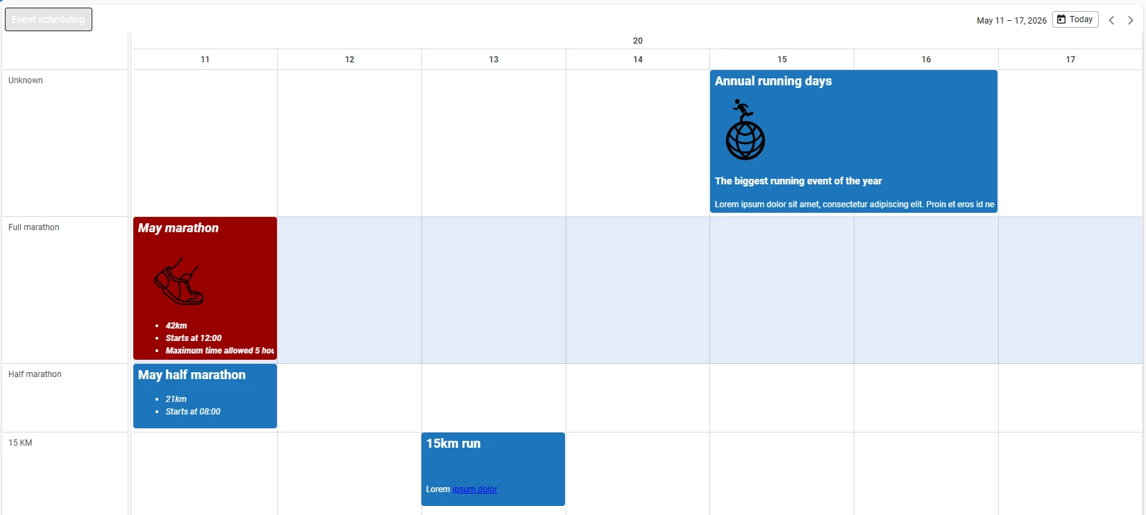
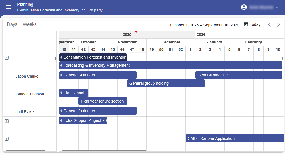 An example of a Scheduler in an application
Add a Scheduler to your application
Prerequisites for adding a Scheduler
Universal UITo add a Scheduler to your application, a table or variant needs a screen type with a Scheduler component. See Scheduler component.
Set up a Scheduler
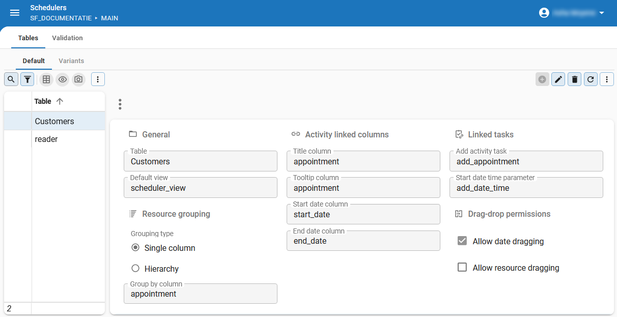
Universal UITo set up a Scheduler for a table or variant:
menu User interface > Schedulers > tab Tables
-
Select the table or variant to which you want to add a Scheduler.
-
Optional. If you already configured one or more Scheduler views, you can select one in the field Default view. For more information, see Add Scheduler views.
-
Specify Resource grouping to determine how the resources are grouped in the Scheduler. See: Set up resource grouping in a Scheduler.
-
Specify the Activity linked columns:
- Title column - Optional. Contains the title for the activity.
- Tooltip column - Optional. Contains the tooltip for the activity.
- Start date column - contains the start date for the activity.
- End date column - contains the end date for the activity.
- The activity color can be set with a conditional layout in the Activity title column.
- You can add resources that do not yet have an activity by including a row in the subject with an empty start- and end date.
-
Optional. Add formatting to the activity or its tooltip. For more information, see Add HTML formatting to activities and tooltips in a Scheduler.
-
Optional. Select a task in the field Add activity task. For more information, see Set up task execution on a time cell.
-
Optional. Specify the Drag-drop permissions:
- Allow date dragging - Allows the activity to be dragged to another date for the same resource.
- Allow resource dragging - Allows the activity to be dragged to another resource for the same date.
noteDragging activities updates records in the underlying subject, so Update permission must be granted on the subject. See Add, Copy, Update, or Delete permissions.
noteIf the subject is a view, this could require an instead-of update trigger. Dragging an activity to another resource will update the Group Until column to the target value. Since the translation of lookups is not yet supported, you may have to translate this back to a correct foreign key value using an instead-of update trigger.
A Scheduler starts in the current month.
 Set up a scheduler for a table or variant
Set up task execution on a time cell
Universal UIYou can set up tasks that can be executed by users when they click or touch a time cell in the Scheduler. They can use these tasks, for example, to easily add an appointment or to block time for machine maintenance. If configured, the task receives the start time of the selected time cell as a parameter.
To set up task execution in a time cell:
menu User Interface > Scheduler > tab Scheduler > group Linked task
-
In the field Add activity task, select the task that should be executed when a user clicks or touches a time cell.
-
To pass the start date and time of the selected time cell to the table task parameter, select the Start date time parameter. For more information, see:
Set up external drag-and-drop on a time cell
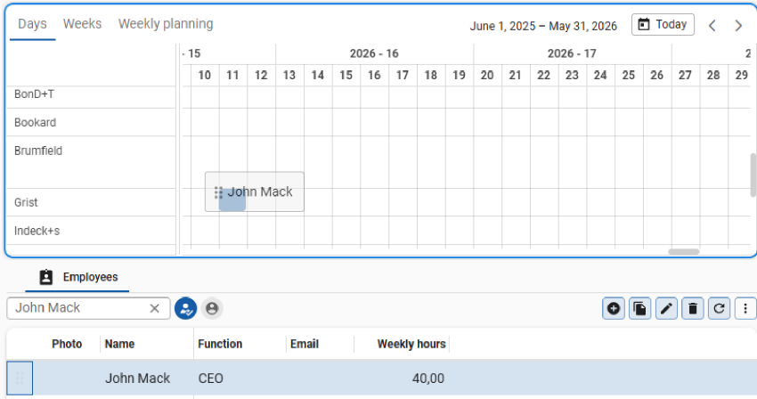
Universal UIUsers can drag items directly onto a time cell to execute a drag-drop task. For example, users can drag rows from a grid onto a time cell in the Scheduler to create an activity.
To set up external drag-and-drop on a time cell:
menu User Interface > Schedulers > tab Scheduler > group Linked tasks
-
In the field Add activity task, select a drag-drop task. If you have not created one, create it in the tab Drag-drop. For more information, see Drag-drop task and Drag-and-drop links.
-
Select the Start date time parameter.
- Task parameters with a DATE or DATETIME data type appear in the list of available parameters. For more information, see Set up task parameters.
- If you have set a Drop date time parameter for the drag-drop task, this automatically populates the Start date time parameter field.
If additional drag-drop parameters are configured, the Add activity task will also be populated with those.
 External drag and drop on a time cell in the Scheduler
Set up a double-click action for an activity
Universal UIYou can set up a double-click action for an activity to quickly view or edit the activity. The example in this topic shows how to set up a double-click action that opens the detail view of an activity.
You must first create a double-click task that is linked to the Scheduler's subject, before you can set up a double-click action for an activity.
To create a double-click task:
menu Processes > Tasks
- Follow the steps to Set up a double-click task.
Setting up a double-click task is sufficient to start a task when the user double-clicks a time cell in the Scheduler. However, if you want the task to open a detailed view of an activity, you can use the task in a process flow.
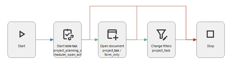
Example: Process flow to open the detail view of an activity
To create a process flow that starts when the double-click task is executed:
menu Processes > Process flows
- Set up a process flow that opens the detail view of the activity. In this example, the process flow has the following process actions:
- Start table task - Run process flow when the task
project_planning_open_activity_detailsis started. - Open document - Opens the detail view of the activity.
- Change filters - Sets filter values for the Scheduler to show the activity details.
Set up resource grouping in a Scheduler
Universal UIYou can apply resource grouping to visually organize resources in a Scheduler. For example, if you use the Scheduler to plan freight trips, you can group resources by truck type or by driver. You can only use one resource column for grouping, however you can select additional resource columns to display more information about the resource. For instance, when you group by truck type, you can also display the truck's license plate and driver name.
To set up resource grouping in a Scheduler:
menu User Interface > Schedulers > tab Tables
-
Set up a Scheduler.
-
In the group Resource grouping, you can choose the type of grouping you want to apply. Select a Grouping type:
-
Single column - use one resource column to group resources. You can use this when you want to group resources by a specific attribute, such as truck type or department.
- Group by column - select the column by which the resources should be grouped. Rows with the same value selected in Group by column will be grouped together in the same resource row in the Scheduler. For example, if you group by 'Truck type', all 'Volvo' trucks will be grouped together in one row, and all 'Scania' trucks in another row.
-
Hierarchy - group resources in a hierarchical tree structure. You can use this to represent parent-child relationships between resources, such as an organizational hierarchy with employees and their managers.
- Group by column - select the column by which the resources should be grouped. Rows with the same value selected in Group by column will be grouped together in the same resource row in the Scheduler. For example, if you group by 'Department', all employees in the 'Sales' department will be grouped together in one row, and all employees in the 'Marketing' department in another row.
- Parent group by column - select the parent column by which the resources should be grouped. For example, 'Manager' could be the parent column for 'Employee'.
- Default expanded - determines if the hierarchy is expanded by default. You can set the level to which the tree should expand by entering a value in the field Level.
-
-
Optional. You can select resource columns to display additional information of the resource. Go to the tab Resource columns and select the checkbox Included to include the resource column in the Scheduler. Here you can also:
- Set the Sequence no to determine the order in which the resource columns are displayed. The order you set here is not linked to the underlying table column order.
- Set the Column width of the resource column. Note that users can adjust the column width in the application and that these changes are cached in the browser for future sessions.
Add conditional layout to a Scheduler resource
Universal UIYou can add a conditional layout to a Scheduler resource. You can use this, for example, to highlight resources that are not available, or to give parent nodes a different color than their children in a hierarchy.
If you add HTML formatting to an activity or its tooltip, the conditional layout is not applied to the Scheduler resource.
To add a conditional layout to a Scheduler resource:
menu User Interface > Subjects > tab Data > tab Conditional layout
- Set up Conditional layout.
- Select the checkbox Apply to Scheduler Resource to apply the conditional layout to the Scheduler resource.
- Set up conditional layout conditions.
Add HTML formatting to activities and tooltips in a Scheduler
You can add HTML formatting to an activity or its tooltip using a column to customize their appearance in the Scheduler. The tooltip appears when users hover over an activity in the Scheduler.
You can use HTML formatting in a Scheduler in two ways:
- Use a column with a HTML control to add HTML formatting to an activity or its tooltip.
- Use a calculated field with a HTML control to add styling to all HTML content in the Scheduler.
Conditional layout is not applied if you add HTML formatting to an activity or its tooltip.
The column must meet the following requirements:
- The column is part of the underlying table or table variant of the Scheduler.
- The column's Domain has a HTML control.
- Optional. The Calculation type is set to Expression. You use the expression field to add additional styling to all HTML content, such as setting a maximum height for the activity or tooltip. See, Calculated field.
To add HTML formatting to an activity or its tooltip in a Scheduler:
User Interface > Schedulers > tab Default/Variants > group Activity linked columns
-
Go to the group Activity linked columns:
- For an activity, select a Title column.
- For a tooltip, select a Tooltip column.
-
Go to menu Data > Data model > tab Tables and find the column you selected as Title column or Tooltip column in the previous step.
-
In the field Query, you can add an SQL expression that returns HTML-formatted content. For example, to set the activity title in bold red:
'<div style="color: red; font-weight: bold;">' +
t1.activity_title +
'</div>'
HTML content in a Scheduler activity has no maximum height by default.
Activities expand vertically to fit all content.
To limit the height of activities, wrap the content in an additional <div> element with a max-height style property.
This can be done using a view template or a Calculated column with a HTML control:
SELECT
  '<div
    class="activity-wrapper"
    style="max-height:200px; overflow:hidden;"
  >
    <style>.activity-wrapper h2 { margin: 0; }</style>' +
  t1.event_html +
  '</div>'
 Scheduler activities with HTML-formatted content, including bold titles, icons, bullet lists, and hyperlinks
- Community post - Format your Scheduler activities with HTML
Add Scheduler views and timescales
Universal UIThe Scheduler views determine how the Scheduler is displayed in your application. It is possible to add multiple timescales.
menu User Interface > Schedulers > tab Tables > tab Scheduler views
-
Enter a Sequence no. If no default is selected, the first Scheduler view according to its Sequence no will be shown as the default instead. The other available Scheduler views can be selected by the user in your application.
-
Clear the Show scheduler view box if this Scheduler view should not be available for this table or variant.
-
Configure the settings for the Scheduler view:
- Sliding pagination - The UI uses the top timescale to determine the pagination.
- If sliding pagination is disabled, the view will cover the entire period of the highest timescale (for example, a complete calendar year from January to December).
- If sliding pagination is enabled, a sliding window will focus on the current date and time (for example, from this summer to the next summer).
The view starts in the past, depending on the highest timescale:
- Quarter or Month: the view starts a week in the past.
- Year: the view starts a month in the past.
- Labels for lowest timescale: Determines whether the lowest timescales will be labeled. If selected, the cells of the timeline will be split according to the lowest timescale interval. This allows for a more fine-grained display of the timeline and more precision when dragging and dropping activities. For example, every hour interval could be split into 30-minute intervals. If deselected, instead of every 30-minute segment, only the hours will be labeled and each hour will contain two segments denoting the 30-minute intervals.
- Sliding pagination - The UI uses the top timescale to determine the pagination.
-
Configure one or more timescales. You can select an existing Scheduler as default in the Scheduler tab.
- The highest timescale will be used as the Scheduler's scale.
- The lowest timescale will be used for the Scheduler's cells.
- The lowest timescale and any other available timescales will become Scheduler headers.
- The highest two headers are combined when relevant to save space, for example, by placing the year after the month.
- Intervals higher than 1 will be denoted in a way that indicates the duration, e.g. "1 AM - 12 AM".
Timescale example
If you configure one year, one month, and one day as timescales:
- Your Scheduler will scale across a year.
- Each cell will be a single day.
- A header will show the day and month.
-
Optional. In the group Time cell settings, configure additional settings for time cells.
- Time cell min width - enter a numeric value to set the minimum width of time cells. This allows you to make the time cells larger for better visibility.
- Min displayed time - specify the minimum hour value to hide certain hours. The minimum hour must be smaller than the maximum hour.
- Max displayed time - specify the maximum hour value to hide certain hours. The maximum hour must be greater than the minimum hour.
- Hide Monday/Tuesday/Wednesday/Thursday/Friday/Saturday/Sunday - select the relevant checkboxes to hide individual days of the week. This option is only available if the checkbox Day is selected in the group Use timescales.
- Day label format - Select Number + name of day to display the day name alongside the number when using a Day timescale. This option is only available if the checkbox Day is selected in the group Use timescales.
For Thinkwise Platform 2026.1.15 and lower, set the extended property SchedulerDayScaleShowDayName to True to show the day name in the Scheduler.
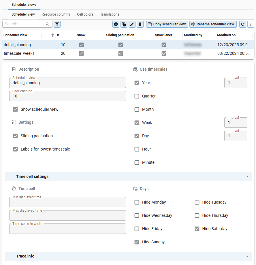 Scheduler views and timescales
Add conditional time cell formatting
Universal UIAfter adding a Scheduler view, you can set up conditional formatting for time cells in the Scheduler.
Examples of conditional time cell formatting
- To highlight important information: a cell in a regular column is orange when 'important = 1'.
- To differentiate between opening hours and closing times: cells in a time scale are gray when hours are not between 8 and 18.
- To combine an organization's opening hours with information about the availability of a machine: cells in a time scale are gray when hours are not between 8 and 18 and 'machine_has_regular_work_times = 1'.
- To highlight limited capacity during a holiday period: cells are orange between
2025-12-25T00:00:00and2026-01-01T00:00:00.
To set up conditional formatting for a time cell in the Scheduler:
menu User Interface > Schedulers > tab Default > tab Scheduler views > tab Cell colors
-
Set the background color for the cell for light and dark mode.
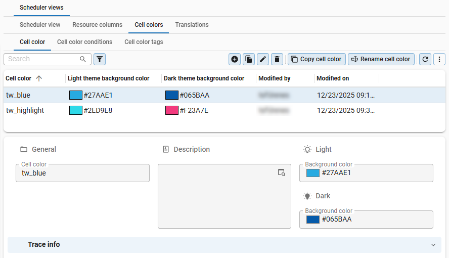 The background color for the cell
 -
Go to the tab Cell color conditions to set up the conditions for the cell color.
-
In the field Type of time scale, select whether to apply a condition to a Column, Time scale, or Datetime.
Available types of time scales
Three types of time scales are available, Column, Time scale, and Datetime:
- Column - When a regular column is used, it will be evaluated against the resource record.
- Column - Select the column you want to use in the condition.
- Condition - Select the condition for the column, for example, Contains.
- Type of value - Select the type of value, Constant or another Column.
- Value - Enter the value for the condition, for example, 'Available'.
- Time scale - When a time scale is used, it will be evaluated against the present time scales.
- Time scale - Select the time scale you want to use in the condition, for example Hour.
- Condition - Select the condition for the time scale, for example Greater than.
- Type of value - Select the type of value, for example, Constant.
- Value - Enter the value for the condition, for example, '8'.
- Datetime - When a datetime is used, it will be evaluated against exact datetime values.
- Condition - Select the condition, for example Between.
- Type of value - Select the type of value, Constant or Column.
- Date time value - Enter the datetime value. Values are entered in your local time zone and stored in UTC (ISO 8601 format).
noteIf you set up a condition on a time scale that is not included in the Scheduler, it will always be true. This could lead to unexpected or unintended styling or behavior.
For example: if the Scheduler is configured with a time scale of 'Year/Month/Day', the conditional layout for 'Hour' will always be true, leading to all time cells being colored. In this case, your condition must also relate at the very least to Months.
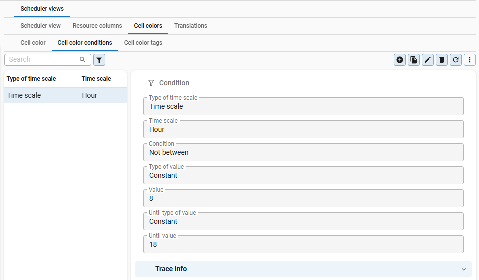 `
Conditions: the cell background color is gray if the hours are not between 8 and 18
`
Conditions: the cell background color is gray if the hours are not between 8 and 18 - Column - When a regular column is used, it will be evaluated against the resource record.