Resource Scheduler
For Universal GUI, an extender is not necessary. See Scheduler.
The resource scheduler is used to visualize appointments or tasks on a timeline.

The scheduler works with two mandatory and one optional entity.
Resources
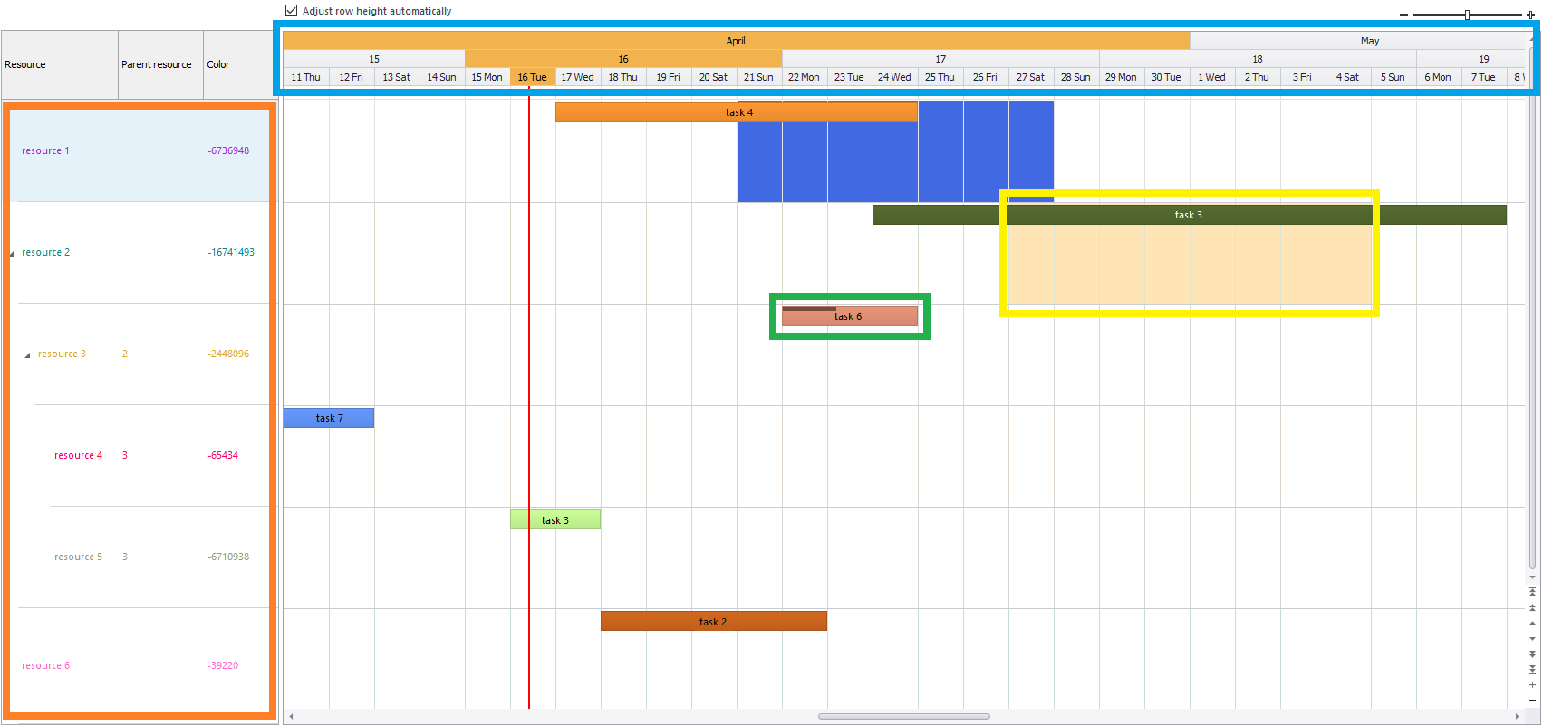
The first mandatory table or view is used to represent the resources, shown in the figure by the orange square. The resources shown follow the column settings of the model, so all hidden columns are skipped. The resource table or view should have the following columns:
resource_id(mandatory, unique)name(mandatory)parentresource id (optional)color(optional, forecolor of the resource)back_color(optional, back color of the resource which will color the entire row)
The same settings are shown in the extender properties, among some other options:
- Resource table (mandatory, table or view id)
- Resource table variant (optional, id of the variant to use)
Example:
Tasks/appointments
The second mandatory table or view is used to represent the tasks (also called appointments) in the scheduler, shown by the green square. The task table or view can have the following columns:
task_id(mandatory, unique)name(mandatory)resource_id(mandatory, determines at which resource the task is linked)start_date(mandatory)end_date(mandatory)color(color of the appointment, these are negative integers, a color pick app is available)percentage(progress of the task from 0 to 100, shown in the top of task 6)
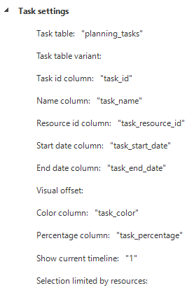
The same settings are shown in the extender properties, among some other options:
- Task table (mandatory, table or view id)
- Task table variant (optional, id of variant to use)
- Visual offset (optional, start date of the scheduler plus or minus this number of days)
- Show current timeline (optional, true to show a timeline at the current time)
- Selection limited by resources (optional, true if the visible resources should be included in the where clause of the task query to improve performance)
Example:

Work times
The third optional table or view is used to represent worktimes, shown by the yellow square. They color the background cells with a given color from a start to end date. Columns in this table or view can be the following:
resource_id(mandatory, determines at which resource the worktime is linked)start_date(mandatory)end_date(mandatory)color(mandatory)
The same settings are shown in the extender properties, among some other options:
- Worktimes table (mandatory, table or view id)
- Worktimes table variant (optional, id of variant to use)
- Selection limited by resources (optional, true if the visible resources should be included in the where clause of the worktimes query to improve performance)
- Disabled days (optional, add multiple for each day that has to be shown with another color, e.g. weekend days)
- Disabled days color (optional, the color for the disabled days)
Example:
Table tasks
You can link table tasks to the tables used in the scheduler. This is useful to automate processes or to trigger certain actions when users interact with the Scheduler. For example, if a user double-clicks an appointment, it can trigger a task that opens a form to show more details about the appointment. For more information on how to set up a table task, see Create a table task.
Table tasks are available for the following actions:
- Refresh after execute
- Double-click an appointment
- Resize an appointment
- Drop an appointment
- Delete an appointment (by specifying the extended property
DeleteAppointmentTaskScheduler) - Double click on a time cell
- Drop an external row
Refresh after execute
You can use Refresh after execute to refresh the scheduler after a table task is executed, including resources and appointments. This is useful when you configure a process flow with multiple actions and want to refresh the scheduler at the end.
To refresh the scheduler:
menu Processes > Tasks
- Select the table that is linked to the appointment table.
- Go to the tab Table tasks and select or create a table task.
- Go to tab Form > group Model settings and set Refresh after execute to Document.
You can also create an empty table task linked to the appointment table and set Refresh after execute to Document to force a refresh of the entire scheduler.
Double click appointment
The Double click appointment task makes it possible to execute a task when an appointment is double clicked.
A task in the model is needed with at least one parameter. This parameter will automatically be filled with the task_id of the clicked appointment.
The parameter name must be the same as the Task id column name specified in Task settings, for example, task_id.
Resize appointment
The Resize appointment task makes it possible to execute a task when an appointment is resized. A task in the model is needed with at least three parameters:
<task id column>start_dateend_date
The <task id column> parameter will automatically be filled with the task_id of the resized appointment.
The <task id column> parameter name must be the same as the Task id column name specified in Task settings, for example, task_id.
Drop appointment
The Drop appointment task makes it possible to execute a task when an appointment is dragged to another place and then dropped. A task in the model is needed with at least three parameters:
<task id column>start_dateresource_id
The <task id column> and the resource_id parameter will automatically be filled with the task_id and the new resource_id of the dropped appointment.
The <task id column> parameter name must be the same as the Task id column name specified in Task settings, for example, task_id.
Delete appointment
The Delete appointment task makes it possible to execute a task when an appointment is deleted by pressing the Delete key.
A task in the model is needed with at least one parameter. This parameter will automatically be filled with the task_id of the deleted appointment.
The parameter name must be the same as the Task id column name specified in Task settings, for example, task_id.
Double click timecell
The Double click timecell task makes it possible to execute a task when a timecell is double clicked. Timecells are in the area behind the appointments. A task in the model is needed with at least two parameters:
date(the actual date that is being double clicked)resource_id(the resource that the timecell belongs to)
The date and the resource_id parameter will automatically be filled with the clicked date and the resource_id it belongs to.
Drop external row
The External drop task makes it possible to execute a task when a row is dragged onto the scheduler, e.g. a row dragged from a grid. Drag drop functionality can be used in the same way as dragging from one grid to another.
A task in the model is needed with at least two parameters:
drop_dateresource_id
The drop_date and the resource_id parameter will automatically be filled with the date and the resource_id of where the row is dropped.
Settings
Timescales and format
The scheduler can show as much timescales as required. In the figure 3 timescales are shown in the blue square; month, week and day timescales. They can be added in the extender properties:
Also the datetime format for each timescale can be provided:
Min and max dates
The scheduler can be limited with a fixed min and max date, or by a dynamic min and max date. By setting this date the user cannot scroll beyond these boundaries.
The dynamic variant uses the current date and time and subtracts or adds the given days. If these dynamic dates are set they overrule the fixed dates. In the example below the user can scroll back two weeks in the past and two weeks forward into the future.
Example:
Global settings
Global settings for the scheduler are:
- First day of the week
- Enable worktime (set true to make sure the worktimes table or view is used)
- Fetch appointments padding days (number of days the scheduler will fetch outside the visible date boundaries)
- Resources per page (initial number of resources shown)
- Auto row height (set true to let the scheduler decide the most ideal height for each resource)
- Fit to size (set true to make the scheduler resize when the entire GUI does)
- Expand resources (set true to initial expand all resources who have resource children)
- Expand resources to level (
int, specifies to which level the scheduler should default expand) - Ensure active row is visible after refresh (
bool, when enabled, the Windows GUI navigates to the previous active row after a task refresh) - Enable resources tree context menu (set true to allow a context menu to be shown when right clicking the resources)
- Enable tooltip (set true to enable tooltips when an appointment is hovered)
- Resource tooltip column (column in the task table or view which represents the data for the tooltip)
- HTML in resource tooltip (enable HTML support (limited) for the tooltip on an appointment)
- Show zoom control (set true to show a zoom control)
- Remove timescale on zoom out (set true to remove the bottom timescale when zooming out to increase the range of the visible date in the scheduler)
- Show weekend on workweek view (Show additional weekend days when viewing the workweek view)
- Active header color (Color of the active timescales)
- Timecell background color (Background color for all timecells other than selected from the worktimes table or view)
Windows settings
Setting that only apply to the Windows GUI:
- Base timescale width (width of the bottom timescale, the timescales above will adjust accordingly)
- Use gradient on appointments (if true a gradient is shown)
- Show datepicker (true to show a datepicker above the scheduler)
- Show rowheight checkbox (true to show a checkbox which toggles the rowheight to automatically fit appointments)
- Extra small base timescale (true to make it possible to zoom out even more, the bottom timescale will become less wide but it takes more performance to draw all timecells)
- Select first visible appointment (true to scroll the first available appointment in view)
- Zoom factor (a value of 1 – 11 with 6 as its center to determine where the zoom control will start at)
- Resource splitter distance (number of pixel to use as width for the resources table)