User interface design guidelines
This document offers guidance for designing and modeling applications in the Thinkwise Software Factory. The focus is on the User Interface and User Experience (UI/UX) of the intended application. This section explains how concepts from the TSF can best be applied in end applications (Do's) and how they should not (Don’ts/Instead of). This document does not go into the various concepts and theories of graphic design in depth. However, this document will provide references to this so that the reader can learn more about the different backgrounds of the graphic design. It is assumed that the reader of this document is familiar with the concept of the Thinkwise Platform and knows the concepts described in this document.
- Community post - Optimize Your UX with these Guidelines
Use of color
The use of color in an application has a major impact on the UI/UX experience of the user. It largely determines the extent to which the user accepts or wishes to use the application. The site http://color.adobe.com is a tool that helps you create a color palette.
Focal points:
- Ensure lots of contrast between colors.
- Use two, or at most three, different colors in the application.
- Make sure the application is not too colorful. This is tiring and distracting when using the application.
- Use the same colors for the same functions (e.g. the same color red for all error messages).
- Make sure that users with color blindness can use the application.
- Use of signal colors (see also conditional layout).
- Red colors are usually used when something is wrong, critical or very important.
- Orange colors can be used as a signaling color if the priority is not very high but attention is needed.
- Green colors are usually used to indicate that something is good.
Typography
The readability of texts is essential within an application. To a large extent, readability is determined by the fonts used and their size.
Focal points:
- Use no more than 2 fonts. One for the headers and one for the body texts.
- We recommend Segoe UI because of its readability and presence on almost all computers and devices.
- Use at least a 9pt font size, 10pt font size is preferred.
- Never make the text completely black, because this will cause too much of a difference in contrast. Instead, use the color RGB (50, 50, 50).
- Use the same font for the same function (e.g. the text in each list is always 10pt).
- Do not write texts in UPPERCASE only (capital letters). Exceptions to this can be headers.
- Do not use effects on texts (gradient, shadow, etc.). This makes texts difficult to read.
The recommended Segoe UI font is of the San serif type. This is the same font that is used in Windows 10 and has the following advantages:
- It is easy to read on both monitors and devices (tablet, smartphone).
- It gives the application a modern look and feel.
- There is a higher degree of recognition for the user.
Icons
The use of icons can enhance the UI/UX. However, it is important that icons are chosen correctly. The user of the application must be able to determine what action will follow just by seeing icon, without having to think about it. Icons must comply with the following four properties:
- Simple in design.
- Intuitive to use.
- Consistently applied throughout the application.
- Action-oriented.
Focal points:
-
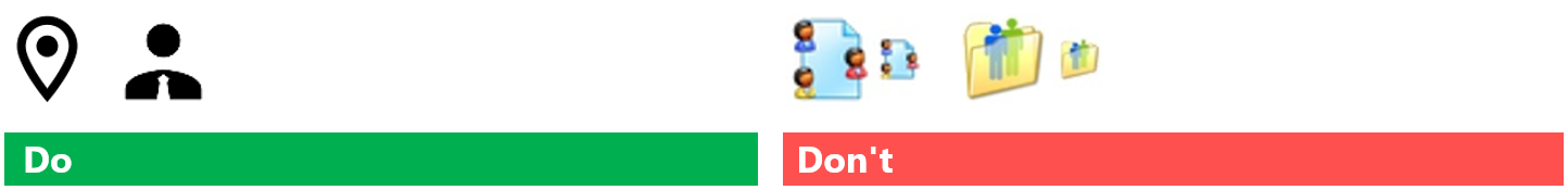
Do not use icons that contain many elements, more than two colors or text; keep it simple. Too many elements in an icon make it unreadable on a smaller display.
A good example of this are 'Material' icons (see also https://icons8.com/icons/material or https://material.io/resources/icons/).
An exception to this can be the tile menu, where icons are displayed larger and have more of a decorative function.
-
Always use 2D icons and not 3D icons as it takes users longer to recognize an icon if it is a 3D icon.
-
We recommend using SVG icons for your application. SVGs are scalable vector graphics, making them suitable for all screen sizes and resolutions without losing quality when resized. This avoids dependencies between the size of the icon and the size used for tasks, pre-filters and so forth. The Universal GUI automatically adjusts icon colors for dark or light mode, provided the SVG does not contain embedded color data.
-
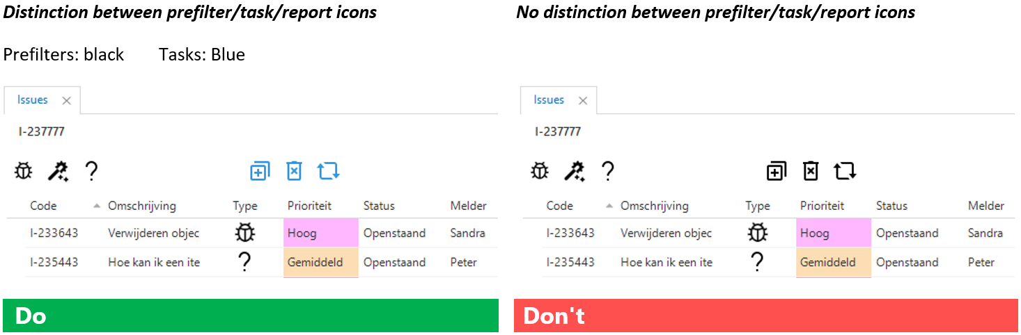
If you need to indicate explicitly whether an icon is for a task, prefilter, etc., consider using color to show the difference between filter functionality and more action-oriented icons.
- Do not use multiple icon packs within one application.
- Remember that your end-user might not know or care about the difference between a filter and an action. If the result of pressing a button is what they expect (e.g., the end user sees the data they want to see), it does not matter if that happened through a filter, task, or even a report. In that case, no distinction needs to be made.
-
If status and/or type icons are used and prefilters are available for them, make sure that the icons for the prefilter are identical to the icons used for the status or type (as shown in the Do from the previous point).
List
Lists are mainly used as overviews of data related to a subject.
Focal points:
-
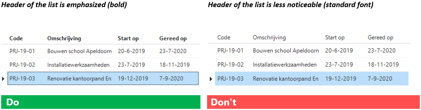
The header of a row contains essential information that helps the user identify what the data is about. As such, this row must stand out from the data. We recommend making the text in the header bold.
-
Use the minimum number of columns that users need to perform their tasks. If a column is not relevant to the user's task, that column must be omitted. Using fewer columns also improves the performance of the application.
-
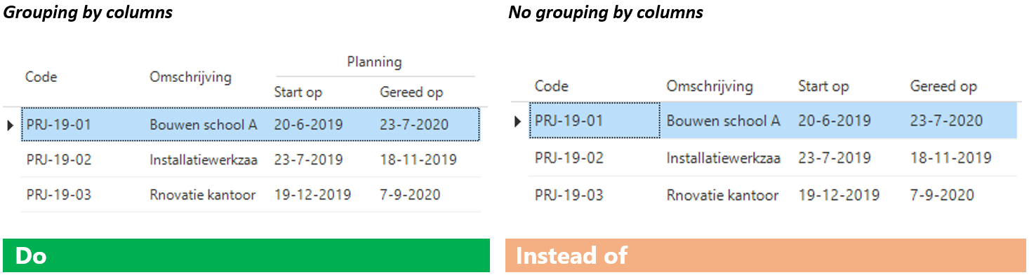
Put the columns in order of importance. The most important columns are on the left. Make sure that data that belongs together is not interrupted (such as a start and end date).
-
Fix the most important columns for a topic, so users know what data it is when they scroll to the right in the list. It is usually sufficient to fix the data up to the table’s lookup column.
-
If a Search field is used, make sure that the columns that are available in the search also appear in the list. If not, there may be ambiguity about the search results.
-
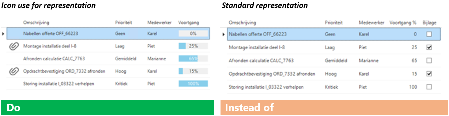
Consider using icons to keep lists clear. Think of things like using icons as a replacement for a checkbox and using a progress bar as a replacement for a percentage.
-
Consider using groupings to indicate that columns belong together.
-
Do not put a multiline or HTML type column in the list. This makes it difficult to read the data; any textual formatting is not (correctly) displayed. It is also detrimental to performance.
Form
Forms offer the possibility to display, add and edit data related to a specific subject. Depending on the type of data, different controls (input fields) are used for this. Information can be displayed in more detail in a form than in a list.
Focal points:
-
Please minimize the number of fields on a form (hide unnecessary fields). Put the most important fields in the form at the beginning. Place fields on the form in such a way that users can complete it from top to bottom and from left to right. Consider how the required fields are displayed.
-
Each field must have a label unless:
- The field belongs to another field that does have a label (two fields placed in a row).
- A group label has been applied as an alternative to the standard label.
-
Make the labels as narrow as possible and the fields as wide as possible, utilize the space you have. Make sure that the labels are all the same size, otherwise the application will be unpleasant because the fields will be skewed.
-
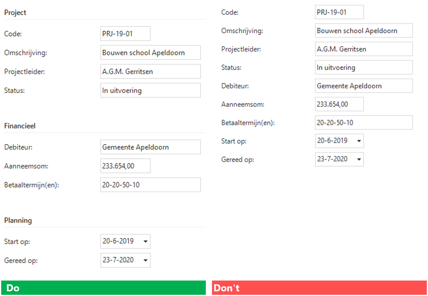
Use groupings in the form to 'keep data together'.
-
If there is a dropdown menu, apply the correct input field type (control):
- Checkbox: apply if there is a yes/no or true/false. The value can also be optional; the value is then undetermined and the checkbox is displayed as a 'grey square'. However, this is difficult to interpret for many users. So consider using only yes and no as values for the checkbox. This makes the checkbox mandatory.

- Radio button: apply with a limited (maximum of 4) number of items, where one item is selected. The advantage is that all items are immediately visible. This way, users can quickly compare the options. Icons can be used for the items instead of text if desired.

- Dropdown (default): apply with a smaller collection of items, where all items are displayed in the dropdown. All items are loaded when a form is opened. This can have an adverse effect on performance. An 'erroneous' selection is deleted when leaving the dropdown.

- Dropdown (suggestion): apply to a larger collection of items. The items that can be selected are displayed based on the input. These items are determined in real-time (so the dropdown is not fully loaded in advance). An 'erroneous' input remains visible, with the text being given a predetermined color to indicate that an invalid value has been entered.

See also https://uxdworld.com/2018/05/06/7-rules-of-using-radio-buttons-vs-drop-down-menus/ for more theory on radio buttons and dropdowns.
Tabs
Tabs are used to display data related to a topic and any related details.
Focal points:
-
Write short tab titles. Use clear language rather than makeshift terms. Tab titles usually contain one or two words. Short titles are easier to scan. The use of longer titles is a sign that the content of a tab is too complicated for one tab.
-
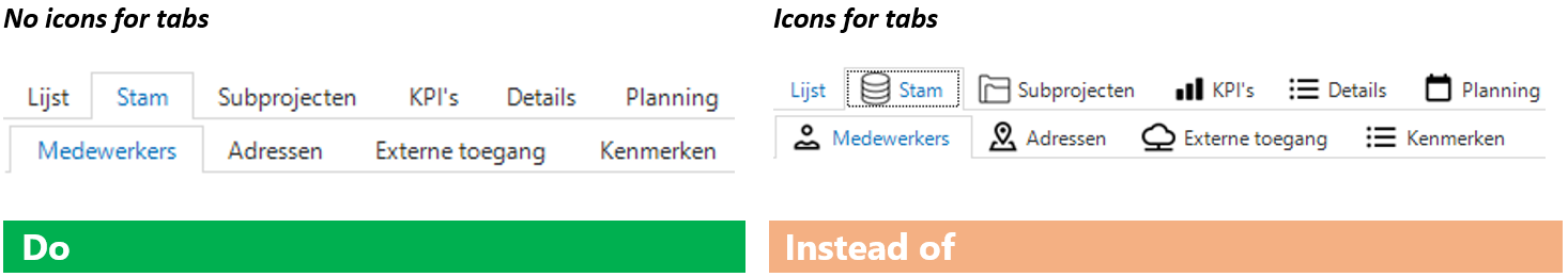
Determine in advance whether it is useful to use icons for each (sub)topic. This means that each (detailed) tab has an icon. This can be hectic, and it may be difficult to come up with meaningful icons. In addition, if no icons are used, users can scan the tab titles more quickly to find what they are looking for.
-
Always use lines in tabs to avoid confusion, as tabs are hierarchical. Tabs without any lines are too similar to buttons and do not give the user an idea of what level they are on.
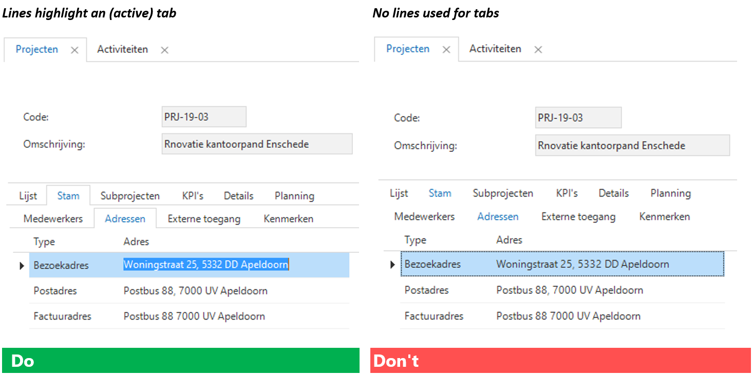
Use a subtle gray color for lines so as not to create too much contrast. For instance, line color RGB (220, 220, 220).
-
Do not place too many tabs on the screen (up to 7, 2 levels deep). To prevent too many tabs from being displayed.
-
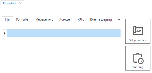
Consider using detail tiles as an alternative display of a detailed tab. In the example below, subprojects and planning could also have been displayed as 'normal' tabs.
-
Use grouped tabs to avoid having too many tabs next to each other. In the example below, stam is a grouped tab. The underlying tabs (medewerkers, adressen, externe toegang, kenmerken) are also related to the topic and could just as easily have been displayed on the top line. However, the coherence would then be lacking and (too) many tabs would be displayed at the main level.

-
Conditional layout
With a conditional layout, data that meets certain criteria can be emphasized through deviating colors use and/or deviating fonts. For more information, see Conditional layouts.
Focal points:
-
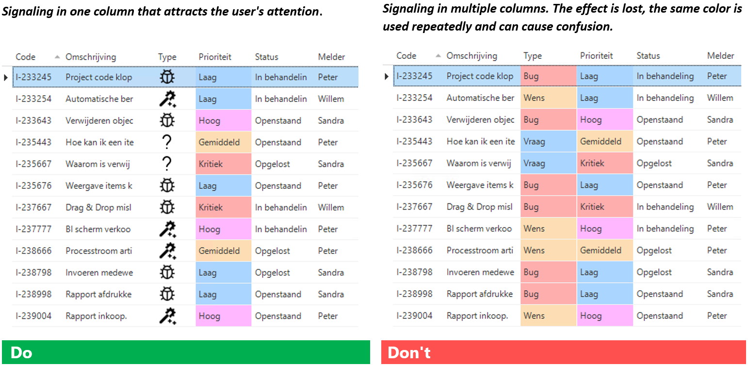
Please note that using too much color will remove the effect of drawing attention.
-
Use conditional layout color for the main column you want to draw attention to, so that the user is quickly drawn to what is most important at a glance. Try the other info/statuses by indicating an icon, for example.
Toolbars
Prefilters, tasks and reports can be opened from the ribbon. These can also be included in the screens so that they can be applied immediately.
Focal points:
- Always make toolbars part of the screen types.
- Use a minimum size of 24px by 24px for the toolbars.
- Ensure consistency within the different screen types. Always position the toolbars in the same way and in the same order, using the same size. For example, do not reverse the position of prefilters and tasks in other screen types. This will confuse the user.
- Visually differentiate between prefilters, tasks, and reports. For example, you could use different icon packs or shapes in the icons. See also icons.
- Name the prefilters, tasks or reports properly:
- Use short and catchy names.
- Use a tooltip for further explanation:
- Purpose of the prefilter.
- Purpose/result of performing a task.
- The information displayed in the report.
- Use uniform language in naming and tooltip texts.