Domains
Introduction to domains
Domains are abstract data types, used to indicate the data type of columns and parameters. Changing a domain will update all columns and parameters that use this domain. Depending on the database management system, user-defined data types or reference-fields are created for domains to be used in SQL business logic.
Create a domain
menu Data > Domains > tab Form
-
Enter a Domain name.
-
Select a Data type.
-
If mandatory or necessary, enter constraints to limit the possible user input:
- Length.
- Scale.
- Min. value and Max. value.
- Elements - to offer the user a pre-defined selection.
- Elements - For the controls COMBO, IMAGE COMBO and RADIO BUTTON you can define elements to offer the user a pre-defined selection. In this field, you see the number of elements you configured and you can set the sort order. See Domain elements.
These are static constraints that will be applied to the database (stored data will be checked). Data will also be checked by the UI and the API. However, if a domain with a constraint is used in, for example, a view or a task, a database constraint cannot be applied, (though the UI and API will still check the input). To use a dynamic constraint instead, see Add dynamic domain input constraints.
-
Enter the User interface settings:
-
Select a Control that is used to visualize the columns and parameters in the user interface, for instance as a text field, an image or a checkbox.
-
Alignment - Alignment in the grid (left, right, or center). The numerical alignment for the entire form can be set with the Extended property:
FormAlignmentOfNumbers. -
Universal UI Word wrap is available for a Multiline control. If checked, the text will wrap to the next line when it reaches the end of the field. Newlines are retained. In edit mode, word wrap is not applied.
Note that the row height is not determined by the column's content. See: Row height.
-
-
The Default value type can be a 'Constant value' or an 'Expression'. An expression can fill any new or changed column during the upgrade.
-
If necessary, enter the tab Default settings:
The tab Usage shows where the domain is being used. This can be helpful when, for example, you want to make a change to the domain and see what impact this might have.
For more information on this generic feature, see Usage.
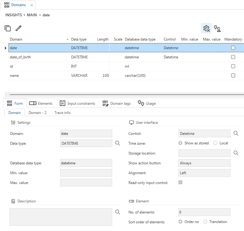 Overview of the Domains screen
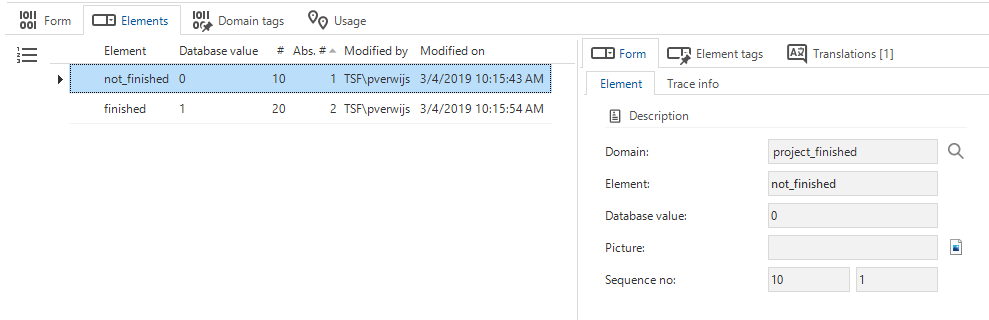 Adding elements to a domain
Add dynamic domain input constraints
Universal UI IndiciumWhen creating domains, it is possible to add some static domain constraints (minimum and maximum values or lengths and a pre-defined selection (Elements)).
Input constraints are a more dynamic extension of these domain constraints. These are simple checks on data at the domain level, at the moment it is entered by the user. Data stored on the database will not be checked, but the UI and API will not accept unallowed input and not process it.
To validate data at the moment of saving, use a check constraint on a table.
Things you need to know before you add a dynamic input constraint:
- Input constraints are applied to columns, task- and report parameters, and deep-link process variable input.
- They are only applied to user input, not to the database.
- Existing records are not subject to the constraints.
- An input constraint can be defined on one column only.
- When a column receives a value programmatically, it will not be checked against the input constraints. A programmatical value is received, for example, through copying a record, default values, input mapping in process flows, detail- or look-up context propagation, task binding, drag-and-drop binding, default logic, and so forth.
- Input constraints are checked only at the moment of input.
This allows using date/time-sensitive input constraints, such as
planned_date > sysdatetime(), without the problem that updating the record later will make this constraint fail. That is, as long as theplanned_dateis not modified, it will not be re-checked. - A regex will be matched on the input and does not have to refer to the value.
- An input constraint can be translated. Multiple input constraints on domains can share a translation using the same ID. The translation will be shown to the user when breaking the constraint.
To add an input constraint to a domain:
menu Data > Domains > tab Input constraints
-
Select a Domain.
-
In the field Input constraint, enter a name.
-
Select a Constraint type:
- SQL expression - To evaluate the entered data with an SQL expression.
An SQL input constraint can refer to the input value using the domain ID as a column alias, optionally prefixed with
t1and quoted if needed. For instance,t1.[planned_date] > sysdatetime(). It is rare to have an SQL input constraint that does not refer to the input value. - Regular expression - To evaluate the entered data with a regular expression.
- SQL expression - To evaluate the entered data with an SQL expression.
An SQL input constraint can refer to the input value using the domain ID as a column alias, optionally prefixed with
-
Select a Timing:
- Immediate - Data will be evaluated while entered into the field. Only available for regular expressions as these can be verified directly by the UI.
- On change - Data will be evaluated before it is processed further, usually when the cursor leaves the field.
Both constraints prevent the value from being processed, and further logic, such as defaults, layouts, expressions, and look-ups, will not be executed with the entered value. The sequence is always in the context of constraint timing. Immediate is always verified before On change.
-
Select a Sequence no. If you use multiple input constraints for the same domain, the sequence determines the order in which they are evaluated.
-
Enter the Expression that has to be used to evaluate the data. It has to match the syntax of the selected Constraint type.
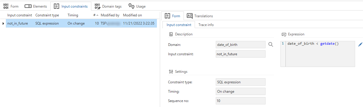 Input constraints for a domain
Make columns created with a domain mandatory
You can indicate that columns using a domain will be mandatory by default. New columns created with this domain will be mandatory by default. This can be adjusted per column.
menu Data > Domains > tab Form > tab Default settings
- In the group Column, select the checkbox Mandatory.
If a checkbox is set to mandatory, it may give users the impression that they have to select it, even if they do not want to.
To address this issue, you can set the checkbox to a default state of 'null' (indeterminate) using the extended property AllowNullMandCheckbox.
After a user selects an indeterminate checkbox, the mandatory indicator disappears.
Use columns created with a domain for optimistic locking
You can indicate that columns using a domain will be used for optimistic locking by default. This can be adjusted per column. Most domains can be marked manually, according to your preferences. Only if it has the datatype ROWVERSION, Use for optimistic locking will be selected by default. If the domain with datatype ROWVERSION is used for a column, the column will also be hidden by default and set as the last column.
The other columns have no effect on the optimistic locking.
menu Data > Domains > tab Form > tab Default settings
- In the group Column, select the checkbox Use for optimistic locking.
Set the field height
You can set the height in rows for a form field. This is particularly useful when dealing with large amounts of text that span multiple lines. Be aware that the outcome may differ between the Windows GUI and the Universal UI, as Windows screens are oriented horizontally while Universal UI screens are vertical.
menu Data > Domains > tab Form > tab Default settings
- In the group Column, fill in the field Field height in positions.
Configure read-only display settings in edit mode
Universal UIYou can configure how a read-only field will be displayed in edit mode.
Data > Domains > tab Form > group User interface
The rendition of a read-only field depends on the setting Read-only input control:
| Read-only input control | Rendition |
|---|---|
| Selected (default) | Disabled input control |
| Cleared | Plain text label |
Show or hide the action button for read-only fields
menu Data > Domains > tab Form
Some fields are always set to Read-only, used only to show data. Show action button allows you to show or hide the action button for that domain.
There are three options:
- Always - the button is always displayed.
- When editable - the action button is only displayed if the field is editable.
- Never - the action button is hidden.
 Control with action button set to Always
Domain controls
Domain controls specify how a column is displayed in the user interface. For example, you can select a Checkbox control to display a domain as a checkbox in the user interface, or a Date control to display a calendar for selecting a date.
The domain controls are available:
| CONTROL | Description | Platform | SQL | ORACLE | DB2 |
|---|---|---|---|---|---|
| BARCODE SCANNER | Text input with a barcode scanner. | Universal | VARCHAR | VARCHAR2 | VARCHAR |
| CALCULATOR | Shows a calculator for performing calculations. | All | INT, NUMERIC | INT, NUMERIC | INT, NUMERIC |
| CHECKBOX | Gives the possibility to check a checkmark. The value can be on, off or unknown. | All | BIT, TINYINT, SMALLINT | SMALLINT | SMALLINT |
| CODE EDITOR | Highlights the syntax for data in JSON or XML format. | All | |||
| CODE DIFF EDITOR | Highlights the syntax for data in JSON or XML format and shows the differences between two versions. | All | |||
| COLOR | Selecting a color. | All | INT | INT | INT |
| COMBO | Selecting a value from a list. | All | Depending on elements | Depending on elements | Depending on elements |
| COPY TO CLIPBOARD (FROM) | Copy the field's value to the user's clipboard | Windows/Universal | Character-based | Character-based | Character-based |
| CORTEX DECODER | Text input with a barcode scanner. | Universal | VARCHAR | VARCHAR2 | VARCHAR |
| CURRENCY | For compatibility, use NUMERIC. | All | NUMERIC | NUMERIC | NUMERIC |
| DATE | Displays a calendar in which a date can be entered. | All | DATE, DATETIME | DATE, TIMESTAMP | DATE, TIMESTAMP |
| DATETIME | Displays a calendar for selecting the date and a time format in hours, minutes, and seconds. | All | DATETIME | TIMESTAMP | TIMESTAMP |
| DATETIME SHORT | Displays a calendar for selecting the date and a time format in hours and minutes (no seconds). | Universal | DATETIME | TIMESTAMP | TIMESTAMP |
| Opening an email program with email address as send to. | All | VARCHAR | VARCHAR2 | VARCHAR | |
| FILE LINK | When adding or editing a file, the location can be selected. Universal UI For use in a 3-tier environment, see File link. | Windows/Web | VARCHAR | VARCHAR2 | VARCHAR |
| FILE UPLOAD | Uploading and downloading a file. The Storage location is used when files are uploaded. | All | VARCHAR | VARCHAR2 | VARCHAR |
| FOLDER LINK | Selecting and opening a folder. Universal UI For use in a 3-tier environment, see Folder link. | Windows/Web | VARCHAR | VARCHAR2 | VARCHAR |
| GOOGLE MAPS | Opening Google maps based on a location. | Windows/Web | VARCHAR | VARCHAR2 | VARCHAR |
| GROUP HEADER ICON (FROM, READ ONLY) | Creates an icon in front of the group header label | All | VARCHAR | VARCHAR2 | VARCHAR |
| GROUP HEADER LABEL (FORM, READ ONLY) | Creates a header label from your own data | All | VARCHAR | VARCHAR2 | VARCHAR |
| HTML | Can contain plain HTML, including URLs to trigger deep links or enable navigation within your application | All | NVARCHAR | NVARCHAR2/NCLOB | VARGRAPHIC/DBCLOB |
| IMAGE COMBO | Selecting an image from a list. See also - Domain elements - Set up an element name of IMAGE COMBO for a tooltip | All | Depending on elements | Depending on elements | Depending on elements |
| IMAGE LINK | Selecting and displaying a photo. | All | VARCHAR | VARCHAR2 | VARCHAR |
| IMAGE UPLOAD | Uploading a photo. | All | VARCHAR | VARCHAR2 | VARCHAR |
| LABEL (FORM, READ ONLY) | Creates a label without a field | All | VARCHAR | VARCHAR2 | VARCHAR |
| LOCATION | Displays a location pin to collect GPS coordinates (latitude, longitude). See LOCATION control | Universal | VARCHAR | VARCHAR2 | VARCHAR |
| MULTILINE | Editing a text with several lines, possibly via a separate pop-up screen. | All | VARCHAR | VARCHAR2 | VARCHAR |
| NUMERIC (THOUSANDS SEPARATOR) | Displays numbers with a comma for thousands. | All | NUMERIC | NUMERIC | NUMERIC |
| PASSWORD | The text is replaced by an asterisk. | All | VARCHAR | VARCHAR2 | VARCHAR |
| PERCENTAGE | Displays numbers as a percentage. | All | INT or NUMERIC | INT or NUMERIC | INT or NUMERIC |
| PHONE NUMBER | Text with link to open a phone application | All | VARCHAR | VARCHAR2 | VARCHAR |
| PROGRESS BAR (READ ONLY) | Displays a bar with the progress (only in grids). | Windows/Web | INT | INT | INT |
| RADIO BUTTON | Displays a list with various options. | All | TINYINT | SMALLINT | SMALLINT |
| REMOTE FOLDER | Upload or download files with crud rights on the folder. | Windows/Web | VARCHAR | VARCHAR2 | VARCHAR |
| REMOTE FOLDER SIMPLE | More secure version of Remote folder without delete or upload the whole folder. | Windows | VARCHAR | VARCHAR2 | VARCHAR |
| RTF | Text is displayed as RTF. | All | NVARCHAR_MAX | NVARCHAR2 | VARCHAR |
| SIGNATURE | Field to enter a signature. | Universal | VARCHAR | VARCHAR2 | VARCHAR |
| SQLEDITOR | This control is used, for example, in the Software Factory to highlight the syntax for data in SQL format. | All | |||
| TIME | Time format in hours, minutes, and seconds. The time can possibly be selected with an up and down button. | All | TIME | TIMESTAMP | TIME |
| TIME SHORT | Time format in hours and minutes (no seconds). The time can possibly be selected with an up and down button. | Universal | TIME | TIMESTAMP | TIME |
| URL | Opens a URL in the active browser via a hyperlink. | All | VARCHAR | VARCHAR2 | VARCHAR |
| VIDEO LINK | Shows a media player. | Windows | VARCHAR | VARCHAR2 | VARCHAR |
FILE LINK control
Universal UIThe File link control is deprecated from Thinkwise Platform 2026.1 and higher since we now enforce a 3-tier architecture. It is not recommended to use this control for a 3-tier environment, since files may be in a different location where users cannot link to directly. Browser applications cannot access desktop files either. Use the File upload control instead.
The File link domain control is designed for 2-tier GUIs. This control is especially suited for desktop applications where all users can access a file or folder from the same environment. The control is not applied if the field is a look-up, since look-up fields have their own control type. For more information, see Lookup settings (subjects).
FOLDER LINK control
Universal UIThe Folder link control is deprecated from Thinkwise Platform 2026.1 and higher since we now enforce a 3-tier architecture. It is not recommended to use this control for a 3-tier environment, since files may be in a different location where users cannot link to directly. Browser applications cannot access desktop files either.
Use one of the alternatives mentioned below instead:
- Remove the control entirely, converting it into a freely editable text field. The GUI will not verify the existence of the entered path.
- Use a process flow for upload/download.
- Use a Copy to clipboard control. Users can use the link on the clipboard to go to the right environment and access the folder.
The Folder link domain control is designed for 2-tier GUIs. This control is especially suited for desktop applications where all users can access a file or folder from the same environment.
Select a time zone for DATETIME controls
Universal UIWhen you select a control for a domain that shows a DateTime value, you can select the Time zone:
- Show as stored - The time zone as stored in the database.
- Local - The user's current time zone as set in IAM. See Users.
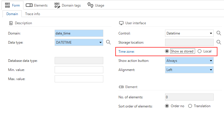 Time zone setting for domains
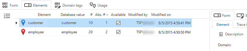
Set up domain elements for COMBO, IMAGE COMBO, and RADIO BUTTON
You can define elements for the controls COMBO, IMAGE COMBO and RADIO BUTTON. These controls limit a user's input to the available elements.
An element translates a database value into a human-readable value. For example, if you create a domain for roles, you can define the elements Admin, User and Guest. If you set the domain control to COMBO, the user can only select one of these three roles in the user interface.
menu Data > Domains > Elements
- Select a Domain that you want to add elements to.
If you add elements to a domain, the control is automatically set to COMBO if it is not already set to COMBO, IMAGE COMBO or RADIO BUTTON. - Create an Element and add an ID. This ID is used to translate the elements.
- Enter a Database value. This value is stored in the database.
The value is usually a number, but other data types are also accepted.
- A IMAGE COMBO control uses icons instead of text. Select images in the field Icon.
For example: The domain Gender has the elements Unknown, Man and Woman with database values 0, 1 and 2. Instead of displaying this as text, you can use icons that represent each gender. You can customize the number of rows and how the options are displayed with the setting field height in positions. - For a RADIO BUTTON control it is optional to use icons instead of text.
- A IMAGE COMBO control uses icons instead of text. Select images in the field Icon.
- Enter a Sequence no. This is used to sort the elements if the sort order is Order no.
- To make an element unavailable, clear the checkbox Available. If an element is made unavailable, it will not be shown in the user interface.
To set the sort order for the elements:
menu Data > Domains > tab Form > tab Domain
- In the field Elements, you can see the number of elements configured in the tab Elements.
- Determine the sort order for the elements:
- Order no - the elements are sorted as set in the tab Elements > field Sequence no
- Translation - the elements are sorted alphabetically, based on their translations
 Two domain elements with icons
Set up an element name of IMAGE COMBO for a tooltip
In the grid, you can view the domain element name of an image combo in its tooltip. You can set the domain element name in the menu Data > Domains > tab Elements > field Element.
Set up a domain with a CHECKBOX control
You can use a Checkbox domain control for Boolean values, such as '1' and '0', or 'true' and 'false'.
To set up a domain with a Checkbox control:
menu Data > Domains
-
Create a domain and use one of the following Data types:
BITfor database values '1' and '0'.CHARorVARCHARfor database values such as 'Y'/'N' or 'T'/'F'. This is useful if your existing database already contains these values, and you want to use a checkbox control without changing the database values.
It is not recommended to use other data types, since a Checkbox control is only suitable for two whole values (checked and unchecked).
-
Enter a Length for the domain.
-
In the group Element, set the Sort order of elements to Order no.
-
In the group User interface, select Checkbox as the Control.
-
Optional. In the group User interface, configure the settings to determine how the checkbox is displayed.
-
Optional. In the group Default value, configure the default value for the domain. For example, you can set the default value to '0' or 'N' to have the checkbox unchecked by default.
-
If the data type is
CHARorVARCHAR, go to the tab Elements to set up domain elements for the Checkbox. These elements specify which database values correspond to the checked and unchecked states of the checkbox. It is not necessary to set up domain elements for theBITdata type.- Add an Element with the name 'true'. Set the Database value to 'Y' or 'T'.
- Add an Element with the name 'false'. Set the Database value to 'N' or 'F'.
Element name Database value true Y or T false N or F noteOnly add two domain elements to a domain with a Checkbox control. Adding more than two elements may cause the checkbox control behave unexpectedly.
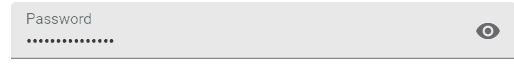
PASSWORD control fields
In a password control field, passwords are by default hidden from view.
Users can toggle the Visibility  to show or hide the password.
The Visibility icon is shown by default, also when the field is non-editable or read-only.
to show or hide the password.
The Visibility icon is shown by default, also when the field is non-editable or read-only.
You can control whether the visibility icon is shown with the setting Show action button.
 Password control field with visibility icon in the Universal UI
If the password control is used, the field has not yet been encrypted. The value will therefore still be visible in the database when it is stored and can also be passed on to the defaults and layouts.
PROGRESS BAR in forms
Universal UIThe PROGRESS BAR control displays a progress bar in grids. To display a progress bar in forms, use the FormProgressBar extended property. You can apply conditional layouts to the progress bar.
LOCATION control
Universal UIThe LOCATION control adds a location pin to the input field.
If a user clicks on this pin, they will be asked to give permission to add the location coordinates of their current location.
The format of the coordinates is latitude, longitude, for example, 52.2083228,5.9794353.
If the user adds a new row, the LOCATION control automatically fills in the current location for empty mandatory input fields.
 In an empty mandatory field, the location is filled automatically
If the field is not in edit mode, it will become a clickable link that opens the coordinates in Google Maps.
 A clickable location link in an non-editable field
HTML control
Universal UIThe HTML control can contain plain HTML, including URLs to trigger deep links or enable navigation within your application.
Deep links are only available for card lists and read-only grids. An example of a deep link is an HTML control that contains a link to trigger a process flow. The process flow opens a specific subject within the application. So, if a user clicks the link in a card list or read-only grid, the subject opens in the application.
You can use the following routing parameters in the HTML control:
- The
originis not required; you can specify only the route as well. - To open the link in a new tab, use the
target="_blank"attribute. Without it, the link will open in the same tab.
Example of a full URL: https://universal.thinkwise.app/#application=123/subject=project/subjectVariant=project_start_empty/refreshModel=true.
| Routing parameter | Must come after | Type | Description | Example |
|---|---|---|---|---|
origin | — | string | Takes the user to the root application. | https://universal.thinkwise.app |
metaSource=:metaSource | origin | string | Overrides the meta source (URL-encoded); triggers a page reload if changed. | https://universal.thinkwise.app/#metaSource=sf |
application=:application | metaSource (if used) | string | guiApplId (numeric) or guiApplAlias. Required for all routes except metaSource-only. | https://universal.thinkwise.app/#application=123 |
subject=:entityId | application | string | Subject entity ID to open as a document. Mutually exclusive with processflow and floatingDocumentKey. | https://universal.thinkwise.app/#application=123/subject=booking_hours |
processflow=:processFlowId | application | string | Process flow primary key to start. Accepts ?key=value query params passed to Indicium. Mutually exclusive with subject and floatingDocumentKey. | https://universal.thinkwise.app/#application=123/processflow=open_booking_hours |
floatingDocumentKey=:floatingDocumentKey | application | string | Opens a subject in floating/overlay mode. Mutually exclusive with subject and processflow. | https://universal.thinkwise.app/#application=123/floatingDocumentKey=keyname |
subjectVariant=:entityVariantId | subject | string | Subject variant ID. Only valid after subject=:entityId. | https://universal.thinkwise.app/#application=123/subject=project/subjectVariant=project_start_empty |
refreshModel=true | Always last | literal | Triggers model refresh (Developer mode only). Removed from URL after processing. | https://universal.thinkwise.app/#application=123/subject=project/subjectVariant=project_start_empty/refreshModel=true |
CODE DIFF EDITOR control
The Code diff editor control can be used to compare and edit code. It is useful for identifying differences between code and resolving potential conflicts. You can apply the control to columns, task parameters, and report parameters.
To set up a Code diff editor control:
-
Create two columns, task parameters or report parameters. One column or parameter is used for the source code, and the other column or parameter is used for the target code.
-
For the source code column or parameter:
- Set the Visibility to Read-only or Hidden.
- Set the Control to Code editor.
-
For the target code column or parameter:
- Set the Visibility to Read-only or Editable.
- Set the Control to Code diff editor.
-
See also, Code diff editor in the user interface documentation.
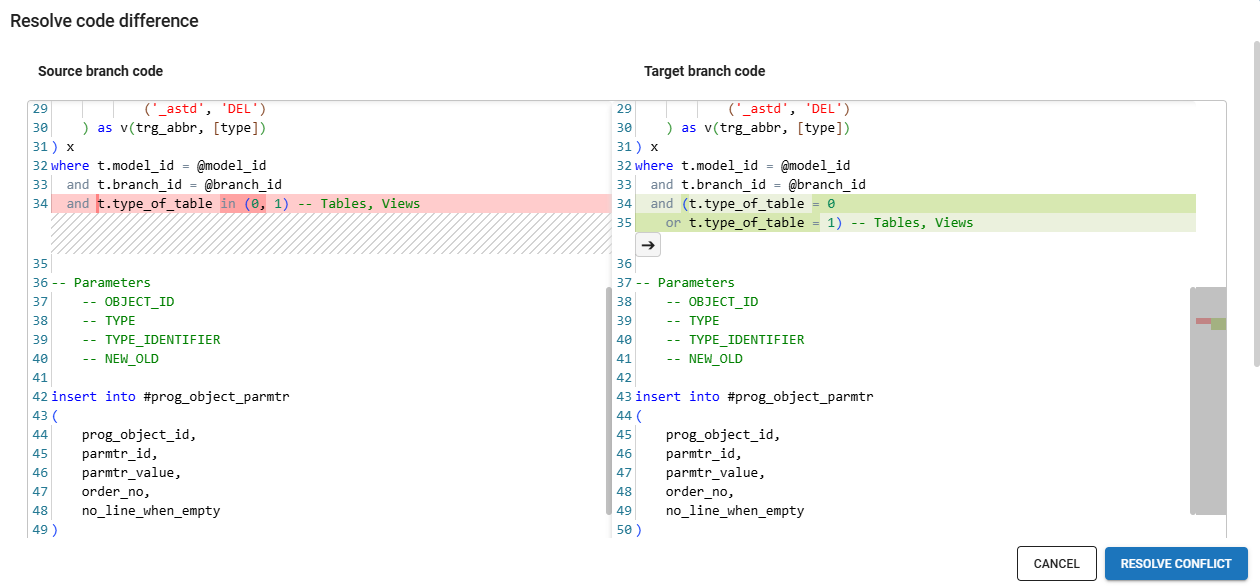 Code diff editor control in the Universal UI
BARCODE scanner controls
Third-party integrations for barcode scanning
Universal UIThinkwise supports two barcode scanner controls. This topic provides information for both types of barcode controls.
- Barcode scanner (ZXing). This barcode scanner is an open-source third-party component. It is a free alternative to the more powerful, paid Cortex barcode scanner.
- Thinkwise partner CortexScan from CodeCorp.
When using Google Chrome on iOS, both the regular and Cortex barcode scanners only work on iOS 14.3 and higher due to vendor limitations.
In addition to the integrated barcode scanning capabilities, it is also possible to process the input from connected handheld scanners in the Universal UI. For scanners with a display that run a recent browser version, for example Zebra scanners, it is even possible to run the Universal UI on the scanner itself.
General settings for barcode scanner controls
Depending on the situation, the barcode-scanning device can send a key code to the application after each successful scan. Usually, this is the tab key, but on some devices this suffix can be configured. If a device is configured to send a tab key code as a suffix, the cursor is moved to the next field. For tasks, if the last visible field is a barcode field, the task will automatically execute if a tab key is sent as a suffix.
- To change the field where the cursor moves after scanning, apply a Default with a
cursor_to_col_idparameter. - With the same default, you can also process the scanned barcode into the database. This way, you can keep the task open and scan multiple items in a short time.
- In a situation or location where the internet connection may occasionally drop, and the task is marked as Offline executable,
consider using the extended property
RepeatOfflineTasksuntil the task is canceled. - If the barcode field is not the last field in a task and you want to scan another item directly, consider Repeating a task after execution.
Virtual keyboard settings for barcode scanner controls
A keyboard icon is shown in the Barcode scanner control, which users can select to open a virtual keyboard.
-
By default, the virtual keyboard is not shown when the control is focused.
-
If the Data type of the domain is set to NUMERIC, a numeric virtual keyboard is shown.
-
To determine whether the barcode or virtual keyboard icons are shown, use the setting Show action button:
- Always - the barcode and keyboard icons are shown in edit mode.
noteThe keyboard icon is only shown on touch devices, since they usually have a virtual keyboard to trigger.
- When editable - the same behavior occurs as if the option is set to Always.
- Never - the barcode and keyboard icons are not shown.
You can also use custom CSS to determine whether one of the icons is hidden. For more information, see Barcode scanner icons.
Virtual keyboard APIs may not be fully supported for some devices and browsers, which can cause the virtual keyboard to appear when it should remain hidden.
Barcode scanner
This barcode scanner control is a regular text input with a barcode icon next to it. It can be used in two different ways:
- If you use an external hand-held barcode scanner that is connected to your device, the text input field is automatically filled after scanning.
- If you use your device to scan a barcode, it uses your device's camera to scan the barcode and extract the data. When a user clicks the barcode icon the first time, permission is asked to use the camera. If the camera permission has been given, scanning will start in a pop-up.

If you're using a hand-held scanner and scanning is the last step in a task, the task is submitted directly, if:
- The barcode scanner is configured to send Tab after the barcode (this is commonly called 'postfix').
- The hand-held scanner is connected to, e.g., a cell phone or a desktop.
- The focus is on the
BARCODE_SCANNERinput field in a task. - The barcode field is the last visible field in a task.
Supported barcode symbologies
The Barcode scanner supports the following barcode symbologies:
| Supported | ||
|---|---|---|
| Aztec | DataBarExpanded | PDF417 |
| Codabar | DataMatrix | QRCode |
| Code39 | EAN-8 | UPC-A |
| Code93 | EAN-13 | UPC-E |
| Code128 | ITF | 1D-Codes |
| DataBar | MaxiCode | 2D-Codes |
By default, the barcode scanner will try to find barcodes with all of the symbologies above.
If only a few symbologies need to be supported, the scan performance can be improved by letting the barcode scanner search for only specific symbologies. This
can be configured in the config.json file in the Universal UI folder. For example, when only UPC-E and QRCode are necessary, config.json can be
configured like this:
{
  "barcodeScannerSymbologies": "UPC-E, QRCode",
  "defaultApplication": "",
  "defaultPlatform": 3,
  "loginOptionsDisabled": false,
  "installNotificationDisabled": true,
  "installNotificationExpirationInDays": 30,
  "serviceUrl": "https://web10.thinkwise.app/ng_indicium/iam/iam"
}
Cortex barcode scanner
Universal UIThe Cortex barcode scanner is a more powerful alternative to the free to use barcode scanner.
To use the Cortex barcode scanner, you need a license from the manufacturer. For more information, see https://codecorp.com/products/web-sdk.
When using Google Chrome on iOS, both the regular and Cortex barcode scanners only work on iOS 14.3 and higher due to vendor limitations.
To use Cortex in the Universal UI:
menu Data > Domains
- Configure CORTEX_DECODER as the domain control.
- In the Universal UIs configuration file
config.json, add the license like this:
"cortexLicense": "your-license-key-here",
To improve the scan performance, you can configure only the symbologies you need:
"cortexEnabledSymbologies": ["Code128", "EAN8", "EAN13", "UPCA"].
By default, Cortex scans the following symbologies:
| Supported (default) | ||||
|---|---|---|---|---|
| Aztec | UPCA | UPCE | PDF417 | Interleaved2of5 |
| Code93 | Code128 | Code39 | QR | EAN8 |
| EAN13 | DataMatrix | DotCode | GS1Databar14 |
However, Cortex supports a lot more symbologies. This is the full list:
| Supported (all) | ||||
|---|---|---|---|---|
| AustraliaPost | MSIPlessey | Code128 | Plessey | EAN8 |
| CanadaPost | MicroPDF417 | Code49 | Straight2of5 | GridMatrix |
| Code11 | Pharmacode | DataMatrix | UPCA | IATA2of5 |
| Code39 | RoyalMail | EAN13 | USPSIntelligent | KoreaPost |
| CompositeCode | Trioptic | GoCode | BC412 | Maxicode |
| DutchPost | UPU | HongKong2of5 | CodablockF | PDF417 |
| GS1Databar14 | USPSPostnet | JapanPost | Code32 | QR |
| HanXinCode | Aztec | Matrix2of5 | Code93 | Telepen |
| Interleaved2of5 | Codabar | NEC2of5 | DotCode | UPCE |
| USPSPlanet |