Custom components
Introduction to Custom components
Custom components are screen components you can add to your application to extend its functionality. You can use them, for example, to add advanced graphic applications, advanced integrated BI and reporting, or chat windows to your applications.
You can add custom components to your model or host them externally and refer to them in your model (external source).
Running your own containers is not supported in the Thinkwise Cloud, so custom components should be added to the model instead of using an external source.
The following example shows an integrated CAD viewer in a Thinkwise application:
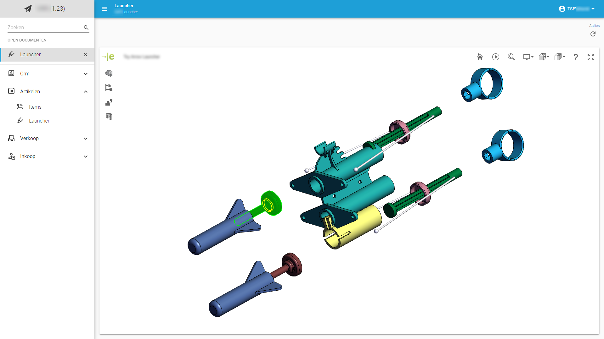 Custom component with a CAD viewer
- Community post - Set up Custom Components
- Community post - Implement a Custom Calendar Component
Third-party integrations for custom components
Many libraries are available that offer advanced components that can be used in custom screens. For example:
- MUI - also used by the Thinkwise Universal UI
- ToastUI - provides a calendar component, among others
Add a custom component to your model
You can upload custom components in the Software Factory Custom components screen. This acts as a repository for custom components you can use when designing a screen type for an application.
To add a custom component to the model:
menu User interface > Custom components
- Enter a name for the Custom component and a description.
- Upload
 a
a .zipfile containing your custom component. - Optional. Enter the Default entry point.
This specifies what file is used to start the custom component, for example
index.html. - Add a custom component to a subject.
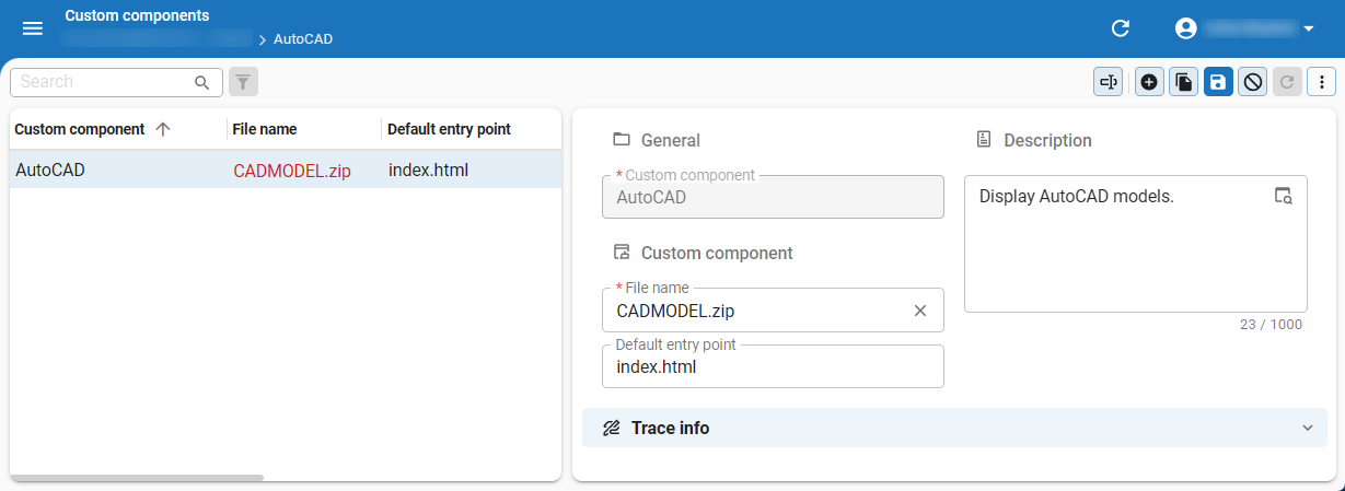 Add a custom component to the model
Add a custom component to a subject (Model source)
After adding a custom component to your model, the following requirements must be met to display it in your application:
- The subject must have the custom component assigned.
- The subject's screen type must include a Custom component screen component. See also, Design a screen type.
To add a custom component to a subject:
menu User interface > Subjects > tab Default/Variants > tab Settings > section Components > group Custom component
- Select Model as the Source.
- Select the Custom component you want to add to the subject.
- Enter the Entry point of the custom component.
If the custom component already has a Default entry point configured in the Custom components screen, this will then be set as the initial Entry point.
You can use
{metasource}and{application}variables in the entry point to refer to different versions of the custom component. These variables resolve the same way as in an external source location.
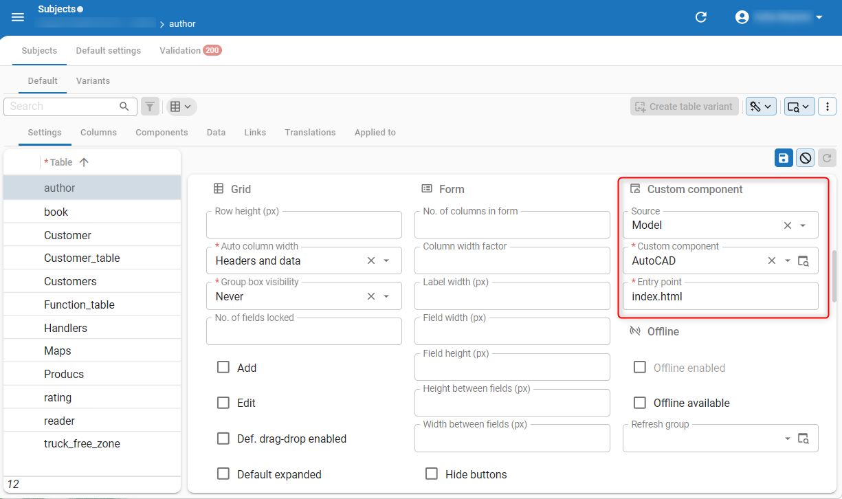 Add a custom component to a subject from the model source
Add a custom component to a subject (External source)
To add a custom component that is hosted externally, you can refer to it in your model by specifying its location.
To specify the location:
menu User interface > Subjects > tab Default/Variants > tab Settings > section Components > group Custom component
- Select External as the Source.
- Enter the Location of the custom component.
For example:
- The custom component is located at
custom/my_component.html - and the Universal UI is deployed at
https://myapp.mycompany.cloud/Universal
In this case, the custom component must be served via https://myapp.mycompany.cloud/Universal/custom/my_component.html.
To refer to different versions of the custom component, you can include {metasource} and {application} variables in the location.
Depending on how the application is started, the variables will be resolved to either the Software Factory or IAM,
and to the runtime configurations' application ID or alias in the Software Factory, or the application ID or alias in IAM.
In this way, you can host different versions without having to change the custom component reference in the model by using /custom/{metasource}/{application}/my_component.html:
- for production, at
/custom/iam/myapp/my_component.html - for development, at
/custom/sf/myapp/my_component.html - a new branch version at
/custom/sf/54/my_component.html
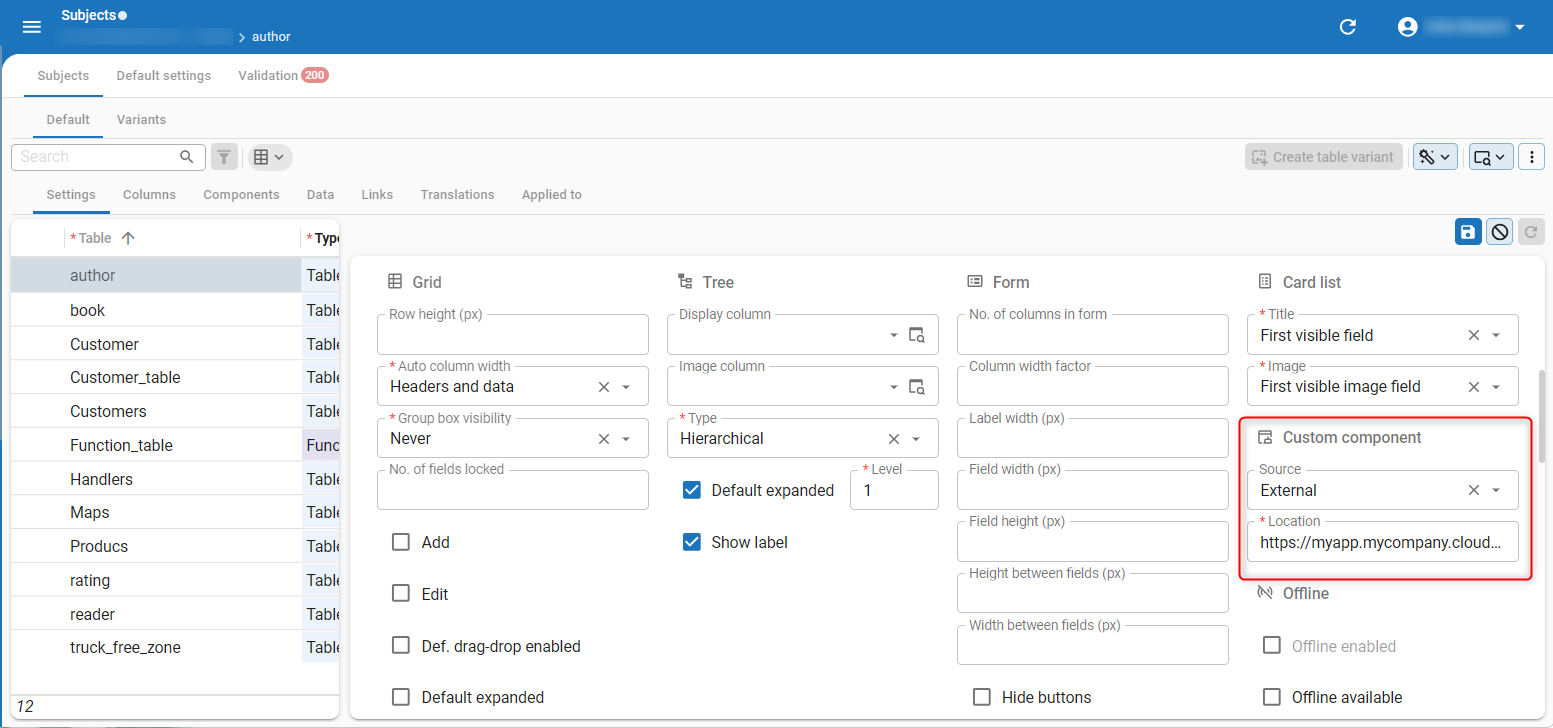 Add a custom component to a subject from an external source
Initialize your custom component
To initialize your custom component and receive updates from the Universal UI, use the following code snippet in your custom component:
  window.parent.postMessage({
        type: 'initComponent'
      }, '*');
Subscribe to window event message
To subscribe to window event message to receive updates, use the following code snippet:
  let currentState = null;

  window.parent.postMessage({
        type: 'initComponent'
      }, '*');
As a next step, you can listen for messages from the Universal UI using the message event listener:
window.addEventListener("message", function(event) {
      currentState = JSON.stringify(event.data);
  });
Structure of the event data
The event data will contain an object with the following structure:
{
  "InitializationInfo": {
    "Application": 80,
    "ApplicationAlias": "erp",
    "ApplicationUrl": "https://thinkwise.app/indicium/iam/erp",
    "MetaURL": "https://thinkwise.app/indicium/iam/iam",
    "Entity": "sales_invoice"
  },
  "State": "regular",
  "Theme": "dark",
  "EntityQueryPath": "https://thinkwise.app/indicium/iam/erp/sales_invoice",
  "DataSetLocation": "https://thinkwise.app/indicium/iam/erp/sales_invoice?$prefilter=pending&$skip=0&$top=100",
  "DataRowLocation": "https://thinkwise.app/indicium/iam/erp/sales_invoice(sales_invoice_id=9559)",
  "DataRow": {...},
  "DataSet": [...],
  "EventType": "initContext"
}
On every event, you get the full-state object.
The property EventType explains what happened in the Universal UI and can have the following values:
initContext- You receive this immediately after postinginitComponent. Note that you should bind to the event listener before posting theinitComponentmessage.updateState- Something changed in the state of the Universal UI; you may want to block or unblock the UI of your component.updateDataRow- Universal UI has changed rows.updateDataSet- Universal UI has updated the data.updateTheme- The theme has changed from dark to light mode or vice versa.
The State property can have three states:
regular- Nothing is in edit mode, and your user should be able to interact with the custom component.editing- Universal UI is in edit mode, or when in default edit mode, there is an unsaved record. It is probably a good idea to block interaction with your component.locked- Universal UI is displaying a pop-up. The custom component is probably not accessible, but coming from this state, you may want to refresh your data.