Cubes
In accordance with our Lifecycle policy, the Windows GUI is no longer supported from Thinkwise Platform version 2026.1 and higher. This means some features on this page are no longer supported. See Transition to the Universal UI for more information.
Introduction
The Software Factory's user interface offers powerful business intelligence features known as cubes. Cubes let you perform online and interactive analyses, helping you to gain deeper insights and make informed, data-driven decisions.
A cube is a structured dataset that is optimized for querying and reporting and is always based on a specific subject. Each dimension within a cube represents a different aspect of the data, such as time, geography, or product categories. This setup allows you to pivot, slice, and dice data to uncover trends and patterns.
Cubes are the foundation for cube views. These views can be displayed as charts or pivot tables, which help you visualize and interpret complex data relationships.
Cube terminology
A cube is a structured dataset that is optimized for querying and reporting and is always based on a specific subject. They allow you to pivot, slice, and dice data to uncover trends and patterns. A cube consists of fields that are categorized into dimensions and values.
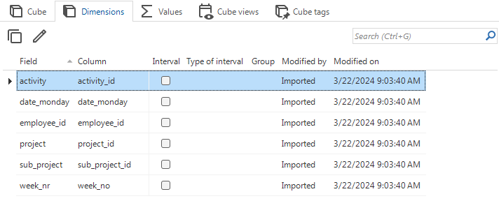
- A dimension within a cube represents a different aspect of the data, such as time, geography, or product categories. A dimension can be an underlying column or an interval of underlying columns and can be nested.
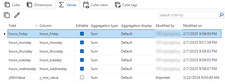
- A value is a data point that is associated with a dimension, such as sales revenue or the number of units sold. A value represents aggregations of underlying columns or formulas based on other values.
A cube view is a predefined configuration of dimensions and values, as well as other configurations that affect the way the pivoted cube data is displayed to the user. You can define multiple cube views for a single cube. Cubes can be visualized in a cube view as a pivot table or a chart:
-
A pivot table is a table that displays data in a grid format, containing rows and columns that can be easily rearranged. This is similar to how a pivot table works in Microsoft Excel.
- A row in a pivot table is a horizontal line of data, for example, a list of products or regions.
- Values are always shown in the context of columns in a pivot table, for example as a list of months or years. When there are multiple fields placed in a pivot table as values, these values will always be shown as columns at all expansion levels.
-
A chart is a graphical representation of data containing series and categories. Dimensions are placed on the axis and legenda as categories or series.
- A series is a set of data points that are plotted on the chart, for example on the y-axis of a chart.
- A category is a group of data points that are plotted together, for example on the x-axis of a chart.
Users can set up their own cube views and save them when a Cube panel is present and enabled on the screen. For more information, see Create a cube.
Example
If you are analyzing sales data for a tech company using a cube that contains sales information, the dimensions might look like this:
- Product - such as a laptop, smartphone, or tablet.
- Region - such as North America, Europe, or Asia.
- Time - such as year, quarter, or month.
The value in this cube represents a measurable fact, such as the total sales revenue in a specific region. For example, the sales revenue in Q1 for laptops in North America is $200,000.
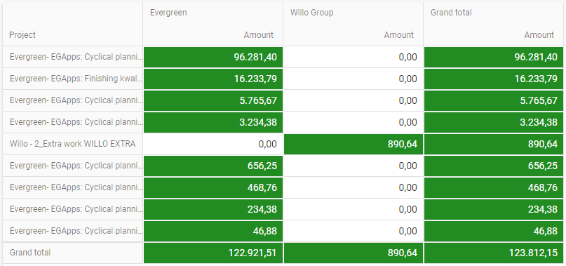
In the example below, this data is displayed as a pivot table:
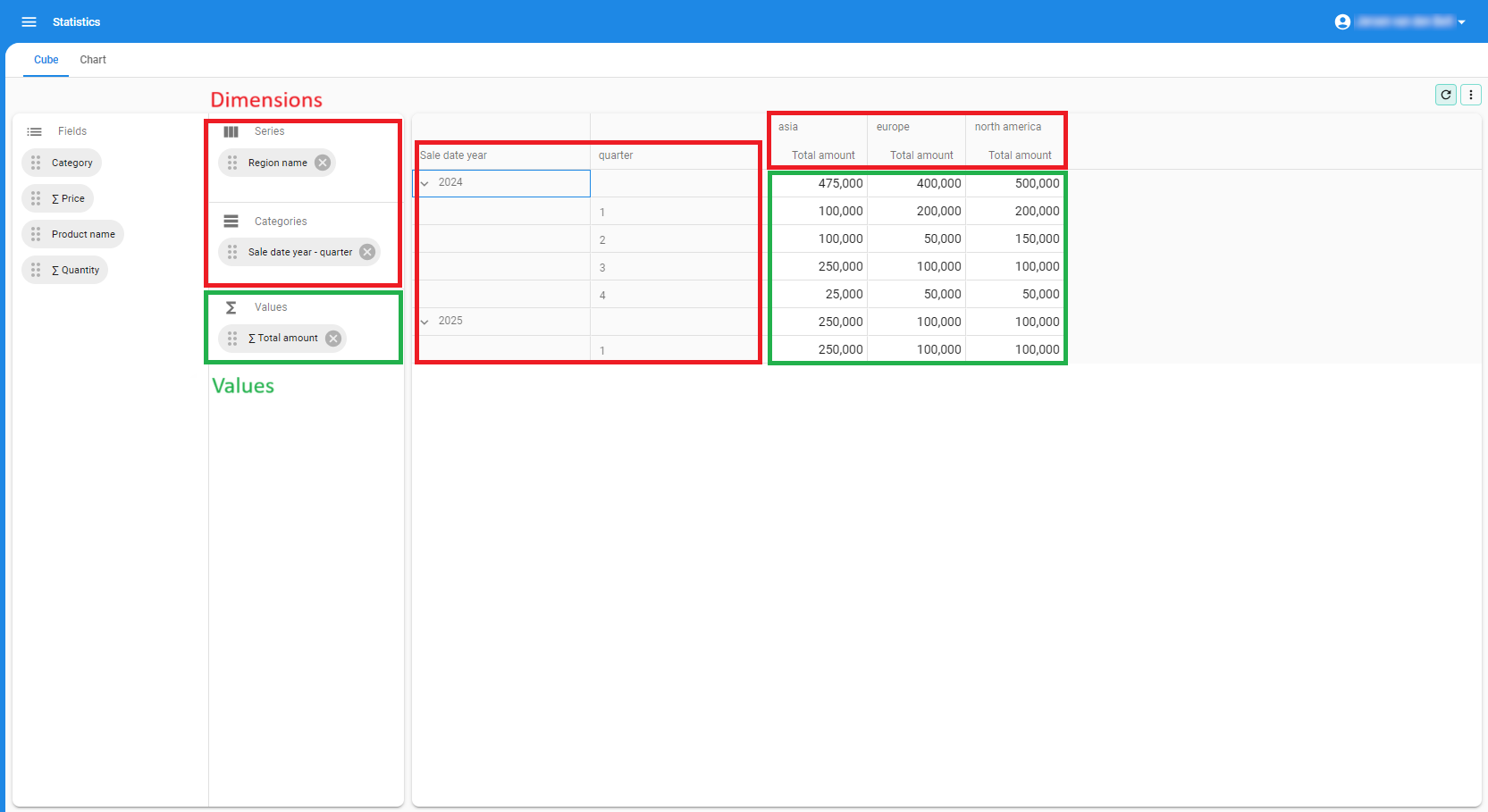 Example of a pivot table
In the example below, this data is displayed as a chart:
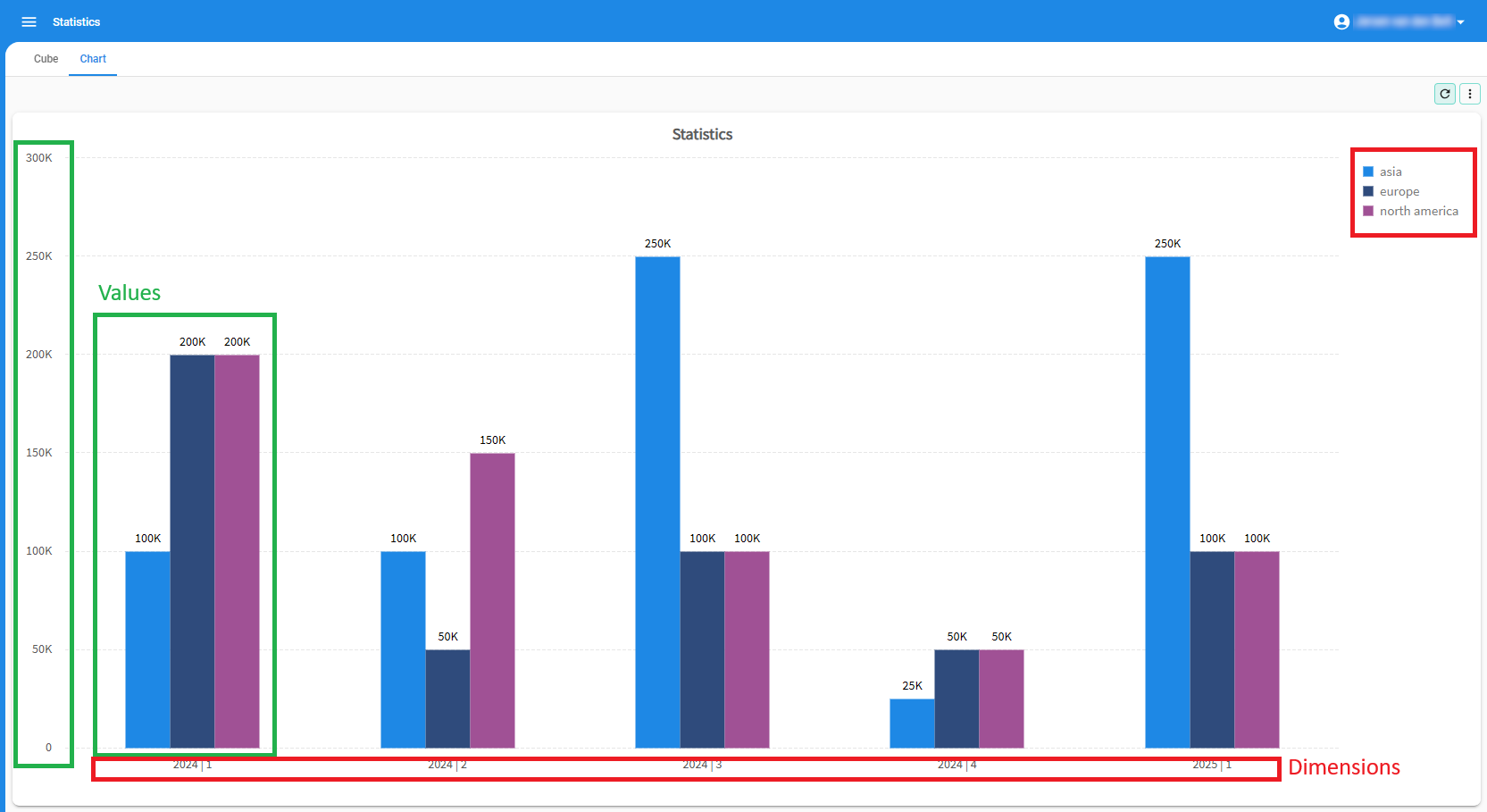 Example of a chart
Third-party integrations for Business Intelligence
For more advanced Business Intelligence solutions, you can use the Thinkwise OData API to make the data from your application available to advanced third-party BI solutions, such as:
- Microsoft Power BI
- QlikSense
- Tableau
The web-enabled dashboards provided by these tools can be seamlessly integrated into your Thinkwise application, using Custom components.
Screen types for cubes
The following screen types are default available for cubes (menu User interface > Screen types):
- cube
- cube_horizontal
- cube_no_fields
See also Design a screen type.
The following screen components are available for cubes (menu User interface > Screen types > tab Design > panel Abstract components):
- Pivot table
- Chart
- Cube panel
- Cube view bar
See also Available screen components.
Set up a cube
Create a cube
menu User interface > Cubes > tab Default > tab Cube
-
Start the task Create cube
 .
. -
Select the table for which you want to create a cube.
-
Select Execute.
-
Choose which model updates you want to run.
-
Execute the task Execute model updates
 and confirm.
Now:
and confirm.
Now:- A cube component definition, including values and dimensions, is added
- The screen type of the table is changed to cube
-
Select the tab Cube. Here, the following settings are available:
- Default cube view - Optional. Select the cube view you want to set as the default for this cube. See Set up a cube view.
- Enable cube panel - Required if you are using the screen component Cube panel. Enabling the cube panel allows users to modify a cube's series and categories and create a customized overview of the pivoted data.
- OLAP connection - See OLAP cubes.
-
Go to the tabs Dimensions and Values to verify the definitions of the dimensions and values. The task for creating a cube has generated the best possible proposal automatically, but you should still verify them:
- Remove all the ID columns with no semantic value for the user from the cube. They then just provide the connection to the other subjects.
- Make sure that the measured value(s) used in the cube are derived from the fact table. That is the data that provides the most detail.
Configure dimensions
Cube fields with type Dimensions, or in short, dimensions, contain categorical data. Examples include product names, regions, dates, or customer segments. You can use them to group and segment your numerical data, the values.
Dimensions can have a hierarchical structure, allowing you to 'drill down' into more detailed levels of analysis. By using dimensions, you can analyze your data in different contexts. For instance, you might want to see the summary of costs (values) broken down by product category (dimension) and market segment (dimension).
To configure a dimension:
menu User interface > Cubes > tab Default > tab Dimensions > tab Form
For each dimension:
-
Enter a name for the dimension in Field.
-
Select a Column.
-
Optional. Select whether you want to Group dimensions. A group can be collapsed and expanded. You can, for example, group
Project activityandProject. In that case, aProject activitywill be shown as a dimension under theProject. TheProject activitywill be no longer available as an independent dimension. -
Optional. Select whether you want to set up an interval. For example, you can assign an alphabetical interval to a dimension. This will show all the names starting with an 'A' in one group.
Possible interval types
The possible interval types are:
- Alphabetical - grouping by initial letter.
- Numeric - interval for a numerical range (for example, per 100 or per 1000).
- Date - the date of a date or timestamp.
- Year - the year of a date or timestamp.
- Quarter - the quarter of a date or timestamp.
- Month - the month of a date or timestamp. Months are displayed as text depending on a user's language settings (for example, October (ENG US), Oktober (NL), or Octobre (FR).
- Week of year - week no. of the year for a date or timestamp.
- Week of month - the week of the month for a date or timestamp.
- Day of year - the day of the year for a date or timestamp.
- Day of month - the day of the month for a date or timestamp. For example, 20 October will result in 20.
- Day of week - the day of the week for a date or timestamp. Weekdays are counted from 1 (Sunday) through 7 (Saturday).
- Year age - age in years based on the current date. For this purpose the numerical range can be used, for instance an age group per year or per 10 years (0-9, 10-19 etc.).
- Month age - see year age, but then for the age in months.
- Week age - see year age, but then for the age in weeks.
- Day age - see year age, but then for the age in days.
 Configure the dimensions
Configure values
Cube fields with type Value, or in short, values, contain numerical data. They are determined by an aggregation, such as summed, averaged, counted, or otherwise calculated.
They can be grouped and segmented by dimensions.
To configure a value:
menu User interface > Cubes > tab Default > tab Values > tab Form
For each value:
- Enter a name for the value in Field.
- Select an Aggregation type. This specifies what aggregation should be used to show the underlying column value. For example, by showing an average, a sum or a count. See also Calculated cube fields.
- Select a Column.
- Optional. Universal GUI Select if the field should be Editable in a pivot table. For more information, see Make values in a pivot table editable.
- Select an Aggregation display type. This specifies how the aggregation should be displayed. This can be as is or, for example, by using a relative percentage.
- Optional. Select the No. of decimals.
 Configure the values
Calculated cube fields
Universal GUICalculated cube fields are fields that are not directly available in the database but are calculated based on other cube fields. They are evaluated on cells and (sub)totals after intervals have been applied to dimensions and after values have been aggregated. You can use them to analyze data without modifying the database. Furthermore, they are evaluated separately for totals, which allows for advanced aggregations that are not possible with regular aggregation types.
For example, a profit margin calculation ((revenue - costs) / revenue) cannot be calculated in the database and aggregated as an average. The weighting of each profit margin and revenue is not taken into account for each (sub)total. Instead, this average must be re-evaluated for each (sub)total based on the summed revenue and summed costs.
Some other examples of when calculated cube fields can be useful:
- Average selling price: total revenue / number of units sold
- Year-over-year growth: (revenue this year - revenue last year) / revenue last year * 100%
To create a calculated cube field:
menu User interface > Cubes > tab Default > tab Values > tab Form
- In the field Aggregation type, select SQL expression.
- In the field Query, enter the SQL expression that calculates the value.
- Use
t1.cube_field_idto refer to another field. The aliast1is mandatory. Thecube_field_idis the name of the cube field.
- Use
- Windows GUI In the field Aggregation type, select Formula (deprecated).
- If you are transitioning from the Windows GUI to the Universal GUI, you can add both settings to your cube view. SQL expression is ignored by the Windows GUI, and Formula (deprecated) is ignored by the Universal GUI.
Set up a cube view
Create a cube view
To create a cube view:
menu User interface > Cubes > tab Defaults > tab Cube views > tab Cube view > tab Form
- Enter a name for the Cube view that you want to add to the selected cube.
- Enter the Sequence no. With this setting you can influence the order in which the cube view appears.
- Optional. Select an Icon for the cube view.
- Optional. Select the Cube view group from the drop-down list. See Create a cube view group.
- To make the cube view available, select the checkbox Show cube view.
- Optional. Select the Default cube view type (pivot table or chart). See also Pivot tables and Charts.
- Optional. To show a cube view in a Cube view bar or (Custom) action bar, select the same Screen area as the bar. For more information, see Screen areas.
- Optional. Select a Custom display type.
For example, Icon + text (> text > icon) means that the report is displayed as an icon with text. On a smaller screen with less space, it is displayed as text (the first fallback: > text). With even less space, it is displayed only as an icon (the second fallback: > icon). The overflow menu is always the last fallback type, except for the display type Hidden.
You can now add fields to the cube view.
Create a cube view group
Cube views can be grouped together in a cube view group. This allows you to organize related cube views under a common button, making it easier for users to find and use them.
To create a cube view group:
menu User interface > Cubes > tab Default > tab Cube views > tab Cube view groups > tab Form
- Create a new Cube view group and add a Description. The Sequence no. is automatically assigned, but you can change it to determine the order in which the cube view group appears.
- Optional. Add an Icon to represent the cube view group.
- Optional. Select the checkbox Submenu to display the cube views in a cube view group as a submenu. If this option is not selected, the cube views are grouped visually with separators.
- Optional. Select a Custom display type. This allows you to display grouped tasks differently for each screen. This option becomes available when you select Submenu.
When you create or edit a cube view, you can now add it to the Cube view group you created.
Universal UI For more information on grouped actions and their behavior in the Universal UI, see Group actions in the action bar.
Add fields to a cube view
The Cube set-up panel allows you to configure the cube view visually, similar to how you would create a cube view in your application. You can drag fields into a cube area, to remove them from a cube area, or to change the field order within an area.
To add fields to a cube view:
menu User interface > Cubes > tab Default > tab Cube views > tab Cube set-up panel
- Select a Field.
- Use drag/drop to drag the field to the desired cube area:
- Filters
- Series / Columns
- Categories / Rows
- Values
After creating the cube view and adding the fields, they are available in your end application's cube.
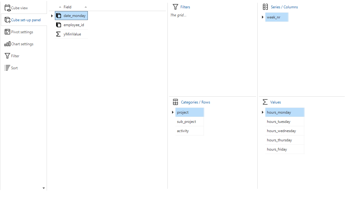 The cube set-up panel
Configure the cube view filter
The dimensions you added to the areas Series / Columns and Categories / Rows in the Cube set-up panel are available for filtering in the cube view. You can also make additional dimensions available by adding them to the area Filters. See Add fields to a cube view.
To configure the cube view filter:
menu User interface > Cubes > tab Default > tab Cube views > tab Filter
- Optional. Select a Filter value for the field.
Configure the cube view sort
The fields you added to the areas Series / Columns, Categories / Rows, and Values in the Cube set-up panel are available for sorting in the cube view. See Add fields to a cube view.
To configure the sort for a cube view:
menu User interface > Cubes > tab Default > tab Cube views > tab Sort
Each area has its own tab for sorting. In these tabs, you can specify the sorting of dimensions and values in the cube. This should not be confused with changing their relative order; this can be done in the Cube set-up panel.
The following options are available:
In the tabs Series / Columns and Categories / Rows:
- Optional. Sort order: Ascending or Descending.
- Optional. Sort by cube field - Use this to base the sort order for a series or category on the value of a cube field. For example, sort companies by revenue instead of alphabetically.
In tab Values:
- Optional. Show top x - Enter a number to show the top x values.
- Optional. Type of show top x - Select how you want to show the top x values, Absolute or Percentage.
- Optional. Show other - Select this checkbox to show the values that are not in the top x in the cube view as 'Other'.
Add conditional layout for a cube view
With conditional layouts you can apply formatting to specific cells when certain conditions are met. This way you can highlight specific cells to capture a user's attention.
Conditional layouts are useful in the following situations:
- Within standard cube views (excluding custom cube views).
- In basic conditional layouts. A single cube view can have multiple conditional layouts.
- For grand totals and nested fields (categories).
To define conditional layouts for a cube view:
menu User interface > Cubes > tab Default > tab Cube views > tab Conditional layout
-
Select a Field - This specifies the target column where the formatting will be applied when a condition is met.
-
For a pivot table, configure the following settings in the group Pivot:
- Apply to cell - Select the checkbox to enable conditional layout for cells within the column specified in Field if a condition is met.
- Apply to total cell - Select the checkbox to enable conditional layout for total cells within the column specified in Field if a condition is met.
- Apply to custom total cell - Select the checkbox to enable conditional layout for custom total cells within the column specified in Field if a condition is met.
- Apply to grand total cell - Select the checkbox to enable conditional layout for grand total cells within the column specified in Field if a condition is met.
-
Configure the settings in the group Condition:
- Condition on - Select the column to apply the condition to.
- Condition - Select the condition to apply, for example Equal to.
- Value - Enter the value for the condition, for example '8'.
-
Set up the formatting of the conditional layout:
- Universal UI In the group Universal:
- Select a Background color and Font color for the Light and Dark themes.
- Select additional settings for Font: Bold, Italic, Underline, or Strikethrough.
- Select a Font size for the font. The size L is 1.25 times the size of the default font, and XL is 1.5 times the size of the default font.
- Windows GUI In the group Windows:
- Gradient direction - Select the direction of the gradient, for example Horizontal.
- Background color 1 - Select the first color for the gradient.
- Background color 2 - Select the second color for the gradient.
- Font - Select the font, font size and the font color, for example Segoe UI 10 (50,50,50).
- Image - Select an image to display in the cell.
For more information, see Set up a conditional layout.
- Universal UI In the group Universal:
Pivot settings for a cube view
Universal GUIA pivot table helps you view your data in a spreadsheet-like format. It is useful to dynamically summarize, organize and manipulate large datasets.
The following principles apply for a pivot table:
- The pivot row height follows the grid row height.
- The pivot header height does not follow the grid row height. It will wrap over multiple lines if the text does not fit within the column width.
- The category columns are pinned.
- The category and value columns auto-wrap their header titles. Note that this can cause the header to use more rows in a cube.
To set up a pivot table:
menu User interface > Cubes > tab Default > tab Cube views > tab Pivot settings > tab Form
The following settings are available:
- Show grand total for rows - adds an additional column that presents the row grand totals.
- Show grand total for columns - adds an additional row that presents the column grand totals.
- Show total for rows - adds an additional column that presents the row totals.
- Show total for columns - adds an additional row that presents the column totals.
- Total position - specifies the position of the additional row:
- Far (default) - Shows the row at the bottom of the pivot table.
- Near - Shows the row at the top of the pivot table.
- Drill down pivot cell - expands the pivot cell to show the underlying data.
Universal UI If you have no visible list type component selected, such as a card list or grid, we recommend the following subject settings for optimal performance.
- Set Max. no. of records to
1. - Set Page size to
0to disable paging - Select Open without data.
 The grand total for rows, shown in an additional column set to position "Far"
Pivot field settings
The following pivot field settings are available:
menu User interface > Cubes > tab Default > tab Cube views > tab Pivot settings > tab Pivot field settings
- Field width Universal GUI - Column resizing is enabled for all pivot columns, the minimum width is 50px.
If a field width is not set, the following applies:
- If the field is a category, the column width is auto-sized based on its content.
- If the field is a series, the column width is set to 110px.
- Expand - When multiple dimensions are placed as rows or columns in the pivot, they can be set to be collapsed or expanded by default.
For example, when the columns contain
year,month, andday of the month, you can choose to haveyearexpanded by default. All months will be visible but collapsed by default. Theday of the monthcells will not be visible until the user expands one month or all months.
Pivot field totals
Windows GUIIf you have selected to show totals in your cube view, more settings for totals are available for pivot fields.
To select the aggregation type:
menu User interface > Cubes > tab Default > tab Cube views > tab Pivot settings > tab Totals
- Select an Aggregation type. This specifies what aggregation should be used to show the underlying column value. For example, by showing an average, a sum or a count.
- Select an Aggregation display type. This specifies how the aggregation should be displayed. This can be as is or, for example, by using a relative percentage.
- Optional. Select the No. of decimals.
Make values in a pivot table editable
Values in a pivot table can be made editable, which allows users to directly edit the fields and make quick changes to their data. This is especially useful for managing and analyzing data where updates or recalculations need to be done frequently.
To make a pivot table editable for the Windows GUI, use the extender default_editable_cube.
If you transition to the Universal UI, the extender is no longer necessary.
To make a pivot table editable, the following conditions must be met:
- The user must have permission to manipulate data in a table, by selecting Update.
- The cube field type must be a value.
- The column type must be set to Editable.
- The aggregation type must be set to min, max, sum, or avg.
- The count of the aggregation type must be 1 (exactly one row behind the aggregation). For example, the sum of ages for Ben (47) and Anna (30) equals 77, with a count of 2 (based on two rows, which cannot be changed). If you add "person" as a dimension, you get Ben (47, count = 1) and Anna (30, count = 1), and these counts can be adjusted since they correspond to individual rows.
When you have made a value in a pivot table editable, you need to check if the editing rights are set up correctly. Context, default and layout procedures are not supported for editable pivot tables.
To set up the editing rights for a cube field:
menu Access Control > Roles > tab Tables > tab Cube > tab Cube fields
or
menu Access Control > Model rights > tab Tables > tab Cube > tab Cube fields > tab Roles
- Select the task Explain
 to check if rights are granted to a cube field.
 - Select the checkbox Editable for each cube field of type Value that you want to grant editing rights to. For more information on configuring roles, see Assign rights to a role.
Universal GUI If a user edits a pivot table, the table is refreshed as configured in the field After update. It is not recommended to set the refresh behavior Document, since this may cause the pivot table to re-render.
Make a pivot table exportable
Universal GUIA pivot table can be exported to Excel or CSV format by using the Export pivot button. This can be useful for further analysis or sharing data with others. For more information, see Import and export.
To make a pivot table exportable:
-
Allow exporting in the underlying table used for the pivot table. For information on how to do this, see Import/export/mass update permissions.
-
Go to menu User interface > Screen types, then add the following to your screen type:
- Pivot table
- Action bar (recommended) or Cube view bar (for versions lower than 2025.1)
-
Add the Export pivot action to the Action bar, if it is not already included. The cube view bar has the Export pivot action included by default. For more information, see Configure the default Action bar settings.
If Show total for rows is disabled, then exporting a pivot table will only include rows that belong to the innermost grouping level. Parent group rows will not be included in the export.
Chart settings for a cube view
Each cube can be displayed in a chart, which is a graphical representation of data used to visualize patterns, trends, and comparisons.
To set up a chart:
menu User interface > Cubes > tab Default > tab Cube views > tab Chart settings > tab Form
The following settings are available:
- Chart:
- Chart type
- Universal GUI The Universal GUI maps any 3D chart type to its 2D equivalent. The following charts are shown as a column chart: candle stick, gantt, point, range, scatter line, stock, swift plot.
- Palette
- Chart type rotated
- Show labels
- Show percentage
- Transparency
- Chart type
- Series:
- Show series
- Alignment horizontal
- Alignment vertical
- Direction
- Max. horizontal percentage
- Max. vertical percentage
Cube view constant lines
To model an area in a chart, you can use a constant line:
menu User interface > Cubes > tab Default > tab Cube views > tab Chart settings > tab Constant lines
- Enter a name for the Constant line.
- Windows GUI The name should start with
area_.
- Windows GUI The name should start with
- Select whether the line should be on the X or Y axis.
- Enter a minimum Value.
- Enter the height or width of the area in the field Thickness.
- Optional. Define a title.
Configure chart properties
To show the cube title in the active chart, set the extended property ShowTitleActiveChart to Yes.
Also, you can add any Fusion Chart configuration property to a chart.
Not all properties have been tested, so Thinkwise does not provide official support for them. Use them at your own risk.
To configure chart properties:
-
Open
config.json. -
Find or add the property
chartDefaults. -
Add any Fusion Chart configuration properties you want.
noteThe following properties are taken from the model, and will not be overridden:
captiondecimalSeparatorthousandSeparatorstack100PercentshowValuesshowPercentageshowLegendlegendPositionreverseLegend
You can override
paletteColors, but if it contains only one item, that color will remain the theme's main color.
For example, to prevent cube charts from rounding values:
"chartDefaults": {
  "formatNumber": "0"
}
Set up chart legend colors
You can apply specific colors to chart elements based on defined conditions. This makes it easier to highlight specific data points or values in the chart.
A conditional color is tied to one or more conditions, each specifying a dimension field and its expected value. The following applies for conditional colors:
- A color is applied to the chart legend based on the series value.
- If multiple conditions are defined, the color is applied if at least one of the conditions is met.
- Only colors that have conditions for all dimensions of the cube view will be used. The color must match the cube view structure to be applied.
A color can be defined without any conditions. An unconditional color will be applied in the following cases:
- The cube view has no dimensions.
- The cube view has a single dimension and no other conditional color is applied.
Furthermore, if a value has multiple colors defined, the first color that matches the conditions will be applied. If a value has no color defined, the values will follow the pre-defined array of colors.
- You can only use the dimensions from a cube to create a Chart legend color condition.
- You can only set up Chart legend colors for one cube and chart combination. You cannot set up the legend colors individually for different cube views of the same table.
To set up a chart legend color:
User Interface > Cubes > tab Default
- In tab Form, enter a Color name.
- Select a Field to which the color should be applied.
- Select a Light color and a Dark color to be applied in the light and dark themes.
- In tab Chart legend colors, select a Field on which the condition should be based.
- Enter a Value for the condition. To apply the color to all values, leave the field empty.
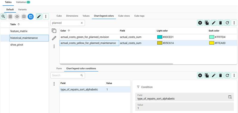 Example settings for conditional colors for a chart
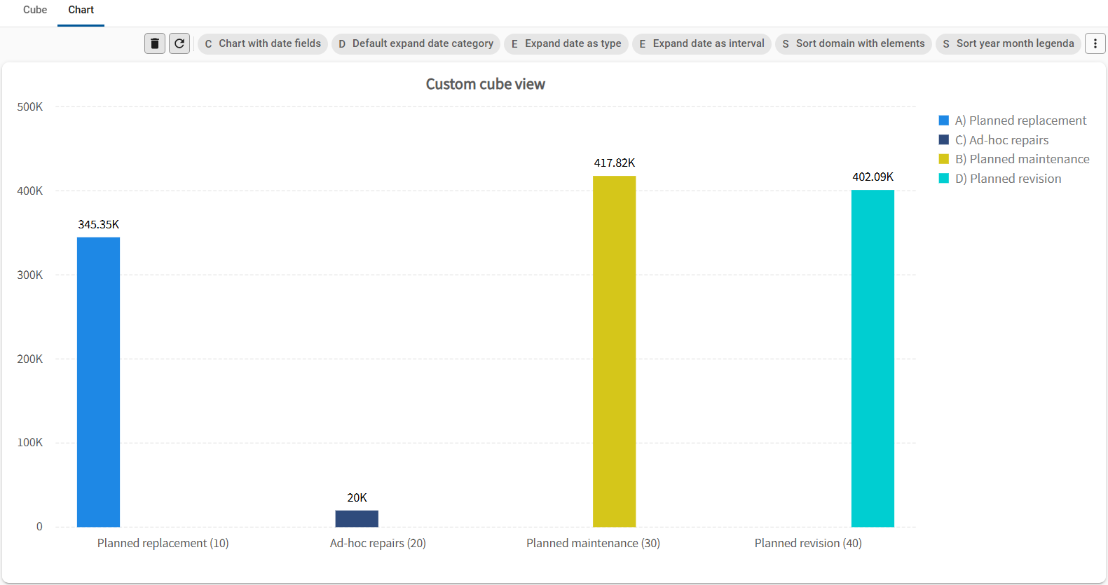 Conditional colors in a chart
Link a task to a cube
It is possible to link tasks to a cube table. For more information, see Create a table task.
menu Processes > Tasks > tab Table tasks > tab Form
When you link a Task to a cube table and connect Task parameters to Columns, the primary key columns of the cube table need to be available as Cube fields.
OLAP cubes
Windows GUI (2-tier)OLAP is short for Online Analytical Processing. It is a method for obtaining multi-dimensional data that can be sliced to obtain limited amounts of data or be viewed from a different viewpoint.
In the Software Factory, cubes and OLAP cubes are different in their data and the way the data is processed:
- The default cubes are based on real-time data. The computations are processed at the client level (Windows .NET GUI application or ASP.NET web server).
- The OLAP cubes are based on cached data rather than real-time data (depending on the cube's settings to gain a performance increase). The computations are processed at the database level.
Requirements and limitations
Requirements:
- An exhaustive, though possibly somewhat technical, list of requirements and limitations can be found here: https://docs.devexpress.com/WindowsForms/11776/controls-and-libraries/pivot-grid/binding-to-data/olap-data-source/olap-requirements-and-limitations?v=21.2.
- The Microsoft Analysis Services OLE DB Provider must be installed on the client machine in order to communicate with OLAP cubes.
Configuration requirements:
- All of the tables in the database that are used by an OLAP cube must also be described in the Thinkwise Software Factory.
- If you want to use an OLAP cube as a detail screen of a table, we recommended to create a dummy table for the cube. The dummy table should contain every primary key column of every table used by the cube. Then, create references between the tables used in the cube and this dummy table.
- Every primary key column of the cube's source tables (read: every column of the dummy table mentioned above) needs a corresponding cube field in the cube definition. For these cube fields, the Table id must point to the dummy table and the Column id must point to the corresponding column in the dummy table. For all the other cube fields, the table ID and column ID are technically irrelevant, which is why these columns need not be included in the dummy table.
- Rules for the cube field IDs in an OLAP cube:
-
For Values: use
Column ID -
For Dimensions: use
Table Name.Column IDnoteThe
Table nameandColumn IDdo not refer to the tables and columns of the database but those of the cube definition.
-
Limitations:
- Only cubes made with Microsoft Analysis Services are supported by the GUI applications.
- At this moment, only the OLE DB Data Provider is supported to retrieve data from the cube.
- Calculated fields are not supported. When defined, the GUI applications will ignore them.
- Group intervals are not supported. When defined, the GUI applications will ignore them.
Configure the connection to an OLAP cube
To turn a cube into an OLAP cube:
menu User interface > Cubes > tab Tables > tab Cube
-
Select the checkbox OLAP connection.
Three new fields will appear.
-
Enter the OLAP server name. This is the SQL Server instance on which the Microsoft Analysis Services runs.
-
Enter the OLAP database name. In the Business Intelligence Development Studio, this is the name of your Analysis Services Project.
-
Enter the OLAP cube name. This is the name of your OLAP cube within your model.
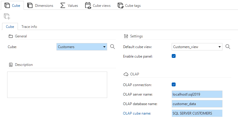 OLAP cube connection configuration
Configure fields for OLAP cubes
A default cube in the Software Factory points to a view on the relational database system. Therefore, all the cube fields will map to columns of one and the same view.
An OLAP cube does not point to a view but rather to each table from which you want to retrieve data. The cube fields that you define in the Software Factory can map to a column of any table in the definition of your OLAP cube.
See also the configuration requirements.
To configure fields for OLAP cubes, see Configure dimensions and Configure values.