Web domains and login page configuration
Introduction to web domains
Web domains allow you to customize the login experience for different customers or scenarios without the need for multiple Indicium instances. Each web domain can have its own unique login settings, translations, and styling. You can also apply specific application-wide styling for each web domain, allowing you to maintain a consistent brand identity across different customers.
You can only use Web domains in combination with a configured DNS record for each web domain that you add to IAM. The DNS record must resolve to the webserver on which Indicium and the Universal GUI are hosted.
Create a web domain
To create a web domain:
Settings > Web domains
-
Enter a Domain name. A web domain name can be a domain, a subdomain and can contain wildcards, for example:
thinkwise.app,*.thinkwise.app,tcp.thinkwise.appnote- A non-removable default web domain
*with the description 'Default web domain' is automatically added. It has the lowest priority (99999) and is used as a fallback for all requests that do not match any other web domain. - Web domain
**is a copy of the default web domain*but has local login disabled. Its priority is 99998. It is only available if the option Enable local login was disabled in IAM before release 2025.2 (menu Settings > Global settings > tab Form > tab Global settings).
- A non-removable default web domain
-
Optional. Enter a Description.
-
Enter a Priority. The priority determines the order in which the web domain name is matched against the request web domain.
A lower number means a higher priority.Priority example
Imagine you have the following web domains:
client1.thinkwise.appwith priority 1admin.thinkwise.appwith priority 5*.thinkwise.appwith priority 10
If a user accesses
client1.thinkwise.app, this results in the following:client1.thinkwise.appmatches because it is an exact matchadmin.thinkwise.appdoes not match this request*.thinkwise.appmatches because it accepts any subdomain (like client1)
The web domain with highest priority (in this case:
client1.thinkwise.app) will be used.
The other web domains are ignored.
 Create a new web domain
Set up login pages with web domains
You can customize the login pages for each Web domain, allowing you to tailor the login experience for different customers or scenarios. You can configure the following aspects of a login page for a web domain:
- Login messages, such as the notice displayed on the login page.
- Login option type, such as local login or OpenID.
- Allowed tenants, to specify which tenants can use the web domain.
- Custom translations for messages used on login pages, such as the TOTP login page.
- Style elements, such as the favicon, logo, and background image.
- Custom CSS, to style the login page to match your brand identity.
For more information on login screens for OpenID, see Login screens for OpenID identity providers.
Customizing a login page for a web domain involves the following steps:
- Create a web domain.
- Configure login settings of a web domain.
- Add translations to a web domain.
- Add login page styling for a web domain.
- Optional. Add custom CSS to a web domain.
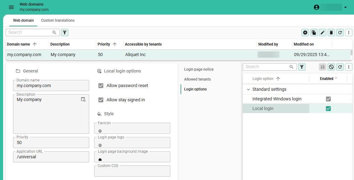
Configure login settings of a web domain
To configure the login settings of a web domain:
Settings > Web domains
-
In tab Login options, select the login options you want to be available for this web domain. To add an OpenID provider, see OpenID providers.
-
In tab Allowed tenants, select the tenants that are allowed to use this web domain.
Defining allowed tenants per web domain helps prevent users from logging in through web domains intended for other tenants. If not configured, users may become confused if they discover they can access the login page of another customer. Note that this does not pose a security risk—user permissions are always scoped to their assigned tenant, regardless of the web domain used to log in. For more information about tenants, see Tenants.
-
Optional. In tab Login page notice, enter a message that will be displayed on the login page. This message can be used to inform users about important information, such as maintenance or updates. Localized messages can be added for each supported language. To add a new language, see Add translations to a web domain.
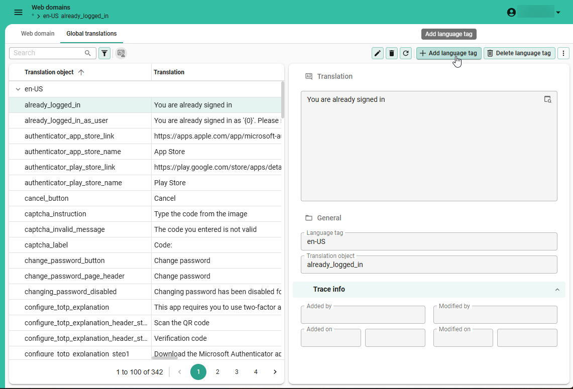
Add translations to a web domain
You can add custom translations for a web domain.
The default web domain * provides the global translations that are used by all web domains.
You can override the global translations by adding custom translations for the new web domain.
To add a custom translation for a web domain:
Settings > Web domains
- Select the web domain
*with the description Default web domain. - Go to tab Global translations and execute the task Add language tag
 to add a new language.
 - Select a different web domain and go to the tab Custom translations to override the global translations for that web domain.
You can change whether authentication links are displayed on the TOTP setup page by overriding
the authenticator_play_store_link and authenticator_app_store_link translations.
If you leave the translation of the links empty, the button will be hidden.
For more information, see TOTP (Time-based one-time password).
 Add a new language for global translations
Add login page styling for a web domain
To add styling to a login page for a web domain:
Settings > Web domains
- Optional. In the group Style, complete the following fields:
- Select a Favicon. This favicon will be used in the browser tab when the user is on the login page.
- Select a Login page logo. This logo will be used on the login page.
- Select a Login page background image. This image will be used as the background of the login page.
- Optional. Add Custom CSS to style the login page and the applications on that web domain. For more information, see Add custom CSS to a web domain.
Custom CSS for web domains
You can use Custom CSS to style login pages and application wide elements for a web domain. See also, Examples of available CSS classes for the Universal UI.
- The Custom CSS file configured per web domain in IAM takes precedence over the existing
custom.cssfile of the Universal UI. If a Custom CSS file is added in IAM, the entirecustom.cssfile of the Universal UI is ignored. If no Custom CSS file is uploaded in IAM, the Universal UI uses its originalcustom.cssfile. - Support for the
custom.cssfile in the Universal UI is deprecated and will be removed in a future release.
Best practices for using custom CSS
When using custom CSS, keep the following best practices in mind:
- To clearly separate styling between Indicium and the Universal UI, every platform uses distinct CSS classes
- All Indicium pages use the class
indicium. - All Universal pages use the class
universal. We strongly recommend including these identifiers into your code to ensure consistent behavior across platforms.
- All Indicium pages use the class
- Do not use custom CSS for things that can be changed using the Software Factory or the Intelligent Application Manager.
- Check your custom CSS after any update (for example, an update of Universal, the Software Factory / Intelligent Application Manager, or your model).
- For support:
- Use the Thinkwise community for questions about custom CSS.
- Before creating a ticket, ensure no custom CSS is active.
- If you are missing
classesor, more likely,data-testids, let us know via the Thinkwise community.
For custom CSS for the Universal UI, specifically:
- Use the
data-testids provided by the Universal UI.- They are used for automated testing and thus unlikely to change.
- They are further along than BEM-classes.
- Avoid using generated CSS classes (e.g.
.css-1ksyjmz), as they may change over UI versions. The Universal UI provides static CSS classes for a selection of elements, mainly on the login page. The BEM — Block Element Modifier naming convention is used to structure classes. Not all components have fixed classes yet. In some cases, you can use pseudo-classes, like:afteror:nth-of-type(x)instead, which are less likely to change. - Refrain from modifying layout.
Check out these resources to learn more about CSS:
Add custom CSS to a web domain
To add custom CSS to a web domain:
Settings > Web domains > tab Web domain > group Style
- Upload a Custom CSS file containing your custom CSS code.
Custom CSS example with classes
The example below changes the primary color to green, shows the background image on the right side instead of the left side,
and displays the OpenID Provider above the local login fields.
The .indicium class ensures that these changes only apply to Indicium pages.
.indicium {
  --main-primary: rgb(0, 200, 0);

  .split-screen {
    grid-template-areas: "content background";
  }

  .login-login-input {
    flex-direction: column-reverse;
  }
}
Examples of available CSS classes for Universal UI
Theme colors and picture
You can use the following custom properties to set the colors and picture of your theme in your custom CSS:
- Main color:
--primary-color - Accent color:
--secondary-color - Theme picture:
--background-picture
/* Give labels the primary color with a background image, with a backup for light mode */
.light label {
  color: var(--primary-color, #323232) !important;
  background-image: var(--background-picture) !important;
}
/* Make all SVG's the secondary color, with a backup for light mode */
.light svg {
  fill: var(--secondary-color, #323232) !important;
}

/* Give labels the primary color with a background image, with a backup for dark mode */
.dark label {
  color: var(--primary-color, #fafafa) !important;
  background-image: var(--background-picture) !important;
}

/* Make all SVG's the secondary color, with a backup for dark mode */
.dark svg {
  fill: var(--secondary-color, #fafafa) !important;
}
Background color for a subject or variant
Each screen in the Software Factory has data properties that allow you to access the current subject and variant.
- {tab}:
data-tab-id - {tab variant}:
data-tab-variant-id - {reference id}:
data-tab-ref-id
You can use these properties in your CSS to set a background color for a subject or variant:
/* Change the background for the grid on the subject `project` with the variant `windows`.*/
[data-tab-id="project"][data-tab-variant-id="windows"] .grid {
   background: #fafafa !important;
}
Logo for login page
The Universal UI login pages have been deprecated and will be removed in a future version. Set up login pages using web domains in IAM instead.
/* Hide the original logo */
.login__group--icon {
  display: none;
}

/* Display an alternative logo */
.login__group--icon-container {
  background: url('https://office.thinkwisesoftware.com/thinkwise2.png');
  background-position: center;
  background-size: contain;
  background-repeat: no-repeat;
  height: 4em;
  width: 4em;
  margin-bottom: 8px;
}
Company logo in scrollbar
.scrollbar-container
{
    background: url(company logo url);
    background-position: center bottom;
    background-repeat: no-repeat;
    background-size: 200px;
}
Title
The Universal UI login pages have been deprecated and will be removed in a future version. Set up login pages using web domains in IAM instead.
/* Hide the original title */
.login__group--title {
  display: none;
}

/* Display an alternative title */
.login__group--header::after {
  content: 'Alternative title';
  font-weight: 500;
  font-size: 1.3125rem;
  font-family: Roboto, Helvetica, Arial, sans-serif;
  padding-bottom: 9px;
}
Message
The Universal UI login pages have been deprecated and will be removed in a future version. Set up login pages using web domains in IAM instead.
/* Display a message */
.card-content__login::after {
  content: 'Maintenance is scheduled for Sunday between 8AM and 12AM. The application will not be available then.';
  font-weight: 300;
  font-size: 0.9rem;
  font-family: Roboto, Helvetica, Arial, sans-serif;
  color: #ba000d;
  display: inline-block;
  text-align: center;
}
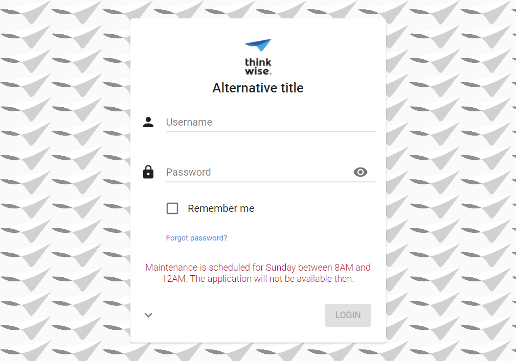 Example: login page with a custom background image, logo and title, and a maintenance message
Use this CSS class instead to change the background color of the message box:
.message-login {
  background-color: rgb(0, 200, 0);
}
Hide menu and header
This example hides the menu and header, and only shows a dashboard or other start objects.
/* Hide the sidebar menu */
#__next > .sidebar {
    display: none;
}

/* Hide the header */
#__next > main > header {
  display: none;
}

/* Resize and reposition the main screen*/
#__next > main > div {
  height: calc(100% - 16px);
  width: calc(100% - 16px);
  left: 0px;
}
 Example: hidden menu and header
Set tab labels to uppercase
By default component and detail tab labels follow the casing that is specified in the translation.
To set tab labels to uppercase, add the following CSS to the custom.css file:
.tabstrip__button__title {
    text-transform: uppercase !important;
}
Transparent login form
The Universal UI login pages have been deprecated and will be removed in a future version. Set up login pages using web domains in IAM instead.
.card__login
{
    background-color: rgba(255, 255, 255, 0.9) !important;
}
Hide 'Forgot password?' link
The Universal UI login pages have been deprecated and will be removed in a future version. Set up login pages using web domains in IAM instead.
#resetPassword {
    display: none;
}
Form section titles and group titles
/* Section title */
.section-title .text {
    font-size: 2rem !important;
    color: red;
}

/* Group icon */
.group-title svg {
    width: 28px !important;
    height: 28px !important;
    fill: blue !important;
}

/* Group title */
.group-title .text {
    font-size: 1.5rem !important;
    margin-top: -2px; // Align text with icon
}
.group-title {
    color: green !important;
}
 Example: custom form section titles and group titles
Form field outlines and background colors
All form fields get a border automatically, and you can specify which color it should have. You can also set a background color for non-editable fields.
 Outlined fields, the non-editable field has a different background color
/* Background color for non edit mode inputs */
.tsf-control.disabled {
  background-color: pink;
}

/* Background color for Read Only inputs */
.tsf-control.read-only {
  background-color: purple;
}

/* Outline color for mandatory fields */
.tsf-control.mandatory .tsf-control-outline {
  border-color: fuchsia;
}
To set no color, use:
.tsf-control.tsf-control {
    background: transparent;
}
Settings for specific modes
To specify style sheet rules that are specific for light or dark mode, or for comfortable or compact mode, use the following classes:
/* light mode */
.light {
  /* settings that are specific for light mode */
}
/* dark mode */
.dark {
}
/* comfortable mode */
.comfortable {
}
/* compact mode */
.compact {
}
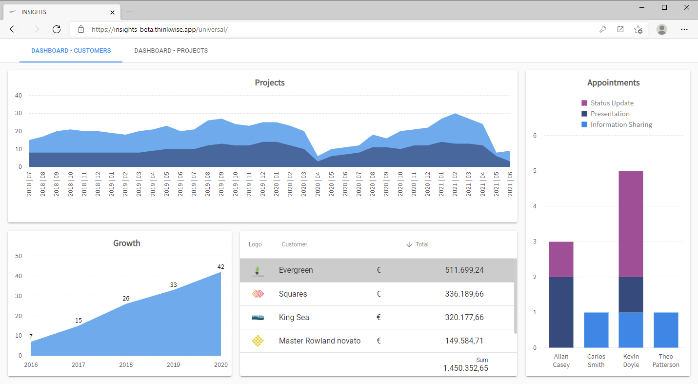
Bind custom CSS to a specific application
The root element of the web page contains a hook that you can use to bind custom CSS to a specific application.
This hook is called data-active-application, and its value defines the active application.
Example HTML:
<!DOCTYPE html>
<html lang="en" translate="no" class="dark compact" data-active-application="insights" style>
  <head>
  </head>
  <body>
  </body>
</html>
In the example above, the active application is called "insights".
In your CSS file, prefix any CSS selector with html[data-active-application="insights"] to use that style only for that active application.
Replace the value "insights" with the name of the application that you want to use the custom style for.
Example CSS:
html[data-active-application="insights"] body {
  background-color: red;
}
Different styling for combobox controls
To visually differentiate between the Combobox (dropdown list) and the Combobox with a suggestion, you can apply different CSS styling for each combobox type:
- The class
combo-selectapplies to the Combobox (dropdown list) control - The class
autocomplete-selectapplies to the Combobox with a suggestion control
Identify field state in a grid
The grid assigns specific classes to cells to indicate the column's state.
The classes are found on the target element .conditional-layout-container within each cell.
You can use custom CSS to emphasize cells with the .has-error class, for example, by using a red border or background color.
The available classes are:
.mandatoryfor cells with a mandatory field.readonlyfor cells with a disabled field.has-errorfor cells with a field that has an error