2025.2
This release of the Thinkwise Platform is a leap forward in user experience.
We have greatly improved the filtering capabilities: users can now filter on data in related detail and lookup subjects in the filter pop-up,
and use advanced AND/OR/NOR filter conditions.
To improve usability, the Filter button is now by default shown on the action bar and the filter pop-up has been optimized for smaller screens.
Graphical components have also received significant updates. You can now:
- Enable your users to add geometric types to and move markers on a Map.
- Enable your users to execute tasks on time cells, and drag and drop external records in the Scheduler.
- Apply conditional layouts in the Scheduler.
- Add custom legend colors to Charts.
- Better interact with Custom Components.
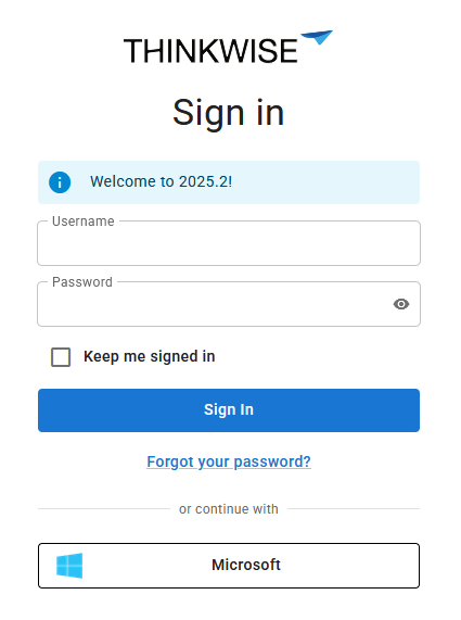
We have further improved the UI/UX flexibility of the Thinkwise Platform. Enhancements include configurable menu color settings within a theme, designated primary actions, alternative translations for task and report buttons, and additional font styling options in conditional layouts. With the ability to embed a custom CSS file in the Intelligent Application Manager and a redesigned Indicium login page, you can create a more personalized and branded user login experience.
To improve your development experience, we have made several enhancements to the Software Factory. This includes a more robust branching and merging process, and improvements for unit tests. We have introduced user preference settings for the Creation process and some new enrichments.
Lastly, we would like to remind you that this year (2025) is the last year the 2-tier architecture is supported. The 3-tier architecture is much more secure and stricter regarding the quality of your model. If you are still working in a 2-tier environment, fix all findings in validations and smoke tests to prepare for the transition to a 3-tier environment. More documentation to support your transition will become available soon.
This release includes 18 community ideas representing 391 votes. The most popular ideas are:
- Alternative translations for buttons in tasks and reports (44 votes).
- Informing users (using Windows GUI or Indicium) of maintenance (37 votes).
- 'Run now' button for system flows in IAM (37 votes).
Questions or suggestions about the release notes? Let us know in the Thinkwise Community!.
Contents
- Contents
- Upgrade notes
- Breaking
- New and changed in the Software Factory
- Models - Merge imported model with existing model
- Models - Branch rebase after merging from origin
- Models - Merge sessions deleted for archived branches
- Models - Access rights for a new branch
- Filter - Filter multiple levels deep
- Filter - Advanced filter options
- Filter - Reset button behavior changed
- Maps - More options for Maps
- Cubes - Add colors with conditional layouts to charts
- Scheduler - Execute a task on a Scheduler time cell
- Scheduler - External drag and drop
- Scheduler - Conditional layout for Scheduler resources
- Scheduler - Conditional layout for time cells
- Translations - Translation objects automatically generated
- Translations - Alternative translations for buttons in tasks and reports
- User Interface - Changes to subject screen
- User Interface - Improved user interface for conditional layouts
- User Interface - Font settings for conditional layout
- User Interface - Menu color settings
- User Interface - Rename Action bars
- User Interface - Configure actions as a primary action
- User Interface - New screen component type
- Processes - Subreports for DevExpress
- Processes - Renaming a process action also renames process step
- Business logic - Support added for 'auto_commit' in DB2 and Oracle
- Enrichments - Convert HTTP connector to Web connection
- Enrichments - Notification for enrichments during creation jobs
- Enrichments - Place 'Filter' after 'Search' button for action bars
- Dynamic model - Phased out checkbox 'Generated'
- Access control - Rights assignment tasks modernized
- Access control - Changed role availability in 'New objects' and 'Model rights'
- Quality - More options for copying unit tests
- Quality - Unit tests with input parameters made easier
- Quality - Validation for empty default theme
- Deployment - Custom preset for full creation
- Deployment - Selected runtime configuration displayed while generating
- Integration & AI - Changes to OAuth server for Web connections
- Generic - Improved 'Changes compared to default' screen
- Generic - Shortcuts for tasks
- Generic - Reserved keywords updated
- Fixed in the Software Factory
- Improved login experience
- New and changed in the Intelligent Application Manager
- Fixed in the Intelligent Application Manager
- Data model changes
- Questions or suggestions?
Upgrade notes
System requirements
For a full overview, see the System requirements.
-
The Thinkwise Platform requires SQL Server 2019.
-
For AI-powered enrichments, use the latest AI models for the best results. For OpenAI, we recommend GPT 4 or up.
-
.NET Framework requirements:
Component Minimum .NET version Windows GUI 4.7 Indicium 8.0 Indicium Basic 4.7.2
Breaking
Indicium - Changed login settings in appsettings.json
breaking changeIn this release, we introduced a new way to configure login options in the Thinkwise Platform, using Web domains in IAM. For more information, see Improved login experience.
Login settings configured in Web domains in IAM override those in Indicium's appsettings.json.
When upgrading to Thinkwise Platform release 2025.2, some LoginOptions settings in appsettings.json will no longer have any effect,
as their configuration is handled entirely within Web domains.
The section LoginOptions in Indicium's appsettings.json now includes the property AlwaysDeferLogin (default: false).
Note that in the future, AlwaysDeferLogin will be enabled (true) by default.
Possibly, if you disabled the following settings in Indicium's appsettings.json, the same settings may be enabled again after the upgrade.
Always check and re-configure these settings in the Web domains in IAM:
- In the section
LoginOptions:AllowLocalAccountsAllowPasswordForgetAllowStaySignedInApplicationRedirectURL
In the Universal GUI's config.json, the following properties are deprecated.
Re-configure them in the Web domains in IAM:
loginRememberMeHidden- In combination withAlwaysDeferLogin, this property will no longer work.loginAuthProviderHint
Indicium - Endpoint changes
breaking changeIn this release, we introduced a new way to configure login options in the Thinkwise Platform, using Web domains in IAM. For more information, see Improved login experience.
The following endpoints have been changed. This is only breaking if you have made shortcuts or links to any of these endpoints.
Some endpoints can also be used in email templates. These should automatically use the new endpoint when the proper URL placeholders are used.
Always use the latest version of Indicium if you update the Universal GUI.
Endpoint changes
The following endpoints have been changed:
| Old endpoint | New endpoint |
|---|---|
/account/ui/locallogin | No longer available, has been merged into /account/ui/login |
/account/ui/externalerror | /account/ui/error/external |
/account/ui/changepassword | /account/ui/password/change |
/account/ui/resetPassword | /account/ui/password/reset |
/account/ui/sendPasswordResetToken | /account/ui/password/reset/start |
/account/ui/twoFactor | /account/ui/totp/login |
/account/ui/totpReset | /account/ui/totp/reset |
/account/ui/totpSetup | /account/ui/totp/setup |
Notable endpoint changes
The following notable endpoint changes have been made:
| Old endpoint | New endpoint |
|---|---|
/account/ui/locallogin | No longer available. Change all references to /account/ui/login |
/account/ui/sendPasswordResetToken | /account/ui/password/reset/start |
/account/ui/changepassword | /account/ui/password/change |
The last two endpoints will remain functional in Indicium until the next Thinkwise Platform release (2025.3). They are used in the Universal GUI for:
- The button Forgot password? in the previous login screen.
- The button Change password in the user menu when logged in.
Removed the checkbox 'Generated'
breaking changeFor more information, see Dynamic model - Phased out checkbox 'Generated'.
Check your dynamic model control procedures to set up the generated_by_control_proc_id where necessary.
Access control - Column 'Granted' removed
breaking newPreviously, when granting rights to objects, the Granted columns were used to determine whether or not an object was granted. However, these columns are redundant because the existence of the rights record already indicates that the object has been granted rights. Therefore, we have removed the Granted columns from the Intelligent Application Manager. See the table changes for IAM at the bottom of this blog for the full impact.
For the Software Factory, the Granted column remains and must always be set to a value of '1'. The Granted columns were kept because of their significance in the Software Factory model and to lower the potential impact on Dynamic model code that may depend on them.
We have added the following check constraints:
- For role tables with a Granted column, the value must be '1'.
- For the table
role_tab, the value for Select granted must be '1'. - For the tables
role_col,role_task_parmtr,role_report_parmtr, the value for Col access type may not be '3'. - For
role_tab_prefilter, the columns Visible and Always on cannot have the value '0'. Either Visible or Always on must be '1', or the row may not be present.
Verify any Dynamic model code, and post-synchronization code for deployment and synchronization to IAM.
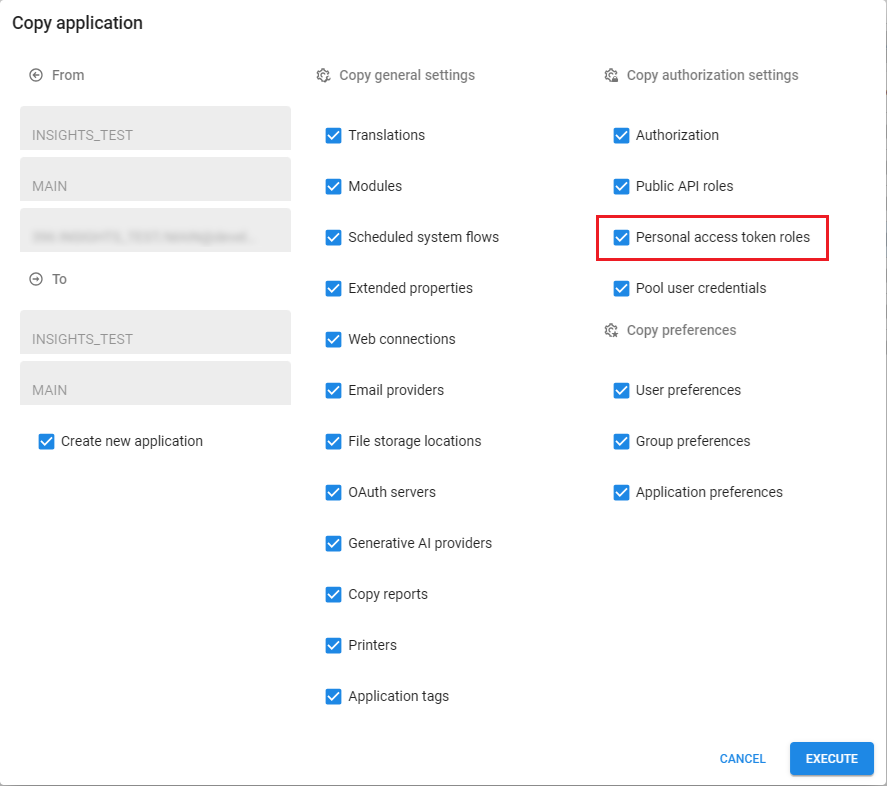
Authorization - Added 'Personal access token roles' to 'Copy application' task
breaking newWhen copying an application within IAM, you can now include personal access token roles.
You can do this by selecting the checkbox Personal access token roles
in the task Copy application  (menu Authorization > Applications > tab List).
If this checkbox is cleared, the new application will not contain any personal access token roles of the copied application.
(menu Authorization > Applications > tab List).
If this checkbox is cleared, the new application will not contain any personal access token roles of the copied application.
If you execute the task (create_gui_appl_from_gui_appl) from post-synchronization or deployment code,
in CI/CD tooling or any other location, you must update the call with the new parameter copy_gui_appl_authorization_pat and give it the value True or False.
 Include Personal access token roles when copying an application
New and changed in the Software Factory
Models - Merge imported model with existing model
newYou can use the task Import model  to either create a new model or branch,
or to replace an existing branch (menu Models > Model overview > tab Models).
to either create a new model or branch,
or to replace an existing branch (menu Models > Model overview > tab Models).
We have now added a new option to this task, to merge the imported model with an existing model without removing any existing objects.
This allows you to add objects from the model.dat to your model instead of having objects inside a base model attached to it.
Additionally, it allows you to customize these objects according to your preferences.
This new addition means that the task Import model now has four options to import your model:
- New model - The uploaded model will be a new model.
- New branch - The uploaded model will be added as a branch of an existing model.
- Replace complete branch - Adds, updates, and deletes all objects based on the uploaded model.
- Merge into branch - Only adds and updates objects based on the uploaded model.
A new parameter, merge_into_existing_model, is available to execute the task Import model via code or to call the task via API.
A value of '1' indicates that the model.dat will be merged into the branch and will therefore not delete any objects.
 Merge imported model with existing model
In addition, both the tasks Import model
and Export model  are now directly available for branches (menu Models > Model overview > tab Branches).
These tasks link directly to the selected branch to export it, or import it into the selected branch.
are now directly available for branches (menu Models > Model overview > tab Branches).
These tasks link directly to the selected branch to export it, or import it into the selected branch.
 Export and import model at branch level
Models - Branch rebase after merging from origin
changePreviously, rebasing a branch could lead to some unwanted behavior.
The origin model version is the point in time when a branch was created or last involved in a reciprocal merge (where the source is merged into the target and the target into the source). If, at some point, the origin contains new features that are not yet in the branch but that you want to have in the branch, you can merge the origin into the branch. The origin model version was not updated in this case, leading to many actions; when the merge session analyzed the changes, it considered all actions from the origin model version up to the moment of merging. This change analysis included all actions performed in the branch since the last merge session, which could easily lead to conflicts.
Most conflicts would be resolved automatically because the data was the same on both sides; however, any change in either origin or branch could cause a conflict that could not be resolved automatically. Additionally, if an object was merged from the origin to the branch and then removed from the origin, it could even reappear in the origin after the branch was merged back to the origin because the merge session would consider it a new object in the branch. You can read more about this in the following Community blog post: Rebase your branch in the Software Factory.
To solve the mentioned problems, we have changed how a branch is updated from the origin. The origin model version is now updated ("rebased") once you merge it into the branch. Updating the branch still performs all the actions from the origin. However, now that the origin model version is updated, the merge session will only consider changes from that moment until the moment of merging. As a result, the analysis step in the merge session has become faster and safer.
When you create a merge session (menu Models > Merging) and select how to continue with the branch after the merge, the option Archive branch at a later point in time has been renamed to Finalize branch, cannot be merged again.
A finalized branch is a branch that was merged into its origin branch and not immediately archived or reciprocally merged. You cannot use this branch in any other merge session; it is only available for reading. Though it can be edited, we recommend archiving the branch as soon as possible to prevent development in a finalized branch.
The checkbox Origin merge pending for branches has been removed as it is no longer needed (menu Models > Model overview > tab Branches). It has been replaced by the checkbox Finalized.
During the update, the value for the checkbox Finalized will be copied from the checkbox Origin merge pending. If a branch had Origin merge pending selected before the upgrade, Finalized will be selected after the upgrade.
The branch diagram (menu Models > Model overview > tab Branch diagram) now also indicates whether a branch is finalized using the icon Finalized  .
.
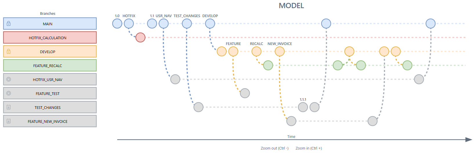 Branch diagram with finalized branches
Models - Merge sessions deleted for archived branches
changePreviously, you could delete an archived branch if there were no merge sessions associated with it. However, if the archived branch was the origin, source or target branch in a merge session, these merge sessions had to be deleted before you could delete the branch.
This has been changed. Now, when you delete an archived or active branch, the related merge sessions will automatically be deleted as well.
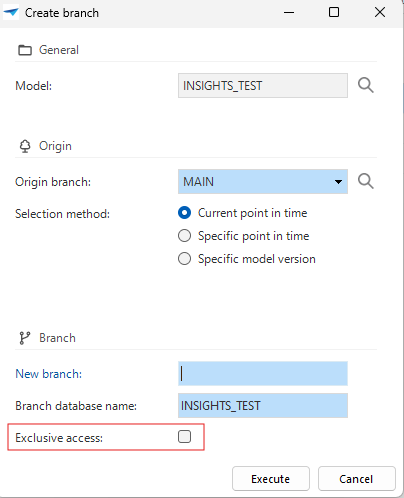
Models - Access rights for a new branch
changeWe have added the option to set up access rights to a branch when you create a new one (menu Models > Model overview > tab Branches > task Create branch  ).
Selecting the checkbox Exclusive access gives full access to the branch's creator while automatically assigning read-only rights to all other users.
).
Selecting the checkbox Exclusive access gives full access to the branch's creator while automatically assigning read-only rights to all other users.
You can reconfigure the rights after creating a branch in menu Maintenance > Users > tab Branch Access. For more information, see Configure access to a branch.
If you set access rights for a branch, the pool user (the user under which Indicium runs) may not be able to process data. This can happen, for example, if Indicium retrieves the source version of your application, but the branch is read-only for the pool user. In that case, Indicium cannot process the data. Resolve this by by giving that user full access rights to the branch.
 Set up access rights to a branch
Filter - Filter multiple levels deep
new change Universal GUIWe have restyled the filter pop-up for the Universal GUI and extended it with new functionality to filter on related subjects.
It can be opened with the Filter  button next to the Search field.
The restyling involves a more compact field width and an optimized layout for smaller screens, such as mobile devices. This makes it easier to use on various devices without losing functionality.
In addition, users can now filter on columns of related subjects, allowing them to filter multiple levels deep. To give a better overview of the active filters, all active filters are now sorted at the top of the list when the pop-up is reopened.
By default, the filter pop-up lists all available lookup and detail references of the subject. With the new setting Visible in filter, you can configure the visibility of the reference in the filter pop-up (menu User interface > Subjects > tab Default > tab Links > tab Details / Lookups). You can also perform a mass update on Visible for filter in the menu Advanced > Model management > Branches > References.
The following options are available:
- Always - Initially visible in the pop-up.
- Extended (default) - Available from the field selection.
- Never - Excluded from filtering. Use this option when joining the reference data degrades the performance of the main subject.
Always analyze referenced subjects on their performance before joining them with the main table. Exclude heavy views or tables with a lot of data from reference filtering to avoid performance degradation at runtime after filtering.
Example of filtering on related subjects
This example shows a filter on applications in IAM. The goal is to filter on expired application ownerships for applications that have a server of type 'DB2'.
If you select a reference to filter on it will look like this:
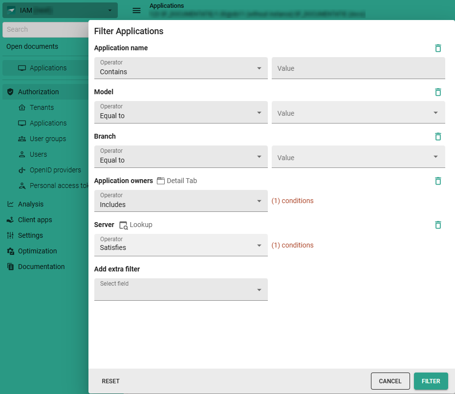 Example of the restyled filter pop-up with related subject filtering
When clicking the link Conditions, the filter pop-up of the related subject opens. Here, the detail or lookup references of the related subject are available.
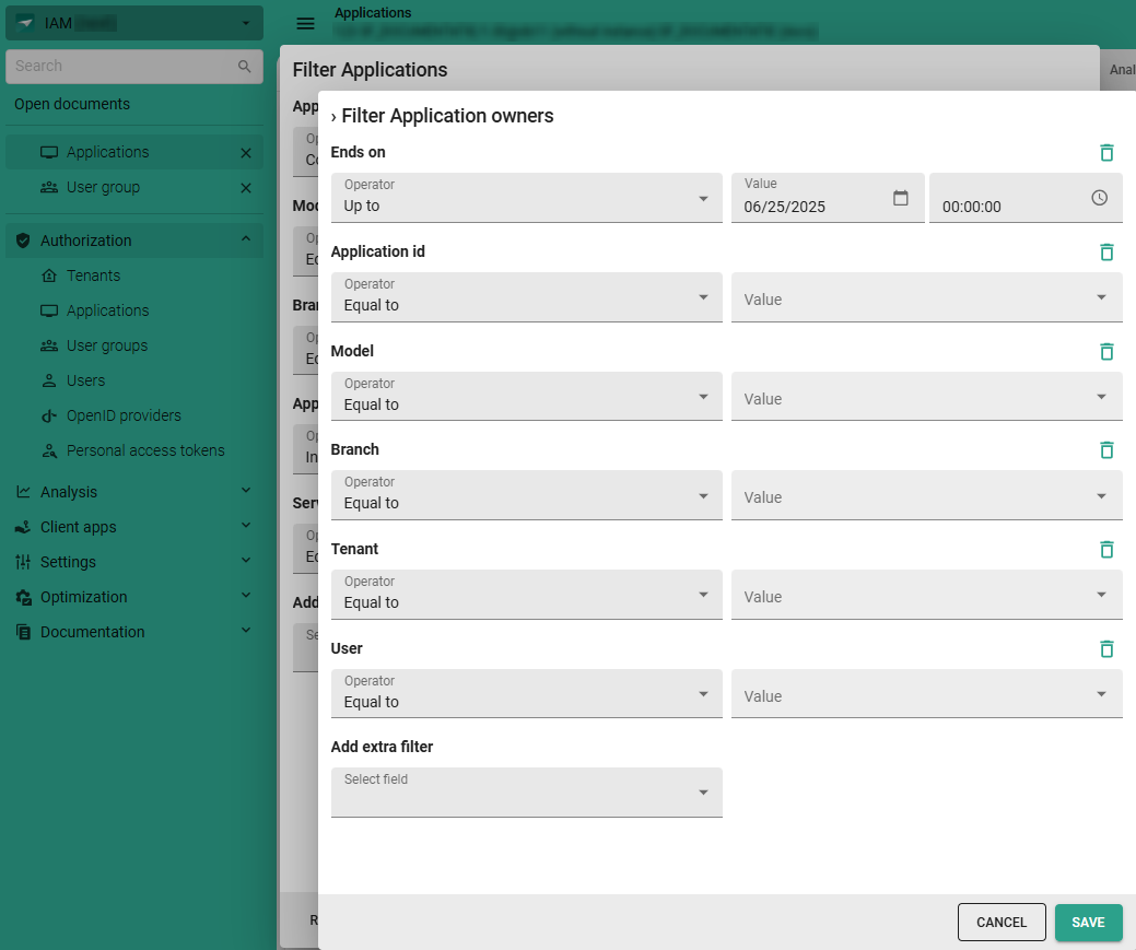 Example of filtering at a deeper level
This feature is backwards compatible with all supported Platform versions, by implicitly applying the default option Extended. If you wish to disable this feature on older Platform versions, use Extended property DisableFilterOnDetails (works with Universal GUI 2025.2.11 and up).
Filter - Advanced filter options
new Universal GUIThe Filter pop-up in the Universal GUI now has a switch to toggle between the default filter and an advanced filter.
The default filter was already available via the overflow menu.
It provides a straightforward way to filter data using simple conditions,
though it also allows filtering multiple levels deep on data in related subjects.
The advanced filter offers a more powerful and flexible way to create complex filter queries.
The conditions already selected in the default filter are carried over when switching to the advanced filter.
From there, users can build more complex filter queries by adding multiple rules and organizing them with AND, OR, or NOR logic.
They can combine rules in groups and connect each group using AND, OR, or NOR operators.
The operators can also be mixed and matched in nested groups.
Multiple filters can be applied to the same column.
This flexibility enables users to address complex scenarios,
such as a situation in which one field must meet one condition but another field must meet one of several alternatives.
In this situation, multiple conditions must be true at the same time (AND), and for alternative conditions, any one condition being true is sufficient (OR).
An example would be filtering for companies whose type is 'Client' (AND condition), and the office location is 'Apeldoorn', 'Rotterdam', or 'Utrecht' (OR condition).
When a filter includes non-elementary conditions, the option Save as Prefilter is disabled. Non-elementary conditions are:
- nested groups
- the root group contains
OR/NORoperators - a filter on data in related subjects
- more than one filter on the same column.
We are currently exploring the possibilities to support saving these filters as prefilters in a future release.
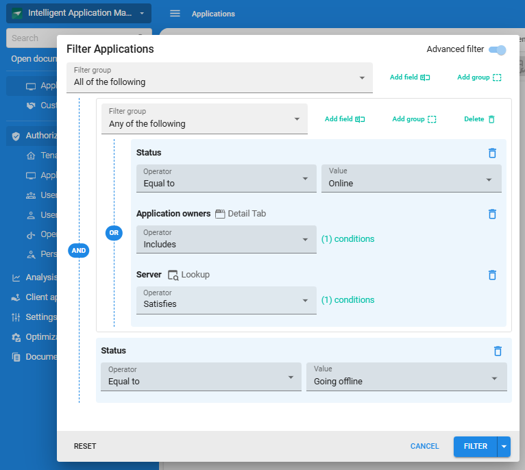 Example of the advanced filter pop-up with multiple conditions
Filter - Reset button behavior changed
Community idea change Universal GUIWe have improved the behavior of the Reset button in the Filter pop-up to make filtering more intuitive.
Previously, the Reset button would revert the filter pop-up to the last applied filter settings. Now, it clears all active filters and returns the pop-up to its initial state, showing all always visible filter conditions without any values selected. After resetting the filter, the pop-up remains open, allowing you to adjust or apply new filters without interruption.
As before, the filter is not applied immediately when you reset it.
Maps - More options for Maps
Community idea new Universal GUIWe have added two new options to the Maps screen.
The first option is the possibility to allow users to add a geometric type to a map. You can set this up by selecting a task for a geometric type (menu User Interface > Maps > tab Tables > tab Maps). The following geometric types are available: Marker, Line, Polygon, Rectangle, and Circle. Each task requires a location parameter with an alphanumeric domain to which the user interface can pass the corresponding coordinates. If necessary, you can add more task parameters, such as a label, to the task (menu Processes > Tasks > tab Task parameters). A task can be linked to only one geometric type within the same map. Tasks can be reused across multiple maps.
Validations for adding a geometric type
The following validations are in place for this option:
- The location parameter must have an alphanumeric domain.
- A task can be linked to only one geometric type within the same map.
 Geometric types with tasks so users can add their own to a map
When a user drops a geometric type on the map, it executes the task. If configured, they can also add a label or other information to the geometric type.
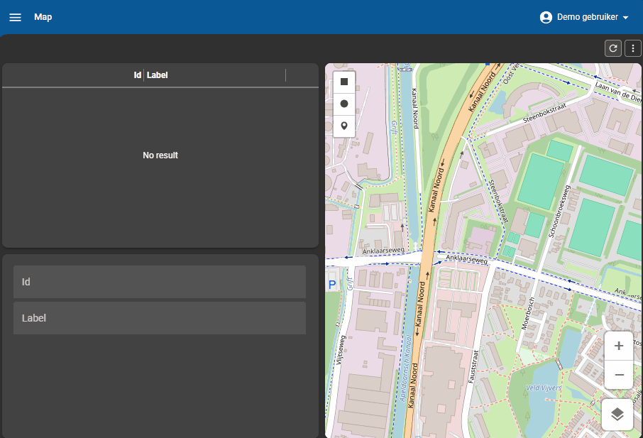 Example of a user adding a marker with a label to a map
Secondly, we have added an option for users to move a map marker. You can set this up by selecting the checkbox Allow drag drop for a Marker (menu User Interface > Maps > tab Default > tab Data mappings).
The following conditions must be met:
- The table linked to the map must have the data manipulation permission Update.
- The latitude/longitude column specified for the map must be editable.
- A role must be available with the permissions mentioned above on both the table and the latitude/longitude column.
 A marker with 'Allow drag/drop' enabled so the user can change its position in a map
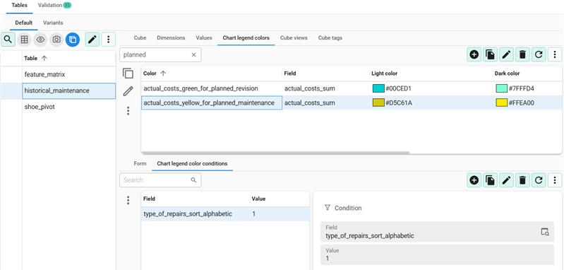
Cubes - Add colors with conditional layouts to charts
Community idea new Universal GUIWithin the Software Factory, you can configure charts to display your cube data in your application. Previously, the colors that were assigned to chart elements were determined by a pre-defined array of colors and it was not possible to assign a specific color to a specific chart element.
It can be useful to give specific chart elements a specific color, for example, to highlight them, or to better match your corporate identity. Therefore, we have introduced a new setting in the Software Factory that lets you assign Chart legend colors to cube view fields. You can create a setup that controls the colors of a legend in a chart that has a specific series. In addition, you can apply conditions.
How conditions work for chart legend colors
A color defined with (multiple) conditions will be applied as follows:
- A value can have multiple conditions; each condition applies to a specific dimension field and its value.
- The color is applied to the chart legend based on the series value.
- If a value has multiple conditions, the color will be applied if at least one condition is met.
- Only colors that have conditions for all dimension fields of the cube view will be considered when computing chart colors; the color structure must exactly match the cube view structure to be applied. However, there is one exception: a color can be defined without any conditions.
A color defined without a condition will be applied in the following cases:
- The cube view has no dimensions.
- The cube view has a single dimension (category or series) and no color with conditions was selected.
If a value field has multiple colors defined:
- The first color takes precedence.
If chart values have no color defined:
- The values will still be colored using the pre-defined array of colors, as before.
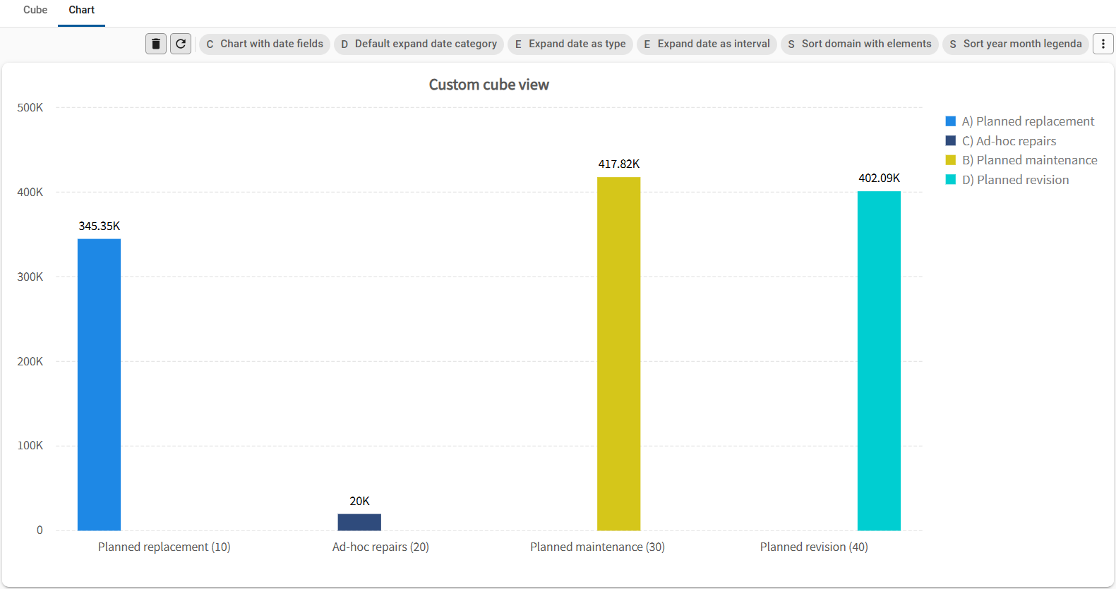 Example of a chart with two custom colors at the right
You can set up Chart legend colors in the menu User Interface > Cubes > tab Default > tab Chart legend colors. Here, you can select a table for which a cube has been generated. In the tab Form, you can enter a name for the Color, select the Field to which you want to apply the color (only value fields can be chosen), and select the colors for light mode and dark mode that you want to apply.
In the tab Chart legend color conditions, you can add one or more conditions that determine when the color is applied. You can only use dimensions and their value types for a condition. If you want to keep the color of a value fixed when there is no legend, you must leave the condition empty.
- You can only use the dimensions from a cube to create a Chart legend color condition.
- You can only set up Chart legend colors for one cube and chart combination. You cannot set up the legend colors individually for different cube views of the same table.
 Adding a chart legend color condition
Scheduler - Execute a task on a Scheduler time cell
Community idea new Universal GUIIt is now possible for users to execute table tasks in the Scheduler when they click or touch a time cell. They can use these table tasks, for example, to easily add an appointment or to block time for machine maintenance. If configured, the task receives the start time of the selected time cell as a parameter.
You can set this up by selecting a table task in the Scheduler in the menu User Interface > Scheduler, in the new field Add activity task. To place the start time of the selected time cell in one of the date or date time task parameter fields, you can select the Start date time parameter.
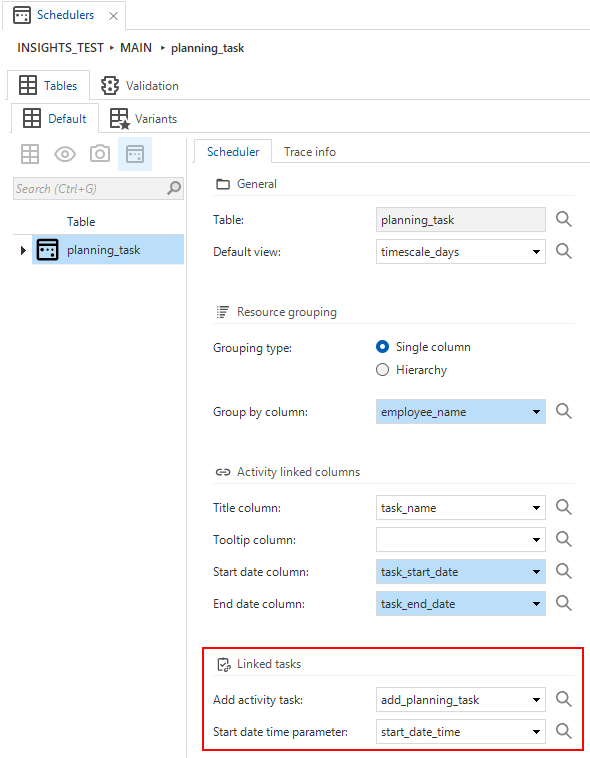 Select a table task to execute when a user clicks or touches a time cell in the Scheduler
Scheduler - External drag and drop
new Universal GUIThe Scheduler now supports dropping rows, such as from a grid, directly onto a time cell within the Scheduler. This extends the existing drag-and-drop capabilities Allow date dragging and Allow resource dragging. See also: Set up a Scheduler.
To set this up, you must first create a Drag-drop task for a table in menu User Interface > Subjects > tab Links > tab Drag-drop. Ensure that Drag-drop interaction is enabled for this task. For more information, see Drag-drop links.
After this, go to menu User Interface > Schedulers > tab Scheduler > group Linked tasks. Here, you must ensure that the same Drag-drop task is entered in the field Add activity task. The chosen Start date time parameter will be filled with the start of the timeslot that it was dropped onto.
If additional drag-drop parameters are configured, the Add activity task will also be populated with those.
 Drag and drop in the Scheduler
Scheduler - Conditional layout for Scheduler resources
new Universal GUIWe have added a new option for the Universal GUI to apply conditional layouts to scheduler resources. It is a checkbox called Apply to Scheduler Resource, and it is available in the menu User Interface > Subjects > tab Data > tab Conditional layout. In the Scheduler you can use this, for example, to highlight resources that are not available or that have a specific status.
The field Column in the screen Conditional layout does not apply to the Scheduler. If the conditions are met, the appropriate Scheduler resources will receive the conditional layout. When evaluating these conditions, only the first record of a source is tested.
See also Improved user interface for conditional layouts.
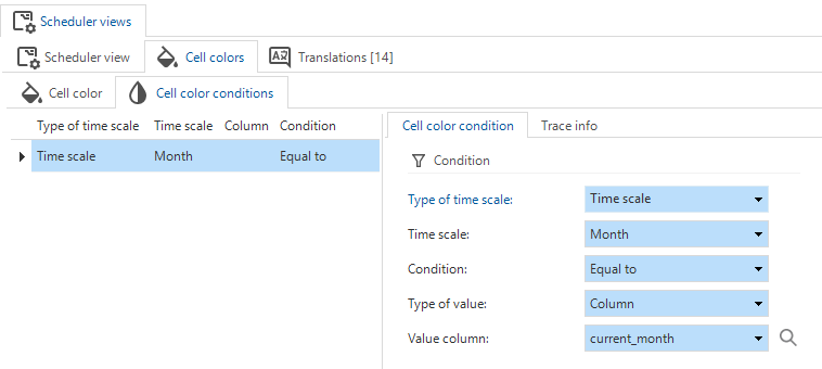
Scheduler - Conditional layout for time cells
new Universal GUIYou can now add conditional formatting to time cells in the Scheduler in the menu User Interface > Schedulers > tab Default > tab Scheduler views > tab Cell colors. Before you can assign a color to a cell, you need to select or add a Scheduler view. After this you can add a new cell color for light and dark mode in the tab Cell color.
In the tab Cell color conditions, you can set up the conditions for the cell color. In the field Type of time scale you can choose whether to apply a condition to a Column or a Time scale.
Available types of time scales
Two types of time scales are available:
- Column - When a regular column is used, it will be evaluated against the resource row.
- Column - Select the column you want to use in a condition.
- Condition - Select the condition, for example, Contains.
- Type of value - Select the type of value you want to use, for example Constant.
- Value - Enter the value for the condition, for example, 'Available'. *-Time scale
- Time scale - Select the time scale you want to use in the condition, for example Hour.
- Condition - Select the condition, for example Greater than.
- Type of value - Select the type of value, for example, Constant.
- Value - Enter the value for the condition, for example, '8'.
Some examples of conditions are:
- A cell in a regular column is orange when 'month = current_month'.
- A cell in a time scale is gray when hours are not between 8 and 18.
- A cell in a time scale is gray when hours are not between 8 and 18 and 'machine_has_regular_work_times = 1'.
A validation checks whether conditions are defined on a time scale that is not included in the Scheduler view. For example, if the Scheduler is configured with a Year/Month/Day time scale, a conditional layout for 'Hour' would always be true, leading to all time cells being colored. In this case, your condition must also relate at the very least to Months.
 Set up a time cell color
 Set up a condition for a time cell color
Translations - Translation objects automatically generated
Community idea newPreviously, when you created, copied, or renamed a translatable object, you had to manually generate a translation object in the tab Translations to start translating it.
From now on, when you create or rename an object using the standard CRUD buttons, this process will be done automatically.
Translation objects are not automatically generated by an insert/update trigger, since this would interfere with the branching and merging mechanism. This is mainly noticeable when you add or rename translatable objects via the dynamic model, rather than using the CRUD buttons or the tasks Create, Copy, or Rename. However, this is automatically corrected when the task Generate translation objects is executed with each definition generation.
Translations - Alternative translations for buttons in tasks and reports
Community idea new Universal GUIPreviously, the Confirm and Cancel buttons for tasks and reports shared the same translation objects. To offer more flexibility, we have now given tasks and reports their own translation objects for the Confirm and Cancel buttons.
You can configure the translation for the buttons on three levels:
-
Branch level - In menu User Interface > Translations, you can change the translations on the branch level, meaning that they apply to all tasks or reports in your branch, unless you have overridden them on the Task/Report level or variant level. You can change the translations by executing the task Unlink generated object in the context menu, or use the keyboard shortcut CTRL + U.
noteIf you unlink the translation object at the branch level, it becomes your responsibility to maintain the translation of this object. The Thinkwise Platform can no longer maintain it from the base model. See also Unlink a generated object from its control procedure.
 Translation objects that can be customized for the 'Confirm' and 'Cancel' buttons. The selected item is no longer italic and grey, indicating that the object is unlinked and can be changed.
 -
Task and report level - in menu Processes > Tasks/Reports > tab Settings > group User interface you can override the default translations for the Confirm and Cancel buttons. These new settings behave the same as alternative translations.
- For the Confirm button: select the checkbox Confirm button alt. transl. and enter a new label in the field.
- For the Cancel button: select the checkbox Cancel button alt. transl. and enter a new label in the field.
-
Tasks and report variant level - in menu Processes > Tasks/Reports > tab Variants > group User interface you can override the default translations for the Confirm and Cancel buttons. These settings are the same as the settings for the default:
- For the Confirm button: select the checkbox Confirm button alt. transl. and enter a new label in the field.
- For the Cancel button: select the checkbox Cancel button alt. transl. and enter a new label in the field.
- If you have overridden the translations for the buttons in the tab Default for a task or report, you can disable this for a variant here. The variant will then follow the branch-level settings instead.
 Overriding the default translations for 'Confirm' and 'Cancel' buttons for tasks and reports
User Interface - Changes to subject screen
changeFor a better overview, we have collected all general component settings in the Subjects screen under a new tab called Components (menu User interface > Subjects > tab Default/Variants > tab Settings > tab Components). New in this tab is the setting for Custom component (see User interface - New screen component type). Previously, the other settings were available in the tab General.
The tab General still contains the general subject settings and the settings for screen types. It also contains lookup settings for the default subject (not for variants).
 New tab 'Components' settings in the Subjects screen
User Interface - Improved user interface for conditional layouts
changeThe user interface for conditional layouts has been improved. Previously, the screen contained a field called Apply to with a dropdown list of options where the conditional layout had to be applied. This field has been replaced with checkboxes for Apply to Grid, Apply to Form, Apply to Edit, and Apply to Scheduler Resource (menu User interface > Subjects > tab Data > tab Conditional layout > tab Form > tab Conditional layout). At least one of these checkboxes must be selected to apply the conditional layout, Apply to Grid is selected by default. If you do not want to apply it, clear the checkbox Show conditional layout.
Not all checkbox combinations are allowed. For example, Apply to Edit always has to be accompanied by Apply to Grid and Apply to Form. If either Apply to Grid or Apply to Form is not enabled, Apply to Edit cannot be selected.
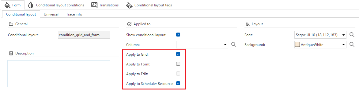 Checkboxes instead of a dropdown field for conditional layouts
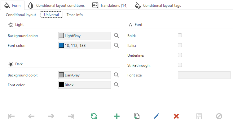
User Interface - Font settings for conditional layout
Community idea new Universal GUIWe have made new font settings available for conditional layout in the Universal GUI. In addition to the existing options (Bold and Italic), the following choices have been added:
- Underline (checkbox)
- Strikethrough (checkbox)
- Font size (dropdown) - Select Large (L) or Extra Large (XL).
You can apply these settings to the following objects:
- Grids and forms - menu User interface > Subjects > tab Data > tab Conditional layout > tab Form > tab Universal
- Cubes - menu User interface > Cubes > tab Cube views > tab Cube view > tab Conditional layout > tab Universal
- Tasks - menu Processes > Tasks > tab Conditional layout > tab Form > tab Universal
- Reports - menu Processes > Reports > tab Conditional layout > tab Form > tab Universal
 New font settings for conditional layout
User Interface - Menu color settings
new Universal GUIIn the Universal GUI, the side menu and top bar both used the Main color set in the Software Factory for the Universal theme.
In addition to the Main and Accent color, you can now set a Menu color in dark and light mode. This allows the use of your brand color for the menu and top bar, and the Main color and Accent color with a good contrast to the backgrounds in dark and light modes for the rest of the screen. These settings are optional; when you leave them empty, the user interface uses the main color.
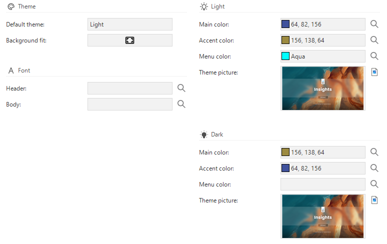 Menu color settings for the Universal GUI
User Interface - Rename Action bars
Community idea newIt is now possible to rename  the Action Bar screen components (menu User Interface > Screen types > tab Action bars).
Instead of the default names like
the Action Bar screen components (menu User Interface > Screen types > tab Action bars).
Instead of the default names like ActionBar1, ActionBar2, you can now give them more meaningful names, such as toolbar_grid_top, toolbar_grid_bottom, toolbar_form.
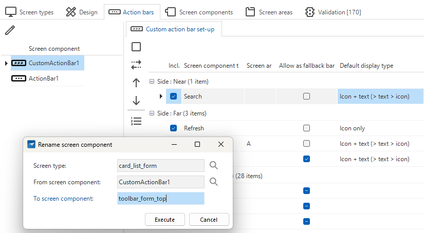 Rename Action Bar screen components to more meaningful names
User Interface - Configure actions as a primary action
new Universal GUIYou can now designate specific actions as a Primary action, also referred to as a 'Call to Action' within the Universal GUI. When an action is marked as a Primary action, the corresponding component is highlighted on the screen. This can help establish a clear visual hierarchy in your application by directing the user's attention to specific and important actions. By default, the Save action is marked as a primary action for the Default action bar and the Custom action bar.
There is no limit to the number of primary actions you can configure. If the number exceeds the available space, the primary actions will be moved to the overflow menu, without the highlight.
The color of the action buttons has changed from a gradient of the Accent color to a gradient of the Main color. Check your application to see if the new color scheme fits your design.
Objects for which you can configure primary actions
You can configure primary actions for the following objects:
- Table tasks and table task variants in menu Processes > Tasks > tab Default/Variants > tab Table tasks > group Screen area
- Table reports and table report variants in menu Processes > Reports > tab Default/Variants > tab Table Reports > group Screen area
- Default action bar in menu Models > Model overview > tab Branches > Tab General settings > Tab Default action bar for any action, except for:
- Tasks
- Reports
- Prefilters
- Cube views
- Search
- Custom action bar in menu User Interface > Screen types > tab Action bars for any action, except for:
- Tasks
- Reports
- Prefilters
- Cube views
- Search
 Configure actions as a primary action
User Interface - New screen component type
new Universal GUIApplying more advanced graphic applications in your application is possible using custom components.
Previously, you had to use the Preview screen component to add custom screen components to your applications. However, using this screen component introduced challenges with the lifecycle of the custom components. It also required the Preview components to have more capabilities than we like; they are able to execute JavaScript code that is provided as data by users. For this reason, the Preview screen component will in the future be limited using an iFrame sandbox to prevent script execution, API interaction, and UI interaction.
As a replacement and improvement, we have added a new screen component type: Custom component. You can add it to your screen type (menu User interface > Screen types > tab Design) to indicate where the custom component should be placed in a subject or variant.
Replace the Preview screen component with the Custom component in your custom screens, and set the location in the subject where relevant.
You can add the location of the custom component as a URL segment relative to the Universal GUI location
(menu User interface > Subjects > tab Settings > tab Components > group Custom component > field Location).
For example, the custom component location is custom/my_component.html.
When the Universal GUI is deployed at https://myapp.mycompany.cloud/Universal, the custom component must be served via https://myapp.mycompany.cloud/Universal/custom/my_component.html.
To refer to different versions of the custom component, you can include {metasource} and {application} variables in the location.
How to use the variables
Depending on how the application is started, the variables will be resolved to either the Software Factory or IAM, and to the runtime configurations' application ID or alias in the Software Factory, or the application ID or alias in IAM.
In this way, you can host different versions without having to change the custom component reference in the model by using /custom/{metasource}/{application}/my_component.html:
- for production, at
/custom/iam/myapp/my_component.html - for development, at
/custom/sf/myapp/my_component.html - a new branch version at
/custom/sf/54/my_component.html
The new screen component allows more interaction with the component code by using the postMessage API, which enables communication between the component and the Universal GUI. Previously, with the Preview screen component, you could only start a process flow in Universal via a post message. Now, you can also send a message to the parent window to indicate that you want to receive state updates from the Universal GUI.
Code examples
To initialize your custom component and receive updates from the Universal GUI, use the following code snippet in your custom component:
  window.parent.postMessage({
        type: 'initComponent'
      }, '*');
To subscribe to window event message to receive updates, you can use the following code snippet:
  let currentState = null;

  window.parent.postMessage({
        type: 'initComponent'
      }, '*');
As a next step, you can listen for messages from the Universal GUI using the message event listener:
window.addEventListener("message", function(event) {
      currentState = JSON.stringify(event.data);
  });
The event data will contain an object with the following structure:
{
  "InitializationInfo": {
    "Application": 89920,
    "ApplicationAlias": "BASIC_CRUD_FLOW",
    "ApplicationUrl": "https://thinkwise.app/indicium/sf_131914/89920",
    "MetaURL": "https://thinkwise.app/indicium/iam/sf_131914",
    "Entity": "table_a.with_detail"
  },
  "State": "regular",
  "Theme": "dark",
  "EntityQueryPath": "https://thinkwise.app/indicium/sf_131914/89920/table_a.with_detail",
  "DataSetLocation": "https://thinkwise.app/indicium/sf_131914/89920/table_a.with_detail?$prefilter=current_e2e_user,field_iii_non_empty&$skip=0&$top=100",
  "DataRowLocation": "https://thinkwise.app/indicium/sf_131914/89920/table_a.with_detail(e2e_usr_id='TSF%5Cuser',field_0=1)",
  "DataRow": {...},
  "DataSet": [...],
  "EventType": "initContext"
}
On every event, you get the full-state object.
The property EventType explains what happened in the Universal GUI and can have the following values:
initContext- You receive this immediately after postinginitComponent. Note that you should bind to the event listener before posting theinitComponentmessage.updateState- Something changed in the state of the Universal GUI; you may want to block or unblock the UI of your component.updateDataRow- Universal GUI has changed rows.updateDataSet- Universal GUI has updated the data.updateTheme- The theme has changed from dark to light mode or vice versa.
The State property can have three states:
regular- Nothing is in edit mode, and your user should be able to interact with the custom component.editing- Universal GUI is in edit mode, or when in default edit mode, there is an unsaved record. It is probably a good idea to block interaction with your component.locked- Universal GUI is displaying a pop-up. The custom component is probably not accessible, but coming from this state, you may want to refresh your data.
Processes - Subreports for DevExpress
Community idea newIn the Windows GUI (2-tier) you could use DevExpress subreports through a workaround. However, this was not available in a 3-tier environment. We have now formalized this feature by adding a tab Subreports to the Reports screen (menu Processes > Reports). This tab is only available when the selected report is of type DevExpress Reports (preferred).
Adding a subreport is done in the same way as adding a report; you can enter a name and upload a file. Note that the file name should be the same as the reference name of the subreport in the report. A report can have multiple subreports; the number of subreports is indicated by a badge.
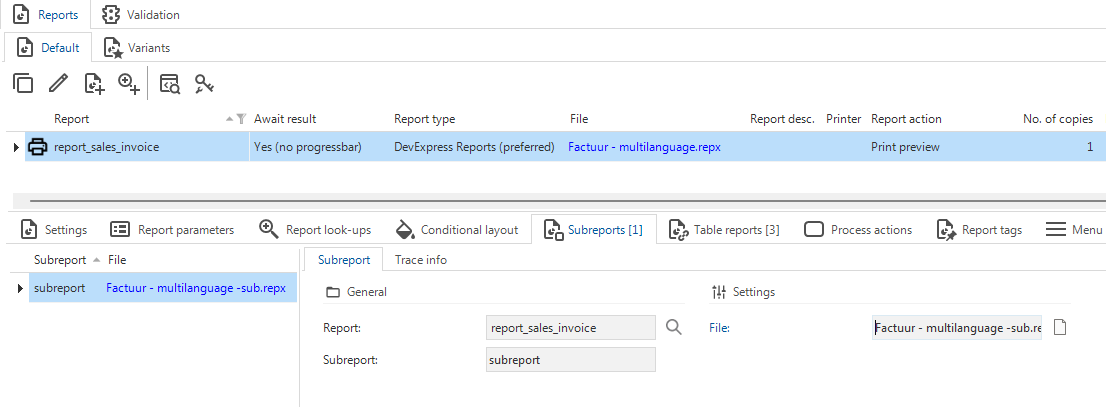 Add a subreport to a DevExpress report
Processes - Renaming a process action also renames process step
changePreviously, when you renamed a process action, the process step was not renamed.
This would lead to inconsistent and potentially confusing step names.
The default name for a process step is the combination of the names of the preceding action and successive action.
For example, if your preceding action is execute_system_task and the successive action is add_row,
the process step name results in: execute_system_task_add_row.
In the old situation, if you renamed execute_system_task to execute_tab_task the step name would still be execute_system_task_add_row.
In the new situation, the process step is automatically renamed to execute_tab_task_add_row.
If you have manually set a step's name, it will remain unchanged when you rename a process action.
Business logic - Support added for 'auto_commit' in DB2 and Oracle
new DB2 OracleThe auto_commit parameter allows you to automatically save the record after completing a field.
Support for the parameter auto_commit in Default logic was already available for SQL Server.
In this release we have also added support for this parameter in DB2 and Oracle.
With or without the new parameter, the Thinkwise runtime components remain compatible with Default procedures.
Therefore, it is not required to implement all default logic again.
However, unit test execution requires the auto_commit parameter to be present.
Fully execute the Default logic in your development or test environment before running unit tests or smoke tests.
Note that DB2 only supports unit tests and does not support smoke tests yet.
For more information, see Default and Auto commit.
Enrichments - Convert HTTP connector to Web connection
newA new enrichment is available in the Software Factory: Convert HTTP connector to Web connection.
You can use it to convert an existing HTTP connector to a Web connection in a process flow.
It is available as an enrichment (menu Enrichments > Model enrichments),
and as a task  for process actions (menu Processes > Process flows > tab Process actions).
For process actions, the task is only available for HTTP connectors that have not yet been converted to Web connections.
for process actions (menu Processes > Process flows > tab Process actions).
For process actions, the task is only available for HTTP connectors that have not yet been converted to Web connections.
Web connections have all the capabilities of HTTP connectors and much more, such as support for JSONPath and XPath.
We recommend using Web connections instead of HTTP connectors due to their benefits.
Web connections are easier to maintain, configurable, and allow you to define output parameters before the code is executed, extracting values directly from the response. Other advantages include the ability to override the base URL and authentication settings of the Web connection per application in IAM. You can use this, for example, to have your Development environment point to an internal web address while your Production environment points to an online endpoint.
The enrichment uses AI to read the process flow logic and determine the required settings for the Web connection. AI may add more input and output parameters than the original HTTP connector, which is intentional, because Web connections have more options.
Always verify the result of the enrichment since AI is not always accurate. A model version is created before the execution of this enrichment. Use it to revert your branch if the result is undesired.
- Check the Web connection settings (menu Integration & AI > Web connections).
- Check the control procedures for the process flows (menu Business logic > Functionality > tab Control procedures).
- Check the process flow and create process steps where necessary: AI maps your input and output parameters but does not create process steps to prevent your process flow from failing (menu Processes > Process flows).
Enrichments - Notification for enrichments during creation jobs
changePreviously, when you executed a task that started an enrichment in the background, the task would not run immediately if a creation job such as Generate definition was still running. It is not possible to run an enrichment when a creation job is running, so the task would be queued until the creation job was finished. However, you would not receive any notification about this, and the task would just be queued in the background. This could lead to confusion, as you would not know why the task was not running immediately.
Now, when a creation job is running and you execute a task that starts an enrichment, you will receive the following notification: "The enrichment could not be started due to an active creation. Please try again after the creation is finished."
All tasks in menu Access Control > Roles where you assign role rights to a role will trigger this notification, as well as the tasks in enrichments in the table below.
Tasks with enrichments that cannot be run during a creation job
| Task | Location |
|---|---|
 Translate using AI Translate using AI | Tab Translations |
 Add comments to code with AI Add comments to code with AI | Menu Business logic > Functionality |
 Generate application logic with AI Generate application logic with AI | Menu Business logic > Functionality and Menu Data > Data model > Tab Tables |
 Summarize template with AI Summarize template with AI | Menu Business logic > Functionality > Tab Templates |
 Add cube Add cube | Menu User Interface > Cubes |
 Generate prefilters based on domain elements Generate prefilters based on domain elements | Menu User Interface > Subjects > Tab Subjects > Tab Default/Variants > Tab Data > Tab Prefilters > Tab Prefilter > Tab Form |
 Review template code by AI Review template code by AI | Menu Quality > Code review |
 Create AI-generated data model Create AI-generated data model | Menu Data > Data model |
 Generate table description with AI Generate table description with AI | Menu Data > Data model > Tab Tables |
Enrichments - Place 'Filter' after 'Search' button for action bars
new Universal GUIPreviously, when you created a default action bar, the Filter button would be placed in the overflow menu. For new models, the button has now been moved to a more prominent position; between the Search field and the prefilters.
For existing models, we have added a new enrichment to update action bars in the Universal GUI. When you run the enrichment Sets the filter after the search in the action bar, it offers to place the Filter button after the Search button across all existing action bars for your model in the Software Factory. This is useful to maintain consistency throughout the user interface of your application. Once you have run the enrichment, ensure you synchronize your application to IAM to implement your updates.
Dynamic model - Phased out checkbox 'Generated'
changeIn Thinkwise Platform version 2021.1, we introduced the field Generated by control procedure to keep track of which control procedure generated which object. This field is also used for objects merged from base models.
For compatibility reasons, the previously used checkbox Generated on various objects has remained available for some years.
Now, this field has been removed from a large number of model objects.
The only exception is validation_msg, where generated remains available but is no longer functional to reduce the impact on custom validations.
Model objects for which the checkbox Generated has been removed
ambiguous_expression | control_proc | msg |
code_file | control_proc_template | process_flow |
code_grp | cube | ref |
col | dom | report |
extender | font | report_ref |
help_index | indx | report_variant |
module_item | screen_area | screen_type |
storage | sub_name | sub_name_excluded_object |
subroutine | subroutine_type | tab |
tab_check_constraint | tab_prefilter | tab_variant |
tag | task | task_ref |
task_variant | test_case | test_step |
test_step_check | test_suite | theme |
transl_object | validation | validation_grp |
When you update to Thinkwise Platform version 2025.2, the following changes will be made to the model objects listed above:
- The checkbox Generated will be removed.
- The field Generated by control procedure will be set to Unknown for all objects (except for
sub_name) where the checkbox Generated was selected. Because there is no control procedure with this ID, the objects will not be automatically removed on generation. generatedwill be renamed tomanualfordata_migration_colanddata_migration_tab. The value will be reversed to the opposite value.
Check your dynamic model control procedures. Remove generated and set up the generated_by_control_proc_id where necessary.
Access control - Rights assignment tasks modernized
newTo make assigning role rights to objects easier, we have improved and modernized the tasks to Assign rights  .
These tasks are available in the menu Access control > Roles / Model rights for menus, tables, tasks, reports, process flows, and subroutines, as well as for the underlying children.
.
These tasks are available in the menu Access control > Roles / Model rights for menus, tables, tasks, reports, process flows, and subroutines, as well as for the underlying children.
In general, we have restyled the pop-up screens for these tasks and added new options, such as presets and checkboxes. Furthermore, you can now review the rights changes before executing them and disable specific changes before execution.
More specifically:
- All Assign rights tasks now contain only one pop-up.
- All additional tabs, such as Child rights and Parent rights, have been removed.
- The fields Affected objects have also been removed.
- To configure child rights, we have added checkboxes to the pop-ups. For tables, this includes column rights, reference rights, prefilter rights, table report rights, table task rights, cube field rights, and cube view rights.
- To configure parent rights, we have added the new checkbox Make available. It is selected by default. Previously, this checkbox was cleared by default.
- The checkbox Granted is now selected by default. Previously, it was cleared by default.
- All tasks now have the option to review and exclude changes before executing them. As a Next action, you can choose to Execute immediately or Review changes.
The task for assigning rights to tables has changed the most. It now contains two different presets for rights assignment and for including children:
- Rights preset:
- No rights - All rights checkboxes are cleared or left empty.
- Read rights - Only read rights for the current object are included. The Include children preset is automatically set to Excluded.
- Full rights - All rights for the current object are included. The Include children preset is automatically set to Included.
- Custom - This option is automatically selected if you deviate from one of the previous options.
- Include children preset:
- Included - All child rights checkboxes are automatically selected.
- Excluded - All child rights checkboxes are automatically cleared.
- Custom - This option is automatically selected if you deviate from one of the previous options.
 Assign rights to a table
Access control - Changed role availability in 'New objects' and 'Model rights'
changeWe have made changes to the availability of Roles in the screens New objects (menu Access Control > New objects) and Model rights (menu Access Control > Model rights). Previously, details where the option Show detail was disabled were still available in the Detail tab overview. This was confusing for multiple reasons:
- Either the detail tab for Roles was greyed out without any data, as if no roles existed.
- Or the detail tab page for Roles was greyed out with data, which was confusing as to why nothing could be changed.
- Setting up role access for details that are not actually available in the user interface is not useful.
That is why these screens have been updated accordingly:
- References where Show detail is disabled are no longer available in the screen Model rights (menu Access Control > Model rights > tab Tables > tab Details).
- References where Show detail is disabled are no longer considered a new object that needs to be verified in the screen New objects and thus will also no longer be available (menu Access Control > New objects > tab Tables > tab Details).
- In both screens, the columns Show look-up and Show detail have been hidden in the grid since they do not provide any value.
Quality - More options for copying unit tests
Community idea newCopying a unit test (menu Quality > Unit tests) has been expanded
with options to change the unit test type and the object type.
With these options, you can, for example:
- For unit test types:
- Copy from an insert handler to an insert statement.
- Copy from a default to a layout.
- For object types:
- Copy a default from a table to a task.
- Copy a layout from a task to a report.
The following data is included in the copy:
- Always: All data from the unit test form, including the assertion and preparation queries, expected message, and linked mock data.
- When copying from one unit test type to another: All input and output parameters that still apply to the new unit test type.
The following data is not included in the copy:
- When copying from one object type to another, input parameters are not included.
- The mandatory parameters for tasks, insert handlers, and insert statements are not generated.
Quality - Unit tests with input parameters made easier
Community idea newWhen you create a new unit test for an insert statement, insert handler or a task, the mandatory parameters will now automatically be added to the unit test as input parameters (menu Quality > Unit tests > tab Form > tab Input).
Note that this does not happen when you copy a unit test; it only happens when you create a new one.
Quality - Validation for empty default theme
newIn the Software Factory, a default theme can be configured in the menu Models > Model overview > tab Branches > tab Model settings > group Theme and in the menu User Interface > Themes > Platforms > group Settings > field Default theme. Leaving the default theme empty could lead to applications being shown with the wrong theme. To prevent this issue and ensure consistent and correct application styling, a validation has been added to warn you when the default theme is left empty.
Deployment - Custom preset for full creation
Community idea newWhen you want to Execute all creation steps  ,
the default setting is Complete (menu Deployment > Creation > task Execute all creation steps).
However, there are cases where you do not want to execute all steps.
For this reason, we have introduced the option to make Creation presets.
If you set up one or more creation presets and execute all creation steps,
you can select the option Custom in the field Execute, and then select a preset in the field Creation preset.
When you use a preset, you can still change the settings for that specific execution.
,
the default setting is Complete (menu Deployment > Creation > task Execute all creation steps).
However, there are cases where you do not want to execute all steps.
For this reason, we have introduced the option to make Creation presets.
If you set up one or more creation presets and execute all creation steps,
you can select the option Custom in the field Execute, and then select a preset in the field Creation preset.
When you use a preset, you can still change the settings for that specific execution.
 Select a custom creation preset when executing all creation steps
You can create custom presets in the menu Maintenance > Creation presets. These presets are available for all users in the Software Factory and for every model and branch. For every user, you can set a default preset in the menu Maintenance > Users > tab User, in the field Default creation preset.
 Set up your custom presets for executing all creation steps
Deployment - Selected runtime configuration displayed while generating
newThe selected runtime configuration is now shown when generating a definition. This helps clarify, for example, which environment is being used for the generation process.
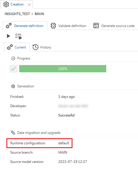 Runtime configuration displayed during 'Generate definition'
Integration & AI - Changes to OAuth server for Web connections
changePreviously, when changing the settings for an OAuth server in Web connections, unexpected behavior would sometimes occur. We have implemented the following changes for OAuth servers used in Web connections:
- The tab Web connections is now shown in the tab Usage, informing you the OAuth server is being used.
- You can no longer delete the OAuth server if used in a Web Connection. Instead, you will receive a notification that it is being used.
Generic - Improved 'Changes compared to default' screen
newIn the 2025.1 release, we introduced a screen that lets you compare a variant to its default. In this release, we made the following improvements to this feature:
- The changes are now displayed in a grouped grid, allowing you to easily collapse changes for screens you do not want to see. The groups in the grid are in the same order as their corresponding tabs in the Software Factory.
- Where the software already displayed the Value in variant, it now also shows the Value in default. This allows you to see how the value of the variant field deviates from the default. To emphasize this deviation, the text in Value in variant has been made bold.
- Where applicable, the translated values are now displayed instead of the raw values. Some examples of this are:
- The Column type now shows 'Hidden' instead of '3'.
- 'True' is now shown instead of '1' for a checkbox.
- The name of an icon is shown instead of its numerical ID.
- You can reset a change to its default value with the task Reset [table/task/report] variant change
 .
This task restores the field to its default value.
If a field is functionally related to other fields, all related fields will be reset simultaneously.
For example, the fields Next group, Group label, and Icon name are linked.
Resetting the Group label automatically resets the Next group and Icon name as well.
.
This task restores the field to its default value.
If a field is functionally related to other fields, all related fields will be reset simultaneously.
For example, the fields Next group, Group label, and Icon name are linked.
Resetting the Group label automatically resets the Next group and Icon name as well.
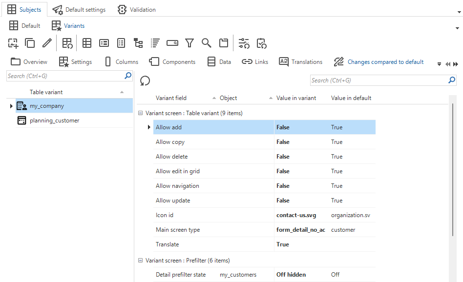 Improved 'Changes compared to default' screen
Generic - Shortcuts for tasks
newTo improve usability, we have added shortcuts to the following tasks:
- menu Deployment > Creation > Generate definition
 Generate definition: Alt + G
- Execute all creation steps: Alt + A
- menu Deployment > Creation > Generate source code
- Generate source code: Alt + G
- menu Deployment > Creation > Execute source code
 Connect: Ctrl + Alt + C
- Execute all code files: Alt + E
- menu Quality > Unit tests
- Execute all unit tests: Alt + E
 Execute selected unit tests: Alt + S
Generic - Reserved keywords updated
changeWe have updated the list of reserved keywords for SQL Server. This can lead to more results for validations that check model object names for overlap with reserved keywords. We recommend renaming model objects to avoid overlap with reserved keywords.
We have adopted the complete list of Microsoft for SQL Server.
Fixed in the Software Factory
- When adding a new Table task or Table report via the form, the checkbox for the setting Enable for empty subject is selected or cleared as specified in the Model settings. However, when adding a Table task or Table report via the task Add to table, the setting was not applied. This has been fixed.
- Windows GUI When you tried to solve complex conflicts, the KDiff3 executable was not found
(menu Models > Merging > tab Active conflicts > tab Compare > task Compare code
 ).
This has been fixed.
).
This has been fixed. - In some instances, synchronization to IAM would take longer than expected or lead to undesired behavior. We have made several optimizations to improve the calculating of effective rights at the start of the synchronization process. This improves the overall performance of synchronization. However, a minor performance degradation may occur in synchronization scenarios where only a small subset of roles are synchronized via the module selection. Lastly, we added progress information of long-running individual synchronization steps to the synchronization screen.
Improved login experience
Styling improvements for Indicium login pages
new IndiciumYou now have more control over the look and feel of Indicium login pages with expanded customization options, including:
- Domain-based login pages
- Configurable login messages
- Custom CSS styling for login pages in IAM
- Tenant email customization and domains
- Changes in properties and settings for login pages
In addition, we have made some minor changes to improve the user experience:
- The 'x' button on the login page has been replaced with two separate buttons:
- Cancel - only appears on the initial login page, allowing users to exit the login flow.
- Previous - appears on subsequent pages, allowing users to return to previous steps without exiting the entire login flow.
- The translations "Log in" and "Log out" are now always "Sign in" and "Sign out".
- "Validation token" is now always "Verification code".
- We have fixed the auto-fill option for a password manager on the Change password page.
- The TOTP setup page now includes instructional text about the Microsoft Authenticator and contains links to the Play Store and App store.
You can change the links by overriding the
authenticator_play_store_linkandauthenticator_app_store_link. If you leave the translation of the links empty, the button will be hidden. - The login pages of the Universal GUI have a dark mode setting, but the new Indicium login pages do not have this yet. It will be added in a future update.
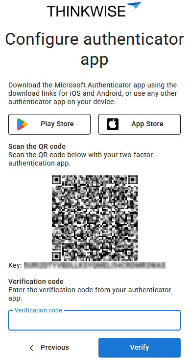 Instructional text on the 'TOTP' page
Domain-based login pages
Community idea newThis feature only works in combination with a configured DNS record for each domain that you add to IAM. The DNS record must resolve to the webserver on which Indicium and the Universal GUI are hosted.
You can now customize the login environment based on the domain using Web domains. This eliminates the need to deploy a separate Indicium or Universal GUI instance for each customer or login scenario. With a single instance, you can support multiple customized login pages. Web domains allow you to configure domain-specific branding, login providers, and other login-related settings. These settings can be managed in IAM in menu Settings > Web domains.
In addition, you can configure the following for a Web domain:
-
In tab Web domain > group General:
- Domain name - A domain name can be a domain, a subdomain and can contain wildcards, for example:
thinkwise.app,*.thinkwise.app,tcp.thinkwise.app - Priority (lower number = higher priority) - The priority determines the order in which the domain name will be matched. Lower values, for example '1', have a higher priority than higher values, such as '10'.
note- A non-removable default web domain
*with the description 'Default web domain' is automatically added. It has the lowest priority (99999) and is used as a fallback for all requests that do not match any other web domain. - Web domain
**is a copy of the default web domain*but has local login disabled. Its priority is 99998. It is only available if the option Enable local login was disabled in IAM before release 2025.2 (menu Settings > Global settings > tab Form > tab Global settings).
Priority example
Imagine you have the following web domains:
client1.thinkwise.appwith priority 1admin.thinkwise.appwith priority 5*.thinkwise.appwith priority 10
If a user accesses
client1.thinkwise.app, it results in the following:client1.thinkwise.appmatches because it is an exact matchadmin.thinkwise.appdoes not match this request*.thinkwise.appmatches because it accepts any subdomain (like client1)
The domain with highest priority (in this case:
client1.thinkwise.app) will be used. The other domains are ignored. - Domain name - A domain name can be a domain, a subdomain and can contain wildcards, for example:
-
In tab Web domain > group Style you can configure the Favicon, Login page logo and Login page background image. You can also set up Custom CSS, see Custom CSS styling for login pages in IAM.
-
In tab Web domain > group Local login options you can configure Allow password reset and Allow stay signed in. These options are only available when you have enabled Local login in tab Login options.
-
In tab Login options you can set up which login options are available.
noteThe tab Login options replaces the
authProviderHintin theconfig.jsonof Universal.
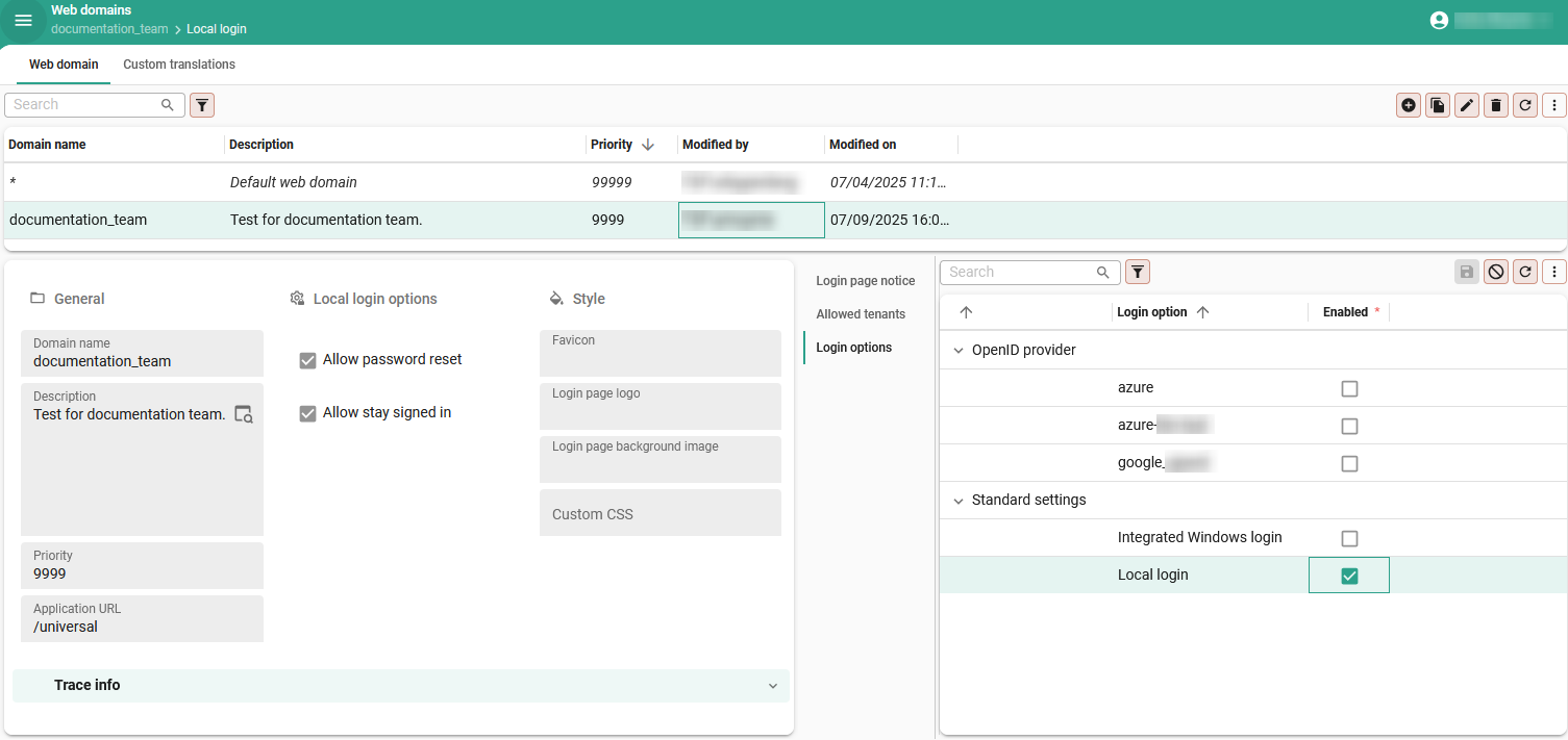 Customize a login environment per domain
Configurable login messages
Community ideaWith Web domains you can now configure a message for the login page in menu Settings > Web domains > tab Login page notice. This message can be used to inform users about events such as scheduled maintenance or other important information. Localized messages can be added for each supported language. For more information, see Domain-based login pages.
 Configure a message for the login page
Custom CSS styling for login pages in IAM
Community ideaYou can now configure a custom.css file in IAM for your login page in menu Settings > Web domains > group Style.
You can modify the layout, fonts, colors and other visual elements to align your login page with your brand identity.
-
The new custom CSS file in IAM replaces the existing
custom.cssfile used by the Universal GUI. If no custom CSS file is configured in IAM, the Universal GUI will continue to use its originalcustom.cssfile. However, support for thecustom.cssfile in the Universal GUI is deprecated and will be removed in a future release. -
To clearly separate styling between Indicium and the Universal GUI, login pages now use distinct CSS classes:
- All Indicium login pages use the class
indicium. - All Universal login pages use the class
universal. We strongly recommend including these identifiers into your code to ensure consistent behavior across platforms.
- All Indicium login pages use the class
Custom CSS in IAM example
The example below changes the primary color to green, shows the background image on the right side instead of the left side and displays the OpenID Provider above the local login fields.
The .indicium class ensures that these changes only apply to Indicium login pages.
.indicium {
  --main-primary: rgb(0, 200, 0);

  .split-screen {
    grid-template-areas: "content background";
  }

  .login-login-input {
    flex-direction: column-reverse;
  }
}
You can configure multiple login pages for a single Universal GUI or Indicium instance using Web domains. This enables you to provide tailored login experiences for different target groups. For example, you can set up separate pages for different customers in a multi-tenant IAM setup, or distinct pages for external portal users and internal employees. For more information, see Domain-based login pages.
 New login styling available in IAM
Tenant email customization and domains
newYou can now set up Tenant email providers and Tenant email templates for each tenant in menu Authorization > Tenants. This allows you to customize email messages and branding in emails for each tenant. You can add localized messages for each language.
You can also configure which tenants can login from a domain in IAM in menu Settings > Web domains > tab Allowed tenants. Defining allowed tenants per domain helps prevent users from logging in through domains intended for other tenants. If not configured, users may become confused if they discover they can access the login page of another customer. Note that this does not pose a security risk—user permissions are always scoped to their assigned tenant, regardless of the domain used to log in. For more information about tenants, see Introduction to tenants.
 Set up a tenant email template
Changes in properties and settings for login pages
As a result of this update, Indicium is now fully responsible for logging in.
This has led to a breaking change in the login configuration previously set up in Indicium's appsettings.json file.
For more information, see Indicium - appsettings.json changes.
A number of settings have been moved from their previous location in IAM to Web domains:
- Login options (partially moved from menu Settings > Global settings)
- Login style, including favicon, login page logo and login page background image (partially moved from menu Settings > Global settings)
- Login localization (moved from menu Settings > Global translations to menu Settings > Web domains > tab Global translations). For the default domain you can set up the default translations in menu Settings > Web domains > tab Global translations. You can deviate from the global settings for every domain in menu settings > Web domains > tab Custom translations.
New and changed in the Intelligent Application Manager
Processes - Optimized process flow schedule log table
changeWe have optimized the process flow schedule log table. This table is used by Indicium to register process flow instances. The index structure has been revised, and several procedures that interact with this table have been optimized. This change makes the process flow schedule log faster.
Applications - 'Run now' task for monitoring and ad-hoc execution of system flows
Community idea newWhen developing your application, you can manually execute and monitor your system flows for testing purposes using the process flow monitor. Previously, to test your system flows in IAM, you had to create a custom schedule and wait until the system flow had run.
From now on, you can use the task Run now in menu Authorization > Applications > tab General settings > tab Scheduled system flows. This task allows you to manually start system flows in IAM, making testing and troubleshooting more accessible and straightforward. The task is also available for system flows for IAM. This can be helpful in executing system flows for IAM, such as a cleanup, when needed, instead of waiting for the schedule.
If multiple instances are (not) allowed
If a scheduled system flow is already running when you execute the task:
- If multiple instances are allowed, the task will start a new instance of the system flow, even in parallel with the scheduled system flow.
- If multiple instances are not allowed, the system flows will not be executed simultaneously. The first scheduled system flow will be executed first.
In both cases, a temporary ad-hoc schedule is created for the system flow. Note that it can take up to 30 seconds before the system flow is started. The ad-hoc schedules are only visible in IAM's Schedule log and are labeled as Manual.
 'Run now' task for system flows in IAM
You can execute the task on any system flow; it does not need to be active. Once the system flow is running, the Schedule log displays the schedule as 'manual' (menu Settings > IAM system flows).
 Schedule is set to 'manual' in the 'Schedule log'
Fixed in the Intelligent Application Manager
Data model changes
Data model changes for the Software Factory and IAM meta-models are listed here. This overview can be used as a reference to fix dynamic control procedures, dynamic model code or custom validations after an upgrade.
Changes Software Factory
Table changes
Changes
| SF - From Table | SF - To Table |
|---|---|
| - | chart_legend_color |
| - | chart_legend_color_condition |
| - | creation_preset |
| - | sub_report |
Column changes
Changes
| SF - Table | SF - From column | SF - To column | Mandatory | Default value |
|---|---|---|---|---|
| action_bar | - | primary_action | 1 | 0 |
| ambiguous_expression | generated | - | - | - |
| branch | - | vrs_control_runtime_configuration_id | 0 | - |
| branch | origin_merge_pending | finalized | 1 | 0 |
| code_file | generated | - | - | - |
| code_grp | generated | - | - | - |
| col | generated | - | - | - |
| conditional_layout | - | apply_to_grid | 1 | 0 |
| conditional_layout | - | apply_to_form | 1 | 0 |
| conditional_layout | - | apply_to_edit | 1 | 0 |
| conditional_layout | - | apply_to_scheduler_resource | 1 | 0 |
| conditional_layout | - | underline | 1 | 0 |
| conditional_layout | - | strikethrough | 1 | 0 |
| conditional_layout | - | font_size | 0 | - |
| conditional_layout | apply_conditional_layout | - | - | - |
| control_proc | generated | - | - | - |
| control_proc_template | code_generated | - | - | - |
| cube | generated | - | - | - |
| cube_view_field_conditional_layout | - | underline | 1 | 0 |
| cube_view_field_conditional_layout | - | strikethrough | 1 | 0 |
| cube_view_field_conditional_layout | - | font_size | 0 | - |
| cube_view_field_conditional_layout | apply_to_series | - | - | - |
| cube_view_field_conditional_layout | apply_to_series | apply_to_series | - | - |
| data_migration_col | generated | - | - | - |
| data_migration_tab | generated | - | - | - |
| definition_generation | - | vrs_control_runtime_configuration_id | 0 | - |
| dom | generated | - | - | - |
| email_provider | email_protocol_type | - | - | - |
| email_provider_configuration | email_protocol_type | - | - | - |
| extender | generated | - | - | - |
| font | generated | - | - | - |
| gai_provider | azure_openai_resource_name | azure_openai_endpoint | 0 | - |
| gai_provider | - | organization_id | 0 | - |
| gai_provider_configuration | azure_openai_resource_name | azure_openai_endpoint | 0 | - |
| gai_provider_configuration | - | organization_id | 0 | - |
| generate_sync_scripts_step | - | progress | 0 | - |
| help_index | generated | - | - | - |
| indx | generated | - | - | - |
| map | - | add_marker_task_id | 0 | - |
| map | - | marker_location_task_parmtr_id | 0 | - |
| map | - | add_line_task_id | 0 | - |
| map | - | line_location_task_parmtr_id | 0 | - |
| map | - | add_polygon_task_id | 0 | - |
| map | - | polygon_location_task_parmtr_id | 0 | - |
| map | - | add_rectangle_task_id | 0 | - |
| map | - | rectangle_location_task_parmtr_id | 0 | - |
| map | - | add_circle_task_id | 0 | - |
| map | - | circle_location_task_parmtr_id | 0 | - |
| map_data_mapping | - | allow_drag_drop | 1 | 0 |
| model_settings | help_feedback_mail_address | - | - | - |
| module_item | generated | - | - | - |
| msg | generated | - | - | - |
| process_flow | generated | - | - | - |
| prog_object | - | prog_object_generated_code_hash | 0 | - |
| prog_object_archive | - | prog_object_generated_code_hash | 0 | - |
| ref | - | visible_for_filter_detail | 1 | 1 |
| ref | - | visible_for_filter_look_up | 1 | 1 |
| ref | generated | - | - | - |
| report | - | confirm_button_has_alt_transl | 1 | 0 |
| report | - | alt_transl_confirm_button | 0 | - |
| report | - | cancel_button_has_alt_transl | 1 | 0 |
| report | - | alt_transl_cancel_button | 0 | - |
| report | generated | - | - | - |
| report_conditional_layout | - | underline | 1 | 0 |
| report_conditional_layout | - | strikethrough | 1 | 0 |
| report_conditional_layout | - | font_size | 0 | - |
| report_ref | generated | - | - | - |
| report_variant | - | confirm_button_has_alt_transl | 0 | - |
| report_variant | - | alt_transl_confirm_button | 0 | - |
| report_variant | - | cancel_button_has_alt_transl | 0 | - |
| report_variant | - | alt_transl_cancel_button | 0 | - |
| report_variant | generated | - | - | - |
| scheduler | - | add_activity_task_id | 0 | - |
| scheduler | - | activity_start_task_parmtr_id | 0 | - |
| screen_area | generated | - | - | - |
| screen_component | - | primary_action | 1 | 0 |
| screen_component_custom_action | - | primary_action | 1 | 0 |
| screen_type | generated | - | - | - |
| storage | generated | - | - | - |
| sub_name | generated | - | - | - |
| sub_name_excluded_object | generated | - | - | - |
| subroutine | generated | - | - | - |
| subroutine_type | generated | - | - | - |
| tab | - | custom_component_ref | 0 | - |
| tab | generated | - | - | - |
| tab_check_constraint | generated | - | - | - |
| tab_prefilter | generated | - | - | - |
| tab_report | - | primary_action | 1 | 0 |
| tab_task | - | primary_action | 1 | 0 |
| tab_variant | - | apply_custom_component_ref | 1 | 0 |
| tab_variant | - | custom_component_ref | 0 | - |
| tab_variant | generated | - | - | - |
| tab_variant_conditional_layout | - | apply_to_grid | 0 | - |
| tab_variant_conditional_layout | - | apply_to_form | 0 | - |
| tab_variant_conditional_layout | - | apply_to_edit | 0 | - |
| tab_variant_conditional_layout | - | apply_to_scheduler_resource | 0 | - |
| tab_variant_conditional_layout | apply_conditional_layout | - | - | - |
| tab_variant_detail | - | visible_for_filter_detail | 1 | 1 |
| tab_variant_look_up | - | visible_for_filter_look_up | 0 | - |
| tab_variant_report | - | primary_action | 0 | - |
| tab_variant_task | - | primary_action | 0 | - |
| tag | generated | - | - | - |
| task | - | confirm_button_has_alt_transl | 1 | 0 |
| task | - | alt_transl_confirm_button | 0 | - |
| task | - | cancel_button_has_alt_transl | 1 | 0 |
| task | - | alt_transl_cancel_button | 0 | - |
| task | generated | - | - | - |
| task_conditional_layout | - | underline | 1 | 0 |
| task_conditional_layout | - | strikethrough | 1 | 0 |
| task_conditional_layout | - | font_size | 0 | - |
| task_ref | generated | - | - | - |
| task_variant | - | confirm_button_has_alt_transl | 0 | - |
| task_variant | - | alt_transl_confirm_button | 0 | - |
| task_variant | - | cancel_button_has_alt_transl | 0 | - |
| task_variant | - | alt_transl_cancel_button | 0 | - |
| task_variant | generated | - | - | - |
| test_case | generated | - | - | - |
| test_step | generated | - | - | - |
| test_step_check | generated | - | - | - |
| test_suite | generated | - | - | - |
| theme | - | universal_menu_color_light | 0 | - |
| theme | - | universal_menu_color_dark | 0 | - |
| theme | generated | - | - | - |
| transl_object | generated | - | - | - |
| usr | - | default_creation_preset_id | 0 | - |
| validation | generated | - | - | - |
| validation_grp | generated | - | - | - |
Changes Intelligent Application Manager
Table changes
Changes
| IAM - From table | IAM - To table |
|---|---|
| - | chart_legend_color |
| - | chart_legend_color_condition |
| - | iam_system_gai_provider |
| - | process_flow_queue |
| - | sub_report |
| - | system_gai_provider_instruction |
| - | tenant_email_provider |
| - | tenant_email_template |
| - | web_domain |
| - | web_domain_allowed_tenant |
| - | web_domain_login_option |
| - | web_domain_transl |
| system_gai_provider | sf_system_gai_provider |
Column changes
Changes
| IAM - Table | IAM - From column | IAM - To column | Mandatory | Default value |
|---|---|---|---|---|
| conditional_layout | - | underline | 1 | 0 |
| conditional_layout | - | strikethrough | 1 | 0 |
| conditional_layout | - | font_size | 0 | - |
| cube_view_field_conditional_layout | - | underline | 1 | 0 |
| cube_view_field_conditional_layout | - | strikethrough | 1 | 0 |
| cube_view_field_conditional_layout | - | font_size | 0 | - |
| cube_view_field_conditional_layout | apply_to_series | - | - | - |
| global_settings | about_icon | - | - | - |
| global_settings | about_icon_data | - | - | - |
| global_settings | login_page_logo | - | - | - |
| global_settings | login_page_logo_data | - | - | - |
| global_settings | login_page_background_image | - | - | - |
| global_settings | login_page_background_image_data | - | - | - |
| iam_email_provider | email_protocol_type | - | - | - |
| iam_gai_provider | azure_openai_resource_name | azure_openai_endpoint | 0 | - |
| iam_gai_provider | - | organization_id | 0 | - |
| map | - | add_marker_task_id | 0 | - |
| map | - | marker_location_task_parmtr_id | 0 | - |
| map | - | add_line_task_id | 0 | - |
| map | - | line_location_task_parmtr_id | 0 | - |
| map | - | add_polygon_task_id | 0 | - |
| map | - | polygon_location_task_parmtr_id | 0 | - |
| map | - | add_rectangle_task_id | 0 | - |
| map | - | rectangle_location_task_parmtr_id | 0 | - |
| map | - | add_circle_task_id | 0 | - |
| map | - | circle_location_task_parmtr_id | 0 | - |
| map_data_mapping | - | allow_drag_drop | 1 | 0 |
| ref | - | visible_for_filter_detail | 1 | 1 |
| ref | - | visible_for_filter_look_up | 1 | 1 |
| report_conditional_layout | - | underline | 1 | 0 |
| report_conditional_layout | - | strikethrough | 1 | 0 |
| report_conditional_layout | - | font_size | 0 | - |
| report_variant | - | alt_transl_confirm_button | 0 | - |
| report_variant | - | alt_transl_cancel_button | 0 | - |
| scheduler | - | add_activity_task_id | 0 | - |
| scheduler | - | activity_start_task_parmtr_id | 0 | - |
| screen_component | - | primary_action | 1 | 0 |
| sf_email_provider | email_protocol_type | - | - | - |
| sf_gai_provider | azure_openai_resource_name | azure_openai_endpoint | 0 | - |
| sf_gai_provider | - | organization_id | 0 | - |
| sf_report | - | alt_transl_confirm_button | 0 | - |
| sf_report | - | alt_transl_cancel_button | 0 | - |
| sf_system_gai_provider | - | core_gai_provider_type | 1 | - |
| sf_system_gai_provider | - | custom_endpoint | 0 | - |
| sf_system_gai_provider | - | organization_id | 0 | - |
| sf_system_gai_provider | - | temperature | 0 | - |
| sf_system_gai_provider | - | system_instruction | 0 | - |
| sf_system_gai_provider | - | custom_api_key | 0 | - |
| sf_system_gai_provider | - | custom_api_key_encrypted | 0 | - |
| sf_system_gai_provider | gai_provider_type | system_gai_provider_type | 0 | - |
| sf_system_gai_provider | azure_openai_resource_name | azure_openai_endpoint | 0 | - |
| tab | - | custom_component_ref | 0 | - |
| tab_report | - | primary_action | 1 | 0 |
| tab_task | - | primary_action | 1 | 0 |
| tab_variant | - | custom_component_ref | 0 | - |
| tab_variant_detail | - | visible_for_filter_detail | 1 | 1 |
| tab_variant_look_up | - | visible_for_filter_look_up | 1 | 1 |
| tab_variant_report | - | primary_action | 1 | 0 |
| tab_variant_task | - | primary_action | 1 | 0 |
| task | - | alt_transl_confirm_button | 0 | - |
| task | - | alt_transl_cancel_button | 0 | - |
| task_conditional_layout | - | underline | 1 | 0 |
| task_conditional_layout | - | strikethrough | 1 | 0 |
| task_conditional_layout | - | font_size | 0 | - |
| task_variant | - | alt_transl_confirm_button | 0 | - |
| task_variant | - | alt_transl_cancel_button | 0 | - |
| theme | - | universal_menu_color_light | 0 | - |
| theme | - | universal_menu_color_dark | 0 | - |
Questions or suggestions?
Questions or suggestions about the release notes? Let us know in the Thinkwise Community!